kage
kage
godaylight.com
Design analysis
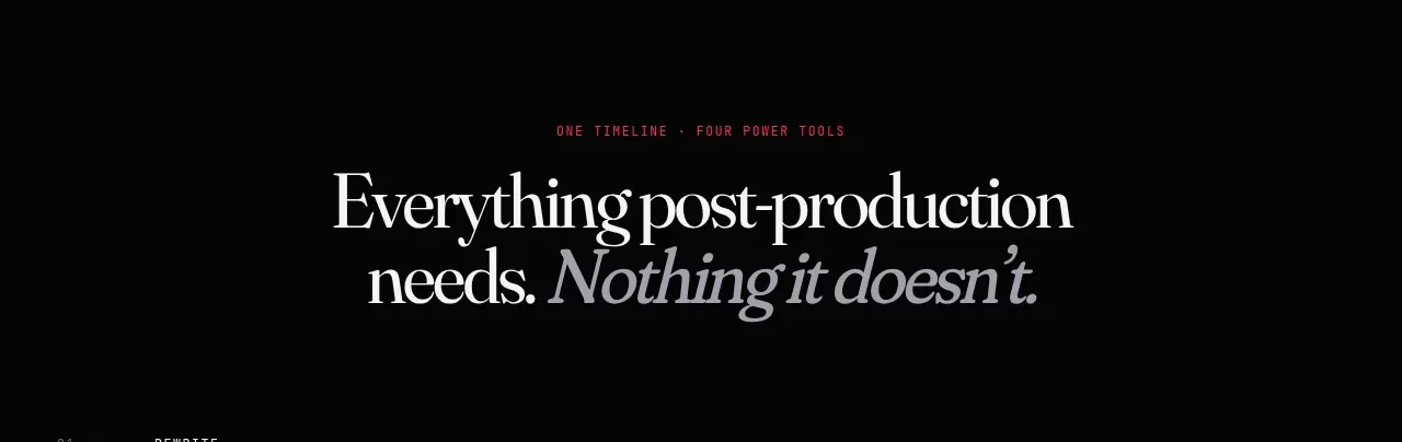
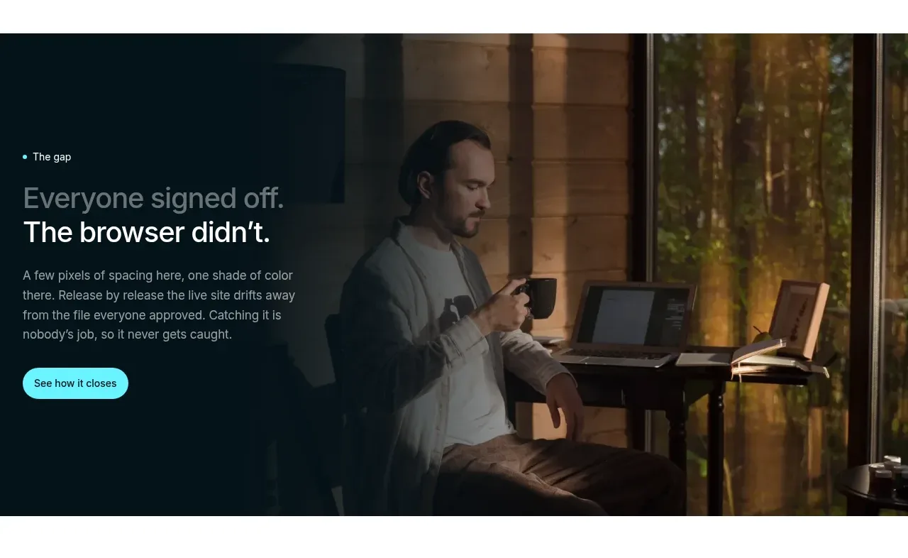
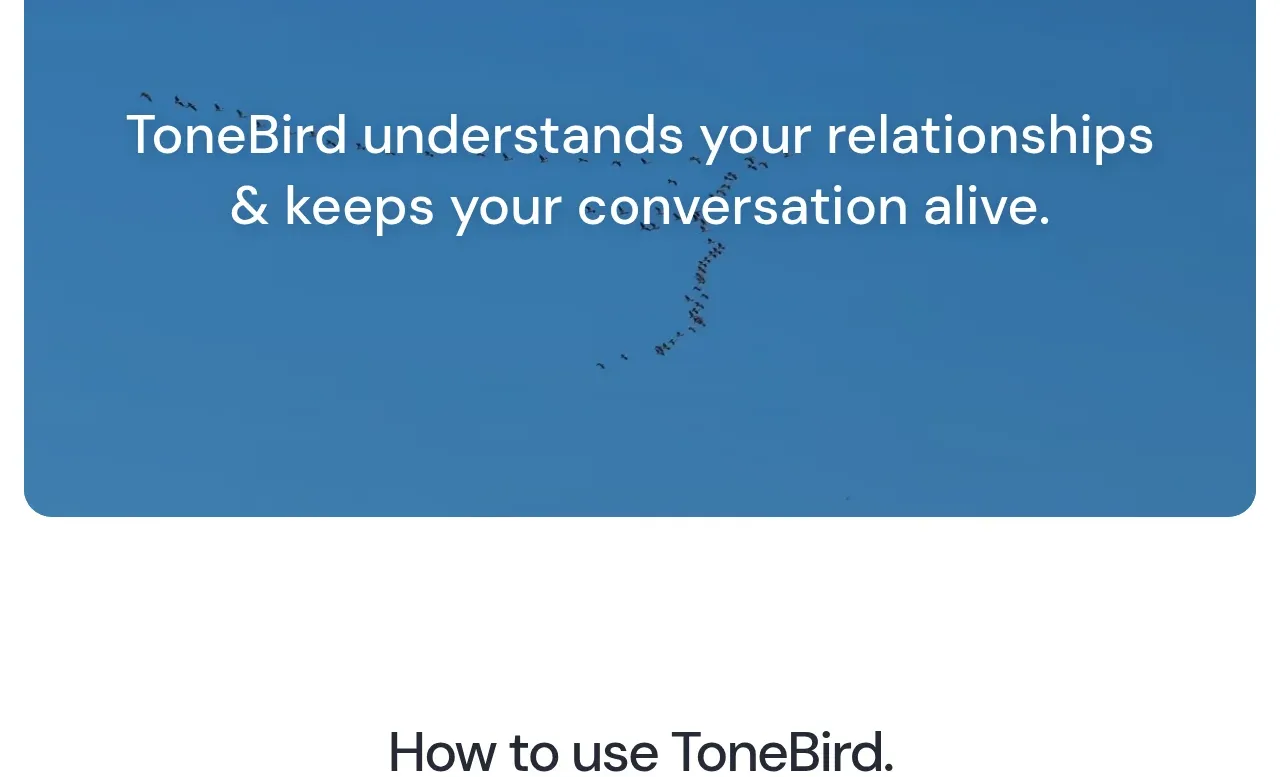
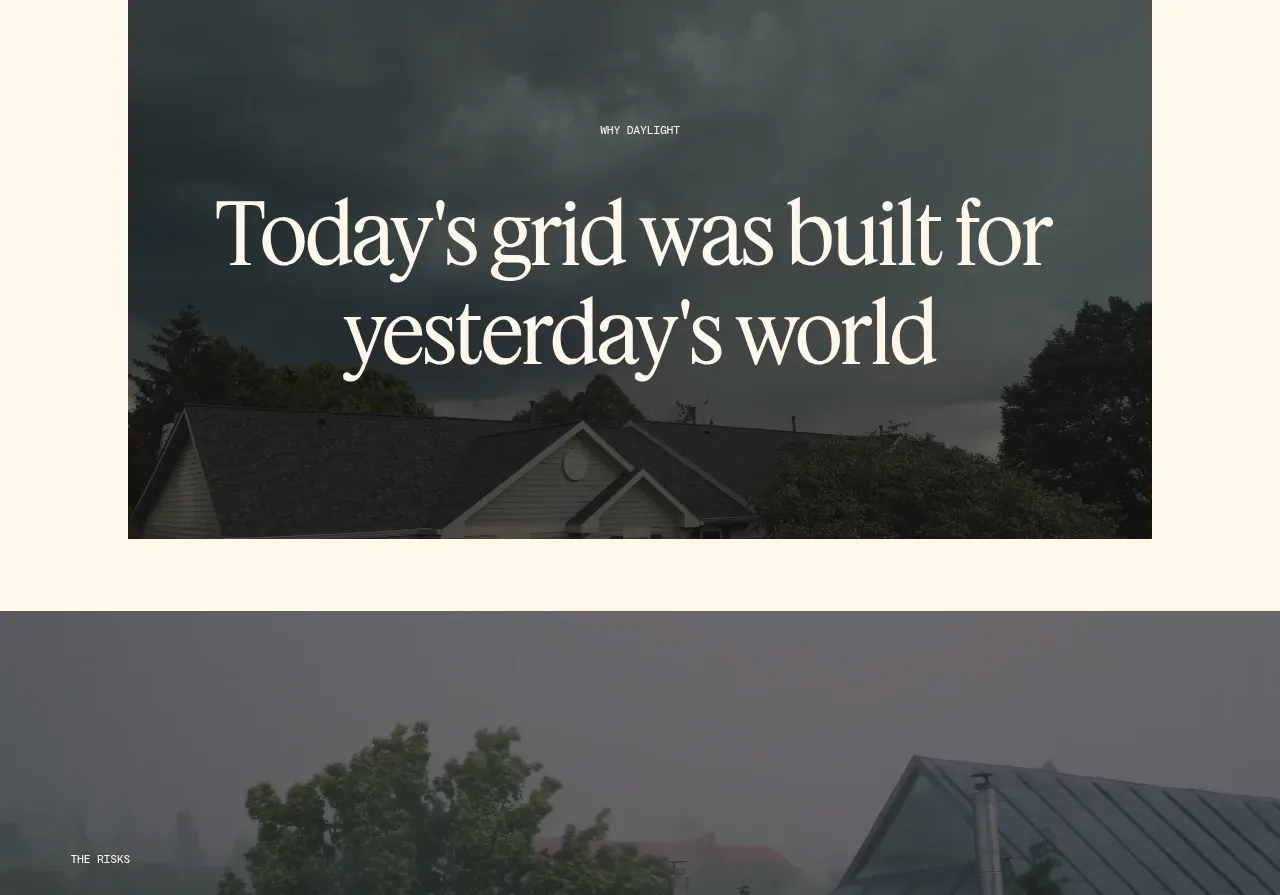
A full-width darkened image banner presents three stacked risk claims as a single high-impact typographic composition.
Prompt preview
## Reference images

Study these alongside the description below: hierarchy, rhythm, spacing, colour. Build for the product you are asked about, using this design language.

- Component: https://kage-design-assets.t3.tigrisfiles.io/components/godaylight-com/ca5e907b-4256-46ba-9367-b5c95fdb4894-1791311230-5.webp
- Full page it was cut from: https://kage-design-assets.t3.tigrisfiles.io/screenshots/godaylight-com/ca5e907b-4256-46ba-9367-b5c95fdb4894-1791311174290-full.webp
- Component on Kage: https://kage.design/component/godaylight-banner

## Before you start
Ask what the user's product is, who it serves, and what its brand personality and visual identity are. Apply the principles below to that product rather than reproducing this reference.

Build a full-bleed dark image banner with a muted overlay and centered statistical or evidence-led claims. Use a tiny uppercase eyebrow followed by 2–4 lines of large sans-serif or serif text, with each claim on its own line and strong vertical rhythm. Keep text width constrained to about 90% on mobile and 760–1000px on desktop. Use near-white text (#fffaf0), a desaturated blue-gray photographic layer, and 80–140px vertical padding. Make the claims scannable, semantically structured, and accessible; support motion only as a subtle background effect.

Never: use logos, product names, copy, illustrations, or imagery from the reference.