 kage
monish.cc

Design analysis
A compact header places the yellow-and-black brand mark at left, simple text links in the middle, and a dark rounded app CTA at right.
Prompt preview
## Reference images

Study these alongside the description below: hierarchy, rhythm, spacing, colour. Build for the product you are asked about, using this design language.

- Component: https://kage-design-assets.t3.tigrisfiles.io/components/monish/5f3b5863-2239-4773-833d-591642a3d58f-1792821773-0.webp
- Full page it was cut from: https://kage-design-assets.t3.tigrisfiles.io/screenshots/monish/5f3b5863-2239-4773-833d-591642a3d58f-1792821722168-full.webp
- Component on Kage: https://kage.design/component/monish-navigation

## Before you start
Ask what the user's product is, who it serves, and what its brand personality and primary action should be. Apply the principles below to that product rather than reproducing the reference.

Build a compact desktop-first navigation bar with a left-aligned brand lockup, a small horizontal set of text links, and one prominent dark pill-shaped CTA. Keep the header on the same pale blue background as the hero, align all items to a centered max-width container, and use generous horizontal breathing room. Use a heavy rounded sans-serif for the brand and a small neutral sans-serif for links. Approximate colours: sky blue #9DD5F7, near-black #080808, white #FFFDF8, yellow accent #FFD91A. Use a 1px near-black border only where needed, pill radius 999px, and a compact 12–16px gap system. On mobile, collapse links into a menu while preserving the CTA.

Never use logos, product names, copy, illustrations, or imagery from the reference.
More components
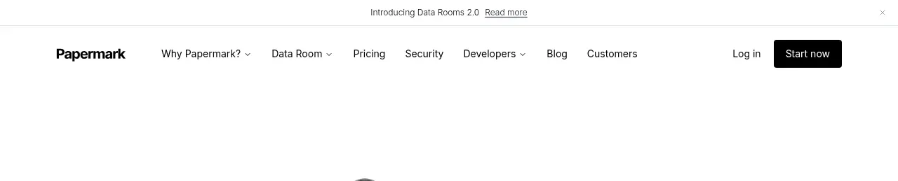
 Announcement bar and primary navigation
Papermark Data Rooms · Navigation

 Minimal product navigation
Badgey · Navigation

 Floating product navigation
Clips by Plastic · Navigation

 Top navigation
AgentGrid.io · Navigation

 Announcement bar and primary navigation
Context Engine · Navigation

 Minimal brand navigation
Peras · Navigation