kage
kage

Design analysis
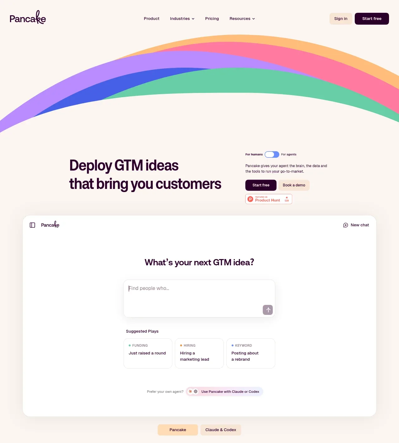
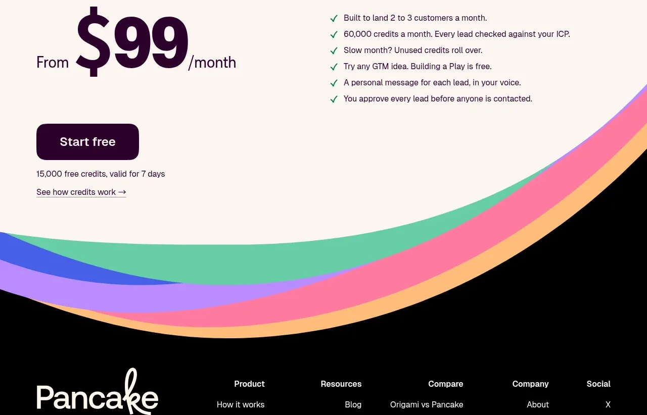
A warm cream landing page where one signature motif — five parallel curved stripes (violet, blue, pink, green, orange) — does all the decorative work: it crowns the hero, frames the closing CTA panel as vertical ribbons, and waves down into a black footer. Hierarchy is built almost entirely from type-scale jumps: chunky rounded display headlines at 80px+ against 16px body copy, plus oversized coloured numerals (01 purple, 02 pink, 03 orange) anchoring three tall feature panels that alternate copy with simplified product mockups. The rhythm deliberately loosens mid-page — a full-bleed sky-blue band left nearly empty acts as a pause — then tightens again around a single-price block with a giant plum $99 figure, a green-check list, and a dense black footer with a script wordmark and five link columns.
Prompt preview
## Reference images

Study these alongside the description below: hierarchy, rhythm, spacing, colour. Build for the product you are asked about, using this design language.

- Full page: https://kage-design-assets.t3.tigrisfiles.io/screenshots/pancake/f2dcc4e1-7584-486e-8c34-37279d03f6e2-1792044073540-full.webp
- Above the fold: https://kage-design-assets.t3.tigrisfiles.io/screenshots/pancake/f2dcc4e1-7584-486e-8c34-37279d03f6e2-1792044069712.webp
- Design on Kage: https://kage.design/designs/pancake-landing-page

# Build a landing page in this design language

## Before you start
Ask the user: what product they are building, who it is for, what brand assets they already have (name, colours, typefaces, any existing motif), their pricing model, and their list of customers or integrations. Wait for the answers. Everything below is applied to their product and brand, not to the reference.

## Page structure
1. **Nav** — slim bar on the page background (no border, no elevation): wordmark left; five text links centred, two with dropdown carets; right side a quiet "Sign in" text link plus one dark pill CTA.
2. **Hero** — an arc of parallel colour stripes sweeps across the top of the page, curving down behind the nav. Below it, a two-column hero: left ~55% holds a two-line display headline; right column stacks a small pill toggle switching between two audience modes (e.g. "for humans / for agents"), a two-line supporting paragraph, a primary pill button plus a peach secondary pill, and one small third-party badge.
3. **Product demo card** — one large white rounded card (24px radius) mocking the real product: a centred question headline, a large empty prompt input with a send button, three "suggested prompt" mini-cards each tagged with a coloured category label, and a footnote row offering alternate modes. Directly below the card, a two-option pill toggle switches which product variant the mock shows.
4. **Social proof strip** — a tiny centred caption, then two loose rows of 6–7 customer wordmarks, near-monochrome, a few with tiny coloured superscript dots. No cards, no borders.
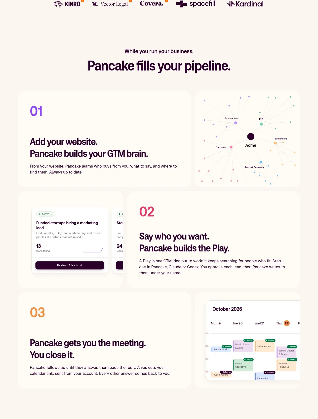
5. **Pipeline statement** — a short eyebrow line completing-into a display-size headline ("While you run your business, / …fills your pipeline." pattern). Centred, surrounded by generous whitespace.
6. **Three numbered panels** — stacked full-width cream cards, each pairing copy with a product visual, alternating sides: 01 copy left + a node-graph visual right (numeral in violet); 02 two overlapping product mockup cards left + copy right (numeral in pink); 03 copy left + a calendar mock right (numeral in orange). Each numeral is display-size in its accent colour, above a two-sentence headline ("Do X. …does Y." cadence) and one short body paragraph.
7. **Breathing band** — a full-bleed section in a single soft colour (light sky blue) with a curved top edge and almost no content: a deliberate visual pause, or a slot for a product video.
8. **Closing CTA panel** — a rounded cream panel whose left and right edges are framed by vertical runs of the same stripe motif; centred headline, a two-line subcopy that names the price, then primary + secondary pill buttons.
9. **Pricing** — one price only, no table: left side a section headline and an enormous "/month" figure with a small "From"; right side a six-item checklist with green checks, each a short benefit sentence. Below: primary button, a free-credits footnote, and a text link.
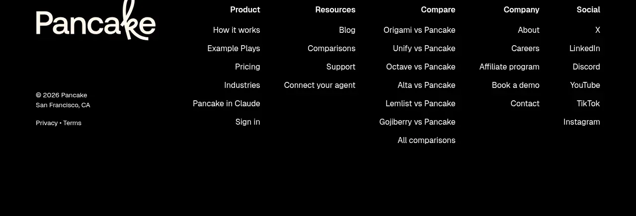
10. **Footer** — the stripe motif re-enters as a wave and resolves into a black footer: giant script-style wordmark left, five link columns right (Product, Resources, Compare, Company, Social); bottom-left legal line with city, plus Privacy and Terms.

## Design language
- **Canvas and ink**: warm cream background (#FAF1E6) everywhere; content sits on white (#FFFFFF) cards with hairline borders (#E9DCCB), 20–28px radius, and no visible shadows. All text in deep plum (#2E0A2E) rather than pure black; primary buttons are that plum with white text, secondary buttons are peach (#F6E2D4) with plum text, all fully rounded pills.
- **One signature motif**: a ribbon graphic of five parallel curved stripes — violet #A78BFA, royal blue #3E63DD, pink #F06CA8, green #35C98E, orange #F5A63B. Repeat it exactly three times (hero arc, CTA frame, footer wave) so it reads as a brand device. Never introduce a second decorative illustration style.
- **Type**: pair one chunky rounded display face with one clean sans. Display headlines go extremely large (72–96px hero, 56–72px section heads) with tight leading (~1.02); body is 15–16px in a muted plum-grey; micro-labels are 11px uppercase, letter-spaced. Hierarchy comes from scale jumps, not weight changes.
- **Accent discipline**: colour is used sparingly and meaningfully — the big panel numerals (violet/pink/orange), the category tags on suggestion cards, green (#2FA96B) checkmarks, pastel fills inside product mockups. Everything else stays cream, white and plum.
- **Rhythm down the page**: airy centred statements alternate with dense contained cards. Hero → tight logo rows → huge statement → three tall panels → a near-empty colour band as a real pause (resist filling it) → compact CTA → editorial single-price block → dense black footer. Section spacing 120–160px.
- **Layout**: max-width ~1200px; numbered panels alternate copy left/visual right; let product mockups overlap slightly for depth. Build all mockups as simplified HTML (chat prompt, list rows with count badges, calendar with pastel event cards) with realistic micro-copy — never as static images of real UI.
- **Motion**: gentle only — 150–200ms ease transitions, slight hover lift on cards, sliding pill-toggle thumbs, a slow arc draw if anything. No parallax or scroll-hijacking.

## Never
- No logos, wordmarks, product names or copy from the reference (its name, its tagline, "fills your pipeline", "GTM brain", "Play", or its section headings).
- No customer logos or badges from the reference; the logo strip uses the user's own customers as placeholder wordmarks.
- No tracing of the exact rainbow ribbon — build the user's own multi-stripe accent motif from their palette.
- Never present the result as the reference product.
Components from this page
All components
 Minimal product navigation
Pancake · Navigation
Minimal product navigation
Pancake · Navigation
 Hero with interactive product preview
Pancake · Hero
Hero with interactive product preview
Pancake · Hero
 Trusted-by customer logos
Pancake · Logo cloud
Trusted-by customer logos
Pancake · Logo cloud
 Three-step pipeline explanation
Pancake · Feature grid
Three-step pipeline explanation
Pancake · Feature grid
 Color-framed conversion call to action
Pancake · Call to action
Color-framed conversion call to action
Pancake · Call to action
 Simple transparent pricing
Pancake · Pricing table
Simple transparent pricing
Pancake · Pricing table
 Multi-column dark footer
Pancake · Footer
Multi-column dark footer
Pancake · Footer