 kage
resend.com

Design analysis
A compact black header anchors the page with the Resend wordmark, grouped navigation links, and contrasting login and primary action controls.
Prompt preview
## Reference images

Study these alongside the description below: hierarchy, rhythm, spacing, colour. Build for the product you are asked about, using this design language.

- Component: https://kage-design-assets.t3.tigrisfiles.io/components/resend-inboxes/352e3462-9455-4ac7-822b-63aef1588265-1792735564-0.webp
- Full page it was cut from: https://kage-design-assets.t3.tigrisfiles.io/screenshots/resend-inboxes/352e3462-9455-4ac7-822b-63aef1588265-1792735452629-full.webp
- Component on Kage: https://kage.design/component/resend-inboxes-navigation

## Before you start
Ask what the user's product is, who it serves, and what brand personality, logo, and navigation destinations it needs. Apply the principles below to that product rather than reproducing the reference.

Build a compact, full-width dark navigation bar. Use a left-aligned brand mark, a centered or balanced set of grouped links with subtle chevrons where menus exist, and right-aligned secondary and primary actions. Keep the header around 48–64px tall, with a restrained black background (#050505), near-white text (#f2f2f2), muted secondary text (#8f8f8f), and a 1px low-contrast bottom border (#1b1b1b). Use an 8px spacing rhythm, 13–14px utility typography, medium-weight labels, and a pill-shaped primary button with a soft dark-gray fill (#202020) and 10–12px radius. Make dropdown links keyboard accessible and preserve a visible focus state.

Never: use the reference logo, product name, exact link labels, exact copy, illustrations, imagery, or brand assets.
More components
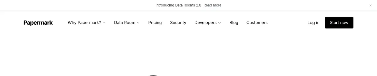
 Announcement bar and primary navigation
Papermark Data Rooms · Navigation

 Minimal product navigation
Badgey · Navigation

 Floating product navigation
Clips by Plastic · Navigation

 Top navigation
AgentGrid.io · Navigation

 Announcement bar and primary navigation
Context Engine · Navigation

 Minimal brand navigation
Peras · Navigation