kage
resend.com

Design analysis
This landing page employs a high-contrast dark mode aesthetic, utilizing a deep charcoal base with vibrant blue accents to establish clear visual hierarchy. The design follows a vertical rhythmic pattern, moving from large, bold typography in the hero to densely packed feature blocks showcasing product UI. Negative space is used effectively around each major section to ensure the content feels premium and focused. All actions and highlights are anchored by a consistent, energetic blue accent.
Prompt preview
## Reference images

Study these alongside the description below: hierarchy, rhythm, spacing, colour. Build for the product you are asked about, using this design language.

- Full page: https://kage-design-assets.t3.tigrisfiles.io/screenshots/resend-inboxes/352e3462-9455-4ac7-822b-63aef1588265-1792735452629-full.webp
- Above the fold: https://kage-design-assets.t3.tigrisfiles.io/screenshots/resend-inboxes/352e3462-9455-4ac7-822b-63aef1588265-1792735448091.webp
- Design on Kage: https://kage.design/designs/resend-inboxes-landing-page

## Before you start
Ask the user what they are building, who their target audience is, and if they have any existing brand assets (name, primary/secondary colours, typography). Wait for the response before applying any of the following guidelines. All output will be designed for their specific product.

## Page structure
1. Hero Section: A large, centered headline establishes the core value proposition, accompanied by a descriptive sub-text and a primary call-to-action (CTA) button. This section should immediately grab attention against a dark background.
2. Feature Showcase Blocks: Succeed the hero section with a series of alternating content blocks. These blocks feature a headline and short descriptive paragraphs paired with relevant product mockups or high-fidelity UI examples.
3. Visual Details Section: Later feature blocks will transition into a more detailed breakdown of specific functionalities, often using smaller components like feature lists, icons, or secondary UI views to provide granular proof points.
4. Closing CTA: The final section of the page must be a prominent, high-contrast area that restates the value proposition and features a final, strong call-to-action button to convert the user.

## Design language
*   **Color Palette:** The primary background should be a deep charcoal or black (#121212). Use a vibrant cyan or electric blue (#00d0ff) as the exclusive accent color for CTAs, active states, and important graphical elements. Secondary text should be a muted medium gray (#a1a1a1).
*   **Typography:** Use a clean, modern sans-serif typeface. Headlines must be extremely large, bold, and highly impactful, relying on weight and size rather than ornamentation. Subheads and body copy should be highly legible at medium size.
*   **Spacing and Rhythm:** Sections should be aggressively separated using significant negative space, allowing each feature block to 'breathe' individually. The rhythm shifts from large, sweeping blocks in the top half to more focused, dense groupings of information in the lower half.
*   **Components:** CTAs must be solid, bright blue with high-contrast white text, featuring a noticeable hover state change. Product mockups should maintain a consistent, elevated visual style (slightly rounded corners, subtle shadows, crisp lines).
*   **Overall Tone:** The design must feel professional, sophisticated, and technically advanced, aligning with high-performance developer tools.

## Never
Do not use any specific logos, wordmarks, or product names from the original reference. Do not present the final result using the exact dark blue gradient or the specific UI of the reference.
Components from this page
All components
 Global navigation
Resend Inboxes · Navigation
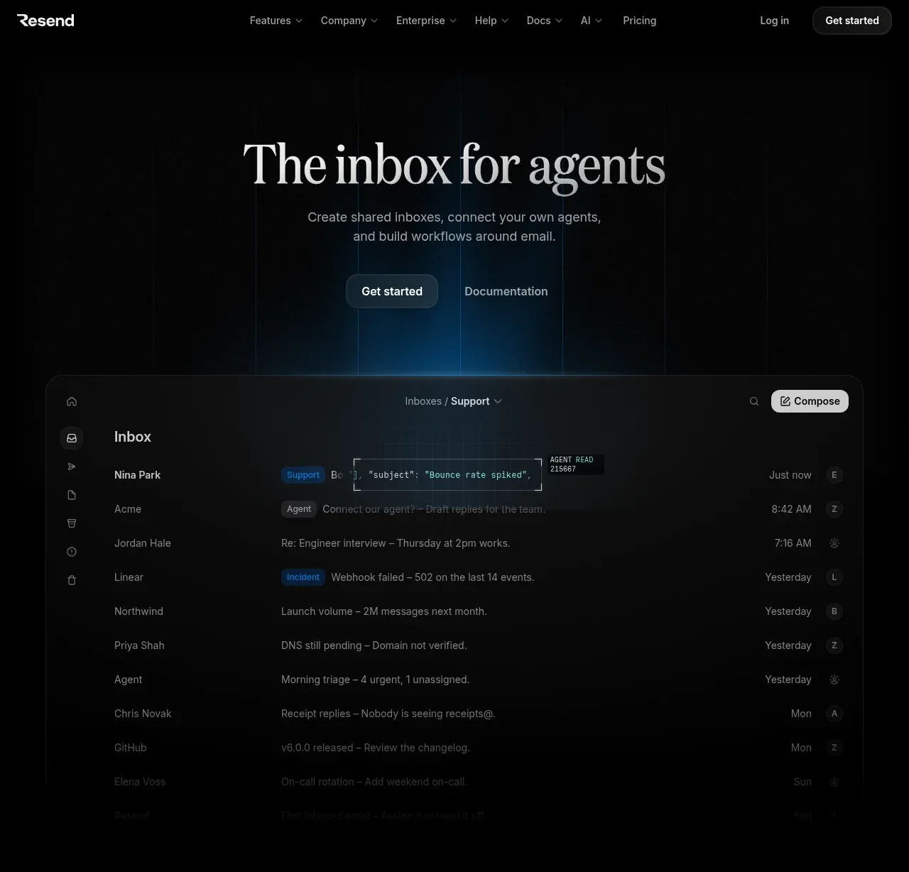 Inbox for agents hero
Resend Inboxes · Hero
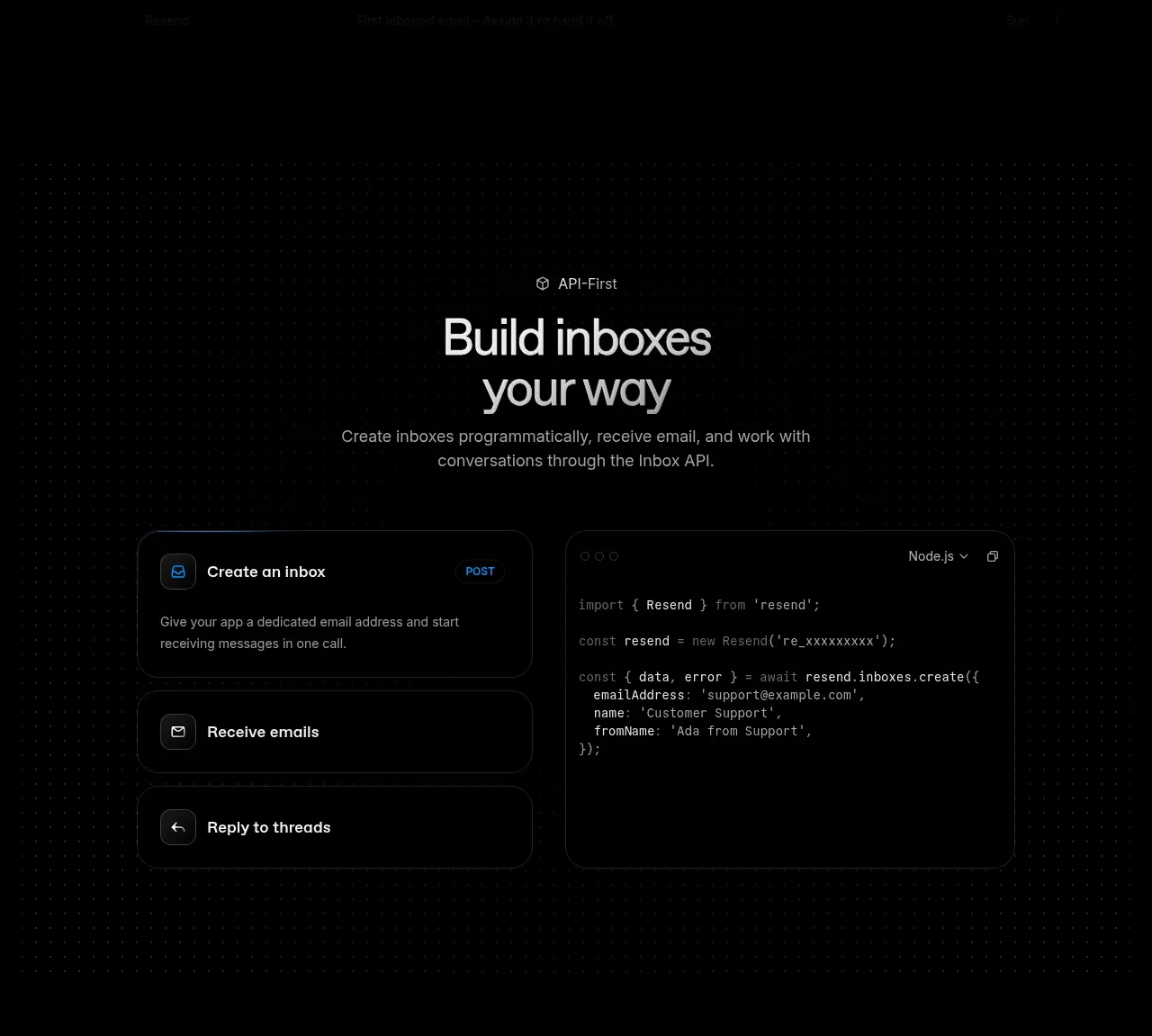 API-first inbox building
Resend Inboxes · Feature grid
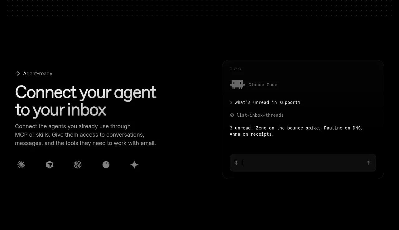 Agent connection
Resend Inboxes · Feature grid
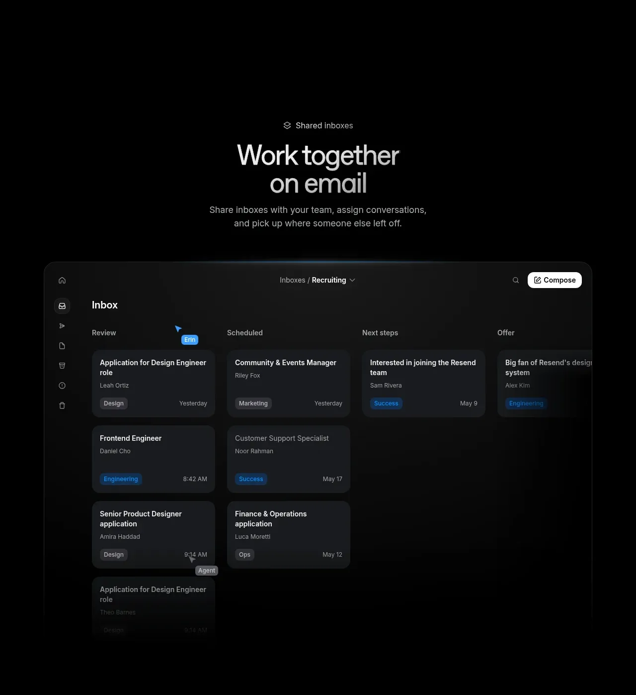 Shared inbox collaboration
Resend Inboxes · Feature grid
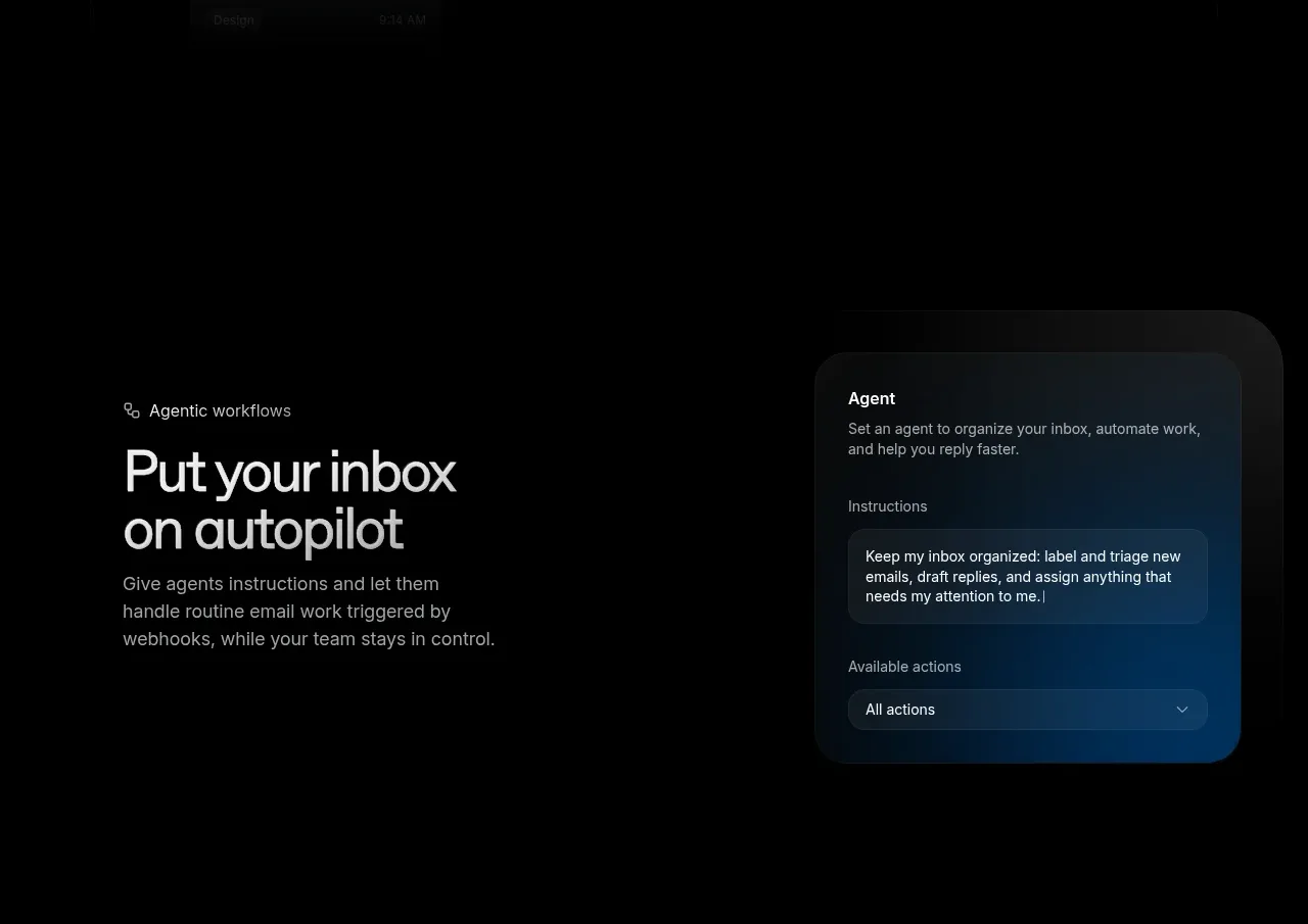 Agentic workflows
Resend Inboxes · Feature grid
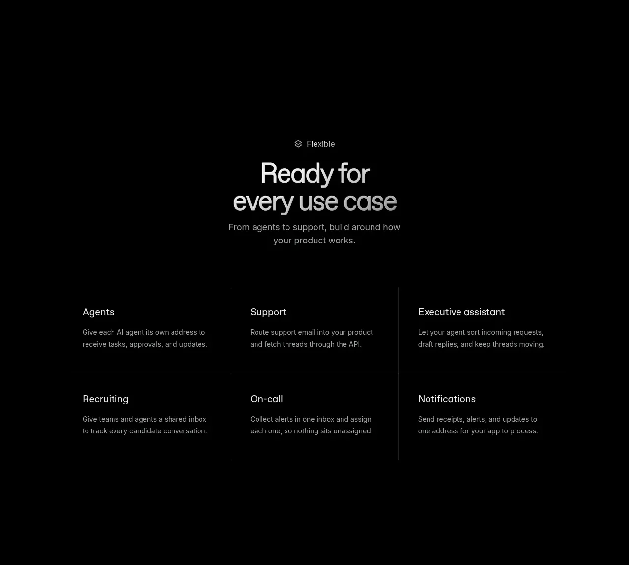 Use-case matrix
Resend Inboxes · Feature grid
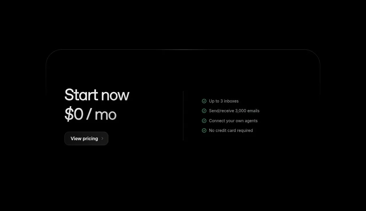 Free plan pricing CTA
Resend Inboxes · Call to action
 Final signup CTA
Resend Inboxes · Call to action
 Global footer
Resend Inboxes · Footer