kage
kage
applyseed.com
Design analysis
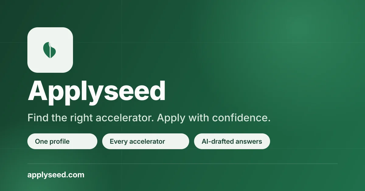
A single-purpose 1200×630 link-preview card built entirely from brand tokens: a deep forest-green radial gradient with a soft vignette, and a left-aligned stack — cream squircle app icon, oversized heavy white wordmark, muted mint subhead, then three cream pill chips restating the value props. The right half of the canvas is deliberately left as empty gradient breathing room so text survives link-preview cropping. One grotesque sans family carries the whole card, with hierarchy built through weight and size steps rather than extra colours.
Prompt preview
## Reference images

Study these alongside the description below: hierarchy, rhythm, spacing, colour. Build for the product you are asked about, using this design language.

- Screenshot: https://kage-design-assets.t3.tigrisfiles.io/screenshots/applyseed/685ab647-4f27-4ecd-9195-3a835a050841-1789797722737.webp
- Design on Kage: https://kage.design/designs/applyseed-og-image

## Before you start
Ask the user what they are building, who it is for, and what brand assets they already have (product name, primary/secondary colours, typeface, logo or app-icon glyph, domain). Wait for the answers before writing any code. Everything below is applied to *their* product — the reference card is only the compositional template.

## Deliverable
Produce a **1200×630 Open Graph social card** — an image shown when the site is shared on X, Slack, LinkedIn or iMessage. Build it as a single self-contained HTML/CSS file (a fixed 1200×630 container) that the agent renders to PNG, or as a standalone SVG. Use placeholder branding and copy if the user hasn't supplied real assets. Do not build a web page — a single static canvas.

## Canvas structure (top to bottom)
1. **Background**: full-bleed deep-green radial gradient, brightest just right of centre, darkening toward all four corners (vignette). No imagery, no illustration — the gradient *is* the visual interest.
2. **App-icon block (top-left, ~96px inset)**: one rounded squircle (~160×160, ~40px radius) in off-white/cream containing the brand glyph in the background colour. It anchors the top-left and acts as the visual start of the stack.
3. **Wordmark**: the product name directly below the icon, extremely large (~90–100px) in the heaviest weight of a single sans family, pure white, tight line-height. This is the focal point.
4. **Subheadline**: one short supporting sentence at ~38px, medium weight, in a desaturated mint/off-white (~#B9D9C5) — one clear step down from the wordmark in both size and contrast.
5. **Pill row**: three fully rounded chips (~64px tall) in the same cream as the icon, each with dark green ~26px semibold text stating one value proposition. Left-aligned in a row with ~16px gaps; keep them on one line at 1200px.
6. **Footer**: a thin 1px horizontal rule in translucent white (~25% opacity) spanning from the left margin to near the right edge, with the bare domain below it in ~28px bold white.
7. **Right half of the canvas stays empty** from the wordmark onward. This is intentional: link previews crop differently across platforms, and the bottom-right is the least safe zone. All information lives in the left ~60%.

## Design language
- **One gradient, one palette.** Background: deep forest green ramp, roughly `#1E5B3C` → `#2E7A50` at the lit centre → `#14472C` at the corners. Foreground: cream `#F2EFE4` for icon and pills, `#FFFFFF` for wordmark and domain, mint `#B9D9C5` for the subhead. Cream appears exactly twice — icon and pills — which ties the composition together.
- **Hierarchy by scale and weight, not by decoration.** Wordmark ~96px/800 → subhead ~38px/500 → pill text ~26px/600 → domain ~28px/700. No borders, no shadows on text; contrast against the dark gradient does all the work.
- **One typeface family** for the entire card (a clean grotesque such as Inter or similar). Weight steps (800 / 700 / 600 / 500) create every level of the hierarchy.
- **Left-aligned single column**: everything hangs off one left margin (~96px), which gives the card a calm, editorial rhythm despite only five elements.
- **Generous radius on foreground objects** (squircle icon ~40px, pills fully rounded) against a square canvas — the soft shapes pop on the flat-edged frame.
- **Vignette as focus control**: the corner darkening pushes the eye to the centre-left where the type sits.
- **No motion** — it's a static image.
- Keep all critical text ≥40px effective height so it stays legible in small inline previews; keep ~96px outer padding so nothing crowds the crop.

## Never
- No use of the ApplySeed name, wordmark, leaf/seed glyph, taglines, pill copy or domain from the reference — substitute the user's own branding and copy (or clearly neutral placeholders).
- No photography, illustrations or icon sets copied from the reference.
- Never present the resulting card as ApplySeed or reuse its exact green-and-cream combination if the user has their own brand colours — the template is the composition, not the palette.