kage
kage
thestory.run
Design analysis
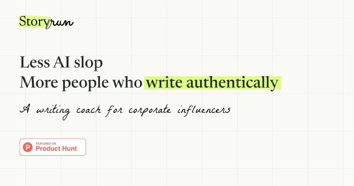
A 1200×630 OG card on a warm off-white paper background with a faint notebook grid. Hierarchy is pure typography: a small serif wordmark ("Story" highlighted in lime, ".run" in a handwritten script) top-left, a large serif two-line headline where "write authentically" gets the same lime highlighter treatment, a handwritten script tagline below, and a small Product Hunt badge bottom-left. The grid lines and highlight marks give it the feel of an edited manuscript.
Prompt preview
## Reference images

Study these alongside the description below: hierarchy, rhythm, spacing, colour. Build for the product you are asked about, using this design language.

- Screenshot: https://kage-design-assets.t3.tigrisfiles.io/screenshots/thestory-run/6e0f24a8-dac0-464f-8e4c-d39c9a7a941f-1790143266106.webp
- Design on Kage: https://kage.design/designs/thestory-run-og-image

## Before you start
Ask the user what product or page the card is for, who it is for, and what brand assets they have (name, tagline, colours, typefaces). Wait for the answers. Everything below uses placeholder branding and copy.

## Goal
Produce a **1200×630 Open Graph social card image** — e.g. a single HTML/CSS file rendered to PNG (via Playwright/wkhtmltoimage) or an SVG — inspired by the "edited manuscript" composition described here, but with the user's own brand and copy.

## Page structure (canvas layout)
- **Background**: warm off-white paper (#F5F4EE) with a subtle notebook grid — thin 1px lines (#E6E4DA) every ~80px, both axes.
- **Top-left, ~64px margin**: small wordmark lockup (~40px cap height) — serif word with a lime highlighter swatch behind part of it, plus a script-style tail.
- **Upper-middle**: the focal element — a two-line headline in a large serif (~72–80px), left-aligned, dark charcoal (#1E1E1E), with one key phrase wrapped in a lime (#C8F56A) highlighter band (slightly rotated/irregular for a hand-marked feel).
- **Below headline**: one-line tagline in a handwriting/script face (~36px), same ink colour.
- **Bottom-left**: one small badge or proof chip (~40px tall, rounded-full, white with a subtle border) — placeholder text.
- Generous negative space on the right half of the card.

## Design language
- Everything is typography; no illustration or photography. Hierarchy comes from scale contrast (huge serif vs. small script vs. tiny badge).
- One accent colour only: lime highlighter (#C8F56A), used twice (wordmark + key phrase) to look like an editor's marks.
- Ink colour near-black (#1E1E1E); paper #F5F4EE; grid lines very low contrast.
- Type pairing: high-contrast serif for headline, human handwriting script for the tagline, sans-serif only in the small badge.
- Left-aligned stack, consistent left margin (~64px), badge anchored to bottom margin.

## Never
Do not reproduce the reference product's name, tagline, copy, or the Product Hunt badge/wordmark. Use placeholder brand and copy throughout, and do not present the result as that product.