kage
kage
blancbrowser.com
Design analysis
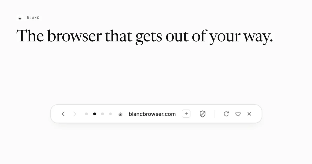
A 1200×630 social card built almost entirely from negative space. The top-left carries a tiny lockup — a small radiating mark beside a letter-spaced uppercase wordmark — followed by an oversized high-contrast serif headline that fills the upper third; the lower half holds a single object, a white pill-shaped floating toolbar with back/forward arrows, tab-position dots, a URL and utility icons, floating on a soft diffuse shadow. The scale contrast between the ~14px tracked-out wordmark and the ~80px serif line does all the work, while the warm off-white field and near-black ink keep the card readable at thumbnail size.
Prompt preview
## Reference images

Study these alongside the description below: hierarchy, rhythm, spacing, colour. Build for the product you are asked about, using this design language.

- Screenshot: https://kage-design-assets.t3.tigrisfiles.io/screenshots/blanc/148bc38e-705a-43d5-afa6-f694c2540699-1789711354753.webp
- Design on Kage: https://kage.design/designs/blanc-og-image

## Before you start
Ask the user what product they are building, who it is for, and what brand assets they already have (name, tagline, colours, typefaces, logo mark). Wait for the answers. Everything below is applied to *their* product, not to the reference. Then produce a single **1200×630 social card** (Open Graph image) — as HTML/CSS fixed to 1200×630 and rendered to PNG, or as an SVG — using placeholder branding and copy if assets are missing.

## Page structure
- **Canvas**: one fixed 1200×630 artboard on a warm off-white background, no border, no footer, no secondary panels. The entire composition is three elements: a brand lockup, a headline, and one product object.
- **Brand lockup (top-left, ~64px from top, ~64px from left)**: a small monochrome logo mark (~18px) sitting on the same baseline as an uppercase wordmark, letter-spaced wide, set at roughly 13–14px in a mono or grotesque face. This is the smallest type on the card and must stay small.
- **Headline (immediately below the lockup, ~90–110px from top)**: one line of display text at ~76–84px in a high-contrast serif with true italics-quality curves, near-black, left-aligned, ending with a period. It may run nearly the full width but must not wrap to more than two lines.
- **Negative space (middle band)**: deliberately empty. Roughly 200–240px of untouched background separates the headline from the product object below — this gap is part of the design.
- **Product object (lower third, horizontally centred)**: one floating UI element that represents the product — e.g. a pill-shaped toolbar with a handful of controls (navigation chevrons, a set of small state dots with one filled to show an active state, a domain or label, one icon in a small rounded-square button, a hairline vertical divider, then three utility icons). Fully rounded ends, near-white fill, soft diffuse shadow, no visible stroke.

## Design language
- **Hierarchy by scale contrast**: one tiny tracked-out uppercase lockup, one enormous serif line, one floating object. Nothing else competes; there are no paragraphs, no badges, no gradients.
- **Colour**: warm off-white field (~#F6F4F0), near-black ink (~#1C1B19), and one mid grey (~#A5A19A) for disabled or secondary icon states. Two hues maximum plus grey; the shadow is the only other tonal layer.
- **Type pairing**: an editorial high-contrast serif for the display line only; a monospace or neo-grotesque in uppercase with ~0.2em letter-spacing for the wordmark; labels inside the product object use a plain UI sans at ~15px. Keep the type scale extreme — roughly 14px vs 80px.
- **Shape and shadow**: the product object uses a ~32px pill radius (or fully rounded ends), a subtle 1px-worth of warmth in its fill if the background is tinted, and a soft shadow like `0 12px 32px rgba(0,0,0,0.08)`. No hard borders; the only divider is a 1px hairline inside the object.
- **Iconography**: thin-stroke line icons at ~18–20px, uniform stroke weight, ink-coloured with grey for inactive states; one state dot filled black to imply "active".
- **Composition rules**: left-align the lockup and headline, centre the product object horizontally, and protect at least 60px of padding on every edge. At thumbnail size the card should still read as: word, word, object.

## Never
- Never reuse the reference's name ("Blanc"), wordmark treatment as a logo, radiating-sun mark, headline copy ("The browser that gets out of your way."), the domain "blancbrowser.com", or its exact icon arrangement — replace all of them with the user's branding or clearly placeholder text.
- Never present the result as the reference product, and never add elements absent from this composition (photos, gradients, badges, second product objects).