kage
kage
creem.io
Design analysis
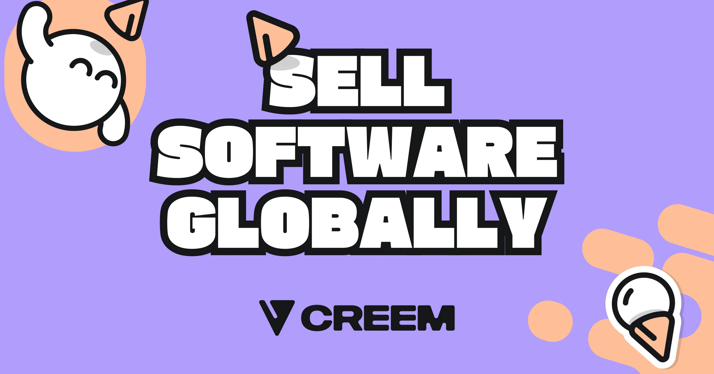
A 1200×630 social card on a flat periwinkle-violet field with exactly four tones: purple background, white type, peach-orange accents, and near-black outlines. The focal point is a three-line stacked headline ("SELL SOFTWARE GLOBALLY") in an ultra-bold rounded display face, white with a thick black contour, each line slightly rotated and staggered so the block feels hand-placed. Two flat sticker-style illustrations — a blob mascot on a peach disc top-left and an orange hand with a cone-toting blob bottom-right — are cropped by the canvas edges to frame the type, while a small solid-black wordmark with a V glyph anchors the bottom-centre as the smallest element on the card.
Prompt preview
## Reference images

Study these alongside the description below: hierarchy, rhythm, spacing, colour. Build for the product you are asked about, using this design language.

- Screenshot: https://kage-design-assets.t3.tigrisfiles.io/screenshots/creem-2-0/79982a66-fefb-4328-9210-debd7422a058-1789711236865.webp
- Design on Kage: https://kage.design/designs/creem-2-0-og-image

# 1200×630 social card in a playful sticker style

## Before you start
Ask the user what product or company the card is for, who it is for, and what brand assets they already have (brand name, tagline or headline to feature, brand colours, typeface, and any mascot or logo glyph). Wait for their answers. Everything below is applied to *their* brand and copy — the reference only defines the composition and visual language.

## Page structure
Produce a single fixed-canvas image, exactly 1200×630, no scrolling and no responsive behaviour. Deliver it either as a standalone HTML/CSS file rendered to PNG with a headless browser, or as a self-contained SVG. Top to bottom on the canvas:

1. **Background** — one flat, full-bleed colour (the brand's primary tone). No gradient, no texture, no pattern.
2. **Corner illustration, top-left** — one mascot or shape cluster positioned so it is partially cropped by the top and left edges. It frames the headline rather than competing with it.
3. **Headline block (focal point)** — the user's headline set as 2–3 stacked lines, all caps, centred slightly right of the canvas middle and occupying roughly 70% of the width.
4. **Corner illustration, bottom-right** — a second balancing cluster, cropped by the bottom and right edges, visually weighing the opposite corner.
5. **Wordmark lockup** — the brand name in solid black, small, centred about 50px from the bottom edge, optionally preceded by a simple geometric glyph. This is the smallest element on the card.

## Design language
- **One focal point.** The headline dominates; the corner illustrations sit at roughly 30% of its visual weight and are always edge-cropped, never floating freely in the middle.
- **Palette discipline.** Exactly four tones: background (reference uses ~#A78BF5 violet — substitute the user's brand colour), white #FFFFFF, one warm accent (reference uses ~#F5B98E peach-orange), and near-black #141414 for outlines and the wordmark. Nothing else.
- **Type treatment.** Use an ultra-bold rounded display face (Baloo 2, Titan One or Bowlby One class; fall back to `Arial Black`). White fill with a thick black contour of ~10–14px at this scale, applied with `-webkit-text-stroke` + `paint-order: stroke fill`, or an SVG stroke. Tight line-height (~0.9), font size ~120–150px per line, and slight per-line rotation (-3° to 3°) with staggered horizontal offsets so the block reads as hand-placed, never justified.
- **Unified sticker system.** Illustration outlines and type outlines share the same stroke weight (~8px) with rounded joins, so text and art read as one flat sticker language. Illustrations are flat fills only — no gradients, shadows or textures.
- **Energy from geometry, not effects.** The playful mood comes from rotation, staggered baselines and cropped corner elements. Keep shapes friendly and rounded.
- **Legibility at thumbnail size.** White-on-mid-tone contrast must survive the card at ~200px wide; render a scaled-down preview to check before delivering. Keep all critical text ~40px inside the canvas edges (only the decorative illustrations get cropped), and keep the bottom-centre wordmark clear of where platforms round card corners.

## Never
- Never reuse Creem's name, wordmark, V glyph, blob mascot, pizza-slice or ice-cream motifs, or its headline copy ("Sell software globally") — replace all branding and text with the user's own placeholders.
- Never present the result as the reference product's card.
- Never introduce photography, gradients, drop shadows, glass blur or stock illustration packs; the style is strictly flat vector shapes with black outlines.