 kage
kage
epilude.com
Design analysis
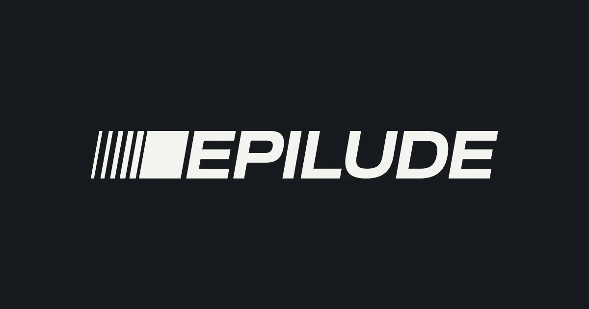
A 1200×630 social card that bets everything on a single centered lockup: a near-black canvas with no headline, tagline or product shot. The mark is a run of thin diagonal strokes that gain weight and terminate in a solid block, butted flush against a heavy all-caps italic wordmark in off-white, so the mark reads as acceleration into the name. Two values only — charcoal ground, bone-white type — and roughly 60% empty canvas make it survive being shrunk into a Slack or X preview.
Prompt preview
## Reference images

Study these alongside the description below: hierarchy, rhythm, spacing, colour. Build for the product you are asked about, using this design language.

- Screenshot: https://kage-design-assets.t3.tigrisfiles.io/screenshots/epilude-notetaker/761e70ab-da8f-440b-8568-982b003e6e60-1789365699702.webp
- Design on Kage: https://kage.design/designs/epilude-notetaker-og-image

## Before you start
Ask the user what product or page this card is for, who it is for, and what brand assets they already have (name, wordmark style, colours, typeface, existing logo file). Wait for their answers before writing any code. Everything below is applied to *their* brand as placeholders, never to the reference product.

The deliverable is a **1200×630 social card image** (the preview shown when a link is shared on X, Slack, LinkedIn, iMessage). Build it as a single fixed-size HTML file (a `1200×630` container, `margin: 0`, no scrollbars) that can be rendered to PNG with Playwright/Puppeteer, or as an SVG exported at 1200×630. Output must be exactly 1200×630 pixels.

## Canvas structure
1. **Background layer** — one full-bleed flat panel covering all 1200×630. No gradient, no vignette, no texture, no border radius (cards are cropped flat in timelines).
2. **Central lockup zone** — one horizontal group, absolutely centred both axes (flex `align-items: center; justify-content: center`). The group = [abstract mark][wordmark], sitting flush with no gap between mark and first letter. Keep everything inside a ~64px safe margin so nothing clips when platforms round corners or crop.
3. **Mark** — an abstract glyph built from 5–7 thin diagonal bars (same slant as the type), whose stroke weight ramps from hairline to heavy left-to-right and terminates in one solid block/parallelogram. It should read as motion lines accelerating into the brand name.
4. **Wordmark** — the brand name in all caps, heavy geometric sans, italic slant (~10–12°), cap height roughly 120–140px (about 20% of canvas height), tight tracking. This is the only required element.
5. **Optional tagline slot** — if the user has a tagline, place it as one short line below the lockup, centred, ~28–32px, letterspaced, at reduced opacity. If they don't, leave the canvas wordmark-only like the reference.

## Design language
- **Focal hierarchy: one idea per card.** Exactly one centred lockup; no secondary elements competing for attention. If a tagline exists it is clearly subordinate (smaller, lighter, lower contrast).
- **Colour: strictly two values.** Background near-black `#141619`; foreground bone-white `#ECEBE4`. No accent colour, no greys beyond one intermediate opacity (e.g. tagline at 55% white). Contrast — not colour — carries the design.
- **Type:** heavy grotesque/geometric sans for the wordmark, uppercase, italicised, tracking around -0.01em to 0.02em. Any tagline in the same family, sentence case or letterspaced caps, never a second typeface.
- **Mark construction:** repetition + ramp — identical shapes repeated with increasing weight, ending in a solid form that kerns tight against the first letter. Diagonal rhythm should echo the italic slant of the type so mark and wordmark feel like one object.
- **Density and space:** ~60% of the canvas is empty. Resist filling it; emptiness is what keeps the card legible at 400px wide in a chat preview.
- **Borders, radius, shadow:** none. Flat shapes only — no cards, no outlines, no drop shadows on the background.
- **Motion:** none. This is a static image; any hover behaviour lives on the page that shares it, not in the asset.

## Never
- Never reproduce the Epilude name, its speed-line mark, its exact letterforms, or the tagline "100% private meeting notes" — use the user's own brand name and copy, or a clearly placeholder name.
- Never copy the reference's specific mark geometry; rebuild the diagonal-ramp idea with the user's own proportions.
- Never present the result as Epilude or imply any affiliation.
- Never add stock photography, illustration or a third colour to the card.


