kage
kage
flowoapp.com
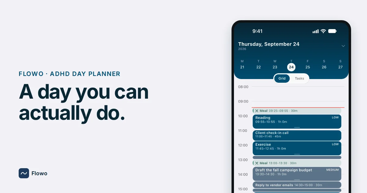
Design analysis
A 1200×630 social card uses a quiet pale-gray canvas with a strong left-to-right split: oversized dark navy headline and small uppercase descriptor on the left, and a cropped smartphone product visual anchoring the right. The phone’s deep teal-blue calendar interface supplies the main colour block and fine-grained detail, while the small bottom-left app mark balances the composition without competing with the headline.
Prompt preview
## Reference images

Study these alongside the description below: hierarchy, rhythm, spacing, colour. Build for the product you are asked about, using this design language.

- Screenshot: https://kage-design-assets.t3.tigrisfiles.io/screenshots/flowo/f24ff94f-ddf7-4ba0-9597-e4762b7aaa08-1791439389460.webp
- Design on Kage: https://kage.design/designs/flowo-og-image

## Before you start
Ask the user what they are building, who it is for, and what brand assets they already have, including the product name, logo or mark, colours, typefaces, and preferred social-card copy. Wait for their answers before designing. Apply the following system to their product rather than reproducing the reference.

## Page structure
- **1200×630 canvas:** Create a fixed Open Graph social-card image, rendered to PNG from HTML/CSS or SVG, with a quiet pale-gray background and generous margins.
- **Left identity and descriptor:** Place a small uppercase category line near the upper-left of the content area, using compact tracking and a dark teal/navy colour.
- **Left headline:** Set a short, two-line headline below it in very large, heavy sans-serif type; keep the line breaks deliberate and the text block dominant on the left half.
- **Right product visual:** Place a large cropped device or product-interface mockup on the right, extending close to the top and bottom edges. Show enough interface detail to communicate the product without making the card feel like a screenshot gallery.
- **Bottom-left brand lockup:** Add a small placeholder app mark and product name near the lower-left, aligned to the same left edge as the headline.

## Design language
- Build hierarchy through scale and placement: a small eyebrow, an oversized headline, then a detailed but secondary product visual.
- Keep the composition asymmetrical and spacious. The left side should feel calm and typographic; the right side should become denser through the device frame and interface details.
- Use a pale cool-gray background around `#F3F3F7`, near-black navy text around `#062A35`, and a deep teal/blue interface accent around `#005B76` or `#00677F`. Use white interface surfaces and restrained muted gray labels.
- Pair a geometric or humanist sans-serif for all text. Use bold weight for the headline, medium uppercase lettering with increased tracking for the eyebrow, and a small semibold brand lockup.
- Use generous left and top padding, a clear alignment column, and a headline width of roughly 42–48% of the canvas. Preserve readable contrast at thumbnail size.
- Treat the device as the only major visual object: use a dark bezel, subtly rounded corners, and a restrained soft shadow. Avoid decorative shadows, gradients, and extra cards outside the product mockup.
- Within the interface mockup, use compact rows, rounded schedule blocks, thin dividers, and a single bright status or timeline accent to create useful density without visual noise.
- Keep motion out of the final asset; if implementing HTML before capture, ensure the render is deterministic and all fonts, dimensions, and artwork are loaded before exporting.

## Never
- Do not use the reference product’s name, wordmark, logo, headline, calendar copy, interface labels, or exact branded artwork.
- Do not copy the reference phone screen pixel-for-pixel; make a new product mockup and use placeholder branding and copy supplied by the user.
- Do not add unrelated logos, wordmarks, illustrations, photography, or icon sets from the reference.
- Never present the result as Flowo or imply an affiliation with the reference product.