kage
kage
esigna.app
Design analysis
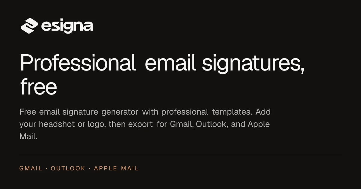
A 1200×630 dark social card with everything on a strict left axis. Near-black background (#141312), white logo lockup top-left, a huge two-line white headline in a clean grotesque, a muted gray supporting paragraph at lower contrast, then a hairline rule and a small orange letter-spaced platform list (GMAIL · OUTLOOK · APPLE MAIL) acting as the only colour accent. The vertical rhythm — logo, headline, body, divider, kicker — reads top to bottom like a well-set editorial page compressed into a card.
Prompt preview
## Reference images

Study these alongside the description below: hierarchy, rhythm, spacing, colour. Build for the product you are asked about, using this design language.

- Screenshot: https://kage-design-assets.t3.tigrisfiles.io/screenshots/esigna/e6994ff6-b62d-40ae-baa9-400da55fff45-1791007442574.webp
- Design on Kage: https://kage.design/designs/esigna-og-image

## Before you start
Ask the user what product or page the card is for, who it is for, and what brand assets they already have (name, logo mark, colours, typeface). Wait for the answers; apply everything below to *their* brand, not the reference.

## Goal
Produce a single **1200×630 social share card** (Open Graph image) for the user's product. Deliver it as an HTML/CSS file sized exactly 1200×630 (render to PNG, or as an SVG). Use placeholder branding and copy if the user hasn't supplied finals.

## Page structure (canvas, top to bottom, all left-aligned to one margin)
- **Top-left logo lockup** (~64px from top): small geometric mark + wordmark in white, scaled to sit comfortably, not dominate.
- **Headline** (~40% down): two-line max, very large (~90–100px) white headline in a neutral grotesque with tight tracking, benefit-first copy ("X, free"-style promise).
- **Supporting paragraph** (~70% down): 2–3 lines, ~28px, in muted gray (~#9a938d) at clearly lower contrast than the headline; describes what the product does in one sentence.
- **Hairline divider** near the bottom: 1px rule at ~15% white opacity spanning the content width.
- **Footer kicker** below the divider: small (~20px) uppercase, letter-spaced (0.15em) list of platform/feature tags separated by middle dots, in a single warm accent colour — the only chromatic element on the card.

## Design language
- **Canvas:** 1200×630, near-black background (#141312), generous ~72px outer padding.
- **Composition:** one strict left axis for all content; no centring, no imagery, no gradients — pure typography carries the design.
- **Hierarchy:** three contrast levels — pure white headline, mid-gray body, accent-coloured kicker. Size does the work, not weight.
- **Type:** one modern grotesque family throughout; headline tight (-0.02em), kicker wide (+0.15em) uppercase for the inverse effect.
- **Colour:** monochrome base (white on near-black) with exactly one warm accent (orange ~#e8a06a) reserved for the footer tags.
- **Details:** hairline 1px rule as a structural separator before the kicker; no shadows, no borders around text blocks.
- Keep total text minimal — the headline must be legible at thumbnail size.

## Never
No logos, wordmarks, product names, copy, illustrations or icon sets from the reference (esigna); never present the output as esigna's card.