kage
kage
c-p.rmcdn.net
Design analysis
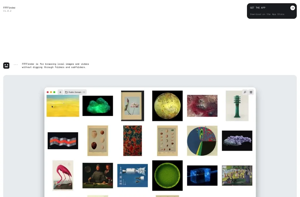
An austere white page run entirely on a monospace type system: a stacked wordmark with version number top-left, one solid black pill CTA top-right, and a single lowercase two-line sentence as the whole hero copy, set beside a tiny rounded logo glyph. The lower two-thirds is a huge pale-gray rounded stage framing a macOS-style app window — traffic lights, a folder tab chip, and a dense six-column grid of vivid images cropped at the fold. The design works through contrast: near-empty monochrome chrome above, a saturated tightly packed product demo below.
Prompt preview
## Reference images

Study these alongside the description below: hierarchy, rhythm, spacing, colour. Build for the product you are asked about, using this design language.

- Screenshot: https://kage-design-assets.t3.tigrisfiles.io/screenshots/ffffinder/3b825687-8ad9-4721-b417-5db99721ed27-1790748795934.webp
- Design on Kage: https://kage.design/designs/ffffinder-og-image

## Before you start
Ask the user what product they are building, who it is for, and what brand assets they already have (name, wordmark, colours, typeface). Wait for the answers before writing any code. Everything below is applied to *their* product, not to the reference site.

## Page structure
1. **Top bar** – No nav links. Left: the wordmark with a tiny version number stacked directly beneath it. Right: a solid black pill button, two lines tall — an all-caps label with an arrow icon on line one, micro-copy on line two. Lots of clear space around both.
2. **Hero statement** – After a tall empty white band, one short sentence broken over two lines in lowercase monospace, indented about a third of the page width, with a small rounded-square logo glyph sitting to its left. This is the only copy on the page.
3. **Product stage** – The rest of the page: a very large rounded-corner panel in pale grey with slim side margins. Centered inside it is a macOS-style app window screenshot — traffic lights top-left, a folder tab chip next to a plus button, search and grid-toggle icons top-right — filled with a dense grid of images. The window is cropped by the bottom of the viewport, implying the grid continues.

## Design language
- **Hierarchy by absence**: one idea per band, no competing sections. Scale contrast does the work — 11–13px monospace micro-text against a full-bleed product visual, with no mid-size headings at all.
- **Rhythm**: generous 120–200px white gaps between the header, hero sentence and stage. Density then flips abruptly from near-empty chrome to a tightly packed 6-column image grid inside the app frame.
- **Colour**: pure white page `#FFFFFF`, near-black ink and button fill `#111111`, pale grey stage panel `#E8EAEC`, white app-window chrome. The chrome stays strictly monochrome; all saturation comes from the product's content (imagery, media thumbnails).
- **Type**: a single monospace/typewriter family throughout. Lowercase for sentences, all-caps only on the button label. Sizes: ~11px for meta/version, ~13–14px for body copy and button micro-copy. Normal letter-spacing, generous line-height (~1.6).
- **Shape and depth**: large radii (~24–32px) on the stage panel; ~12px on the pill button, logo glyph and folder chips; small radius on the app window with a soft, barely-there shadow so it reads as an object sitting on the grey stage.
- **Motion**: minimal and functional — arrow nudge or slight lift on the CTA hover, nothing else. The grid is the show; let it stay still.

## Never
Never reuse the reference product's name, wordmark, logo glyph, copy, or its specific images. Do not present the result as that product — rebuild the layout with the user's own branding, content and screenshots.