kage
kage
godaylight.com
Design analysis
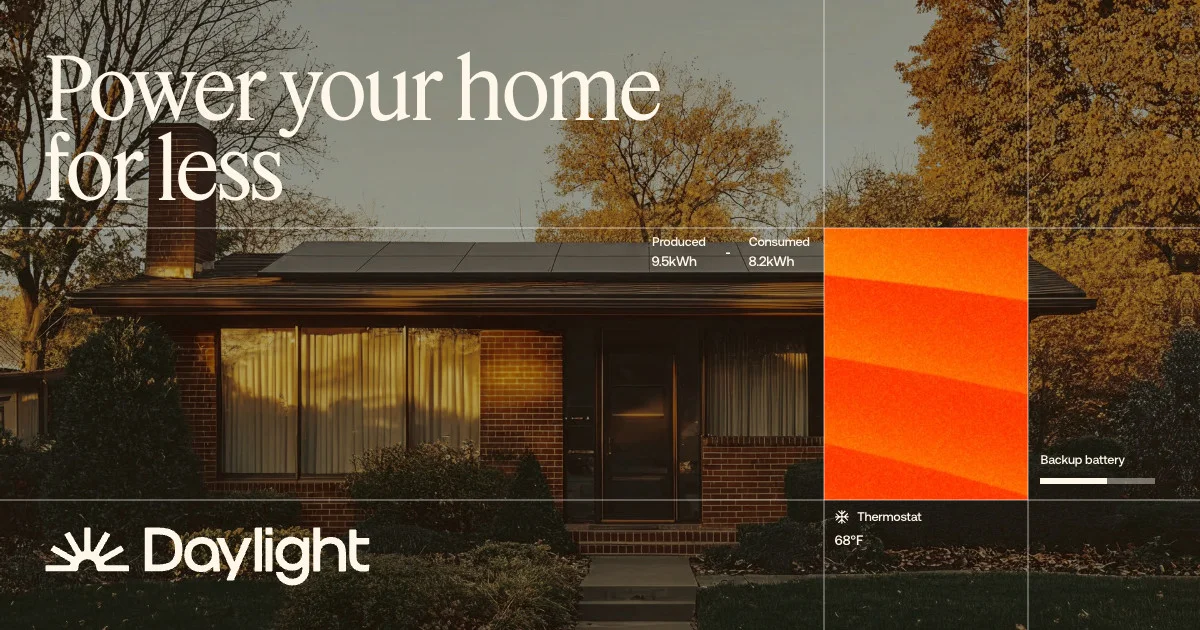
A 1200×630 social card built on a full-bleed golden-hour photo of a mid-century brick home with rooftop solar. A huge warm-cream serif headline occupies the upper-left third, while a thin white grid divides the photo into editorial panels: a small data readout (produced vs consumed kWh), a vivid orange thermal-gradient tile, and a thermostat/battery widget column on the right. The wordmark and sun-ray icon anchor the bottom-left, giving the card a blend of lifestyle photography and product-UI collage.
Prompt preview
## Reference images

Study these alongside the description below: hierarchy, rhythm, spacing, colour. Build for the product you are asked about, using this design language.

- Screenshot: https://kage-design-assets.t3.tigrisfiles.io/screenshots/godaylight-com/7157076c-8d16-4feb-87e9-faf2f2ee210e-1791311172620.webp
- Design on Kage: https://kage.design/designs/godaylight-og-image

# 1200×630 social card — warm photo-collage style

## Before you start
Ask the user what product the card is for, who it targets, and what brand assets they already have (name, logo mark, colours, type). Wait for the answers. All branding and copy below are placeholders to be replaced.

## Deliverable
Produce a single **1200×630** social share image (OG card), ideally as an HTML/CSS file rendered to PNG at exactly 1200×630 (or an equivalent SVG). No scrolling content, nothing outside the canvas.

## Page structure
- **Canvas base**: full-bleed background photograph (or warm-toned gradient placeholder) at roughly 55–60% darkness so all overlaid elements read clearly. Pick a warm golden-hour lifestyle photo for a home/energy product; use any subject the user's brand suggests.
- **Headline zone (top-left, ~60% width)**: two-line display headline in a large cream serif (approx 90–100px, tight leading, e.g. "Power your home / for less" placeholder). It is the single focal point.
- **Grid overlay**: 1px translucent white lines dividing the canvas into a loose editorial grid (one horizontal line ~40% down, vertical lines at ~68% and ~85%). This gives a "technical drawing over photo" feel.
- **Data readout (centre, sitting on the horizontal grid line)**: two small paired metrics — "Produced 9.5kWh" / "Consumed 8.2kWh" — 14–16px, labels above values, cream on the dark photo.
- **Feature tile (right column, upper cell)**: a solid vivid orange-red tile (~200×270px) with a soft thermal/gradient sweep — the card's colour punch.
- **Widget column (far right)**: stacked micro-widgets — "Backup battery" with a small segmented progress bar, and below the lower grid line a thermostat row: small glyph + "Thermostat" label, "68°F" value.
- **Wordmark lockup (bottom-left)**: simple sun-ray icon + wordmark in cream, ~44px, comfortably inset (~48px padding).

## Design language
- **Palette**: warm cream (#F2EBD9-ish) for all type and lines; deep warm black/umber shadow base; one saturated orange (#FF5A1F-ish) accent tile. Keep the photo warm and desaturated so cream text dominates.
- **Type**: one high-contrast serif for the headline at very large scale; one small clean sans for all UI/data text (labels ~14px, values ~18px). The extreme scale contrast between the two carries the hierarchy.
- **Hierarchy**: photo → serif headline → orange tile → data widgets → wordmark. Nothing competes with the headline.
- **Lines & layout**: hairline white rules at low opacity, sharp corners everywhere (no radius, no drop shadows), generous outer padding (~48px).
- **Data widgets**: minimal, text-first, tiny bars/dashes only; align them to the grid lines so they feel embedded in the layout rather than floating.

## Never
No logos, wordmarks, product names, copy, photography or iconography from the reference (Daylight); never present the result as that product.