kage
kage
harbor.my
Design analysis
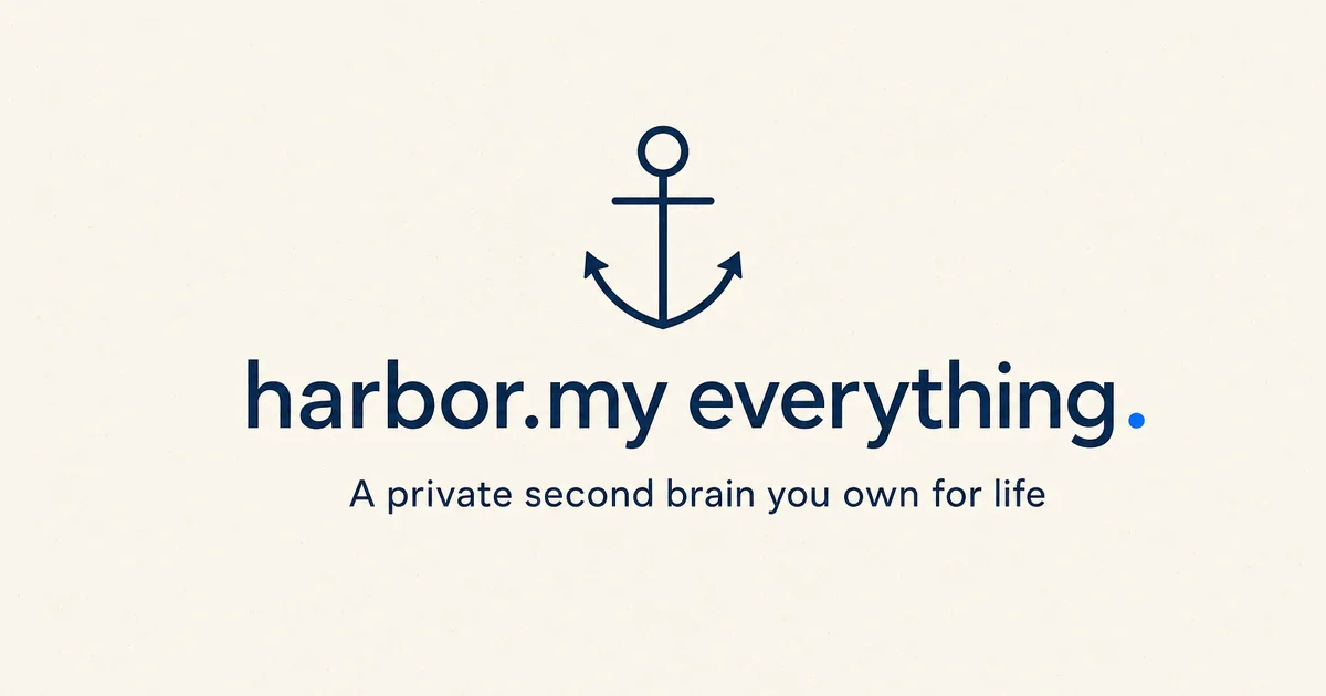
A flat 1200×630 social card that replaces product screenshots with one centered vertical lockup on a warm cream field. A thin-line navy anchor sits above an oversized serif line reading 'harbor.my everything.', whose terminal period is swapped for a saturated blue dot — the only accent on the whole canvas. A single lighter navy subhead and huge vertical margins keep the hierarchy to exactly three levels: mark, headline, promise.
Prompt preview
## Reference images

Study these alongside the description below: hierarchy, rhythm, spacing, colour. Build for the product you are asked about, using this design language.

- Screenshot: https://kage-design-assets.t3.tigrisfiles.io/screenshots/harbor/6e6d8963-2d8f-4d0d-8f3a-e01f35a1b544-1789970505919.webp
- Design on Kage: https://kage.design/designs/harbor-og-image

## Before you start
Ask the user what product the social card is for, who it is for, and what brand assets they already have: product name, a domain or short wordmark, brand colours, a typeface, and a one-line positioning sentence. Wait for the answers before building. Everything below is applied to their product, not to the reference. If they have no assets yet, agree on placeholders first: a name, a cream-and-navy two-tone palette, and a serif for the headline.

## Page structure
Produce a single 1200×630 image — either an HTML/CSS file sized exactly 1200×630 that can be rendered to PNG, or an SVG with a 1200×630 viewBox. Composition, top to bottom:

1. **Full-bleed canvas.** Flat warm cream background covering the entire frame. No texture, no gradient, no border, no footer strip.
2. **Brand mark (upper centre, ~35% down).** A simple line-art mark drawn in the ink colour, centred horizontally, roughly 18% of canvas height. Its stroke weight should visually match the weight of the headline's stems so the mark and the type feel like one family.
3. **Headline (just below the vertical midpoint).** One line filling about 80% of the canvas width: the product's name or domain plus a two-word claim, set in a large warm serif. Replace the final period with a solid dot in the accent colour — this single glyph carries the accent.
4. **Subhead.** One short line directly beneath, roughly a quarter of the headline's size, medium weight, same ink colour, centred. It states the promise in plain words.
5. **Nothing else.** No corner logos, no URL bar, no CTA, no imagery, no social handle.

## Design language
- **Hierarchy is a stack of three.** Mark → headline → subhead, all left-to-right centred on one vertical axis. Nothing competes; the accent dot is the only element that breaks the two-tone scheme.
- **Two colours plus one accent.** Warm cream field (~#FAF2E3), dark navy ink (~#1D2B4C) for both the mark and all text, and a single saturated blue (~#2F7CF0) used exactly once — as the terminal period. If the user's brand has an accent colour, this dot is where it lives.
- **Type pairing and scale.** A chunky, friendly serif at ~110–130px for the headline (lowercase reads better at this scale); the subhead in a clean sans or lighter cut at ~32–36px with normal tracking. The jump between the two sizes should be dramatic — that contrast is the whole hierarchy.
- **Flatness.** No shadows, gradients, strokes, rounded panels or cards. The card is ink on paper; depth is faked only through size contrast and whitespace.
- **Air.** Keep at least 12% of the canvas as margin on every side and generous but even gaps between the three layers; the lockup should sit slightly above true centre so the bottom margin reads a touch deeper.
- **Static by design.** This is a fixed-size asset — no motion, no responsive behaviour; just export-correct 1200×630 dimensions.

## Never
Do not use Harbor's name, the "harbor.my everything." phrasing, the anchor mark, or the exact tagline. Never present the card as Harbor's. All copy, mark and colours come from the user's own brand or agreed placeholders.