kage
kage
huly.io
Design analysis
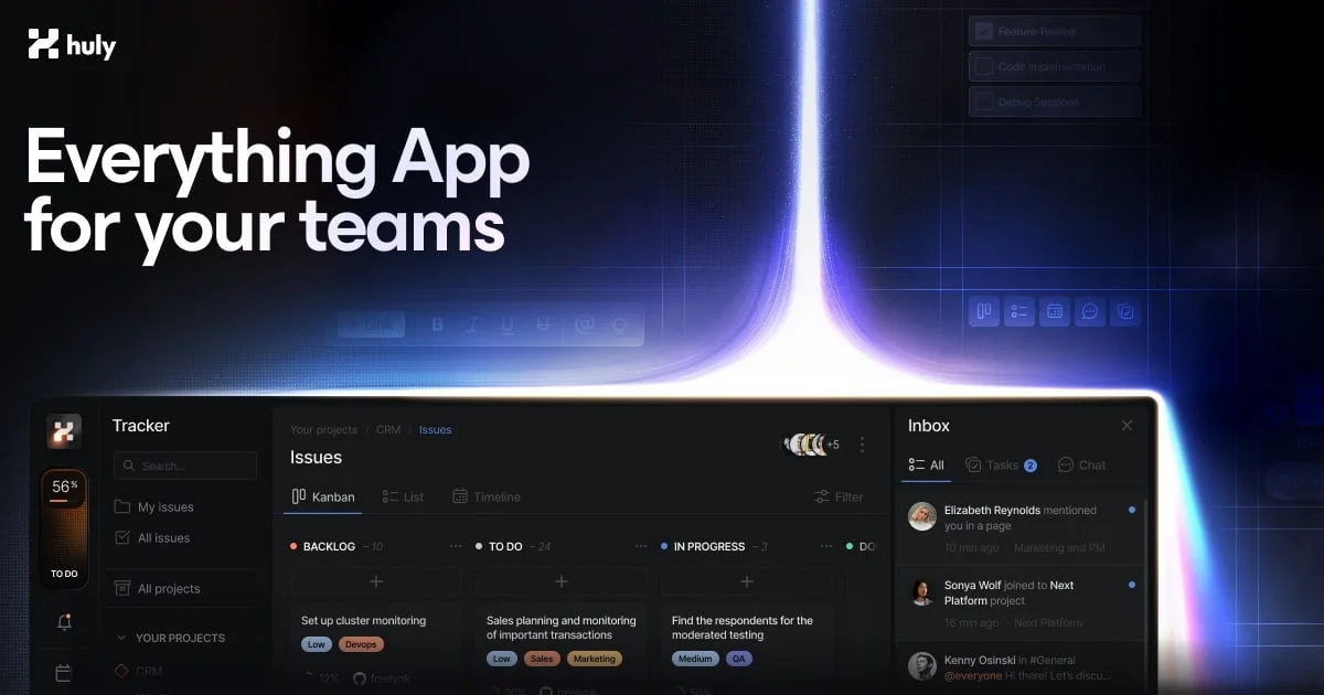
A 1200×630 social card built around a single dramatic gesture: a blue-violet light beam rising out of a realistic product screenshot that anchors the bottom edge. The top-left wordmark and a two-line white headline on the left third carry the message, while faint floating UI chips fill the upper right so the canvas never feels empty. The bottom third is a dense, legible kanban-plus-inbox render with a warm orange sidebar widget that gives the otherwise cool palette one hot accent. Composition is diagonal — text upper-left, glow centre, product lower band — so the eye travels from claim to proof in one sweep.
Prompt preview
## Reference images

Study these alongside the description below: hierarchy, rhythm, spacing, colour. Build for the product you are asked about, using this design language.

- Screenshot: https://kage-design-assets.t3.tigrisfiles.io/screenshots/huly-io/7aebca86-bd07-41ac-8f65-e1c0b92ba913-1790434805300.webp
- Design on Kage: https://kage.design/designs/huly-og-image

## Before you start
Ask the user what product they are building, who it is for, and what brand assets they already have (name, wordmark, logo file, brand colours, typeface). Wait for the answers before producing anything. Everything below is applied to *their* product and brand, not to the reference.

## Deliverable
Produce a single social share card at **1200×630** (standard Open Graph ratio), ideally as HTML/CSS rendered to PNG, or as an SVG that exports cleanly at that size. Leave ~48px safe padding on all edges so crop previews never clip content.

## Page structure (canvas layout, top to bottom)
1. **Top-left wordmark** — small logo mark plus lowercase wordmark, roughly 28–32px tall, positioned ~40px from the top and left edges. Never centred; it sets the left alignment for the whole card.
2. **Upper-right ambient chips** — 2–3 faint, low-opacity (~15–25%) rectangular UI fragments plus one small row of tiny icon tiles. These are texture, not content; they must stay barely readable.
3. **Headline block, left third, vertically centred in the upper half** — two short lines, bold geometric sans, ~72–80px, tight leading (~1.05), pure white on the dark ground. One line of positioning claim, one line of payoff (e.g. "Everything App / for your teams" rhythm, but in the user's own copy). Never exceed two lines.
4. **Light beam, centre of canvas** — a vertical column of light, ~120–160px wide, rising from the product window below and fading upward into the background. Core is near-white, halo shifts blue→violet with heavy blur. It physically overlaps the headline's right edge slightly and is the brightest element on the card.
5. **Product window, bottom band** — a real-looking app screenshot or faithful mockup filling the full width, ~300–340px tall, cropped by the bottom edge so it reads as grounded rather than floating. Give it a subtle rounded top corners, dark chrome, and include: a slim left sidebar with navigation items and one warm accent widget, a main area with a columned board (column headers + 2–3 item cards with coloured label chips), and a right-hand activity/notification panel with avatar rows. All text in the mockup must be legible at card size — no lorem gibberish.
6. **Glow interaction** — the beam's base blooms outward where it meets the window's top edge, so product and light feel physically connected.

## Design language
- **Ground:** near-black navy background (~#0a0d16), flat, with a very faint vertical gradient lightening toward the beam.
- **Focal hierarchy:** headline first, beam second, product window third, wordmark and ambient chips last. Achieve this with size (72px → 16px UI text), brightness (pure white → dim panels) and saturation (blue-violet glow → desaturated chrome).
- **Colour:** cool monochrome base (white text, ~#8a93a5 secondary text, ~#141821 panel fills) plus one saturated glow (blue ~#4f6bff to violet ~#7b5cff) and exactly one warm accent inside the product UI (orange ~#e0762e) — the hot accent lives only in the app render, never in the headline area.
- **Type:** one bold geometric sans throughout. Headline in a heavy weight with tight tracking; product mockup text in the same family at 11–14px with normal weight. Never mix serif or more than two weights.
- **Label chips:** small rounded pills (~10px font, fully rounded corners) in muted tints (dim blue, dim orange, dim teal) to make the board read as real software.
- **Depth:** glow via layered box-shadows / radial gradients, not borders. Window gets a 1px hairline highlight on its top edge plus a soft outer glow in the beam colour.
- **Composition rule:** diagonal flow — wordmark top-left → headline left → beam centre → product bottom. Keep the right half of the upper area intentionally quieter than the left so the headline dominates.

## Never
- Do not use the Huly name, wordmark, logo mark, headline copy, or any of its UI content.
- Do not reproduce Huly's actual product screens, illustrations, or its specific beam-over-kanban artwork verbatim; rebuild the composition with the user's own product, name and copy.
- Never present the result as Huly or imply endorsement.