kage
parthjadhav.com
Design analysis
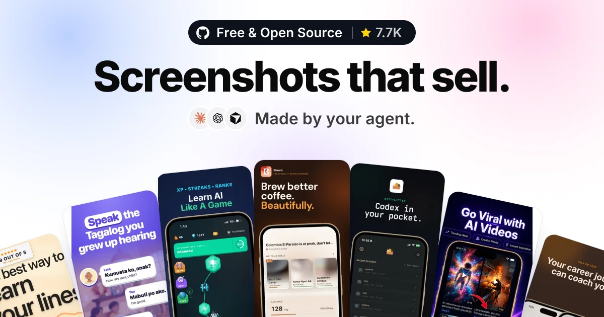
A 1200×630 social card built on a strict top-down hierarchy: a dark rounded credential pill (open-source badge with star count), a single extra-bold near-black headline line, then a small row of agent icons with a grey subline, all dead-centre on a soft periwinkle-to-blush gradient. The lower ~45% is a fanned hand of phone-shaped app screenshot mockups, each with its own saturated palette, radiating outward with slight rotations and cropped by the canvas edges so the composition feels like the cards keep going. The calm, airy type zone contrasts with the dense colourful mosaic below, and the tiny yellow star and colourful cards are the only saturated accents against an otherwise pastel canvas.
Prompt preview
## Reference images

Study these alongside the description below: hierarchy, rhythm, spacing, colour. Build for the product you are asked about, using this design language.

- Screenshot: https://kage-design-assets.t3.tigrisfiles.io/screenshots/app-store-screenshots/b0c25bbe-497c-4333-9a3f-0750ddb694a9-1793253635859.webp
- Design on Kage: https://kage.design/designs/app-store-screenshots-og-image

# 1200×630 social card — "fanned app screenshots" composition

## Before you start
Ask the user what product this social card is for, who it is for, and what brand assets they already have (name, tagline, colours, typeface, logo). Wait for their answers before writing any code. Everything below is applied to *their* product with placeholder branding — it is not a rebuild of the reference.

## Output format
Produce the card as a single self-contained HTML file with a fixed 1200×630 container (no scrolling, nothing clipped unexpectedly), which can be rendered to PNG with a headless browser (`page.screenshot({ clip: {0,0,1200,630} })`) at 2× scale for a crisp 2400×1260 export. A standalone SVG with embedded CSS is an acceptable alternative. All copy and logos are placeholders.

## Page structure
One canvas, every element centred on a single vertical axis:
1. **Background** — full-bleed soft diagonal gradient: periwinkle blue at the lower-left (#dfe6fa), lavender-pink at the upper-right (#f5dff0), with a near-white bloom (#fbfbfd) in the centre behind the headline so the type sits on the lightest area.
2. **Credential pill** (top, ~60px from top) — a dark rounded-full pill (#17171b) containing: a small white logo glyph, one short credential phrase in white semibold (e.g. "Free & Open Source" or the user's equivalent claim), a thin 1px vertical divider at ~40% opacity, and a second segment with a yellow star icon (#f6b40e) plus a count metric. Pill height ~56px, generous horizontal padding.
3. **Headline** (~130–230px from top) — one single line, extra-bold (800), near-black (#101014), ~110–120px, tight tracking (−0.03em), sentence case, ending in a period. This is the largest element on the canvas by a wide margin.
4. **Subline row** (~250–290px) — three small circular icon chips (~44px, white/soft background, subtle shadow) left-aligned as a cluster, followed by a short grey (#55555c) medium-weight phrase at ~34px that attributes the outcome (e.g. "Made by your agent." → the user's own variant).
5. **Screenshot fan** (bottom ~45% of canvas) — 6–7 phone-shaped cards (rounded ~30px corners, tall 9:19.5-ish aspect) arranged as a radiating hand of cards: the two centre cards sit most upright and tallest, outer cards rotate progressively (up to ~−25° on the far edges) and drop lower, so all of them bleed off the bottom and side edges. Each card is a miniature, plausible app screenshot with its own distinct UI theme (light cream, dark brown, deep purple, forest green, near-black), built from placeholder blocks: a title line, a device-frame mockup or stat blocks, small chips. Overlap the cards slightly and give the whole fan a soft diffuse shadow so it reads as one object.

## Design language
- **Hierarchy is vertical, not scattered**: one axis, three text elements top-down (badge → headline → subline), then imagery. Nothing competes; the headline is the only giant element.
- **Contrast of rhythm**: the top half is airy, pastel and typographic; the bottom half is dense, colourful and object-based. Keep that calm-to-busy gradient down the canvas.
- **Colour discipline**: the canvas itself is only pastel gradient + near-black type + one dark pill. Saturation lives almost entirely inside the phone cards — give each card one dominant hue from the user's brand plus 4–5 complementary themes (cream #f3ead9, espresso #2b2018, deep purple #2a1445, forest #12241d, charcoal #101014). The yellow star in the badge is the single warm accent in the text zone.
- **Type pairing**: one geometric sans family throughout. Weight does all the work — 800 for the headline, 600 for the badge, 400–500 for the subline. No serif, no second family.
- **Shape language**: rounded-full for the pill, ~30px radius on phone cards, small circles for icon chips. No hard borders anywhere; depth comes from soft shadows only.
- **Cropping as energy**: let the fan bleed off the bottom and side edges. Cropped content implies there is more product than the frame can show — do not shrink the cards to fit inside the canvas.
- **Keep the text zone empty**: no decorations, blobs or particles behind the headline; the gradient bloom is the only backdrop.

## Never
- Do not reuse the reference copy ("Screenshots that sell.", "Made by your agent.", "Free & Open Source") — write equivalent placeholder copy for the user's product.
- Do not include the GitHub mark, Claude, ChatGPT or Codex logos, or any real app-store screenshots; use invented placeholder UI and a neutral logo glyph.
- Never present the result as the reference product; it is the user's product rendered in this composition.