kage
kage
layernote.io
Design analysis
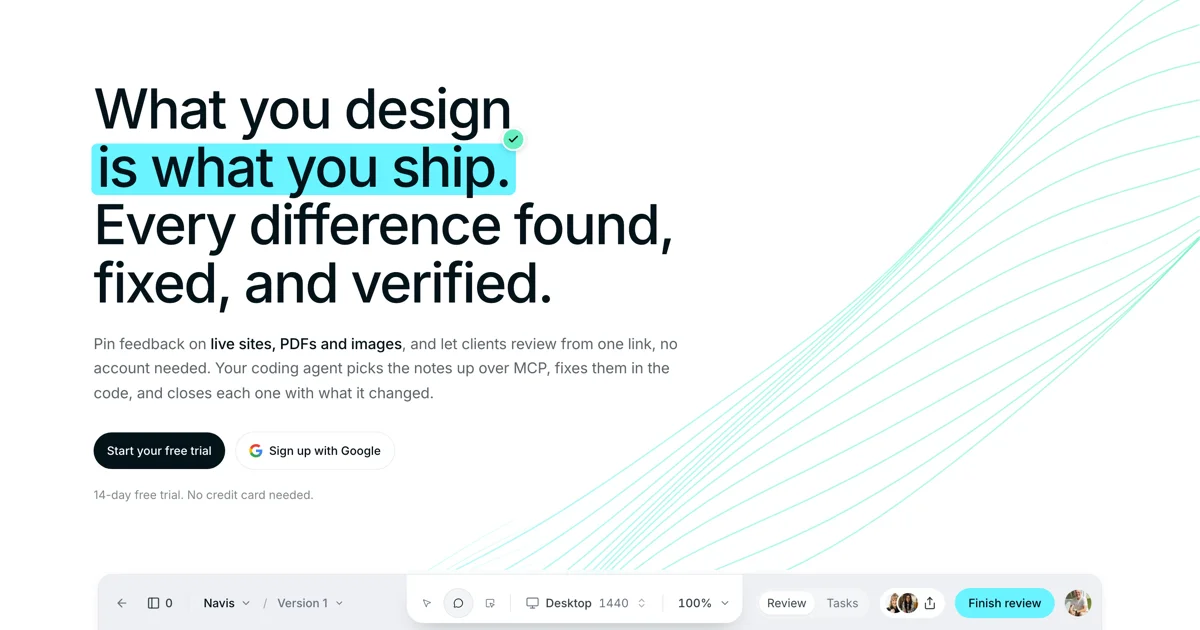
A 1200×630 share card composed like a cropped hero section: a four-line, ~90px grotesque headline anchors the upper-left, and one line is masked by a cyan highlighter band with a small green check badge docked at its end, so the claim reads as already verified. A grey paragraph with bolded media nouns, a black pill and an outlined secondary pill, and one fine-print line close the type stack. Hairline teal curves sweep up the otherwise empty right third, while a cropped review toolbar — breadcrumb, zoom control, tabs, avatar cluster, cyan action pill — peeks from the bottom edge to imply the live product beneath the copy.
Prompt preview
## Reference images

Study these alongside the description below: hierarchy, rhythm, spacing, colour. Build for the product you are asked about, using this design language.

- Screenshot: https://kage-design-assets.t3.tigrisfiles.io/screenshots/layernote/9f6b4f48-bd59-4014-92e8-d5d6e098b9a2-1790402511356.webp
- Design on Kage: https://kage.design/designs/layernote-og-image

## Before you start
Ask the user what product or announcement the card is for, who will see it (X, Slack, LinkedIn, iMessage link previews), and which brand assets they already have (name, logo, colours, typeface). Wait for the answers before designing; everything below is applied to their brand, not to the reference product.

## Goal
Produce a **1200×630 Open Graph / social share card** as a single self-contained HTML file with a fixed 1200×630 body (rendered to PNG via a headless browser or screenshot tool) or as an equivalent SVG. Use placeholder brand name, copy and logo marks throughout.

## Card structure (top to bottom)
1. **Canvas** — plain white background, generous margins (~90–100px on the left), no border, frame or vignette.
2. **Headline stack** (upper-left, ~55–60% of width) — 3–4 lines of oversized display type stating the value proposition; one full line carries an accent highlight band; a small circular badge overlaps the end of that highlighted line.
3. **Supporting paragraph** — 2–4 lines of grey subcopy, max-width ~600px, with two or three key nouns bolded in near-black.
4. **CTA row** — a primary solid dark pill button beside a secondary white outlined pill with a small leading icon; one short line of grey fine print underneath.
5. **Ambient graphic** — a bundle of thin accent-coloured curves sweeping from bottom-left to top-right through the right third of the canvas, bleeding off both edges, behind all text.
6. **Product strip** (bottom edge) — a cropped application toolbar peeking up from the bottom: breadcrumb with item name and version, small icon cluster, a viewport/zoom control, two pill tabs, an avatar cluster with a share affordance, and one accent-coloured pill button on the right — cut off by the canvas edge so only the top ~60–70px shows.

## Design language
- **Type-first hierarchy:** the headline is the hero — ~88–96px, weight 600–700, line-height ~1.02, letter-spacing ≈ -0.02em. Subcopy steps down to 20–22px, fine print to 14px. One neutral grotesque family (Inter/Helvetica-like) throughout; hierarchy comes from size and weight only, no secondary typeface.
- **Highlight as proof:** render the key line as text sitting on an accent highlight band (background or inset box-shadow, ~10px taller than the glyphs), and dock a 26–30px circular badge with a check mark at the line's end so the highlight reads as "verified", not decoration.
- **Colour discipline:** near-black ink `#111418` on white `#FFFFFF`; one accent (e.g. cyan-teal `#7EE8DC`) reserved for the highlight band, the product-strip pill button and the curves; support grey `#6B7280`; hairline borders `#E5E7EB`; optionally one green `#22C55E` only inside the badge. Never more than three hues on the card.
- **Ambient curves:** 6–10 hairline (1px) cubic-bezier strokes in the accent at 25–40% opacity, rising diagonally (~35–40°), spaced roughly 60–150px apart, confined to the right third and fading toward the edges. No gradients, glow or fills — the emptiness of the right third is part of the composition.
- **Buttons:** fully-rounded pills, ~44px tall; primary = near-black fill with a white 15–16px label; secondary = white fill with a 1px `#E5E7EB` border and an 18px placeholder icon. Never gradient or shadowed buttons.
- **Product strip:** light grey `#F3F4F6` bar with a 12px top radius and 1px top border, slightly distinct from the canvas so it reads as an app window; items at 13–14px, small 28px pill tabs, controls separated by hairlines. Crop it at the canvas edge — it implies the live app without showing it.
- **Rhythm:** the type stack hugs the upper-left; whitespace owns the right third; the bottom strip anchors the canvas so the floating copy feels grounded. The diagonal curves inject directional energy from copy toward the empty top-right corner.
- **Static by nature:** no motion — this is a still card; all energy comes from type scale, the highlight and the curves.

## Never
- Never reuse the reference product's name, wordmark, headline copy, tagline or fine print; invent placeholder equivalents in the same spirit.
- Never reproduce the Google "G" logo or any other real third-party logo — use a generic circle, initial or glyph placeholder.
- Never present the result as the reference product; it is a new social card in the same composition style for the user's brand.
- Never add photography, illustrations or icon sets copied from the reference, and never exceed the 1200×630 canvas.