kage
kage
lullme.app
Design analysis
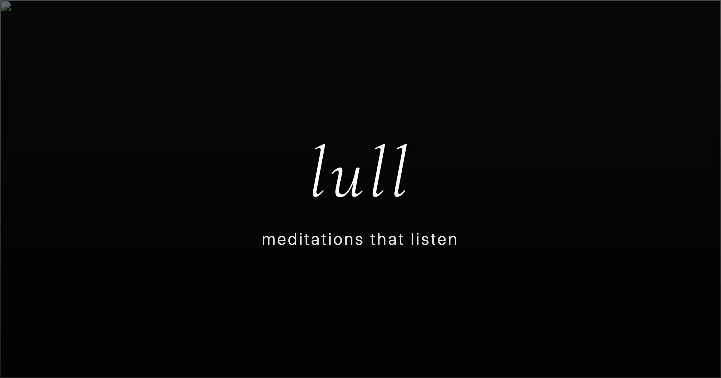
A 1200×630 social card that leans almost entirely on negative space: a near-black field with a barely perceptible vertical gradient, a tiny favicon chip pinned in the top-left corner, and one centered lockup. The wordmark 'lull' is set very large in a high-contrast italic serif, sitting slightly above optical centre, with the tagline 'meditations that listen' below in small, widely tracked lowercase sans. The roughly 5:1 scale jump between the two lines and the switch from italic serif to tracked sans does all the hierarchical work — no borders, imagery or colour accents appear anywhere.
Prompt preview
## Reference images

Study these alongside the description below: hierarchy, rhythm, spacing, colour. Build for the product you are asked about, using this design language.

- Screenshot: https://kage-design-assets.t3.tigrisfiles.io/screenshots/lull/e3879c01-0696-4d53-bfed-4b29bb581e12-1789884065830.webp
- Design on Kage: https://kage.design/designs/lull-og-image

## Before you start
Ask the user what product or feature the card announces, who it is for, what brand assets they already have (name, wordmark character, favicon/logo glyph, colours, typefaces), and what the card must say (a wordmark plus one short tagline). Wait for the answers before writing any code. Everything below is applied to *their* product, not to the reference.

## Page structure
Produce a single static social card image at exactly 1200×630 (e.g. one HTML file whose body is 1200×630, rendered to PNG, or a standalone SVG).

- **Canvas**: one full-bleed near-black field (#0b0b0b) with a subtle vertical gradient (lighter #141414 band around the middle fading to #060606 at top and bottom). No border, no frame.
- **Corner mark**: the product's favicon/logo chip, 28–32px, pinned ~24px from the top-left edge. It is the only element off-axis.
- **Central lockup**: the wordmark set large (~150–170px) in a high-contrast italic serif, centred horizontally and slightly above the vertical midpoint (centre around 46–48% height).
- **Tagline line**: one short line in lowercase sans, ~28–32px, letter-spacing ~0.18–0.22em, centred, sitting ~70–90px below the wordmark baseline.
- **Negative space**: nothing else. At least 200px of empty black on every side of the lockup.

## Design language
- **One focal point**: the card is a two-line lockup on a dark field. Hierarchy is built purely from scale (roughly 5:1 between wordmark and tagline) and from the serif-italic/sans switch — never from boxes, icons or accents.
- **Colour discipline**: two colours only — near-black background (#0b0b0b–#141414 range) and pure white (#ffffff) type. If the user's brand has an accent colour, it may tint only the tiny corner mark, never the lockup.
- **Type pairing**: a high-contrast display serif in italic for the wordmark (e.g. a Didone or Canela-like italic) against a neutral geometric sans in lowercase with wide tracking for the tagline. No weights, no bolding — the italics and the tracking carry the expression.
- **Optical centring**: centre the lockup slightly above geometric centre so the card doesn't sag; balance the asymmetric corner mark against the large empty right half.
- **Geometry and depth**: zero borders, zero radius, zero shadows. Depth comes only from the faint background gradient and the amount of black around the type.
- **Restraint check**: if any third element wants to enter the canvas, delete it.

## Never
Do not reuse the name "lull", the tagline "meditations that listen", its italic wordmark or its favicon glyph. Use the user's own branding, or clearly generic placeholder name and copy if they have none. No photography, illustration, wave/sun/breathing motifs, or decorative icon sets borrowed from the reference — and never present the result as the reference product.