kage
kage
marqly.com
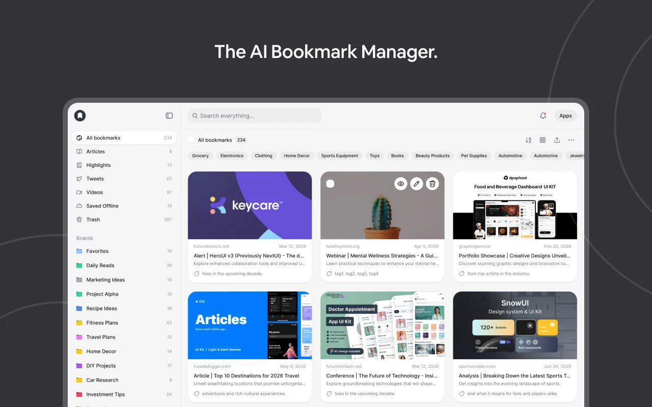
Design analysis
The 1200×630 card splits into two zones: a near-black charcoal field whose only element is a single white sentence-case headline centred in the top fifth, and a rounded light-mode app screenshot filling the lower three-quarters, inset from the sides and cropped by the bottom edge so the product feels larger than the frame. Branding is deliberately absent from the dark canvas — the only mark is a small black logo dot inside the mockup's sidebar — letting the headline carry the message. All saturation (purple/blue/green cover art, coloured board dots, category chips) is quarantined inside the screenshot, while hairline concentric arcs bleeding off opposite corners add depth to an otherwise two-tone canvas.
Prompt preview
## Reference images

Study these alongside the description below: hierarchy, rhythm, spacing, colour. Build for the product you are asked about, using this design language.

- Screenshot: https://kage-design-assets.t3.tigrisfiles.io/screenshots/marqly-6-0/ee2713c3-8f8c-419b-94f7-6ab51ac1735a-1789452074255.webp
- Design on Kage: https://kage.design/designs/marqly-6-0-og-image

## Before you start
Ask the user what product this social card is for, who it is for, and which brand assets they already have (name, logo mark, one-line positioning statement, brand colours, typeface). Wait for the answers — every decision below is applied to their product, not to the reference.

## Page structure
Produce a single **1200×630** canvas — build it as HTML/CSS and screenshot to PNG (e.g. Playwright/Puppeteer at 1200×630, deviceScaleFactor 2 for crispness), or as a hand-authored SVG. Compose it top to bottom:

1. **Canvas base** — solid dark charcoal background. Two decorative sets of thin 1px concentric circle arcs bleed off the top-right and bottom-left corners, sitting behind everything else. Nothing else lives on the dark field.
2. **Headline zone (top ~20%)** — one sentence-case line, horizontally centred, stating the product's positioning (the user's equivalent of a category-defining claim, ending with a period). This is the only text outside the mockup. Deliberately omit a wordmark here; branding appears only as a small logo dot inside the mockup.
3. **Product showcase (lower ~75%)** — a rounded light-mode app mockup inset ~120px from left and right, starting ~150px down, and cropped by the bottom edge. Build it as real markup, not a screenshot:
   - **Left sidebar (~200px)**: small logo dot top-left, nav rows with right-aligned counts, then a "Boards" group where each row is a 4px coloured square dot + label + count.
   - **Main pane**: a top search bar with trailing icon buttons; a section-title row with a count and toolbar icons; one horizontal line of pill-shaped filter chips that overflows the right edge; a 3-column card grid where each card has a cover image area (~180px tall), a domain + date meta row, a bold truncated title, one line of description, and a small tag row.
   - The last card row is clipped by the canvas edge — intentional, signalling a bigger product.
4. **Safe area** — keep headline and card text ≥40px from canvas edges except the deliberate bottom crop.

## Design language
- **Two-zone hierarchy**: a quiet, near-empty dark top against a dense, colourful product block below. Exactly one message sits on the dark canvas; everything else is evidence inside the mockup. The contrast between empty and dense is the composition's engine.
- **Colour**: canvas `#282828`, headline `#FFFFFF`, arcs `#3A3A3A` at 1px. Mockup surfaces: white `#FFFFFF` cards on `#F4F4F5`, hairline borders `#E4E4E7`, meta text `#71717A`. Saturated accents appear only in small doses inside the mockup — board dots and chip accents in `#3B82F6`, `#22C55E`, `#EAB308`, `#A855F7`, `#EC4899`, `#EF4444`, plus full-colour cover art. Accent colour never escapes the mockup onto the dark field.
- **Type**: one geometric grotesque sans throughout. Headline 64–72px, weight 500–600, sentence case, trailing period. Inside the mockup: 13–14px 600-weight card titles, 11–12px 400-weight meta and labels. Two sizes on the canvas, many small sizes inside — that scale contrast is intentional.
- **Shape and depth**: mockup radius 20–24px lifted off the canvas with a wide soft shadow (`0 30px 60px rgba(0,0,0,0.45)`); chips fully rounded with 1px borders; cards 10–12px radius, hairline border, near-flat shadow. Depth belongs to the mockup-vs-canvas relationship, not to elements inside the mockup.
- **Density rhythm**: sidebar rows ~32px tall; grid gaps ~16px; cards top-aligned with equal cover heights so the grid reads on a straight baseline. The overflowing chip row implies more content without adding rows.
- **Motion**: none — this is a static export. Verify legibility at 600×315 and ~300×150: the headline must still read; the mockup may soften.

## Never
- No "Marqly", no "The AI Bookmark Manager.", no "Ask your bookmarks…" copy, and none of the reference screenshot's content (keycare, dopotood, SnowUI, the specific card titles or cover art).
- No logos, wordmarks, icons or illustrations imitating the reference brand.
- Use the user's own name, positioning line and placeholder data (example domains, generic titles, their brand colours); never present the output as the reference product.