kage
kage
quiethint.com
Design analysis
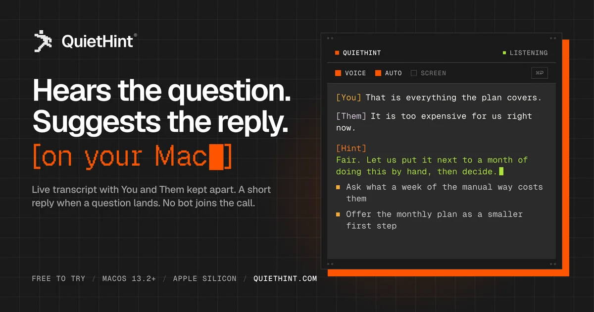
A 1200×630 social card set on a near-black canvas with a faint square grid, split into a text-heavy left column and a product-proof terminal window on the right. Focal hierarchy runs white two-line headline → orange monospace bracket line with a block cursor → small grey support copy, while the right-hand window mockup shows colour-coded [You]/[Them]/[Hint] transcript lines to prove the product. Everything is pointed at by a single orange accent — square bullets, tab chips, the bracket hook and a hard, blur-free offset shadow behind the window — with green quarantined inside the terminal as the 'live' signal, and an uppercase monospace meta strip anchoring the bottom edge.
Prompt preview
## Reference images

Study these alongside the description below: hierarchy, rhythm, spacing, colour. Build for the product you are asked about, using this design language.

- Screenshot: https://kage-design-assets.t3.tigrisfiles.io/screenshots/quiethint-r/ac5b65e0-7061-4a81-91b0-708de7a8dc0e-1789711325778.webp
- Design on Kage: https://kage.design/designs/quiethint-r-og-image

## Before you start
Ask the user what product this social card is for, who the audience is, and what brand assets they already have (product name, tagline or headline they want, brand colours, typeface, any logo mark). Wait for the answers before writing any code. Everything below is applied to **their** product with placeholder branding — if they have no assets, invent neutral placeholders and say so.

## Page structure
Produce a single fixed-size image at **1200×630** (build it as one HTML file with a 1200×630 body, or an SVG, then render to PNG — e.g. Playwright `page.screenshot({ clip: {0,0,1200,630} })` at `deviceScaleFactor: 2` for a crisp 2400×1260 export). No scrolling, no responsive behaviour.

Top to bottom, left to right:

1. **Background canvas** — near-black fill with a faint square grid (thin lines at low opacity, ~40px cells) covering the whole card; keep it barely visible so text stays dominant.
2. **Brand lockup (top-left)** — a small distinctive logo mark (pixel-art or otherwise characterful) next to the product wordmark with a small ® superscript. Roughly 40px tall, aligned to the top safe margin.
3. **Left column (~55% width)** — the message stack, left-aligned, vertically sitting in the upper two-thirds:
   - Two-line headline in bold white sans-serif, ~72–80px, tight leading — the first focal point.
   - A bracketed monospace hook line in the accent colour, ~40–44px, ending in a solid block cursor (▮) — the second focal point and the personality moment.
   - Two lines of small grey supporting copy, ~22px — what the product does, in plain words.
4. **Right column (~40% width)** — a product-window mockup that proves the claim:
   - Dark panel with a 1px border and sharp corners; small tick dots at the panel corners.
   - Title bar: coloured square bullet + product name left, status bullet + uppercase status word right (e.g. green dot + “LISTENING”).
   - Chip row: two active toggle chips with square bullets, one inactive greyed chip, and a small key-cap (e.g. ⌘P) at the far right.
   - Body: monospace transcript — speaker labels in brackets, one reply block labelled in the accent colour with text in green, then two bulleted suggestion lines with small square bullets, ending in a green block cursor.
5. **Offset shadow** — the window sits on a solid, blur-free accent-coloured offset shadow (~14–16px right and down), visible along its right and bottom edges. Nothing else on the card casts a shadow.
6. **Footer meta strip (bottom-left)** — one uppercase monospace line of facts separated by ` / ` slashes (availability, platform, requirements, domain); the final item in white/bold, the rest in grey.

## Design language
- **Composition:** asymmetric two-column split — declarative text left, structured UI proof right. Align both columns to a shared safe margin of ~60px; never centre content.
- **Hierarchy:** exactly three text levels — big white headline, mid accent-coloured mono hook, small grey support. The window mockup is imagery, not more text hierarchy.
- **Colour tokens:** background `#131110`; panel `#1F1D1A`; primary text `#FFFFFF`; secondary text `#98928A`; borders `#3A3733`; single accent orange `#FF5A00` for bullets, chips, the hook line and the offset shadow; green `#7CE04A` reserved strictly for “live/terminal” signals inside the mockup (reply text, status dot, cursor). One accent does all the pointing; don't add a second.
- **Type pairing:** a bold geometric sans (Helvetica/Inter Bold) only for the headline, tight tracking; everything else — hook line, transcript, chips, status, footer — in one monospace (JetBrains Mono / SF Mono). Uppercase + ~0.08em letter-spacing for all UI labels and meta text.
- **Shape & borders:** sharp corners (0–4px radius max), 1px hairline borders, no rounded cards, no gradients, no blur shadows. Depth comes only from the flat accent offset shadow.
- **Details that sell it:** small filled squares instead of dots for bullets, block cursors (▮) instead of blinking lines, bracketed `[Speaker]` labels, key-cap with 1px border, tick dots on panel corners.
- **Thumbnail legibility:** the card must read at 300px wide — headline dominates, accent blocks stay visible, support copy may become illegible (that's acceptable).
- **Motion:** none — this is a static export.

## Never
- Do not reproduce the reference product's name, wordmark, pixel-figure logo, tagline, transcript copy, footer facts or domain — use the user's brand or clearly neutral placeholders.
- Do not present the result as the reference product or imitate its logo mark.
- Do not add photography, stock illustration, emoji icons, gradients or glass blur to this card.