kage
kage
splitformac.com
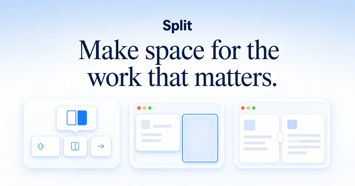
Design analysis
A 1200×630 social card built as a single centred stack on a cool gradient: a small bold sans wordmark, a two-line high-contrast serif headline that owns the upper half, and three illustrated mini-window cards anchoring the bottom edge. Hierarchy is earned through scale contrast — the serif headline is by far the largest element while the wordmark stays small and the illustration row reads as quiet proof. Colour is disciplined: navy ink on a pale blue-to-white vertical gradient, with exactly one saturated blue reserved for the selected pane and primary icon; skeletons stay neutral grey so the accent pops.
Prompt preview
## Reference images

Study these alongside the description below: hierarchy, rhythm, spacing, colour. Build for the product you are asked about, using this design language.

- Screenshot: https://kage-design-assets.t3.tigrisfiles.io/screenshots/split/fc7abc50-14c2-4647-8d67-76c03cc57c31-1790402543458.webp
- Design on Kage: https://kage.design/designs/split-og-image

## Before you start
Ask the user what product they are building, who it is for, and what brand assets they already have (name, tagline or headline, colours, and any typeface preferences). Wait for the answers before writing any code. Everything below is applied to *their* product — the reference is only a compositional template.

## Page structure
Produce a single 1200×630 social card image (build it as HTML/CSS sized exactly 1200×630 and render to PNG, or as an SVG). Zones from top to bottom:

1. **Background** — one full-bleed vertical gradient, cool pale blue at the top edge fading to near-white by the headline zone. No other background decoration; all texture comes from the gradient.
2. **Wordmark zone** (~top 15%) — the product name, centred, in a bold sans-serif at roughly 44–48px, dark ink colour, no logo mark needed. Small relative to the headline; it labels, it does not compete.
3. **Headline zone** (~15–55%) — a benefit statement of at most ~8 words, centred, wrapping to exactly two balanced lines, in a high-contrast serif at roughly 92–100px with tight leading (~1.05) and no letter-spacing tricks. This is the focal point of the card; give it clear space on both sides.
4. **Illustration row** (~60–92%) — three rounded white cards in a centred row, each roughly 340×230 with ~40px gaps, bottom-anchored with ~48px margin from the canvas edge. Each card is a simplified UI vignette: card 1 shows an abstract product gesture (a small floating control above a row of three tiny buttons), cards 2 and 3 show mini window mockups with three traffic-light dots top-left, a split of two panes separated by a small rounded gutter handle, and grey skeleton bars standing in for content. Exactly one element across the whole row (one pane in the middle card) is highlighted with a light blue fill and a 2px accent-coloured border.

## Design language
- **One focal point, two support layers.** The headline is ~6× the wordmark's size; the illustration row is visually quiet (grey skeletons, thin borders) so the type always wins. Never let the illustration row grow taller than the headline block.
- **Centred symmetric stack.** Everything is horizontally centred on one axis; rhythm comes from vertical spacing (~40–64px gaps), not from columns.
- **Background as a whisper.** Vertical gradient from #D8E6F5 at the top to #F7F9FA by mid-canvas. Contrast between background and cards must stay low so white cards read as lifted, not cut out.
- **Ink and one accent.** All text in a single dark navy ink (#14263F). One saturated blue accent (#2E7CF6) used sparingly: the selected pane fill (#EAF2FE) plus its border, and the primary glyph in the first vignette. Skeleton content is neutral grey (#D7DEE8 bars on white) — never colour the placeholder content.
- **Type pairing.** Bold geometric/grotesque sans for the wordmark only; high-contrast serif (Playfair/Freight-style, or a system serif fallback) for the headline. Nothing else on the card carries text. Headline uses tight leading and balanced line breaks ("Make space / for the work" style two-line split), not ragged centred soup.
- **Cards and chrome.** Corner radius 16–24px on vignette cards, 10–12px on inner panes and buttons. Borders are 1–2px in a light cool grey-blue (#E3ECF6). Shadows are soft and wide, e.g. `0 8px 24px rgba(20,38,63,0.08)` — lift, not drop-shadow drama.
- **Mini-window grammar.** Any mocked window gets: three traffic-light dots (red #F56E5C, yellow #F5BE4F, green #57C05B) top-left, a light pane background, grey skeleton bars of varying widths for text, and one accent-highlighted region to imply interactivity. Keep dots ~10px and panes padded ~16px.
- **Legibility at small size.** Assume the card is viewed at ~600px wide: minimum text size 28px at full canvas scale, minimum skeleton bar height ~8px, and check the composition still reads as wordmark → headline → imagery in one glance.

## Never
- Do not reuse the reference product's name, its "Make space for the work that matters." headline, or any of its copy.
- Do not imitate the reference's specific illustrations or icon set; build new vignettes from the user's own product concept using the same visual grammar (traffic lights, skeletons, one accent).
- Do not add a logo image, URL, badge, or secondary call-to-action to the card; the card carries wordmark, headline, and illustration only.
- Never present the output as the reference product — it is a new card for the user's own brand.