kage
kage
adant.ai
Design analysis
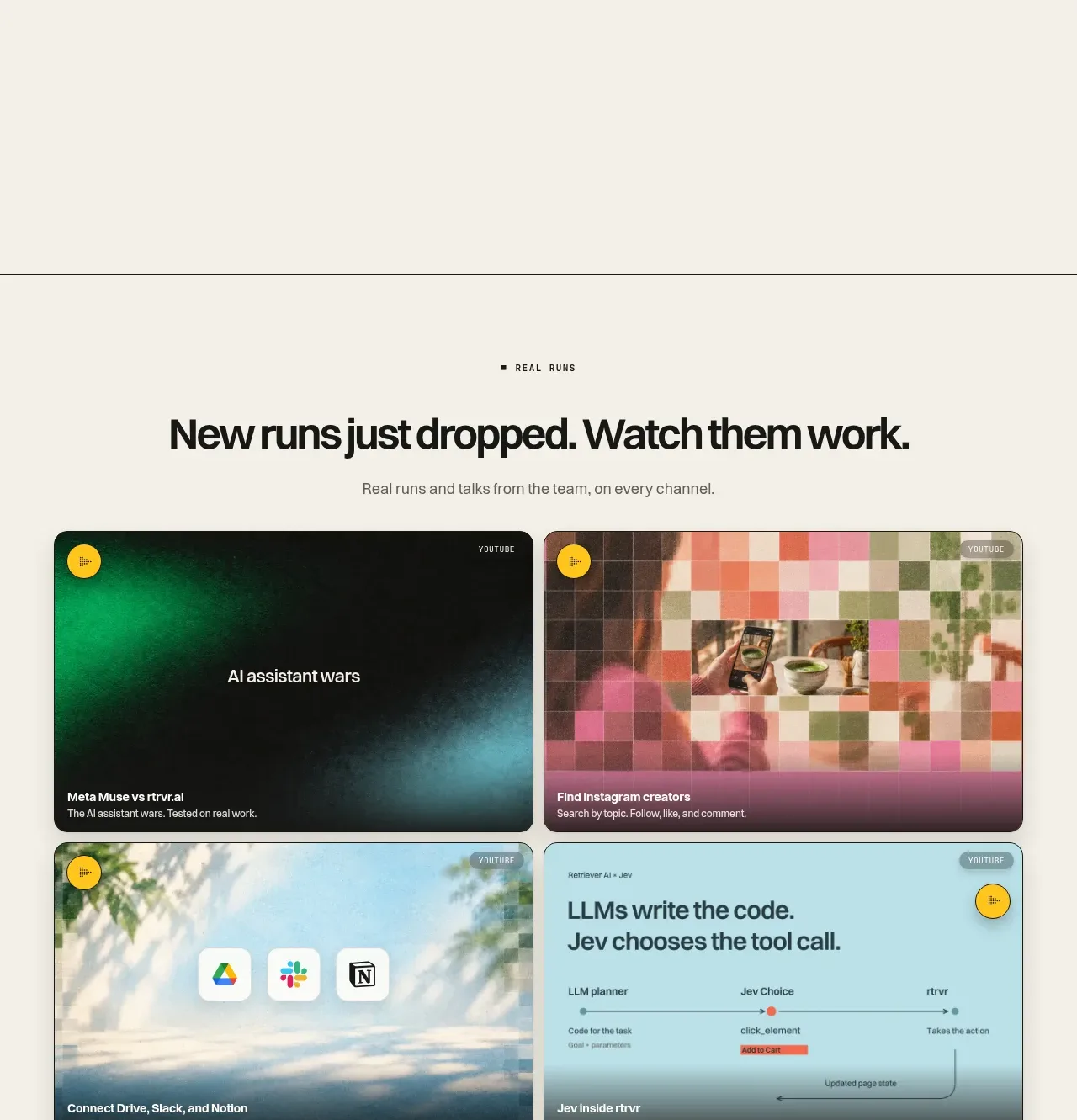
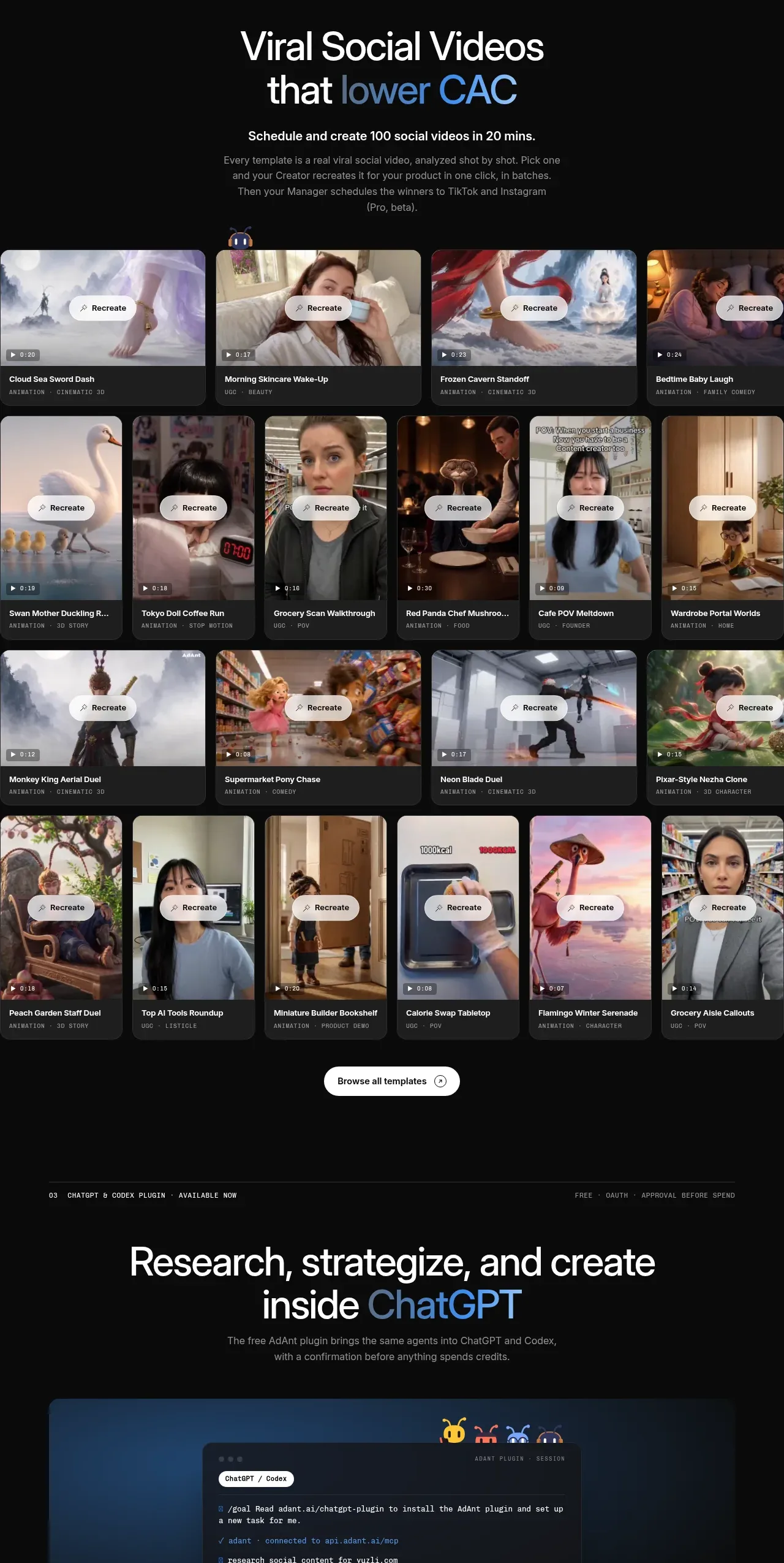
A dark showcase section presents a bold promise, explanatory copy, and a dense grid of media templates with consistent recreate controls and metadata.
Prompt preview
## Reference images

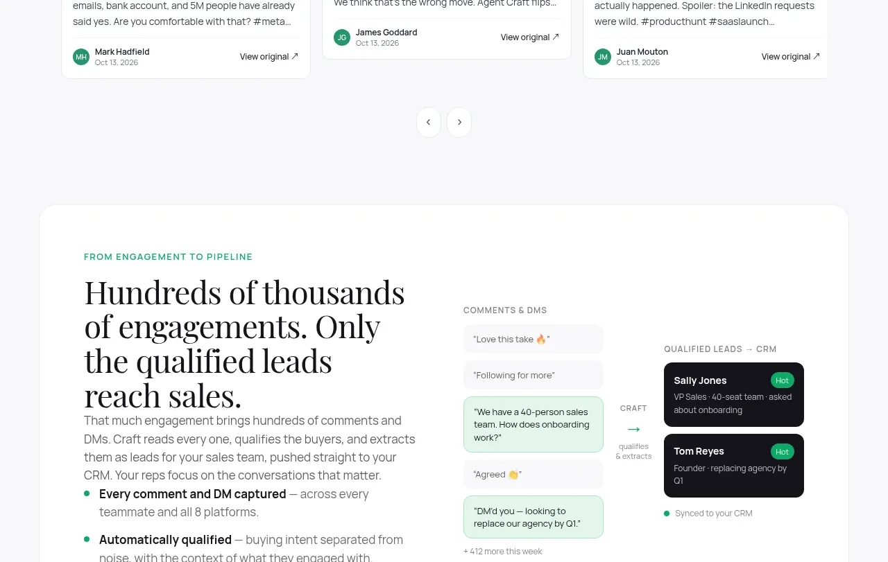
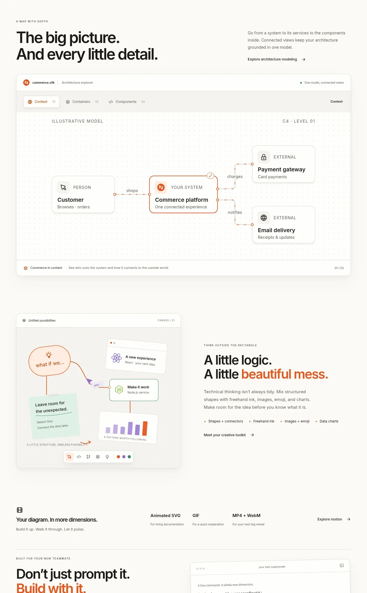
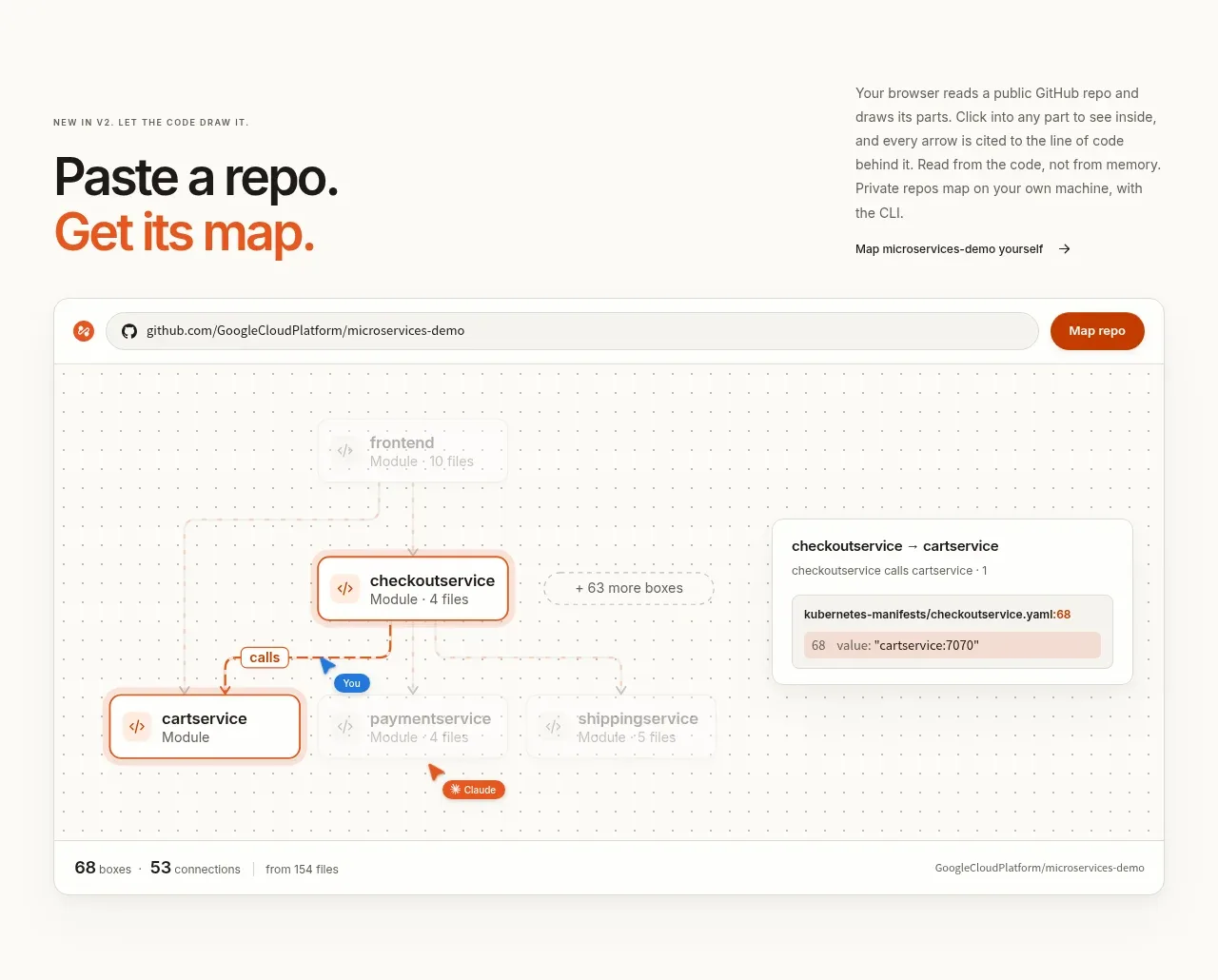
Study these alongside the description below: hierarchy, rhythm, spacing, colour. Build for the product you are asked about, using this design language.

- Component: https://kage-design-assets.t3.tigrisfiles.io/components/adant-2-0/1b13b0a2-e64e-418d-a933-0f40a66c40ee-1792044358-4.webp
- Full page it was cut from: https://kage-design-assets.t3.tigrisfiles.io/screenshots/adant-2-0/1b13b0a2-e64e-418d-a933-0f40a66c40ee-1792044250464-full.webp
- Component on Kage: https://kage.design/component/adant-2-0-gallery

## Before you start
Ask what kinds of reusable assets the user's product offers and what action users should take from the gallery. Apply the design system below to an original collection.

Create a dark gallery section with a small metadata overline, a large centered headline containing one blue accent phrase, and a short paragraph explaining the library. Below, arrange media cards in a dense responsive grid with varied but consistent thumbnails, dark surfaces, 12–16px radii, tiny duration/category metadata, and a centered pill action over each thumbnail. Add a single browse-all button beneath the grid. Use #090A0B or #0D0F12 for the background, #F7F8FA for primary text, #9AA2AD for metadata, and #4C91E8 for emphasis. Use 44–58px heading type, 13–15px body copy, 10–11px metadata, 8–16px grid gaps, and modest hover lift/thumbnail zoom. Ensure cards remain legible and keyboard-focusable.

### Never
- Never use logos, product names, copy, illustrations, or imagery from the reference.
- Never reuse the reference videos, thumbnails, titles, or exact card count.
- Never sacrifice readable metadata for visual density.