 kage
kage
milepost.club

Design analysis
A rounded white inset panel presents a fan of recap cards, turning product output into a collectible visual artifact and creating a strong contrast with the yellow section above.
Prompt preview
## Reference images

Study these alongside the description below: hierarchy, rhythm, spacing, colour. Build for the product you are asked about, using this design language.

- Component: https://kage-design-assets.t3.tigrisfiles.io/components/milepost/daa1b44b-e646-4a0f-860e-b6d9c76440c8-1791871477-5.webp
- Full page it was cut from: https://kage-design-assets.t3.tigrisfiles.io/screenshots/milepost/daa1b44b-e646-4a0f-860e-b6d9c76440c8-1791871382204-full.webp
- Component on Kage: https://kage.design/component/milepost-gallery

## Before you start
Ask what recurring summary, report, or artifact the user's product generates and what visual form would make it desirable to revisit. Build an original version for that product.

Create a large white gallery panel with very generous rounded corners around 42–56px on a soft warm-gray page background #f4f3ef. Center a two-line uppercase heading and a short muted subtitle at the top. Below it, arrange five to seven portrait recap cards in a shallow fan: the center card is largest and frontmost, neighboring cards rotate subtly and recede in scale. Use strong contrast between card backgrounds—black #111315, white #f7f7f4, yellow #ffd43d, and one secondary brand color—while keeping typography systemized. Add realistic shadows, 12–18px card radii, and enough bottom padding that the panel feels like a contained module. On mobile, convert the fan into a horizontal scroll gallery with snap points.

Never: use logos, product names, copy, illustrations or imagery from the reference.
More components
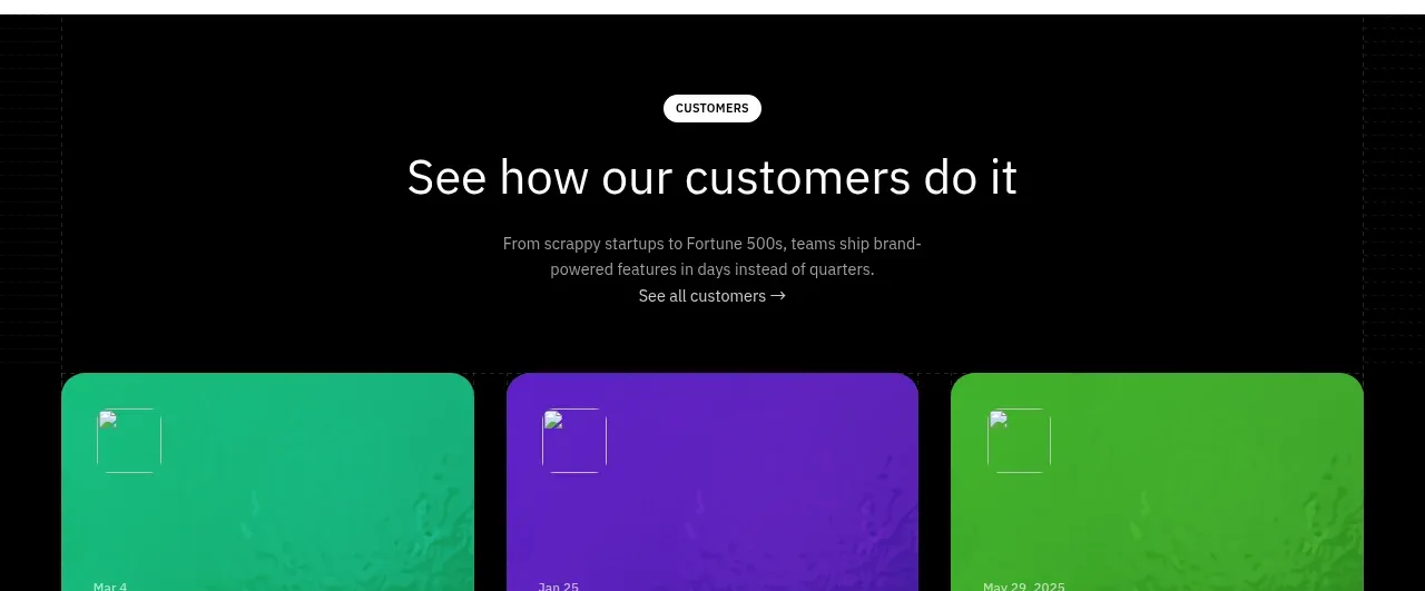
 Blog article cards
Scrape Anything by Context.dev · Gallery
Blog article cards
Scrape Anything by Context.dev · Gallery
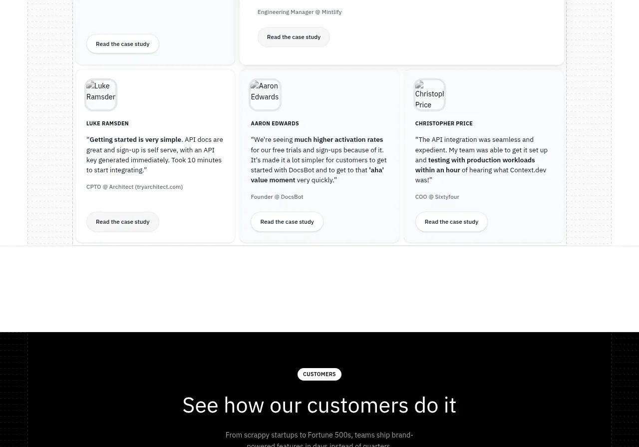 Customer stories carousel
Scrape Anything by Context.dev · Gallery
Customer stories carousel
Scrape Anything by Context.dev · Gallery
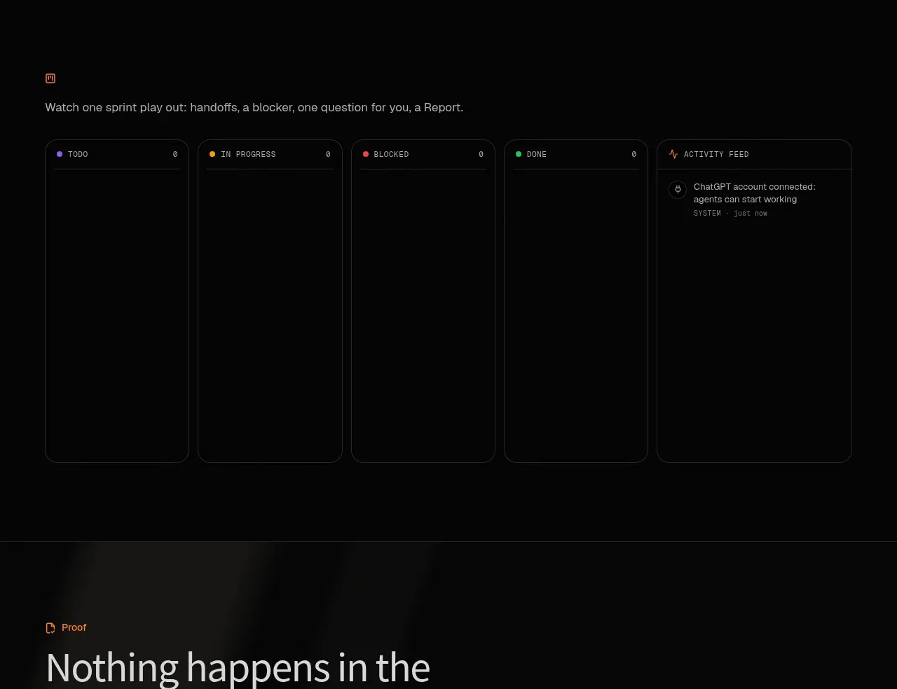
 Operational board preview
SquadRoom · Gallery
Operational board preview
SquadRoom · Gallery
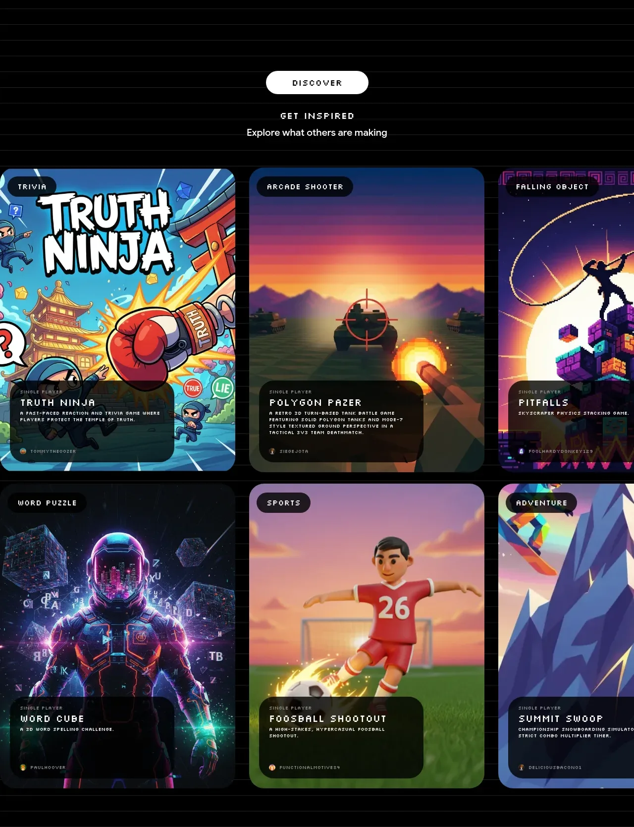
 Discover inspiration gallery
Playground by Google Labs · Gallery
Discover inspiration gallery
Playground by Google Labs · Gallery
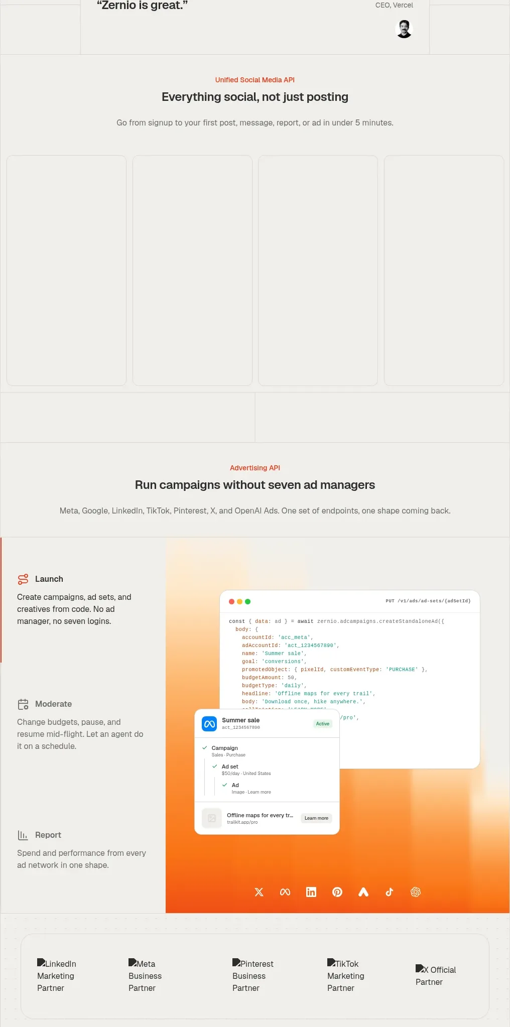
 Social media campaign API showcase
Zernio · Gallery
Social media campaign API showcase
Zernio · Gallery
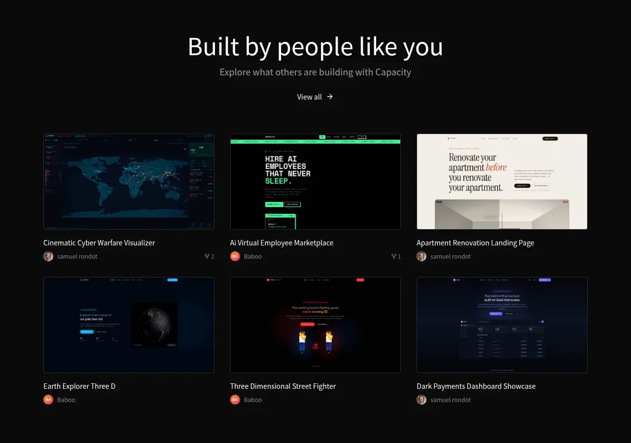
 Community project gallery
capacity.so · Gallery
Community project gallery
capacity.so · Gallery