 kage
kage
openflowkit.com
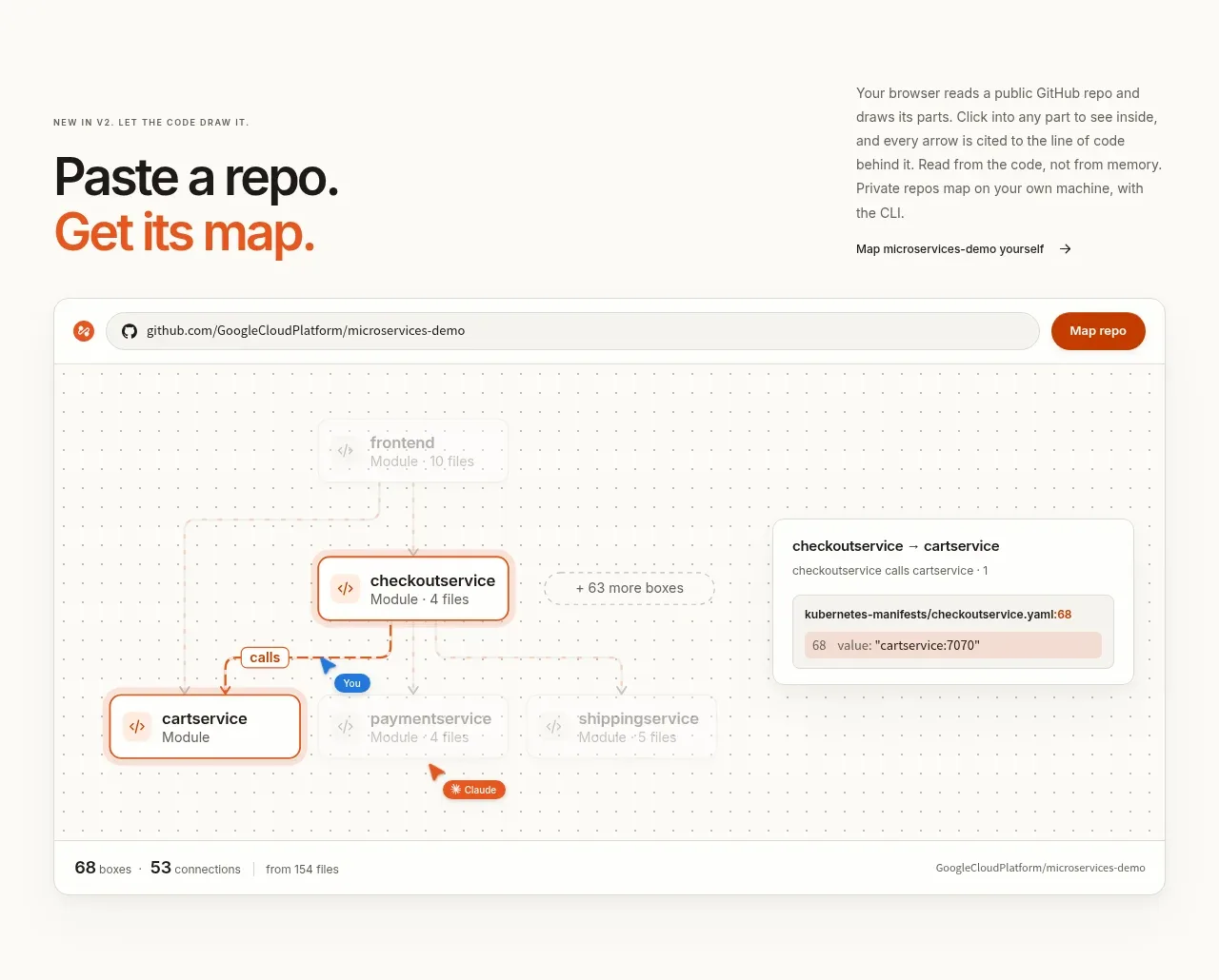
Design analysis
A heading and side explanation lead into a large browser-like product preview that demonstrates turning a code repository into a navigable map.
Prompt preview
## Reference images

Study these alongside the description below: hierarchy, rhythm, spacing, colour. Build for the product you are asked about, using this design language.

- Component: https://kage-design-assets.t3.tigrisfiles.io/components/openflowkit-2/3de20331-4179-415d-a7ba-29915155b155-1791957760-4.webp
- Full page it was cut from: https://kage-design-assets.t3.tigrisfiles.io/screenshots/openflowkit-2/3de20331-4179-415d-a7ba-29915155b155-1791957697393-full.webp
- Component on Kage: https://kage.design/component/openflowkit-2-gallery

## Before you start
Ask what source material the user's product transforms and what the most convincing before/after visual would be. Use that to design the demo.

Build a product-demo section with an editorial heading on the left and explanatory copy plus a text link on the right. Beneath it, place a wide browser-style preview with a rounded 12px frame, a light border (`#e2dfd8`), and a top toolbar containing a source field, small status icon, and orange action button. Inside, show a pale dotted canvas with abstract connected modules, a few highlighted nodes, and a contextual detail panel. Use off-white, gray, charcoal, and restrained orange accents; avoid visual clutter. Add a thin footer/status strip inside the frame. The preview should be responsive, preserving the sense of a large workspace by allowing horizontal internal scaling or a simplified mobile layout.

Never use the reference's logo, product name, copy, repository names, illustrations, imagery, or exact diagram content.
More components
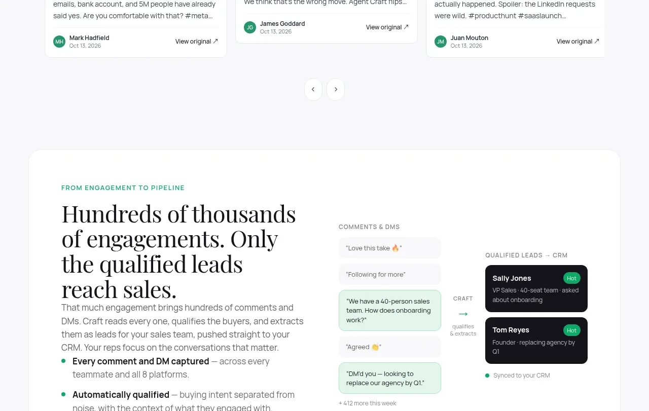
 Content examples gallery
Agent Craft · Gallery
Content examples gallery
Agent Craft · Gallery
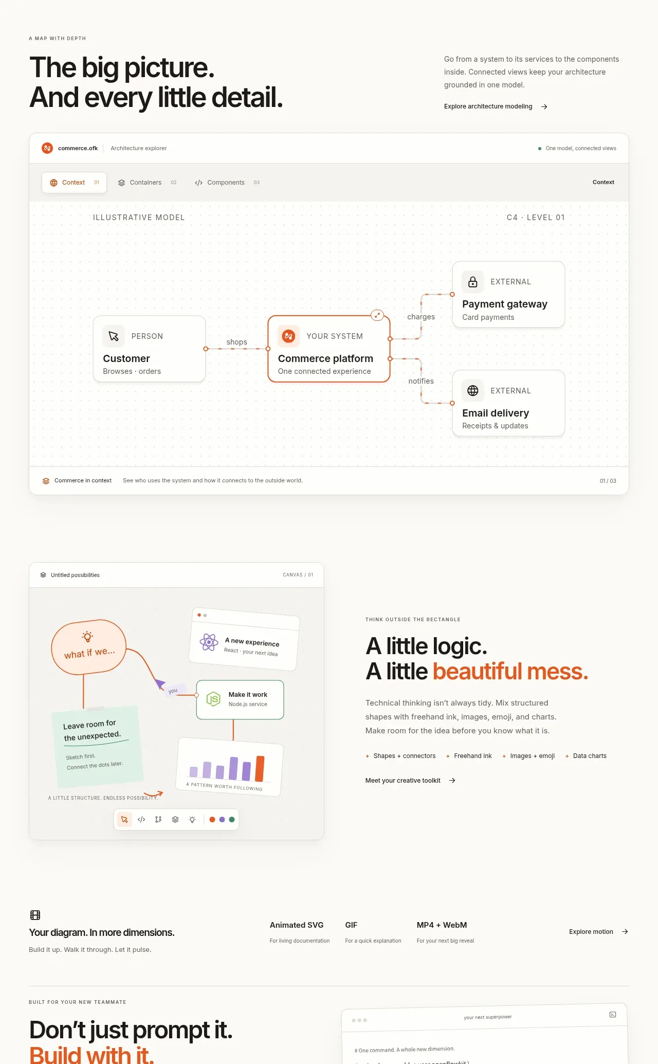
 System overview canvas
OpenFlowKit 2 · Gallery
System overview canvas
OpenFlowKit 2 · Gallery
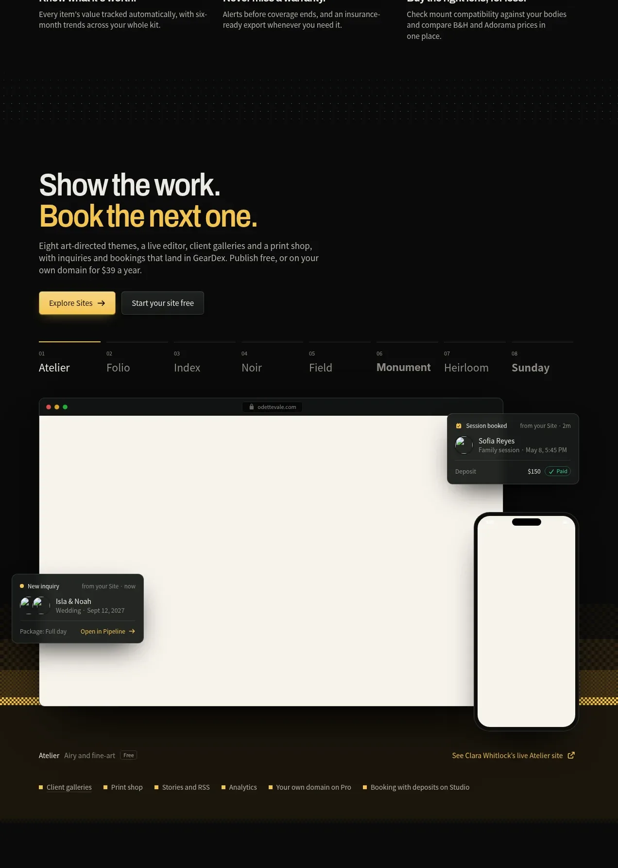
 Website showcase and booking preview
geardex.app · Gallery
Website showcase and booking preview
geardex.app · Gallery
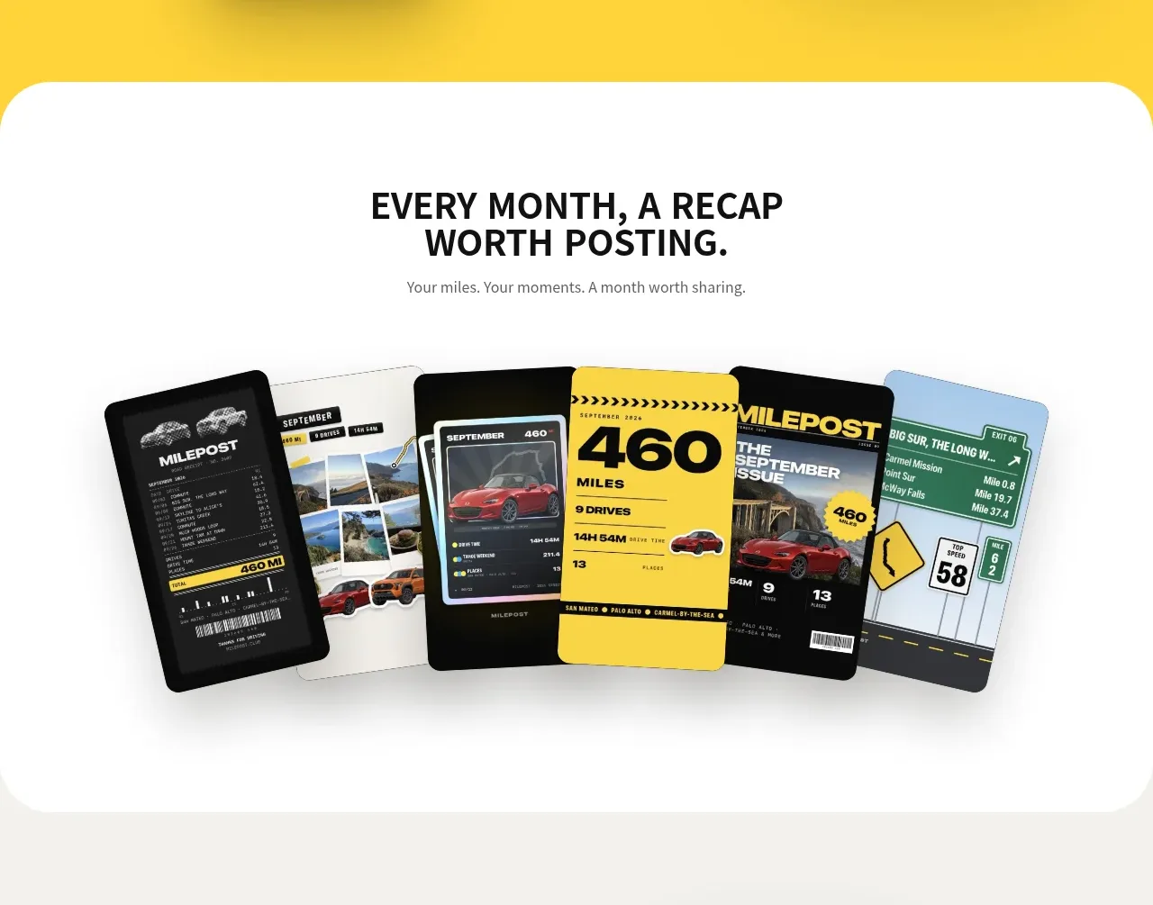
 Monthly recap gallery
Milepost · Gallery
Monthly recap gallery
Milepost · Gallery
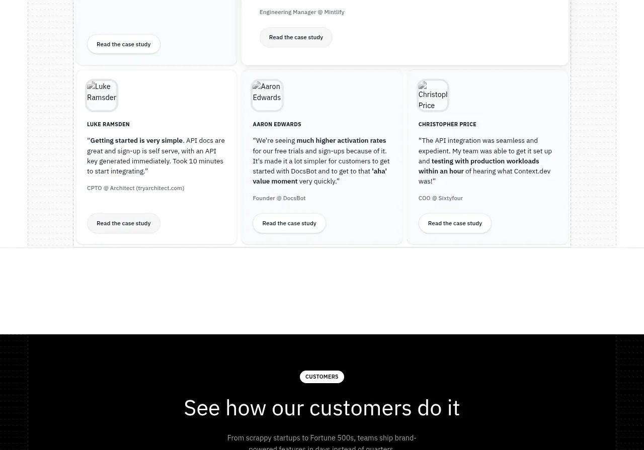
 Customer stories carousel
Scrape Anything by Context.dev · Gallery
Customer stories carousel
Scrape Anything by Context.dev · Gallery
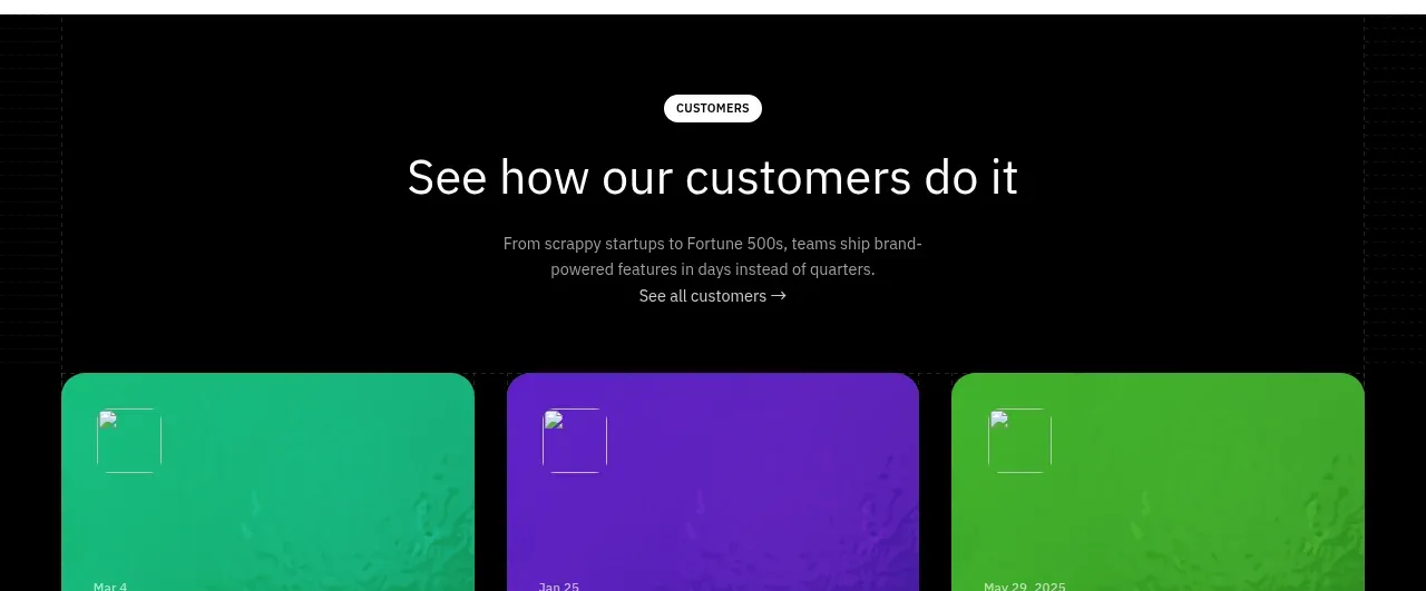 Blog article cards
Scrape Anything by Context.dev · Gallery
Blog article cards
Scrape Anything by Context.dev · Gallery