 kage
kage
geardex.app
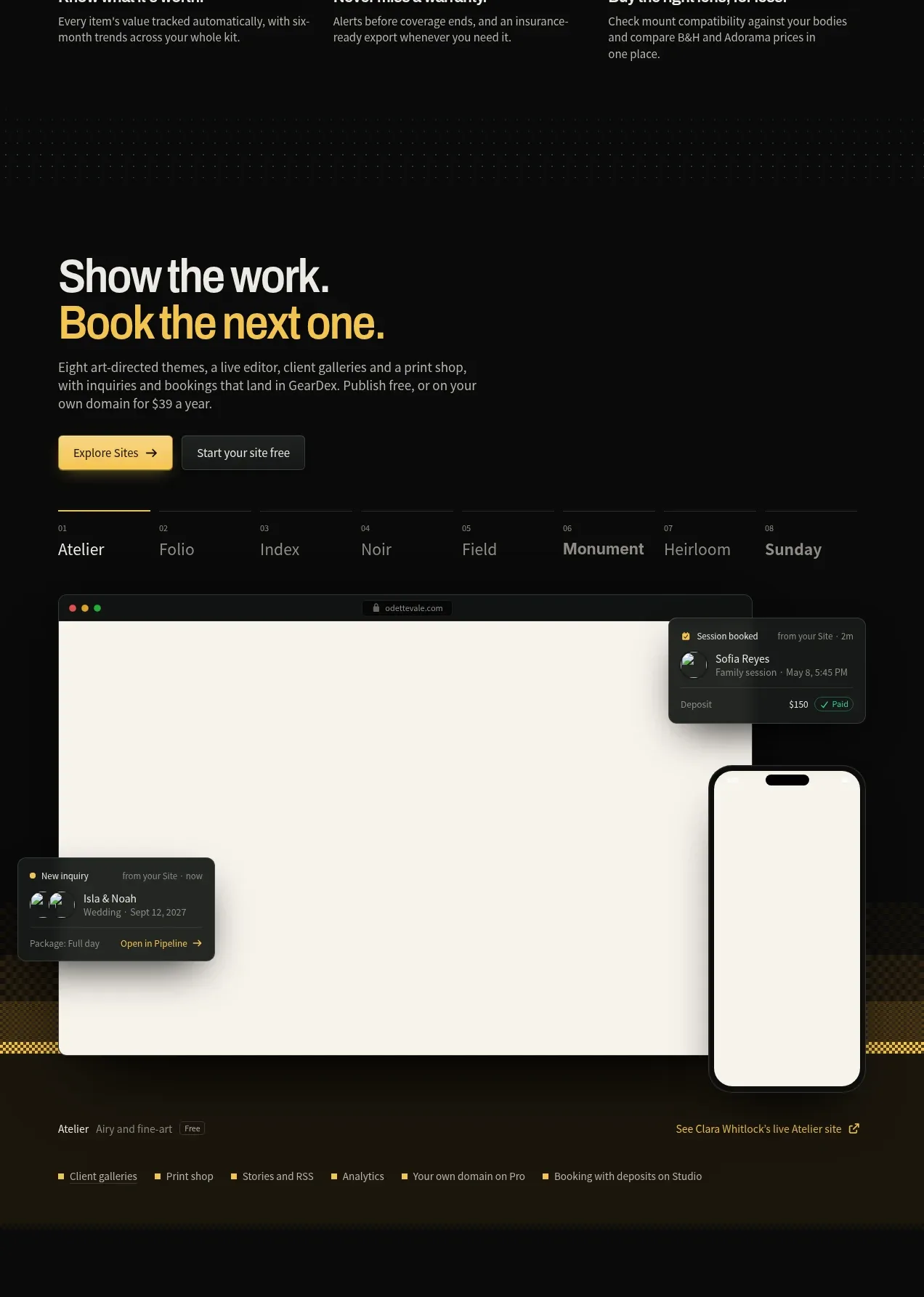
Design analysis
A visually rich showcase section combines a headline and controls with a large website mockup, floating notifications, and a small navigation row of example styles.
Prompt preview
## Reference images

Study these alongside the description below: hierarchy, rhythm, spacing, colour. Build for the product you are asked about, using this design language.

- Component: https://kage-design-assets.t3.tigrisfiles.io/components/geardex-app/fc33b7d0-970c-45a6-93bf-9b94f05b130c-1791941530-4.webp
- Full page it was cut from: https://kage-design-assets.t3.tigrisfiles.io/screenshots/geardex-app/fc33b7d0-970c-45a6-93bf-9b94f05b130c-1791941487258-full.webp
- Component on Kage: https://kage.design/component/geardex-gallery

## Before you start
Ask what the user's product, audience, and brand are, then apply these principles to that product rather than reproducing the reference.

Design a showcase gallery for a product feature. Use a dark section with a bold two-line headline, a short paragraph, and two contrasting buttons. Include a slim horizontal style/category selector with numbered items, then a large browser-like preview with a warm light canvas, rounded frame, and a few floating dark status cards positioned around it. Add subtle ambient texture behind the preview, but keep it decorative and low contrast. Use #080a09, cream #f2efe5 for the preview, white #edf1ec, amber #f2bf4b for the headline accent, and green #2cc887 for actions. Ensure floating elements do not obscure core content, and make the gallery horizontally scrollable or stack on small screens.

Never use logos, product names, copy, illustrations, or imagery from the reference.
More components
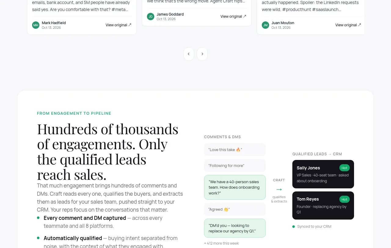
 Content examples gallery
Agent Craft · Gallery
Content examples gallery
Agent Craft · Gallery
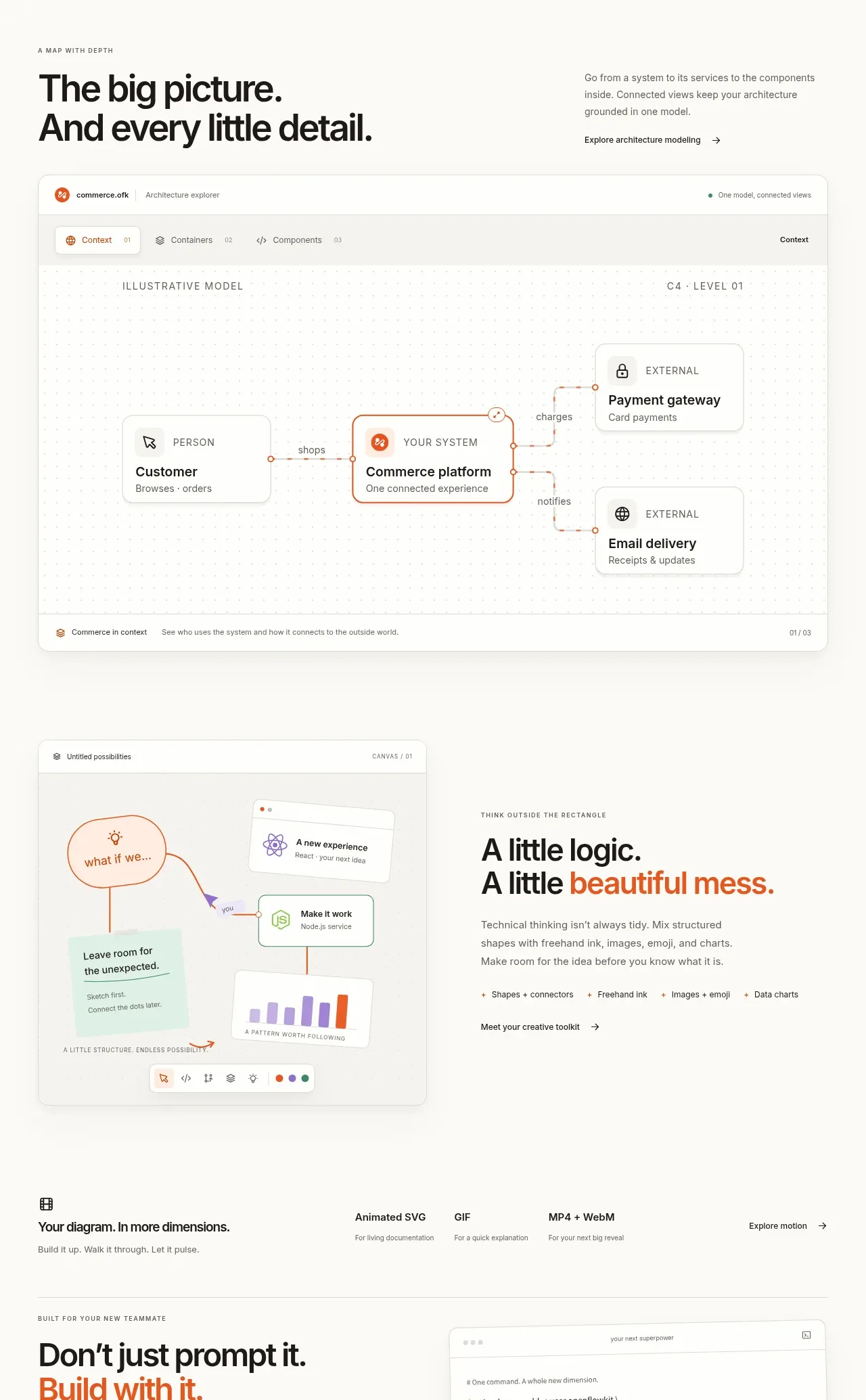
 System overview canvas
OpenFlowKit 2 · Gallery
System overview canvas
OpenFlowKit 2 · Gallery
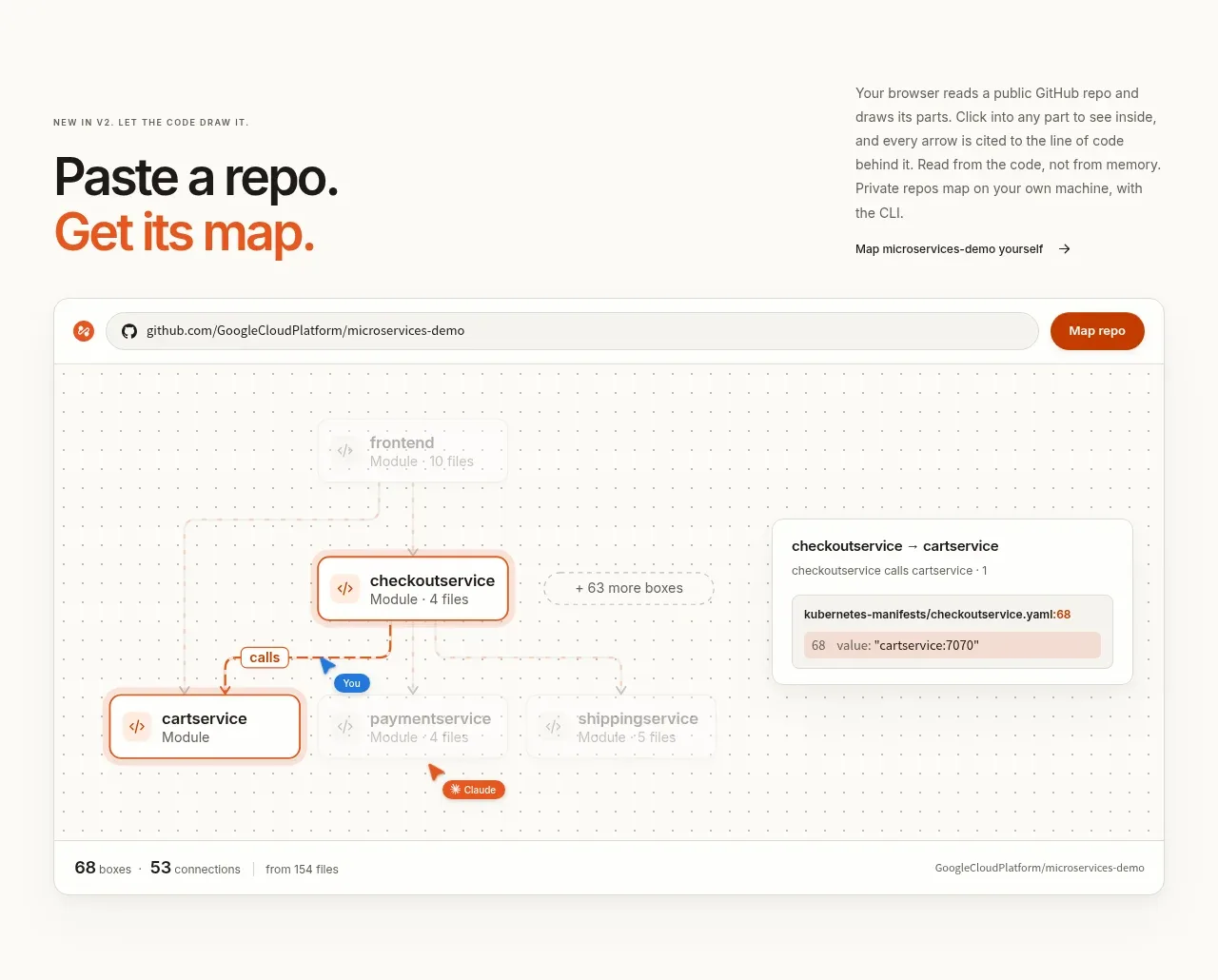 Repository mapping demo
OpenFlowKit 2 · Gallery
Repository mapping demo
OpenFlowKit 2 · Gallery
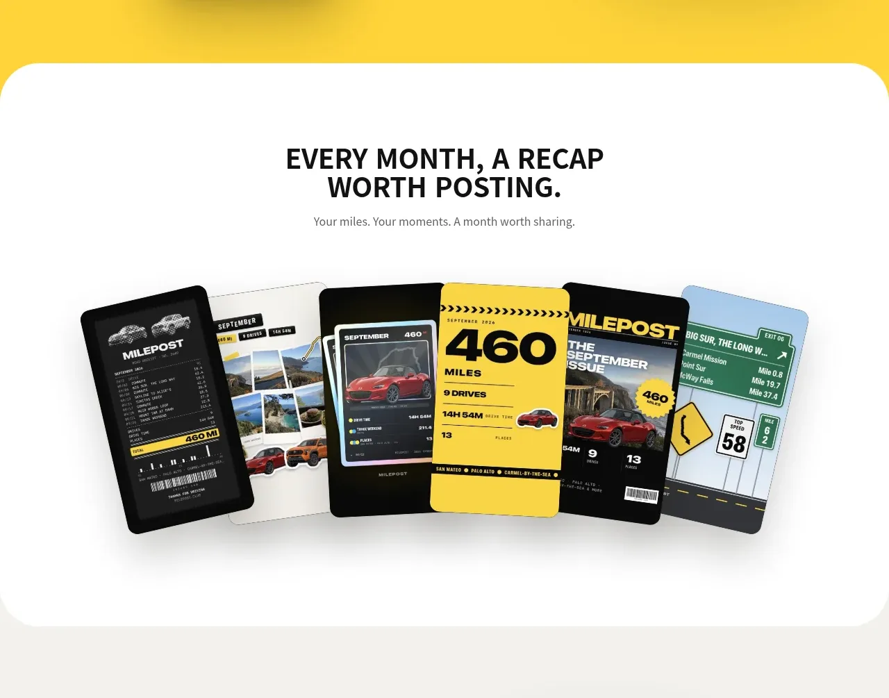
 Monthly recap gallery
Milepost · Gallery
Monthly recap gallery
Milepost · Gallery
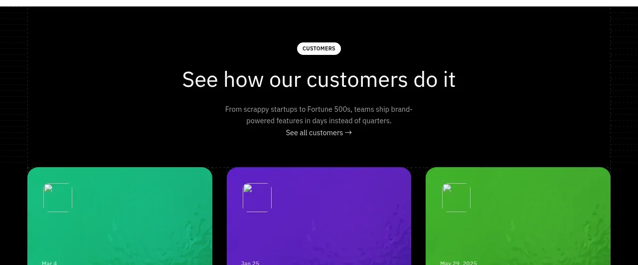
 Blog article cards
Scrape Anything by Context.dev · Gallery
Blog article cards
Scrape Anything by Context.dev · Gallery
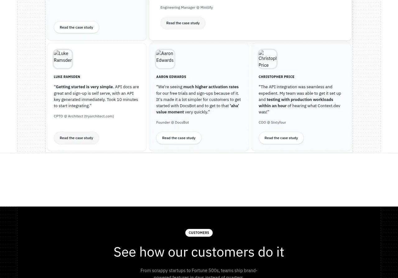 Customer stories carousel
Scrape Anything by Context.dev · Gallery
Customer stories carousel
Scrape Anything by Context.dev · Gallery