kage
kage
adant.ai

Design analysis
A long-form marketing page alternates between airy white feature sections and dense black product-led sections, creating a clear rhythm as it moves from hero to proof, templates, pricing, and conversion. Large high-contrast typography uses blue gradient emphasis, while rounded UI mockups, agent avatars, video cards, and thin rules make the AI workflow tangible without making the layout feel crowded.
Prompt preview
## Reference images

Study these alongside the description below: hierarchy, rhythm, spacing, colour. Build for the product you are asked about, using this design language.

- Full page: https://kage-design-assets.t3.tigrisfiles.io/screenshots/adant-2-0/1b13b0a2-e64e-418d-a933-0f40a66c40ee-1792044250464-full.webp
- Above the fold: https://kage-design-assets.t3.tigrisfiles.io/screenshots/adant-2-0/1b13b0a2-e64e-418d-a933-0f40a66c40ee-1792044245201.webp
- Design on Kage: https://kage.design/designs/adant-2-0-landing-page

## Before you start
Ask the user what they are building, who it is for, and what brand assets they already have (name, colours, type). Wait for their answers before designing. Apply every instruction below to their product, not to the reference product.

## Page structure
1. **Announcement bar and navigation:** Begin with a slim promotional strip, then a compact centered navigation row with a small brand mark, links, a resources dropdown, and a dark sign-in button.
2. **Hero:** Use a pale, almost-white hero with social-platform badges above a large centered headline, a short prompt/composer field beneath it, and a row of colourful character or agent avatars. Finish the hero with a tilted horizontal collage of tall, rounded social-video thumbnails.
3. **Agent overview:** Add a numbered section label and a centered headline introducing the product’s specialist roles. Show four compact agent cards in a row, each with an avatar, role, and one-line description; give the active card a darker outline.
4. **Product workspace demonstration:** Place a large light product mockup below the agent cards. Use a split interface: a narrow research/project panel on the left and a generated canvas or storyboard grid on the right, with a dark command/chat bar running along the bottom.
5. **Positioning statement:** Insert a generous white breathing-space section with a small pill label, a centered two-line statement, a muted paragraph, and four small numbered capability tabs.
6. **Feature section — research:** Use a two-column feature row with copy on the left and a rounded pale-blue interface illustration on the right. Include an eyebrow, large headline with blue-emphasis words, explanatory paragraph, checklist, and a small “done by” attribution.
7. **Feature section — recreate:** Reverse the visual order: show the rounded interface mockup on the left and the copy on the right. Demonstrate turning a reference link into a new video, with a checklist and attribution.
8. **Feature section — scheduling:** Return to copy left and mockup right. Present a calendar-like scheduled-agent interface and explain recurring research, idea generation, captions, and publishing.
9. **Feature section — social listening:** Reverse the order again. Show a listening/replies interface beside copy about monitoring conversations, ranking opportunities, and drafting responses.
10. **Template library section:** Switch to a full-width black section. Center a large white headline with a blue-highlighted phrase, supporting copy, and a dense responsive grid of rounded video thumbnails. Overlay small white recreate pills and metadata on each card, then finish with a centered browse button.
11. **ChatGPT/Codex plugin section:** Continue the dark treatment with a centered headline, blue emphasis, short explanation, and a large dark-blue/black terminal-style product mockup. Add a prominent install button and small utility metadata below.
12. **Comparison section:** Return to white. Introduce a numbered eyebrow and a centered/left-aligned headline about agent speed, then build a comparison table with the product column highlighted using a pale blue background, agent avatars above it, and adjacent agency and DIY columns. Add three supporting callout cards underneath.
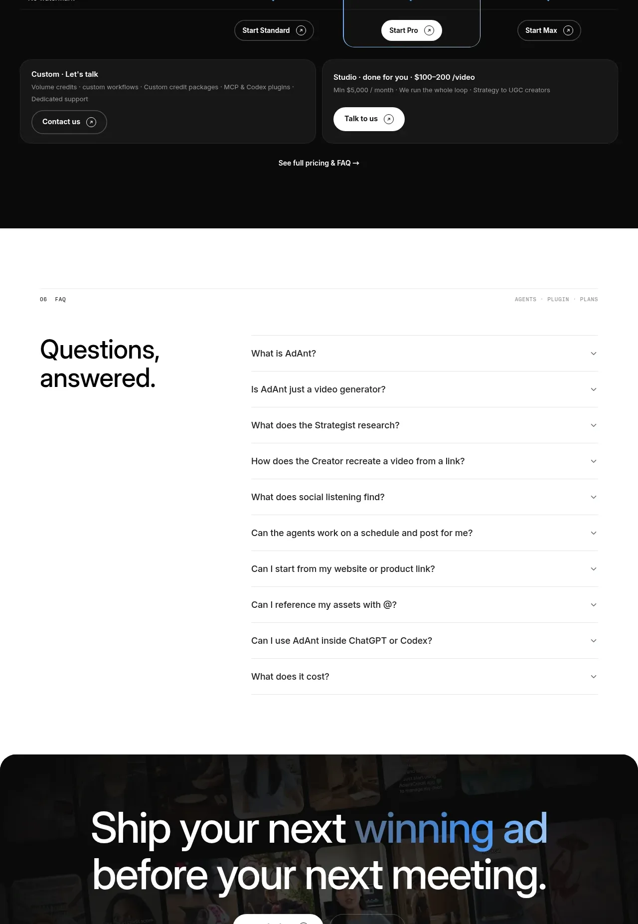
13. **Pricing section:** Use another black section with a free-trial pill, large heading, billing toggle, and three pricing columns. Make the middle plan visually dominant with a blue-tinted panel, border, and avatar row; include feature comparison rows, plan buttons, custom/studio callouts, and a pricing FAQ link.
14. **FAQ:** On white, split the section into a large “Questions, answered” heading on the left and a vertical accordion list on the right. Use thin dividers, concise questions, and chevron affordances.
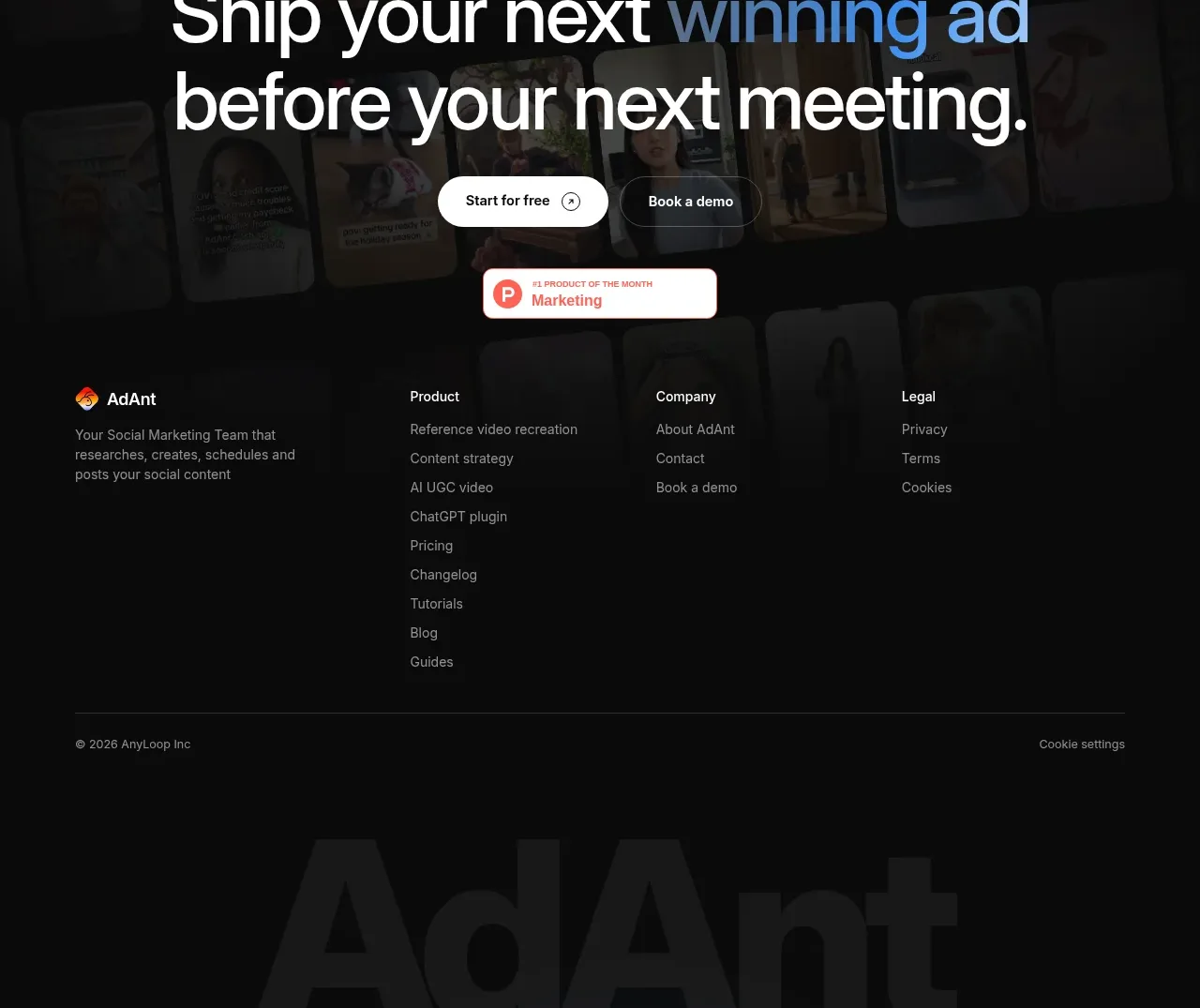
15. **Final CTA and footer:** End with a large rounded black panel over a dimmed collage background. Center an oversized conversion headline with blue gradient emphasis and two buttons, followed by a small award badge. Place footer columns for the brand, product, company, and legal links, then a bottom rule, copyright/settings row, and oversized low-contrast brand lettering.

## Design language
- Build hierarchy with oversized geometric sans-serif headlines, compact monospace or letter-spaced uppercase eyebrows, and short body copy in a restrained sans-serif. Scale hero and section headlines aggressively, while keeping labels and metadata tiny.
- Change rhythm deliberately: use spacious white feature rows and generous vertical gaps for explanation, then compress information into dark sections containing video grids, terminal mockups, tables, and pricing.
- Use white and near-white backgrounds (`#ffffff`, `#f7f8fa`) for clarity, near-black panels (`#090909`, `#111111`) for high-density showcases, and a cool blue accent/gradient (`#6fa6e8` to `#3d78c4`) for selected headline words and highlighted product states. Keep supporting UI colours muted and pastel.
- Pair black text with blue gradient emphasis instead of using many accent colours. Reserve saturated colours for social-platform badges, agent avatars, status dots, and tiny product details.
- Use thin light-gray rules (`#e6e8eb`) to divide sections and table rows. Prefer large rounded rectangles, generally around 16–24px radius, with soft or nearly invisible shadows; on dark sections use subtle gray borders rather than heavy elevation.
- Alternate two-column layouts and reverse their order from feature to feature so the page feels editorial and varied while preserving a stable grid. Keep content widths controlled and align text, mockups, and tables to consistent vertical guides.
- Make interface mockups feel like product evidence: use pale blue surfaces, rounded cards, small labels, checklists, calendars, grids, chat bars, and realistic thumbnail content. Avoid decorative illustration when a working UI can communicate the idea.
- Use pill-shaped buttons and controls with high contrast, modest borders, and concise labels. Use dark buttons on white sections, white buttons on black sections, and a blue-outlined or blue-tinted treatment for the featured option.
- Motion should be restrained: allow video thumbnails, horizontal hero media, accordions, carousels, and hover states to animate with short ease-out transitions. Keep sticky navigation or floating controls unobtrusive and never let motion compete with the headline.

## Never
- Do not copy the reference’s logos, wordmarks, product names, copy, illustrations, photography, video thumbnails, avatar designs, or icon sets.
- Never present the result as AdAnt or imply affiliation with it.
- Create original brand assets and product-specific content for the user’s product while preserving only the reusable layout logic, hierarchy, colour discipline, and interaction patterns.
Components from this page
All components
 Announcement bar and primary navigation
AdAnt 2.0 · Navigation
Announcement bar and primary navigation
AdAnt 2.0 · Navigation
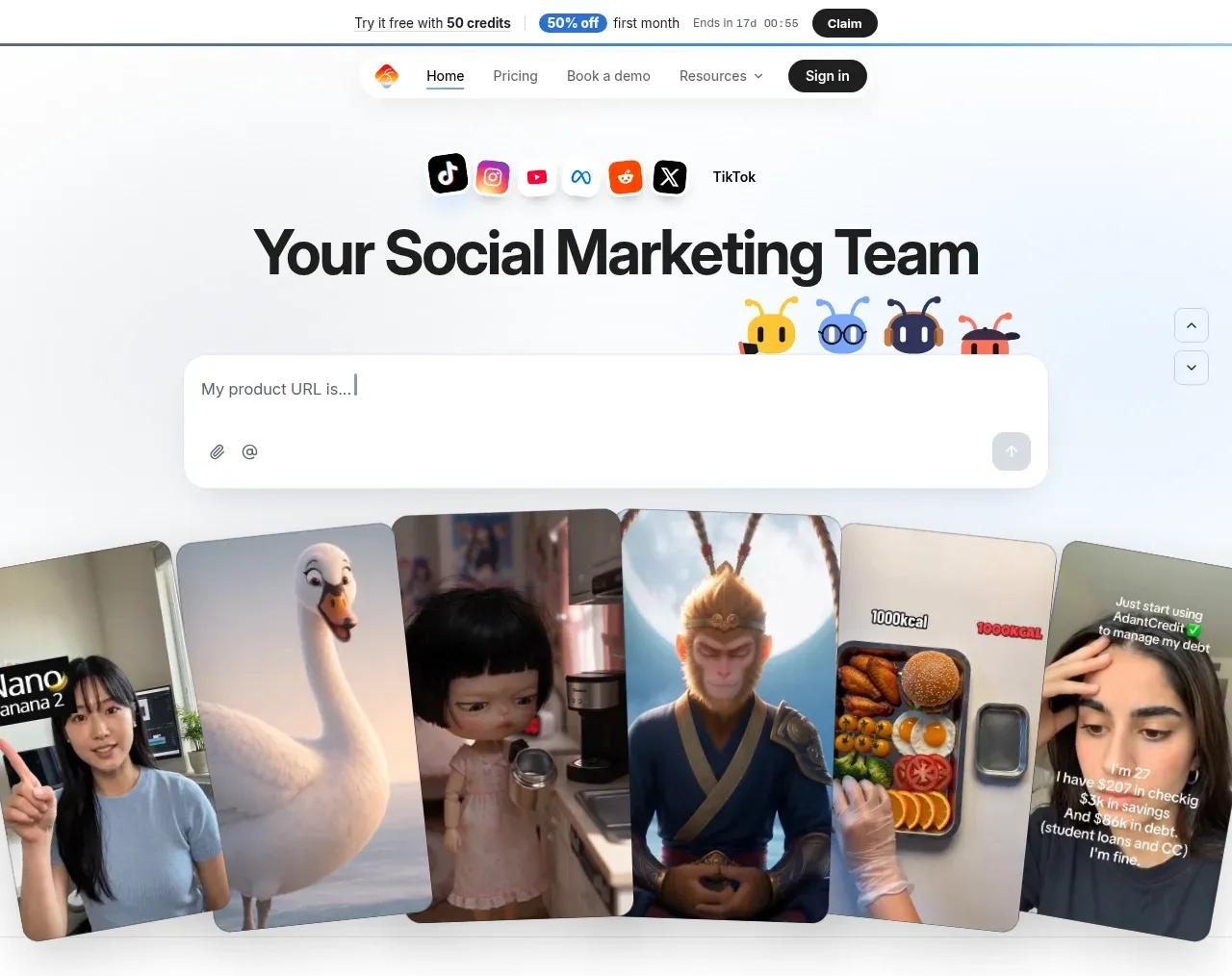 Social marketing team hero
AdAnt 2.0 · Hero
Social marketing team hero
AdAnt 2.0 · Hero
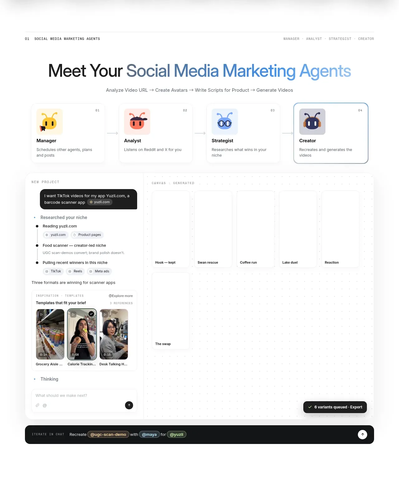 Agent team workspace
AdAnt 2.0 · Feature grid
Agent team workspace
AdAnt 2.0 · Feature grid
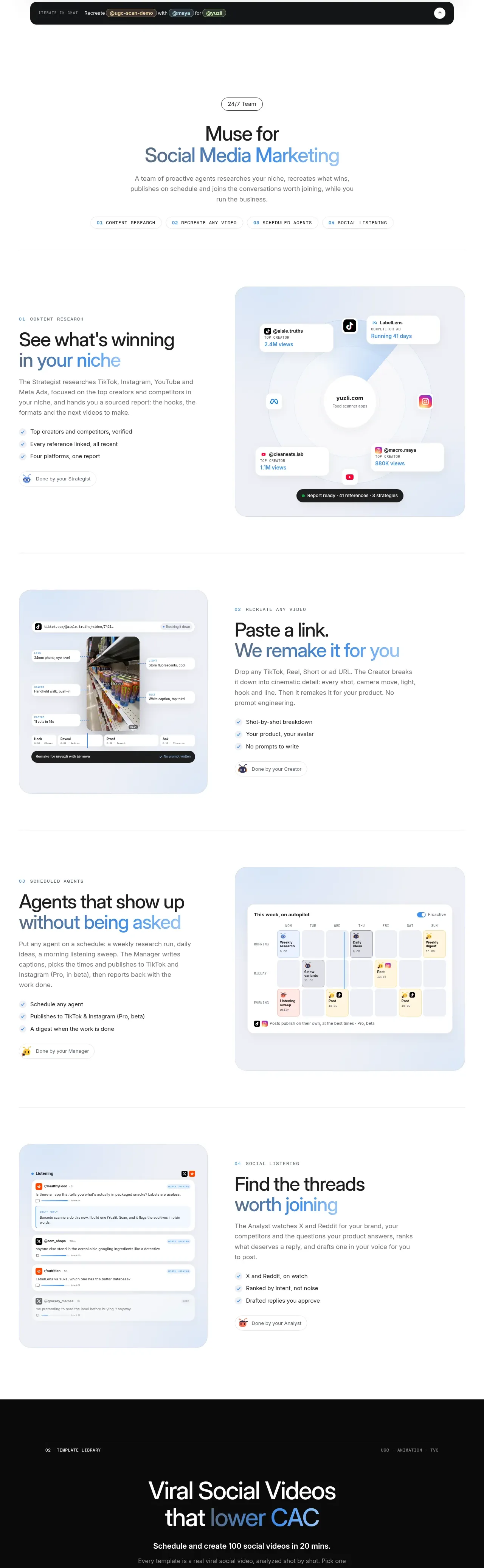 Research and automation capabilities
AdAnt 2.0 · Feature grid
Research and automation capabilities
AdAnt 2.0 · Feature grid
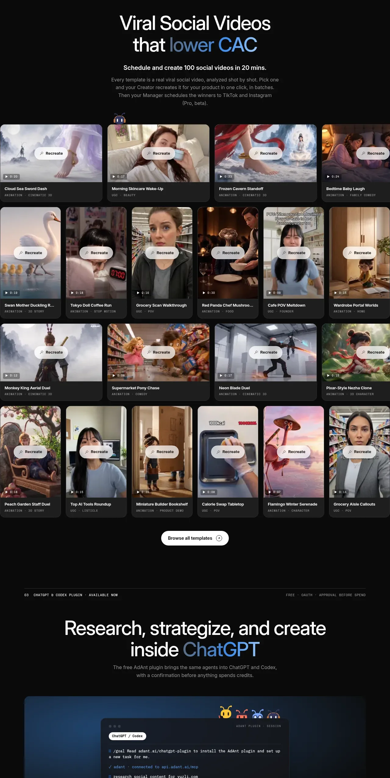 Template library gallery
AdAnt 2.0 · Gallery
Template library gallery
AdAnt 2.0 · Gallery
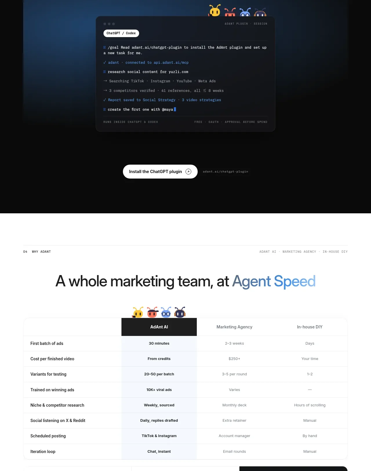 Chat workspace plugin showcase
AdAnt 2.0 · Code block
Chat workspace plugin showcase
AdAnt 2.0 · Code block
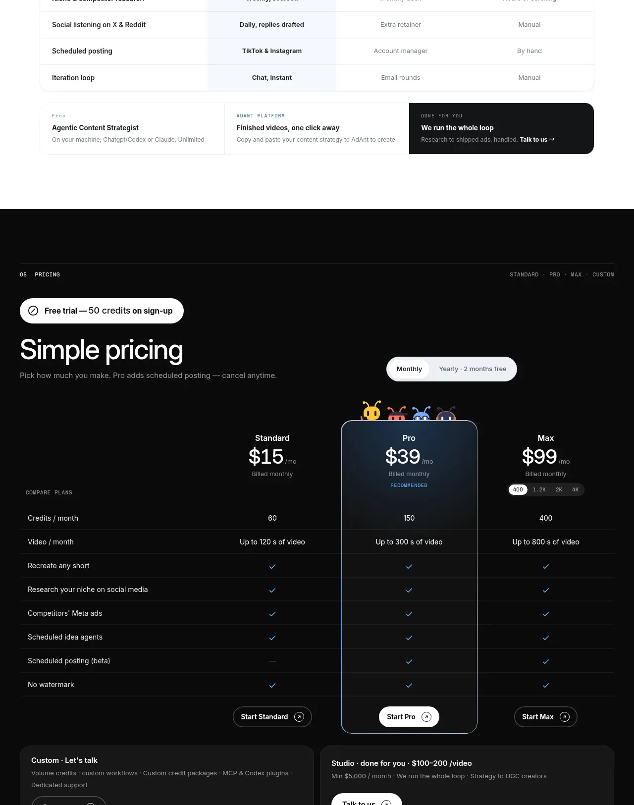 Capability comparison table
AdAnt 2.0 · Table
Capability comparison table
AdAnt 2.0 · Table
 Three-tier pricing
AdAnt 2.0 · Pricing table
Three-tier pricing
AdAnt 2.0 · Pricing table
 Frequently asked questions
AdAnt 2.0 · FAQ
Frequently asked questions
AdAnt 2.0 · FAQ