kage
kage
agentcraft.ai
Design analysis
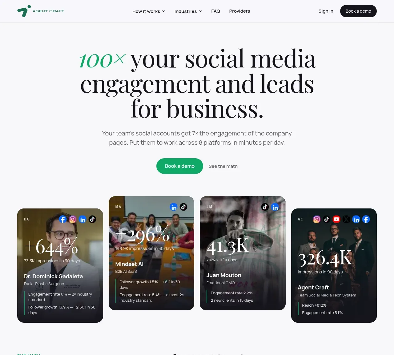
The hero uses an oversized editorial headline, a short explanatory paragraph, two actions, and a row of dark testimonial/result cards to make the promise tangible.
Prompt preview
## Reference images

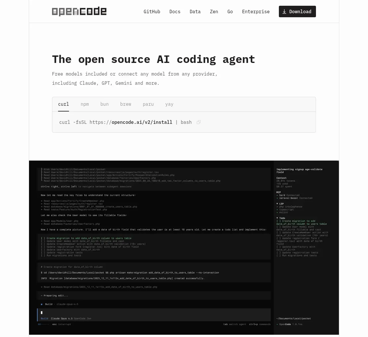
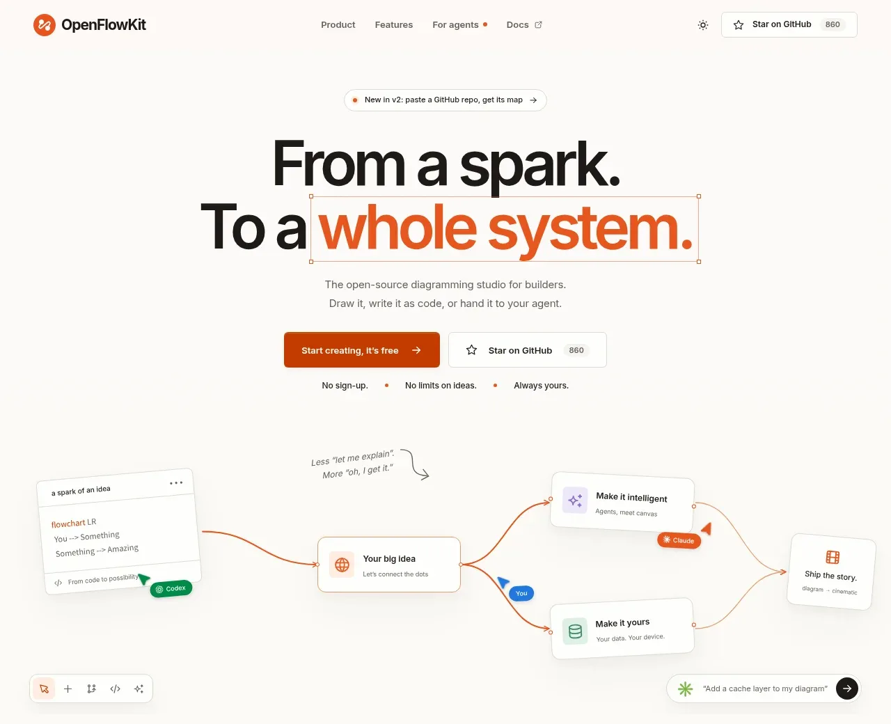
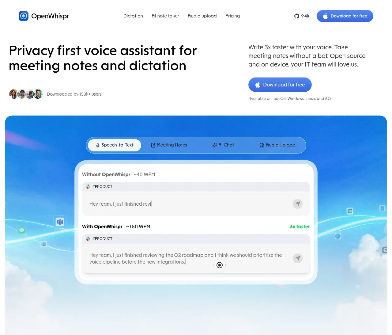
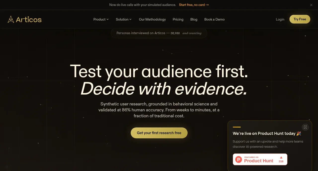
Study these alongside the description below: hierarchy, rhythm, spacing, colour. Build for the product you are asked about, using this design language.

- Component: https://kage-design-assets.t3.tigrisfiles.io/components/agent-craft/d8105fc6-c65e-46ba-b702-5f209216873d-1791957788-1.webp
- Full page it was cut from: https://kage-design-assets.t3.tigrisfiles.io/screenshots/agent-craft/d8105fc6-c65e-46ba-b702-5f209216873d-1791957724400-full.webp
- Component on Kage: https://kage.design/component/agent-craft-hero

## Before you start
Ask what the user's product and brand are, then apply these principles to that product rather than copying the reference.

Create a centered hero directly below navigation. Use a large high-contrast serif or display headline in 56–72px with a selectively italic or accent-colored phrase, followed by a 16px muted paragraph constrained to about 500px. Place a filled green pill CTA beside a quiet text link. Below it, add a generous horizontal row of 4 unevenly tall social-proof/result cards: dark translucent surfaces, rounded 18–22px corners, compact avatars or platform chips, very large metric numerals, and short supporting labels. Use an off-white background (#fafafd), charcoal type (#16161a), green accent (#129f73), and near-black cards (#18181d) with white text. Maintain centered alignment, 48–72px vertical gaps, and responsive horizontal scrolling or a two-column stack on mobile. Cards may use user-provided media only, with readable overlays and clear contrast.

### Never
- Never reuse logos, product names, copy, illustrations, or imagery from the reference.
- Never claim fabricated metrics or use decorative cards that obscure the product promise.