kage
kage
agentcraft.ai

Design analysis
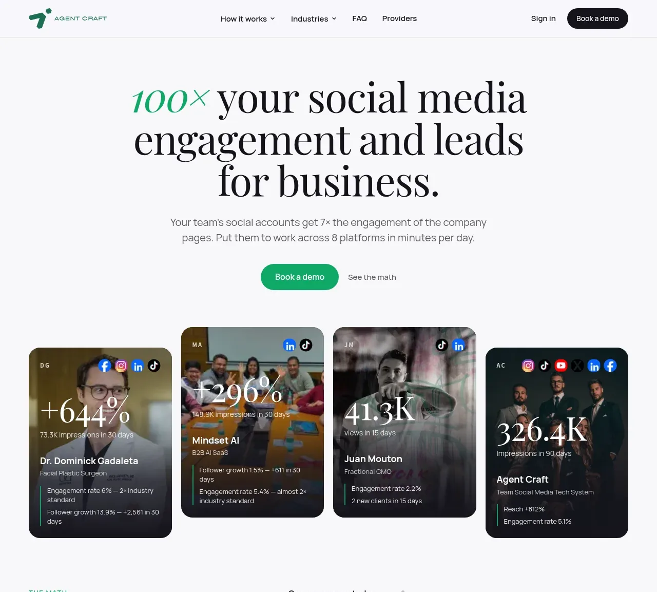
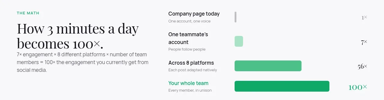
An editorial B2B marketing page on a warm off-white ground, pairing a high-contrast serif display face with a compact sans and a single vivid green accent used only for eyebrows, deltas, bullets and CTAs. The hero states one number — 100× — then spends the rest of the page proving it: four dark photographic result cards, a 1×→7×→56×→100× bar chart, a footnoted four-card "real numbers" grid, and paired 1×/7× comparison cards. Rhythm alternates airy centered statements with dense data cards and large rounded feature panels holding phone and dashboard mockups, before a full-bleed black CTA inverts the palette ahead of a two-column FAQ accordion and a quiet link-column footer.
Prompt preview
## Reference images

Study these alongside the description below: hierarchy, rhythm, spacing, colour. Build for the product you are asked about, using this design language.

- Full page: https://kage-design-assets.t3.tigrisfiles.io/screenshots/agent-craft/d8105fc6-c65e-46ba-b702-5f209216873d-1791957724400-full.webp
- Above the fold: https://kage-design-assets.t3.tigrisfiles.io/screenshots/agent-craft/d8105fc6-c65e-46ba-b702-5f209216873d-1791957719453.webp
- Design on Kage: https://kage.design/designs/agent-craft-landing-page

## Before you start
Ask the user what they are building, who it is for, and what brand assets they already have (name, colours, typefaces, logo). Wait for the answers. Everything below is a design language to apply to *their* product, not the reference site.

## Page structure
1. **Header** — logo left; four nav links (two with dropdown carets) centre; "Sign in" text link and a dark pill "Book a demo" right. Off-white background, hairline bottom border.
2. **Hero** — centred serif headline (~72–88px) with the key metric ("100×") in italic green inside the sentence; sans subhead in muted grey; one green pill primary CTA plus a quiet text link beside it.
3. **Proof cards** — four dark photographic cards in a row: row of small platform icons on top, oversized serif stat ("+644%", "326.4K"), person/company name, then 2–3 tiny metric rows with green left-border ticks. Real people, real numbers.
4. **The math** — left: green uppercase eyebrow, serif headline ("How 3 minutes a day becomes 100×."), short explanatory paragraph; right: horizontal bar chart with four progressively wider green bars labelled 1× → 7× → 56× → 100×.
5. **Real numbers** — eyebrow + serif headline, then four white stat cards (big serif figure, green delta, sub-metrics in small grey text) and a small footnoted paragraph explaining the measurement window.
6. **Metric strip** — four inline facts ("3 min a day · 8 platforms · 1–1,000 teammates · 1 review queue") separated by thin dividers, no boxes.
7. **Why it works** — large rounded panel: left column with eyebrow, serif headline ("People follow people, not logos.") and paragraph; right column stacks two comparison cards, a plain white "1×" company card against a green "7×" person card.
8. **Mobile app** — phone mockup left (green status bar, "Today's prompt" card, content feed, recording pill, tab bar with the key action highlighted); right: eyebrow, serif headline, paragraph, three green-bullet points.
9. **Dashboard** — mirrored layout: text left with three bullets, browser-framed dashboard screenshot right showing a queue of post cards with approval states.
10. **Three steps** — centred serif headline ("Three minutes. Then it's handled."), then three bordered white cards each with a small green numbered circle, a bold step name and a two-line description.
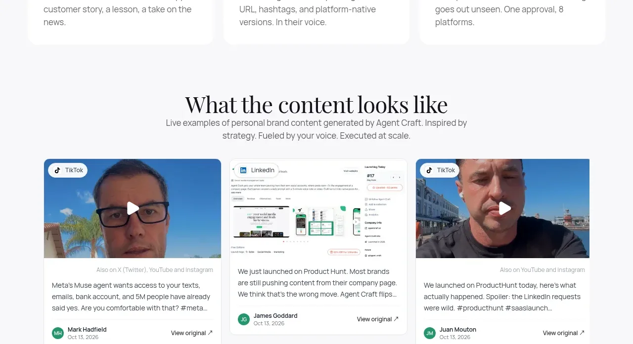
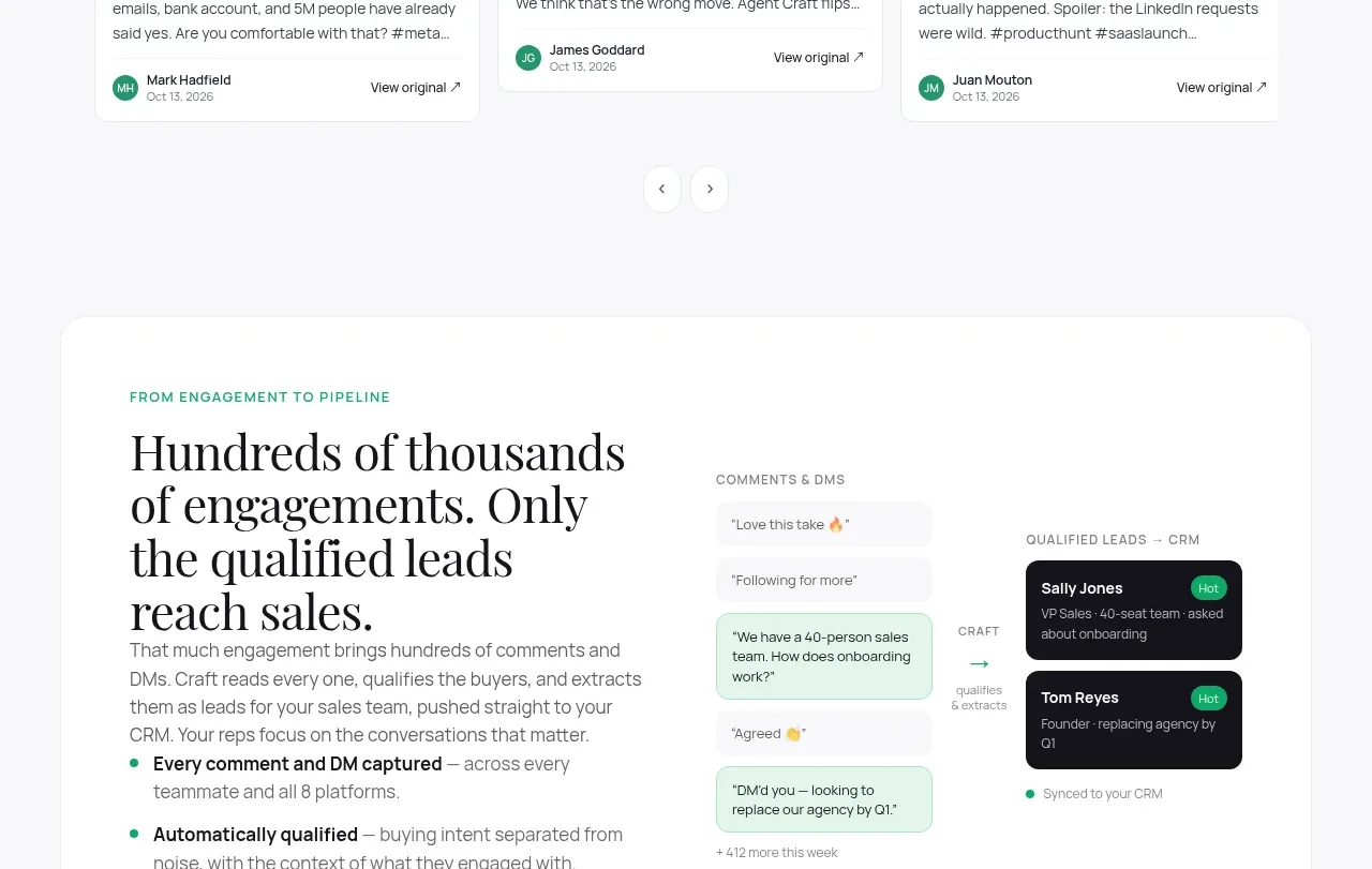
11. **Content examples** — centred serif headline + subtext, then three sample-post cards (video card, screenshot card, video card) each with caption text, author avatar/date row and "View original ↗" link; carousel arrows beneath.
12. **Pipeline panel** — large rounded panel: left column with eyebrow, serif headline and three green bullets; right column a visual flow: grey chat bubbles → a highlighted green bubble → "CRAFT qualifies & extracts" annotation → two dark CRM lead cards with HOT badges.
13. **Dark CTA** — full-bleed near-black band, centred serif headline with one green italic word ("your"), one-line subtext, white pill CTA, and a small reassurance link underneath.
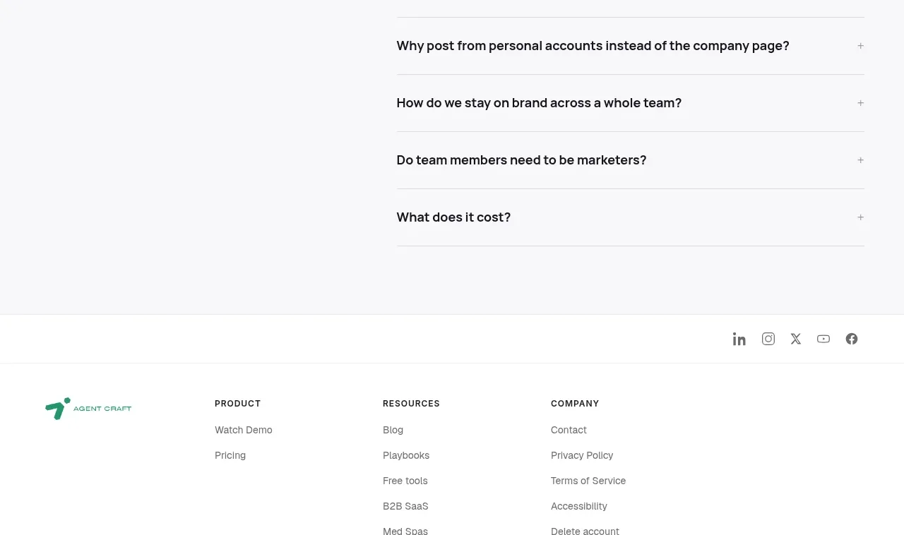
14. **FAQ** — two columns: left intro (eyebrow "FAQ", serif headline, one-line helper text); right an accordion with hairline dividers, the first question expanded by default, +/− toggles on the rest.
15. **Footer** — social icons right-aligned on top, then logo plus three link columns (Product / Resources / Company), closing with a legal bar: copyright left, Privacy · Terms · Cookies right.

## Design language
- **Type pairing**: an elegant high-contrast transitional serif for all display type (hero ~72–88px, section heads ~40–48px, stat figures ~40px, tight leading) against a neutral humanist sans at 15–16px/1.6 for body, 13–14px for UI captions. Reserve *italic serif* in the accent colour for exactly one word or number per headline — it is the page's signature move.
- **Colour**: warm off-white background (≈#FAFAF7), near-black text (≈#141414), muted grey secondary (≈#6B7280), one vivid green accent (≈#17A75C) used sparingly for eyebrows, deltas, bullets, bar fills, one highlighted card and primary CTAs. Dark surfaces (≈#0F1512) appear only twice: the proof cards and the closing CTA band. No gradients.
- **Eyebrow system**: every section opens with an 11–12px uppercase, letter-spaced, green sans label, then the serif headline — this keeps long-page navigation legible.
- **Numbers-first hierarchy**: every claim is backed by a figure; figures always set in the serif at large size with green deltas; explanations stay small and grey so data carries the weight.
- **Cards and borders**: 16–24px radius on stat/step cards with 1px hairline borders and no shadows; very large radius (28–32px) rounded panels for feature sections; dark proof cards use photography under darkened overlays with white serif stats.
- **Buttons**: fully rounded pills only — green fill primary, dark fill in the header, white fill on the dark band, plain text links for secondary actions.
- **Rhythm down the page**: alternate airy centred statements (lots of whitespace, no boxes) with dense data rows and boxed panels; mirror left/right between mockup sections; drop the full-bleed dark section at ~85% down for contrast, then end quiet and light in the FAQ/footer.
- **Data visuals**: flat horizontal bars that widen with the claim, green fill on light ground; comparison patterns use explicit "1×" vs "7×" badges on stacked cards.
- **Motion**: restrained — accordion expand/collapse, card hover lift, carousel arrows; nothing animated in the hero.

## Never
No logos, wordmarks, product names, copy, illustrations, photography or icon sets from the reference; never present the result as that product.
Components from this page
All components
 Minimal product navigation
Agent Craft · Navigation
Minimal product navigation
Agent Craft · Navigation
 Social proof hero with result cards
Agent Craft · Hero
Social proof hero with result cards
Agent Craft · Hero
 Time-to-impact comparison
Agent Craft · Chart
Time-to-impact comparison
Agent Craft · Chart
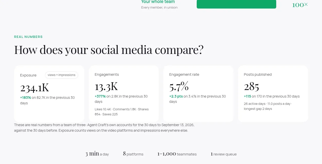 Real-number metric cards
Agent Craft · Stats
Real-number metric cards
Agent Craft · Stats
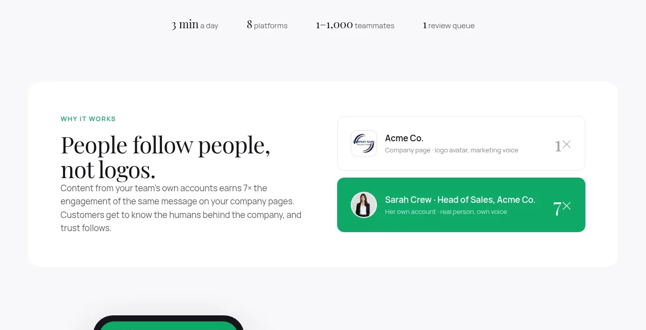 People over logos principle
Agent Craft · Card
People over logos principle
Agent Craft · Card
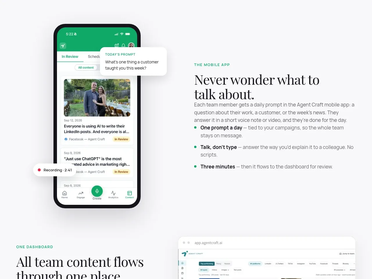 Mobile capture workflow
Agent Craft · Feature grid
Mobile capture workflow
Agent Craft · Feature grid
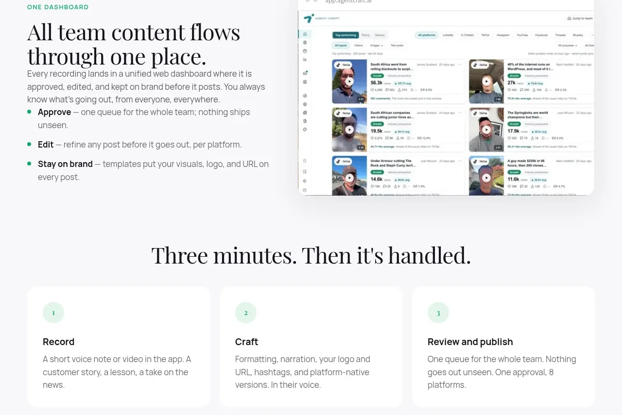 Unified dashboard workflow
Agent Craft · Feature grid
Unified dashboard workflow
Agent Craft · Feature grid
 Three-step operating model
Agent Craft · Feature grid
Three-step operating model
Agent Craft · Feature grid
 Content examples gallery
Agent Craft · Gallery
Content examples gallery
Agent Craft · Gallery
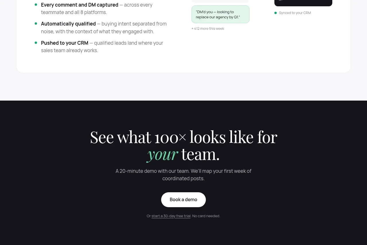 Engagement-to-pipeline flow
Agent Craft · Card
Engagement-to-pipeline flow
Agent Craft · Card
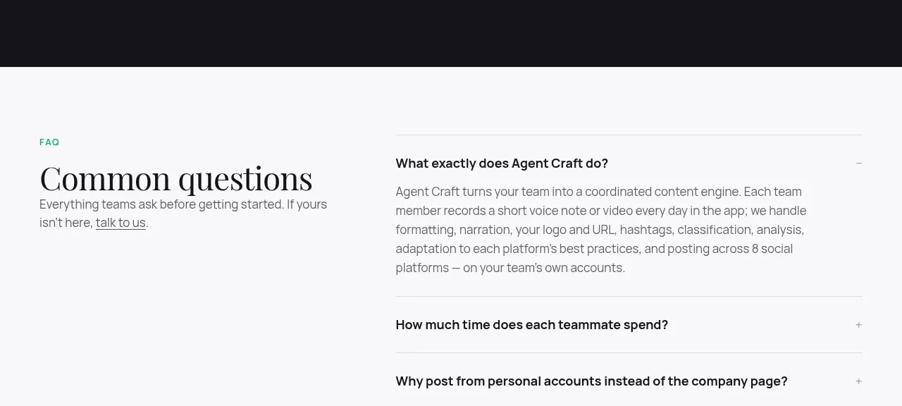 High-contrast demo CTA
Agent Craft · Call to action
High-contrast demo CTA
Agent Craft · Call to action
 Common questions accordion
Agent Craft · FAQ
Common questions accordion
Agent Craft · FAQ