 kage
kage
opencode.ai
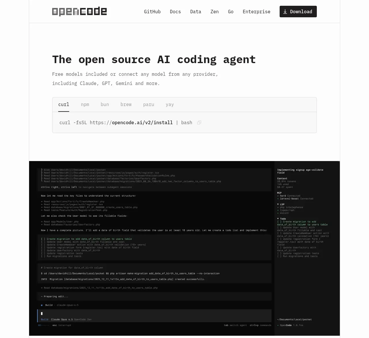
Design analysis
The hero combines a plainspoken value proposition, multi-package install tabs, and a large dark terminal/product preview to make the tool immediately understandable and actionable.
Prompt preview
## Reference images

Study these alongside the description below: hierarchy, rhythm, spacing, colour. Build for the product you are asked about, using this design language.

- Component: https://kage-design-assets.t3.tigrisfiles.io/components/opencode-2-0/565a21f1-5840-46fe-9e23-a71210513fd4-1791957896-1.webp
- Full page it was cut from: https://kage-design-assets.t3.tigrisfiles.io/screenshots/opencode-2-0/565a21f1-5840-46fe-9e23-a71210513fd4-1791957827568-full.webp
- Component on Kage: https://kage.design/component/opencode-2-0-hero

## Before you start
Ask what the user's product is, what action matters most, and what brand system to use. Then adapt this structure to the user's product.

Create a spacious monochrome hero for a developer tool. Stack a bold technical headline, one short supporting sentence, an installation command panel with package-manager tabs, and a large dark terminal or workspace preview. Use a narrow centered content column inside a wide max-width section; align every element to the same left edge. Give the heading a 30–36px heavy monospace or technical font, supporting text 13–15px in medium gray, and command tabs a small uppercase-or-monospace treatment. Use an off-white #fafafa page, faint #e5e5e5 borders, a #f5f5f5 command panel with 6px radius, and a near-black #090909 preview with subtle inset borders. Make tabs keyboard accessible and let the install command update when a tab changes. On small screens, keep the preview scrollable rather than shrinking unreadable text.

Never: use the reference logo, product name, copy, illustrations, or imagery.
More components
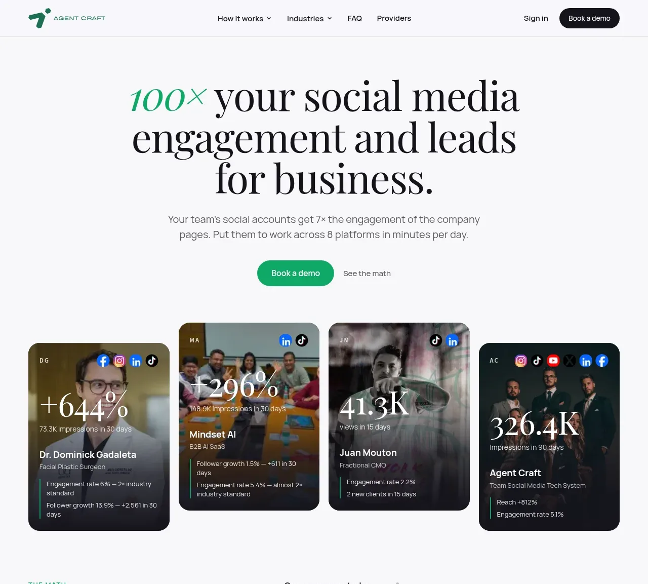
 Social proof hero with result cards
Agent Craft · Hero
Social proof hero with result cards
Agent Craft · Hero
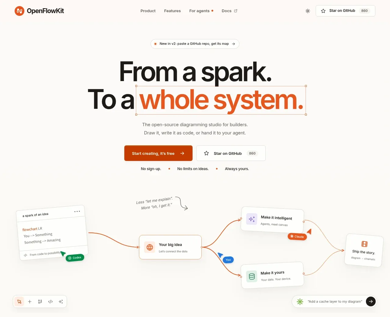
 Product positioning hero
OpenFlowKit 2 · Hero
Product positioning hero
OpenFlowKit 2 · Hero
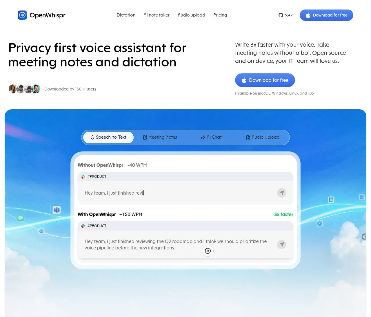
 Privacy-first voice assistant hero
OpenWhispr for iOS · Hero
Privacy-first voice assistant hero
OpenWhispr for iOS · Hero
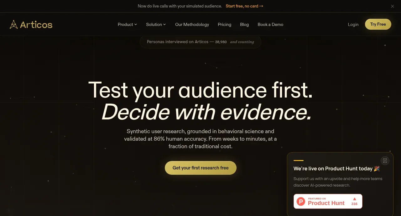
 Evidence-led research hero
Articos MCP · Hero
Evidence-led research hero
Articos MCP · Hero
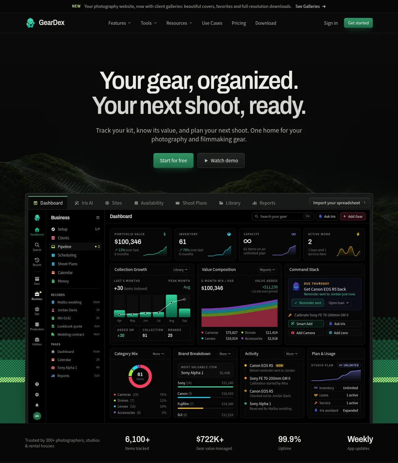
 Product promise hero with dashboard preview
geardex.app · Hero
Product promise hero with dashboard preview
geardex.app · Hero

 Driving-story hero
Milepost · Hero
Driving-story hero
Milepost · Hero