 kage
kage
openflowkit.com
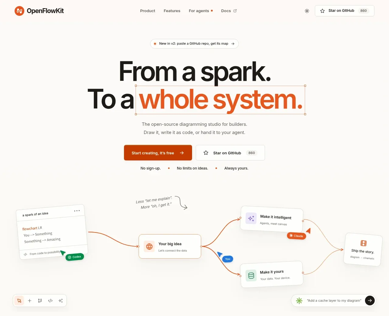
Design analysis
The hero uses an oversized two-line statement with a single orange-emphasis phrase, concise supporting copy, paired CTAs, and a lightweight product workflow visual below.
Prompt preview
## Reference images

Study these alongside the description below: hierarchy, rhythm, spacing, colour. Build for the product you are asked about, using this design language.

- Component: https://kage-design-assets.t3.tigrisfiles.io/components/openflowkit-2/3de20331-4179-415d-a7ba-29915155b155-1791957759-1.webp
- Full page it was cut from: https://kage-design-assets.t3.tigrisfiles.io/screenshots/openflowkit-2/3de20331-4179-415d-a7ba-29915155b155-1791957697393-full.webp
- Component on Kage: https://kage.design/component/openflowkit-2-hero

## Before you start
Ask what the user's product does, who the ideal user is, and what single transformation the hero should communicate. Apply these principles to that product and brand.

Create a centered landing-page hero directly below the navigation. Use a warm off-white background (`#fbfaf7`), a tiny announcement pill above the heading, and a very large bold sans-serif headline around 52–64px with tight line-height (0.92–1.0). Put the most emotionally important phrase in a vivid burnt orange (`#d94b16`) while keeping the rest near-black (`#11110f`). Add one short explanatory paragraph in muted gray (`#6f6b65`), then a primary orange button and a secondary white outlined button. Place a compact reassurance row beneath the buttons. Finish the hero with a spacious, low-contrast workflow/diagram preview: rounded white cards, faint gray borders, thin orange connector lines, and tiny labels. Keep the composition airy and centered, with generous top and bottom whitespace and no heavy drop shadows.

Never use the reference's logo, product name, copy, illustrations, imagery, or exact diagram content.
More components
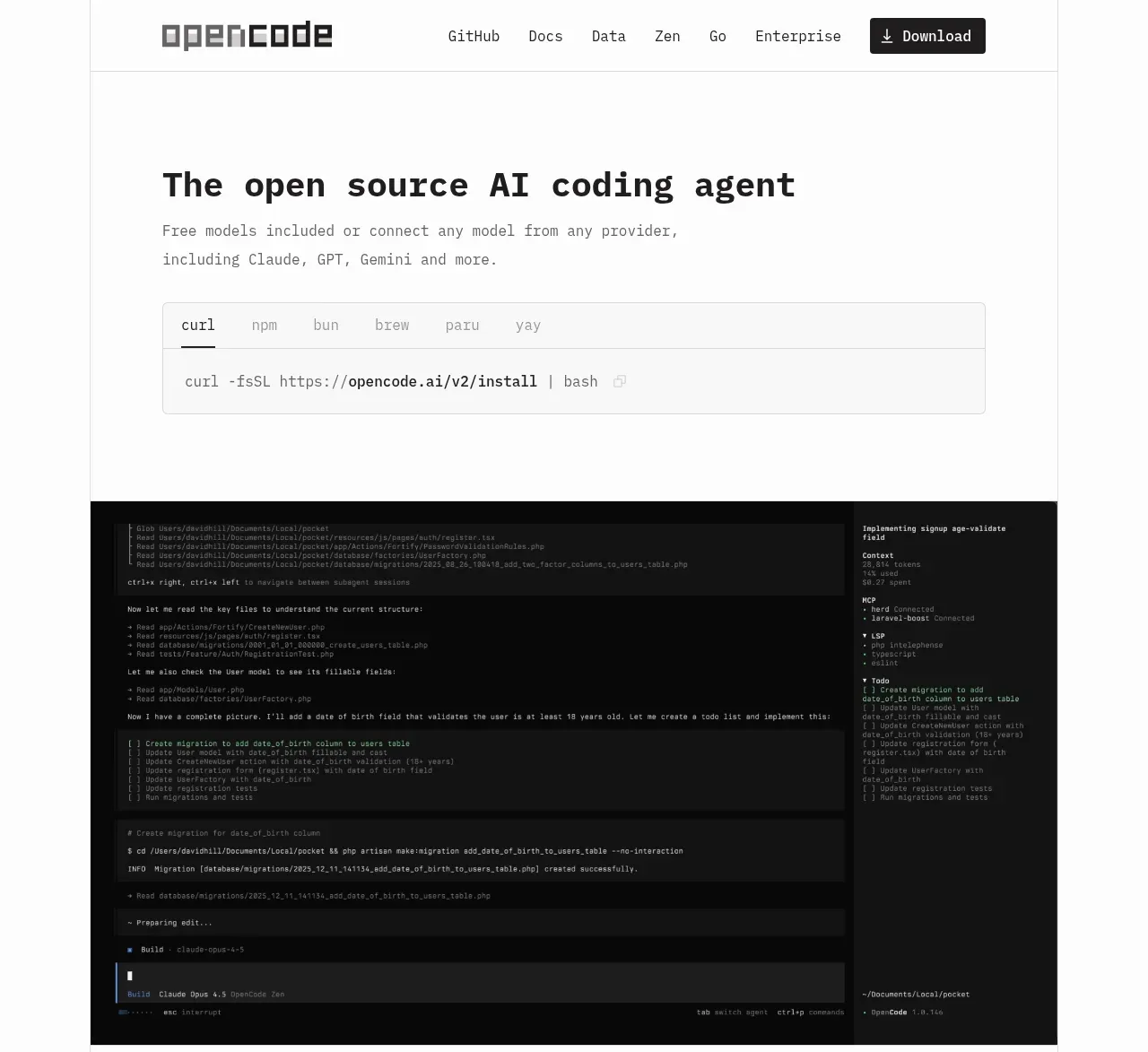
 Terminal-first product hero
OpenCode 2.0 · Hero
Terminal-first product hero
OpenCode 2.0 · Hero
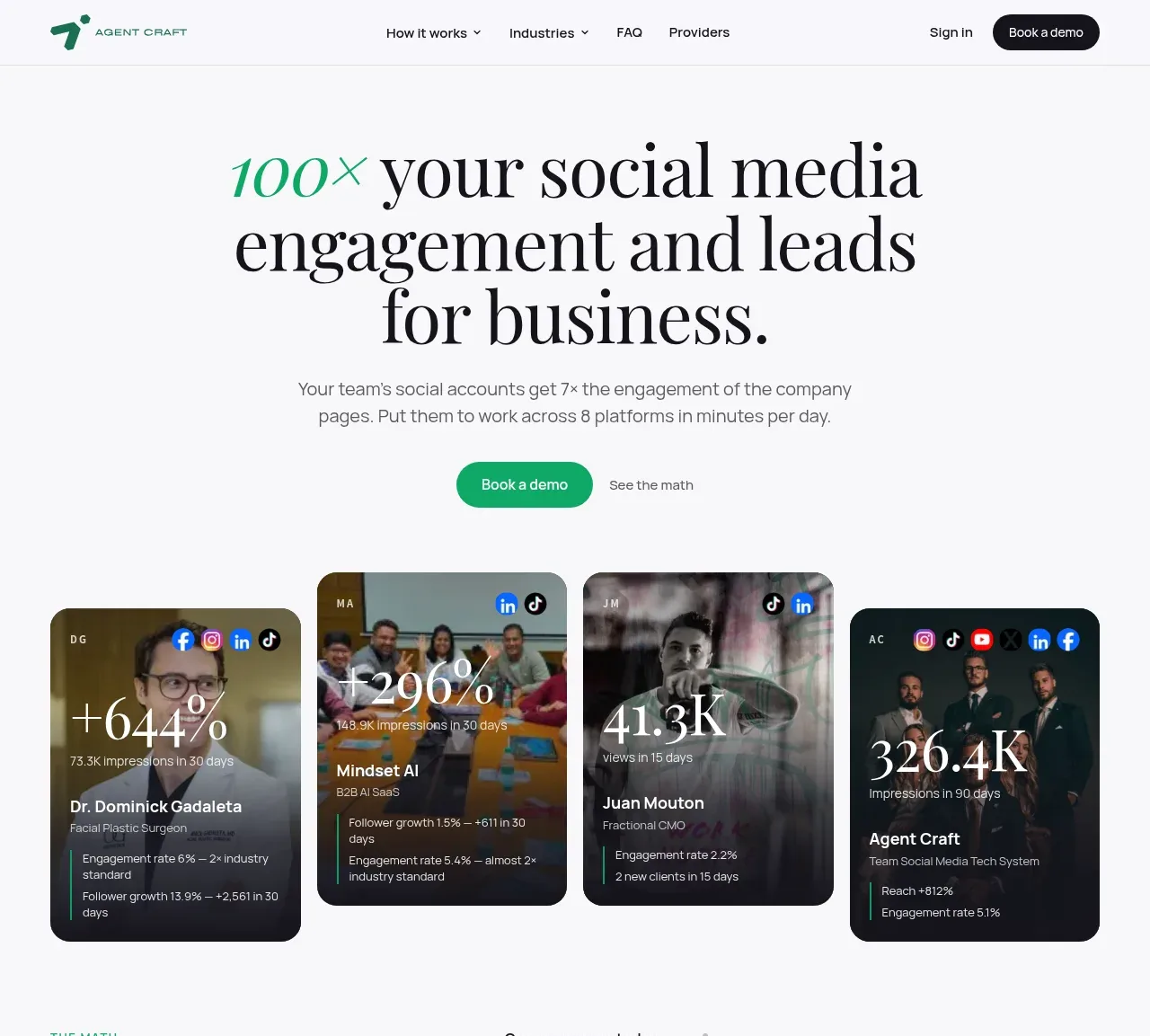
 Social proof hero with result cards
Agent Craft · Hero
Social proof hero with result cards
Agent Craft · Hero
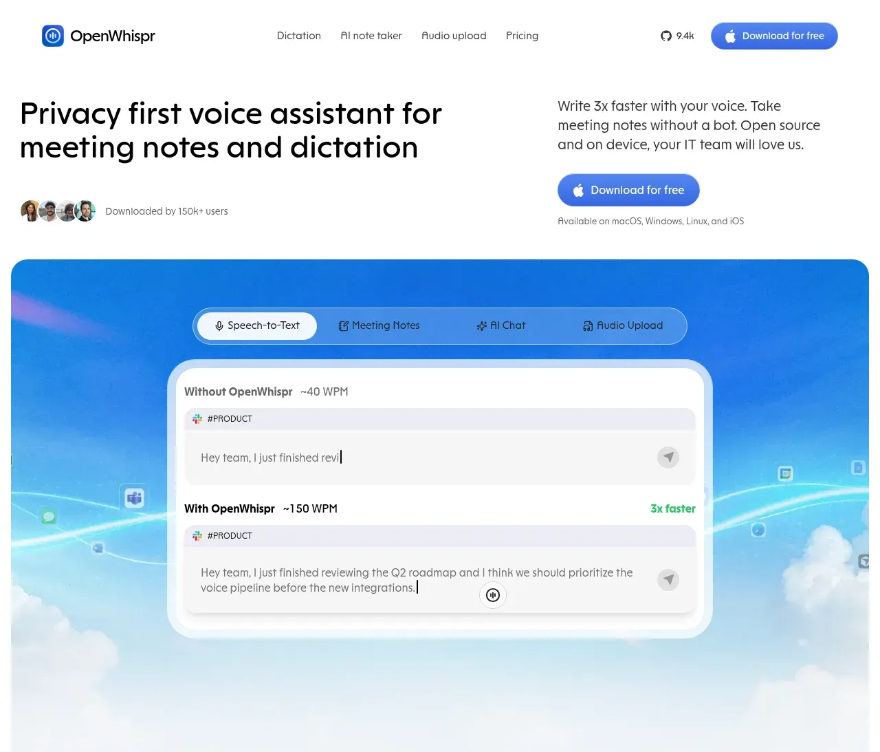
 Privacy-first voice assistant hero
OpenWhispr for iOS · Hero
Privacy-first voice assistant hero
OpenWhispr for iOS · Hero

 Evidence-led research hero
Articos MCP · Hero
Evidence-led research hero
Articos MCP · Hero
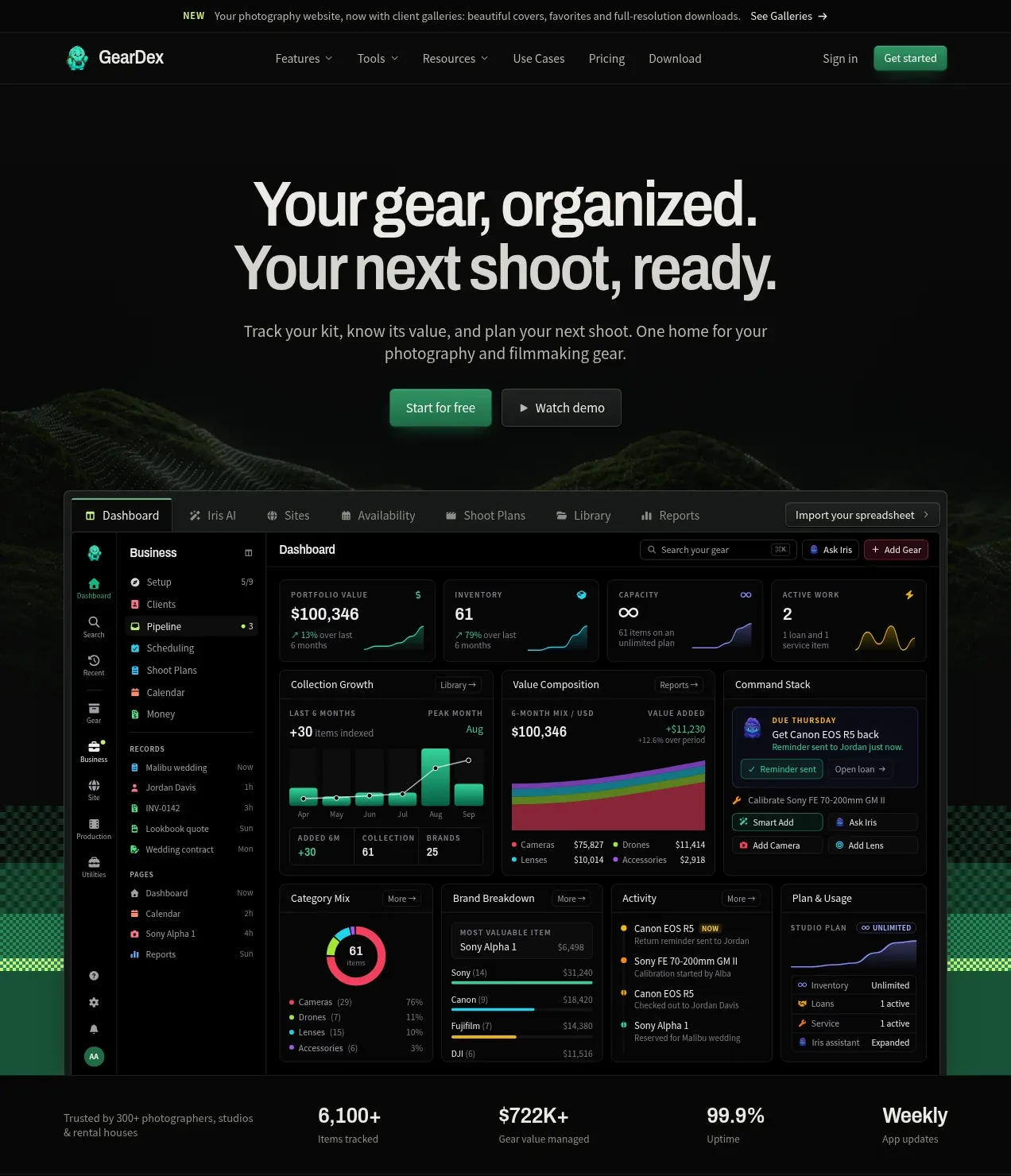
 Product promise hero with dashboard preview
geardex.app · Hero
Product promise hero with dashboard preview
geardex.app · Hero

 Driving-story hero
Milepost · Hero
Driving-story hero
Milepost · Hero