kage
kage
milepost.club
Design analysis
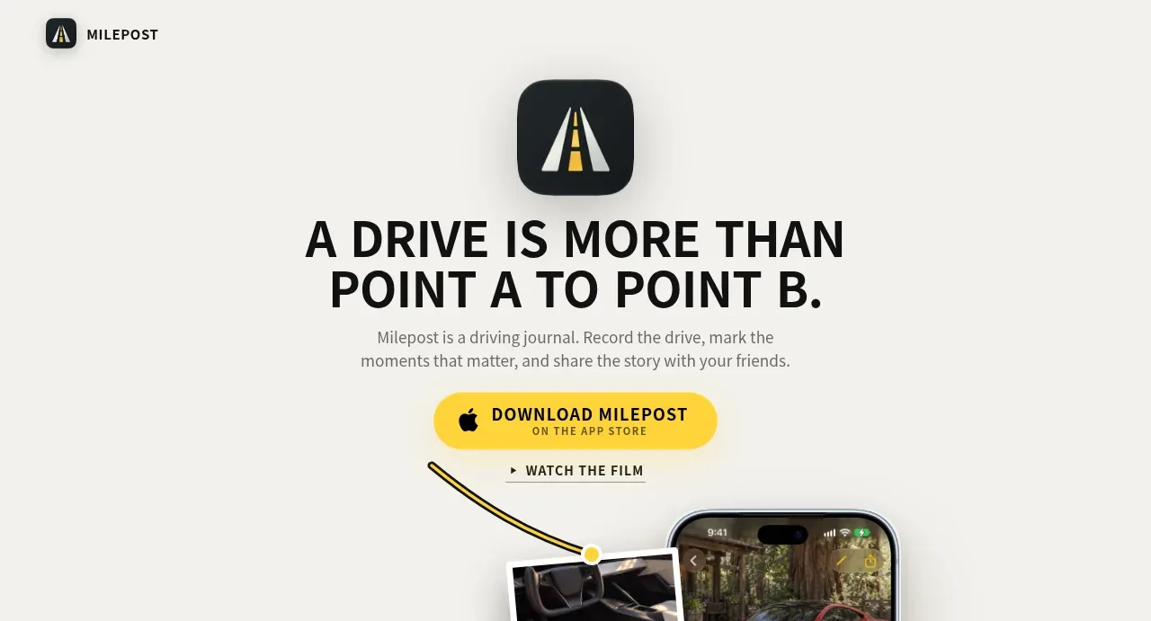
A centered, high-contrast headline and short explanation lead directly to the primary app-download action, with a secondary film link creating an editorial entry point.
Prompt preview
## Reference images

Study these alongside the description below: hierarchy, rhythm, spacing, colour. Build for the product you are asked about, using this design language.

- Component: https://kage-design-assets.t3.tigrisfiles.io/components/milepost/daa1b44b-e646-4a0f-860e-b6d9c76440c8-1791871476-1.webp
- Full page it was cut from: https://kage-design-assets.t3.tigrisfiles.io/screenshots/milepost/daa1b44b-e646-4a0f-860e-b6d9c76440c8-1791871382204-full.webp
- Component on Kage: https://kage.design/component/milepost-hero

## Before you start
Ask what the user's product is, what single promise should lead the page, and what primary conversion matters most. Apply these principles to that product and brand.

Create a centered hero beneath the navigation on a warm off-white canvas (#f4f3ef). Place a compact rounded app/product mark above an oversized uppercase headline, followed by one or two restrained lines of supporting copy. Use a heavy geometric sans-serif, near-black #111315, tight headline line-height around 0.95–1.05, and muted gray body copy around #777873. Make the primary action a bright warm-yellow pill/button around #ffd43d with bold dark text and generous horizontal padding; add a quieter underlined or text-based secondary action below it. Keep the vertical rhythm intentional: mark, headline, copy, primary CTA, secondary CTA, with 18–28px gaps. Center all content and provide responsive type scaling.

Never: use logos, product names, copy, illustrations or imagery from the reference.