 kage
basedash.com

Design analysis
A high-whitespace transition band centers a large statement that introduces the next group of product capabilities.
Prompt preview
## Reference images

Study these alongside the description below: hierarchy, rhythm, spacing, colour. Build for the product you are asked about, using this design language.

- Component: https://kage-design-assets.t3.tigrisfiles.io/components/basedash-view-only-members/6dbd0b50-cdba-4977-b7dc-6a7ba68a352e-1793253918-4.webp
- Full page it was cut from: https://kage-design-assets.t3.tigrisfiles.io/screenshots/basedash-view-only-members/6dbd0b50-cdba-4977-b7dc-6a7ba68a352e-1793253800610-full.webp
- Component on Kage: https://kage.design/component/basedash-view-only-members-banner

## Before you start
Ask what the user's product does and what broad promise should introduce its main capabilities. Match the answer to its brand voice.

Build a transitional statement band with a centered, maximum-width headline and ample whitespace above and below. Use a large 36–42px near-black sans-serif headline with tight line-height, optionally wrapping to two lines, and no supporting UI or decorative imagery. Keep the background white and let the typography carry the moment. On small screens, reduce the headline to 30–34px while preserving comfortable side padding.

Never: use logos, product names, copy, illustrations, or imagery from the reference.
More components
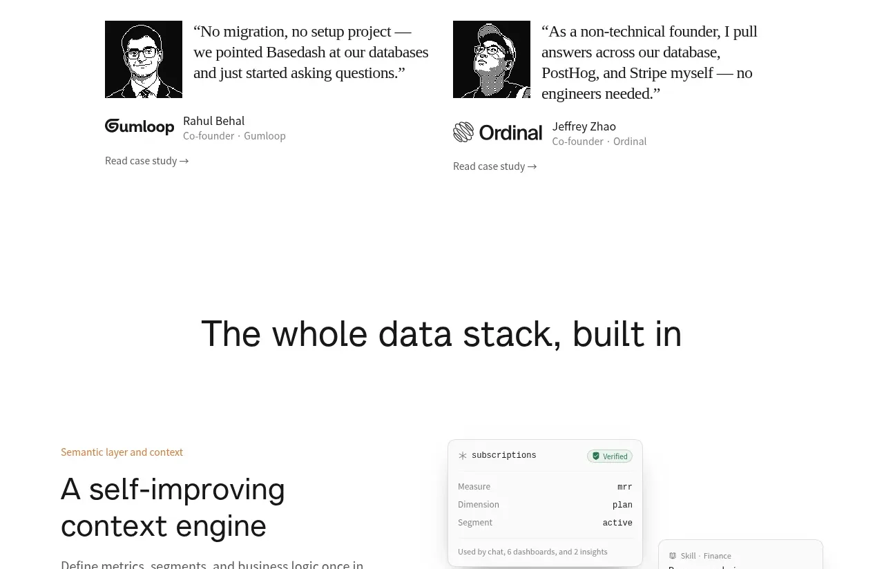
 Data stack introduction
Basedash View-only members · Banner

 Product Hunt announcement bar
Zro: Uncensored Security Models · Banner

 Early-adopter offer banner
Flyweel · Banner

 Product Hunt announcement bar
Takweem AI · Banner

 Product Hunt announcement bar
Incredible · Banner
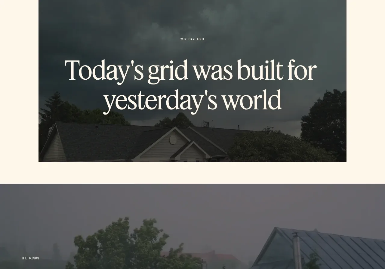
 Risks statistic banner
godaylight.com · Banner