kage
kage
arsaze.com

Design analysis
A near-black editorial landing page pairs oversized high-contrast serif headlines with restrained sans-serif labels and body copy. The hero establishes the product with a large timeline screenshot, then the page develops through four numbered feature sections with alternating text and full-width interface captures, followed by compact capability cards, a three-step workflow, an eight-item feature grid, FAQ rows, and a final rounded CTA; faint borders, low-contrast panels, and selective magenta/red glows keep the long page cohesive without adding visual noise.
Prompt preview
## Reference images

Study these alongside the description below: hierarchy, rhythm, spacing, colour. Build for the product you are asked about, using this design language.

- Full page: https://kage-design-assets.t3.tigrisfiles.io/screenshots/arsaze/e4f15c51-7821-4e39-ba4c-e316208d7c18-1790748036683-full.webp
- Above the fold: https://kage-design-assets.t3.tigrisfiles.io/screenshots/arsaze/e4f15c51-7821-4e39-ba4c-e316208d7c18-1790748032799.webp
- Design on Kage: https://kage.design/designs/arsaze-landing-page

## Before you start
Ask the user what they are building, who it is for, and what brand assets they already have (product name, logo, colours, type choices, imagery, and other constraints). Wait for their answers before designing. Apply the reference's structure and design language to their product, not to Arsaze, and use their own content and assets.

## Page structure
1. **Top navigation:** Use a compact black header with a small brand mark at left, centered or grouped navigation links, a small status/time display if useful to the product, and subdued login text plus a bright pill CTA on the right.
2. **Hero:** Center a small credibility badge above a very large two-line serif headline, followed by a tiny uppercase eyebrow, a concise explanatory paragraph, primary and secondary pill buttons, and a low-contrast reassurance line.
3. **Hero product preview:** Place a large rounded, dark-framed product screenshot directly below the hero. Let it dominate the first viewport and add only a subtle red/magenta ambient glow beneath it.
4. **Integration strip:** Add a small uppercase caption and a horizontal row of supported tools, partners, or formats in muted gray, keeping this section sparse and centered.
5. **Feature-introduction heading:** Introduce the main product story with a small red/magenta section label and a centered editorial serif statement with an italicized second phrase.
6. **Feature 01 — rewrite:** Use a two-column heading/copy row: numbered micro-label and large serif promise on the left, explanatory sans-serif copy and compact feature chips on the right. Follow it with a wide rounded screenshot of the text-based editing interface.
7. **Feature 02 — playground:** Repeat the same text-and-chip structure, then show a wide dark screenshot of a node or prompt graph. Preserve the repeated rhythm while changing the interface imagery.
8. **Feature 03 — color:** Present the grading feature with the same two-column editorial row and a full-width screenshot of color wheels, LUTs, or visual presets.
9. **Feature 04 — reviewer:** Present the review/commenting feature with the same layout, then show a wide screenshot of media playback with pinned comments and a review sidebar.
10. **Dual-engine section:** Use a smaller section label, a large left-aligned serif heading with italic contrast, and a short paragraph. Below, place two equal bordered cards side by side: each combines a visual preview area with an engine label, title, and description.
11. **Generation section:** Add another left/right editorial heading row, then a three-column card grid for distinct media-generation capabilities. Give each card a dark preview block or restrained gradient swatches, followed by a title, description, and small model/category pills.
12. **How-it-works section:** Use a large editorial heading and a single three-column bordered strip. Number each step, then show a short bold title and compact explanatory copy; keep the cells separated by fine vertical rules.
13. **Editor-capabilities section:** Introduce the breadth of the product with a heading and supporting paragraph, then use an eight-item, two-row grid. Each cell has a number, concise bold title, and short description, with fine borders and no heavy card shadows. Add a small inline link row beneath the grid.
14. **FAQ:** Center a small section label and serif heading, then present a narrow accordion list. Use horizontal rules, large readable questions, plus icons for collapsed rows, and one expanded answer with a close icon.
15. **Final CTA:** Place a large rounded dark panel with a subtle red/magenta glow near the bottom. Center a two-line serif headline with an italic second line, short supporting copy, and primary/secondary pill buttons.
16. **Footer:** Finish with a thin top divider, four sparse link columns, another divider, then a small brand mark and copyright at left with a login link at right.

## Design language
- Build hierarchy through contrast in type scale rather than decoration: use oversized display serif headlines for the hero and section statements, medium serif subheads for feature promises, and compact neutral sans-serif for body copy, labels, navigation, and controls.
- Pair a high-contrast editorial serif with a clean sans-serif. Use tight display leading, generally 0.88–1.0em for large headings, and relaxed 1.45–1.65em leading for explanatory copy. Make selected second lines italic to create a recurring editorial cadence.
- Keep the canvas almost black, approximately `#050505` to `#090909`, with white headings around `#F2F0ED`, gray body text around `#929096`, and borders around `#242326`. Use a restrained accent range of deep crimson/magenta such as `#7D183C`, `#C51B55`, and occasional pink/red glow rather than broad saturated fills.
- Let colour signal interaction and emphasis: use off-white for primary CTA pills, near-black translucent fills for secondary buttons, and tiny magenta labels, chips, status dots, and gradients. Avoid making every section colourful.
- Change rhythm down the page: begin with a spacious, centered hero; move into large interface-led feature sections; compress into card grids and workflow tables; slow down again for the centered FAQ and spacious CTA/footer ending.
- Use a wide centered container with generous horizontal margins. Feature headings and copy sit in a two-column grid, while screenshots span almost the full content width. Keep vertical gaps large enough that each section reads as a distinct chapter.
- Frame screenshots as product evidence: use near-black browser-like shells, 1px gray borders, 10–14px corner radii, subtle inner contrast, and soft crimson ambient shadows. Do not add decorative mockups that compete with the interface.
- Treat cards and tables as quiet surfaces: use translucent black fills, thin outlines, minimal shadows, and restrained 10–14px radii. Use vertical and horizontal rules to organize the three-step strip and eight-item capability grid.
- Make controls compact and tactile: pill buttons, small uppercase labels with letter spacing, tiny chips, and clear hover states. Hover can brighten borders, lift a card by 1–2px, or add a faint accent glow; keep motion understated.
- If the implementation includes motion, use slow ambient glow movement and gentle reveal transitions for screenshots/cards. Avoid large parallax, bouncing elements, or autoplay behaviour that distracts from the editorial typography.
- Ensure the long page remains legible and responsive: stack the two-column feature rows and card grids on small screens, preserve the serif/sans hierarchy, and allow screenshots to scroll or crop without shrinking their interface details into illegibility.

## Never
- Do not use Arsaze's logo, wordmark, product name, tagline, copy, screenshots, illustrations, photography, interface content, or icon set.
- Do not reproduce the reference's exact text, partner names, model names, or branded UI labels.
- Do not present the result as Arsaze or imply an affiliation; replace every reference-specific asset and example with the user's own product content.
Components from this page
All components
 Minimal product navigation
Arsaze · Navigation
Minimal product navigation
Arsaze · Navigation
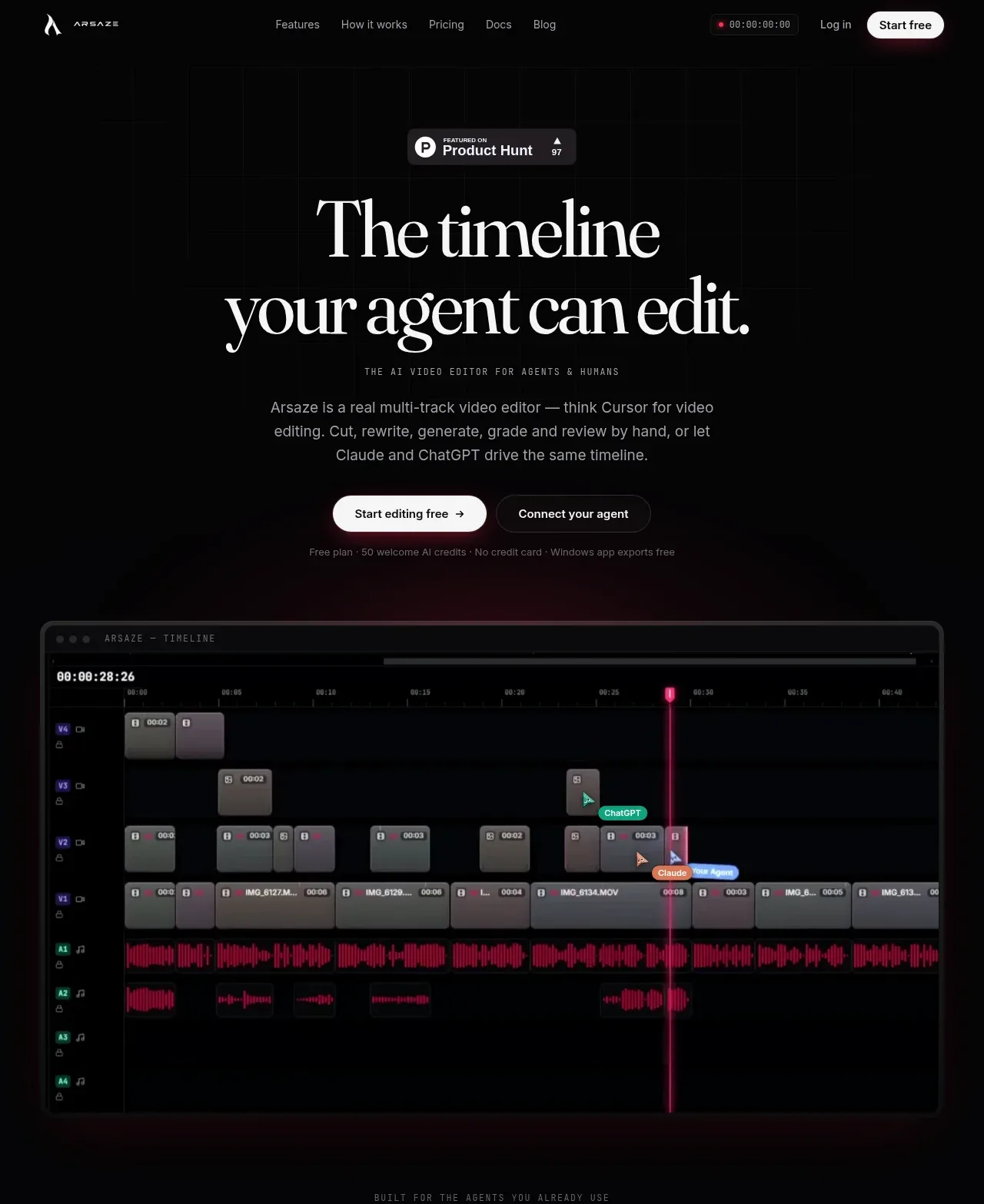 Editorial AI video hero
Arsaze · Hero
Editorial AI video hero
Arsaze · Hero
 Connected tools strip
Arsaze · Logo cloud
Connected tools strip
Arsaze · Logo cloud
 Post-production positioning statement
Arsaze · Banner
Post-production positioning statement
Arsaze · Banner
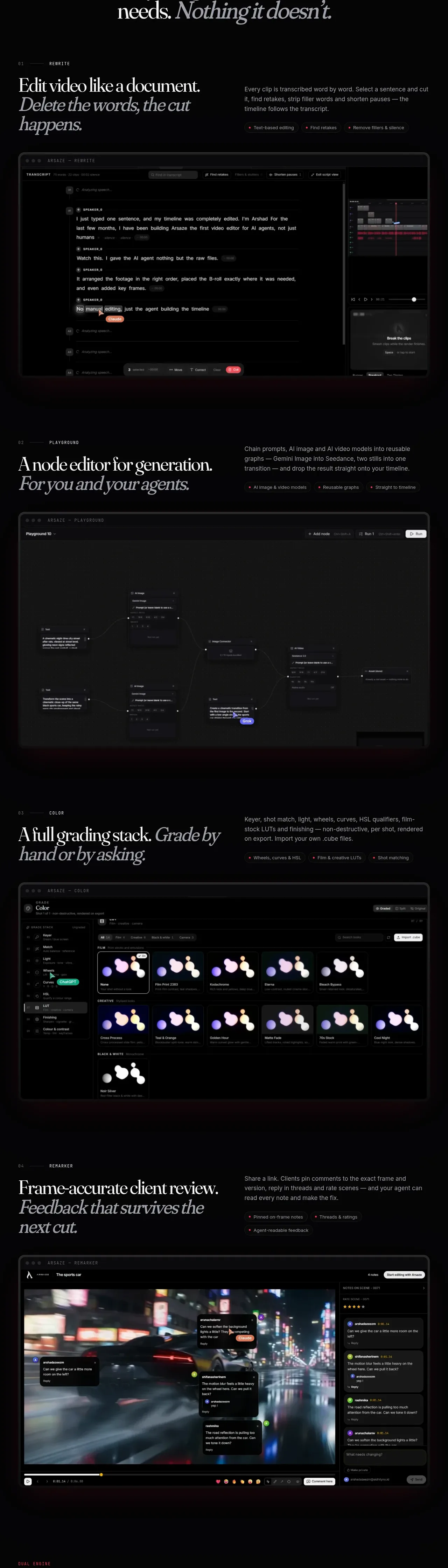 Core workflow feature modules
Arsaze · Feature grid
Core workflow feature modules
Arsaze · Feature grid
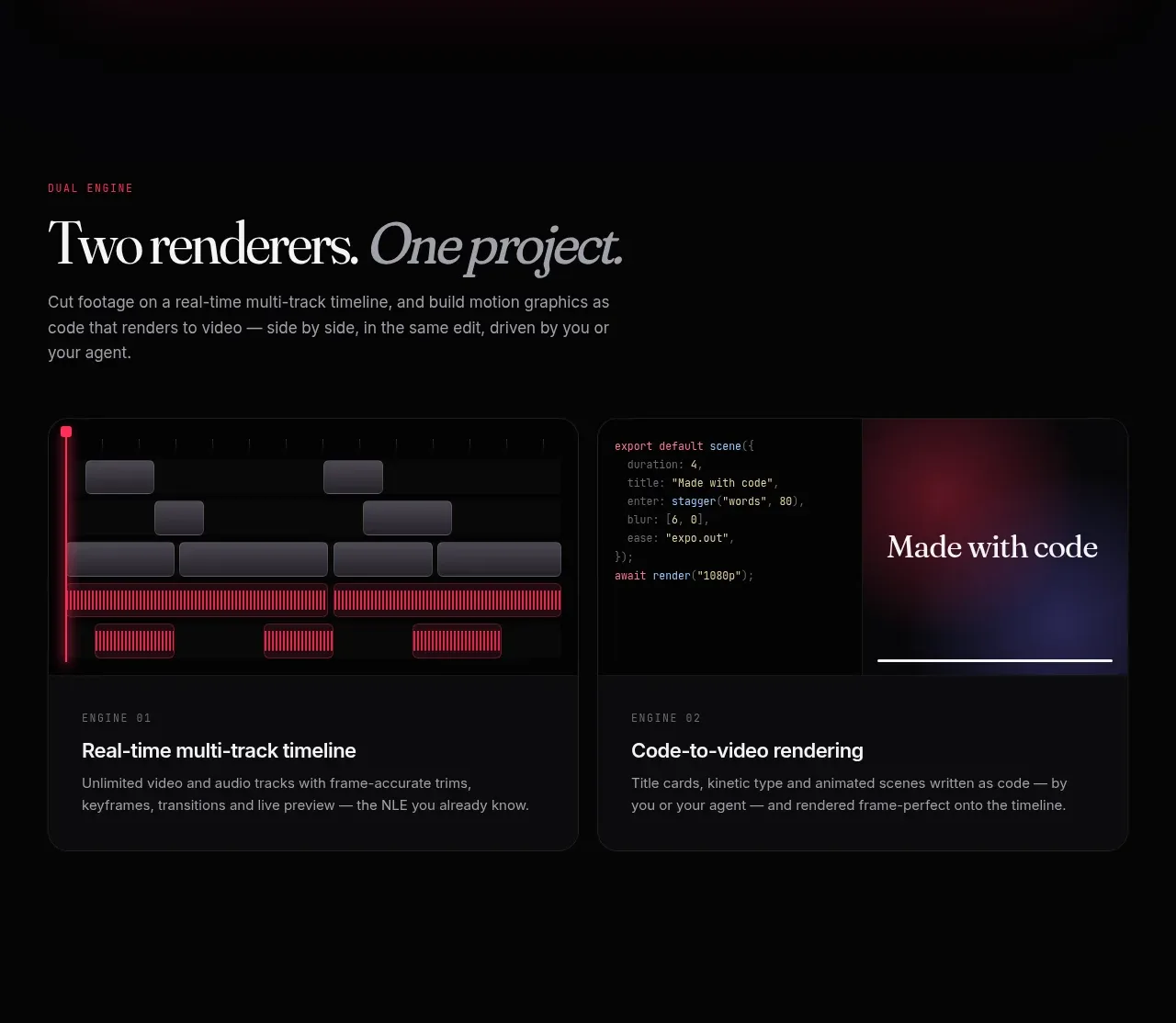 Dual-engine comparison cards
Arsaze · Card
Dual-engine comparison cards
Arsaze · Card
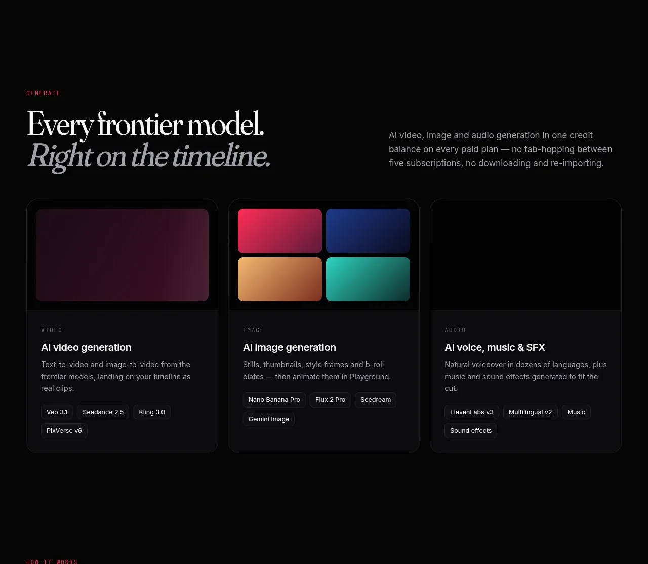 Generation model cards
Arsaze · Card
Generation model cards
Arsaze · Card
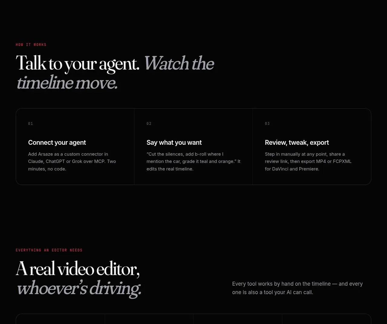 Three-step agent workflow
Arsaze · Card
Three-step agent workflow
Arsaze · Card
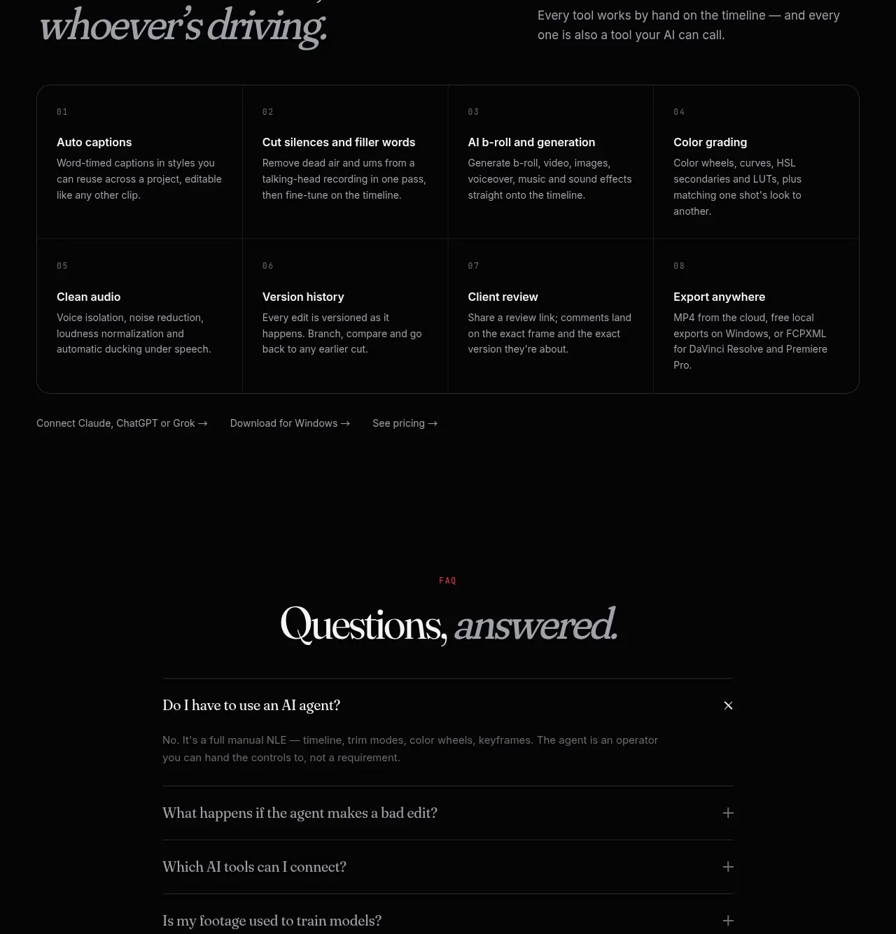 Manual editor capability matrix
Arsaze · Feature grid
Manual editor capability matrix
Arsaze · Feature grid
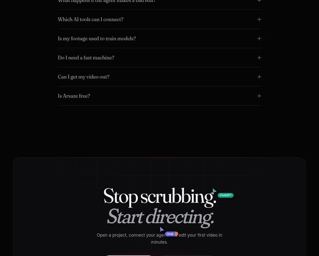 Questions and answers
Arsaze · FAQ
Questions and answers
Arsaze · FAQ
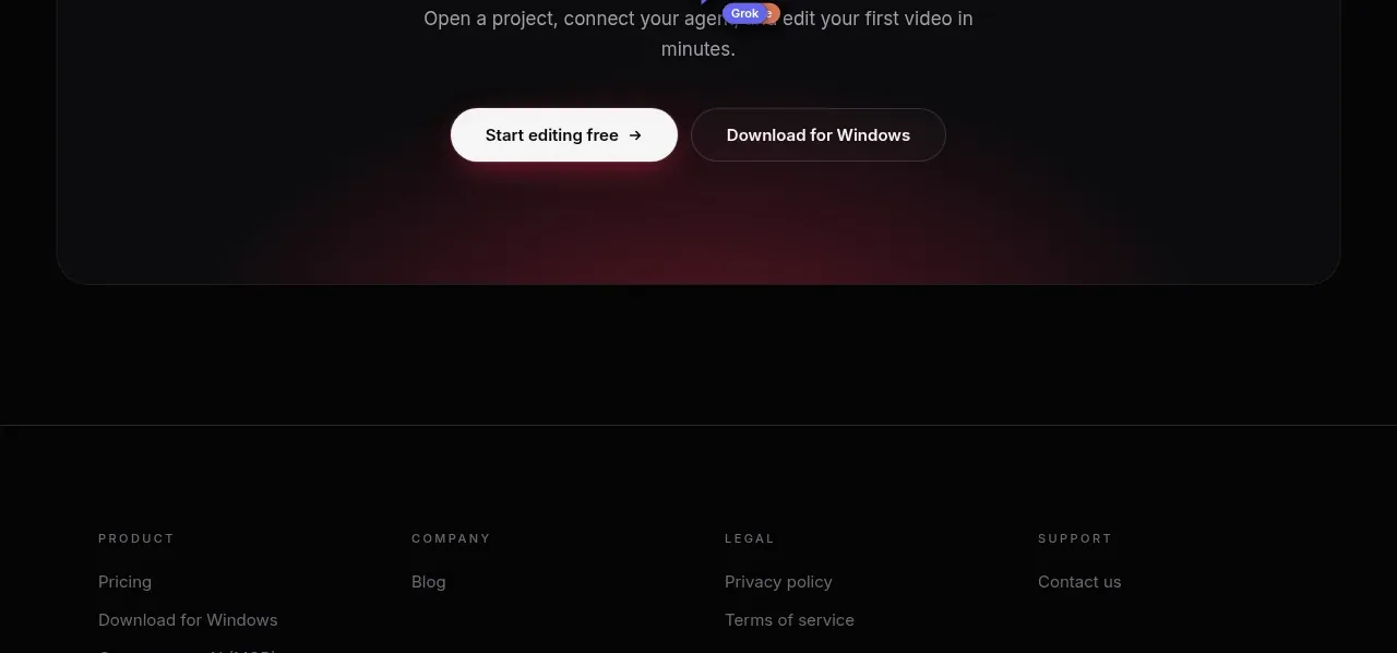 Final conversion panel
Arsaze · Call to action
Final conversion panel
Arsaze · Call to action
 Utility footer
Arsaze · Footer
Utility footer
Arsaze · Footer