kage
kage
articos.com

Design analysis
Three concise metrics establish value quickly, followed by a small trusted-by label and a low-contrast row of partner marks.
Prompt preview
## Reference images

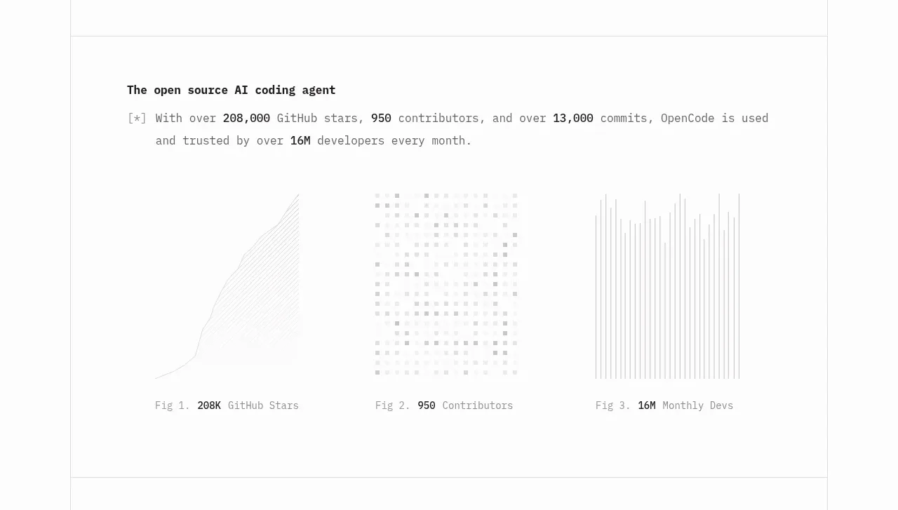
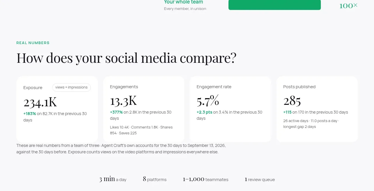
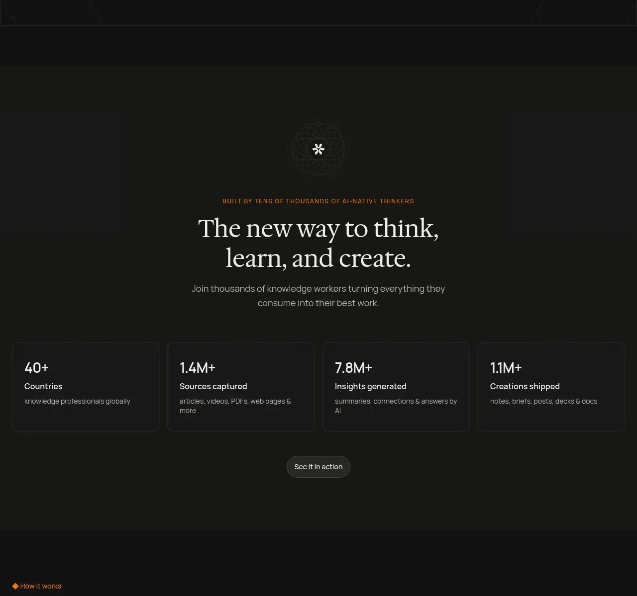
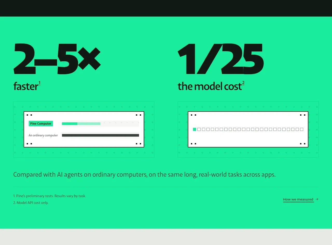
Study these alongside the description below: hierarchy, rhythm, spacing, colour. Build for the product you are asked about, using this design language.

- Component: https://kage-design-assets.t3.tigrisfiles.io/components/articos-mcp/b74b5a52-121a-40b3-9410-436e13736de5-1791957710-2.webp
- Full page it was cut from: https://kage-design-assets.t3.tigrisfiles.io/screenshots/articos-mcp/b74b5a52-121a-40b3-9410-436e13736de5-1791957659853-full.webp
- Component on Kage: https://kage.design/component/articos-mcp-stats

## Before you start
Ask what measurable outcomes the user's product can credibly claim and which customer or partner types may be shown. Adapt the structure to those facts.

Build a dark proof strip beneath a hero. Use `#0d0d0b` as the background, ivory labels, and muted gold for the large numbers (`#c7aa45`).

- Arrange three equal metric columns in a centered max-width container, separated by whitespace rather than heavy rules.
- Make the metric value 26–34px, with a short explanatory label below in 10–12px muted text.
- Include a small uppercase “trusted by” style label beneath the metrics and a horizontal logo-cloud region with evenly distributed, monochrome marks.
- Desaturate partner marks to approximately `#77746c` so they support rather than dominate the CTA.
- Use 64–88px vertical padding overall, with a subtle top or bottom hairline border around `#25231c`.
- Stack metrics to one column or a two-column grid on narrow screens; allow the logo row to wrap.

Never use logos, product names, copy, illustrations, or imagery from the reference.