 kage
kage
temprl.org
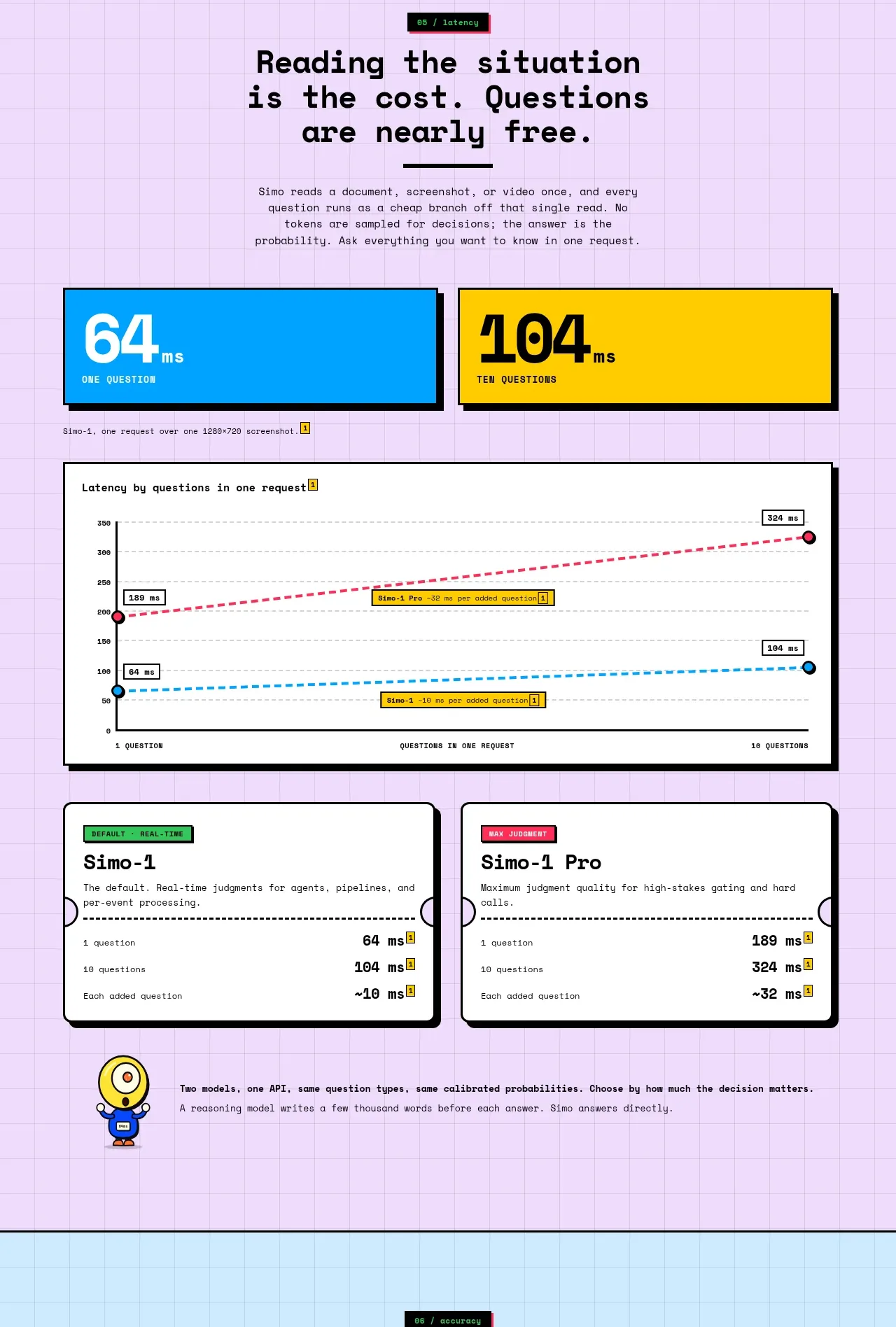
Design analysis
A lavender performance section opens with two large latency stat tiles, a framed comparison chart, and compact plan cards. The progression from headline numbers to evidence to options is easy to scan.
Prompt preview
## Reference images

Study these alongside the description below: hierarchy, rhythm, spacing, colour. Build for the product you are asked about, using this design language.

- Component: https://kage-design-assets.t3.tigrisfiles.io/components/simo/01913313-62ce-4f89-a048-ac4500929f0e-1791525858-6.webp
- Full page it was cut from: https://kage-design-assets.t3.tigrisfiles.io/screenshots/simo/01913313-62ce-4f89-a048-ac4500929f0e-1791525747684-full.webp
- Component on Kage: https://kage.design/component/simo-stats

### Before you start
Ask the user which performance metrics matter and what comparisons are fair for their product. Then apply these rules to build an original performance section.

Use a soft lavender grid background. Start with a centered heading and supporting copy, then place two oversized statistic tiles in a two-column row with bold numerals and contrasting accent fills. Follow with a large white chart panel: give it a clear title, labeled axes, a restrained grid, and 2–3 accessible line series with a legend and highlighted datapoints. Beneath, add two compact comparison cards for plans, configurations, or operating modes. Use thick dark outlines and hard shadows on the main tiles and chart, modest radius, and a technical monospace face for labels. Include responsive behavior: stack tiles and cards, preserve chart legibility, and provide text equivalents for the data.

Never: copy the reference's logo, product name, copy, illustrations, imagery, or exact measurements.
More components
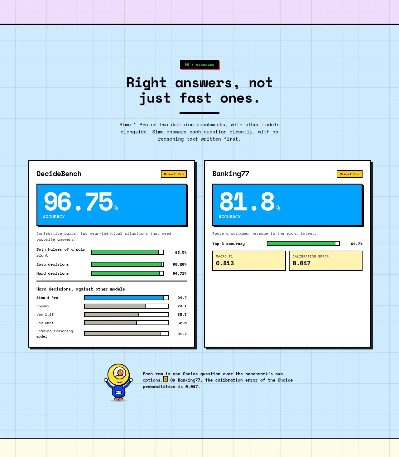
 Accuracy benchmark results
Simo · Stats
Accuracy benchmark results
Simo · Stats
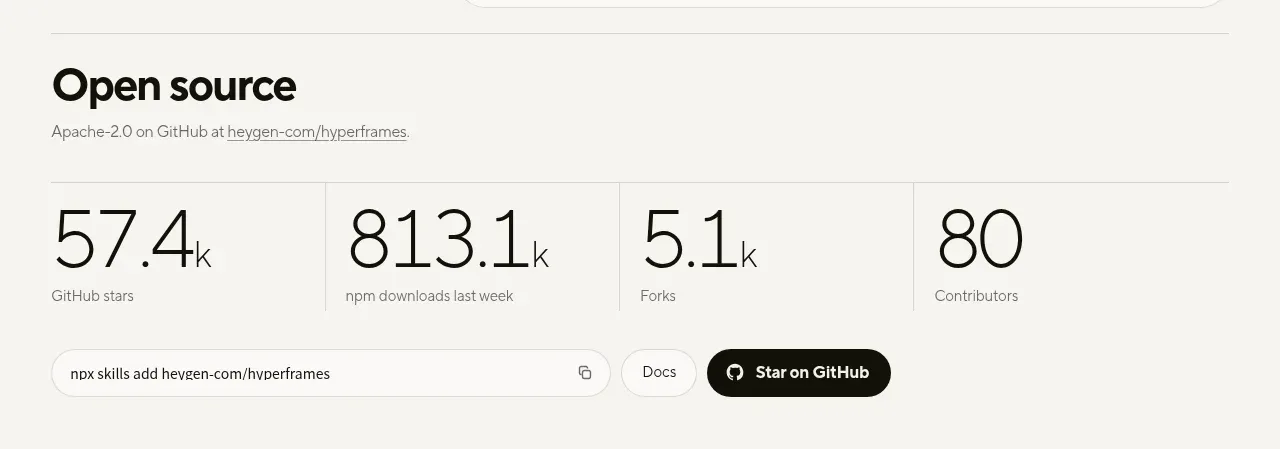
 Open-source proof and repository stats
HyperFrames Studio (Desktop) · Stats
Open-source proof and repository stats
HyperFrames Studio (Desktop) · Stats
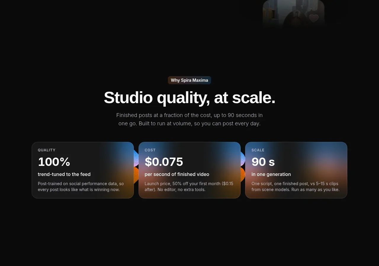
 Quality, cost, and scale metrics
Spira Maxima · Stats
Quality, cost, and scale metrics
Spira Maxima · Stats
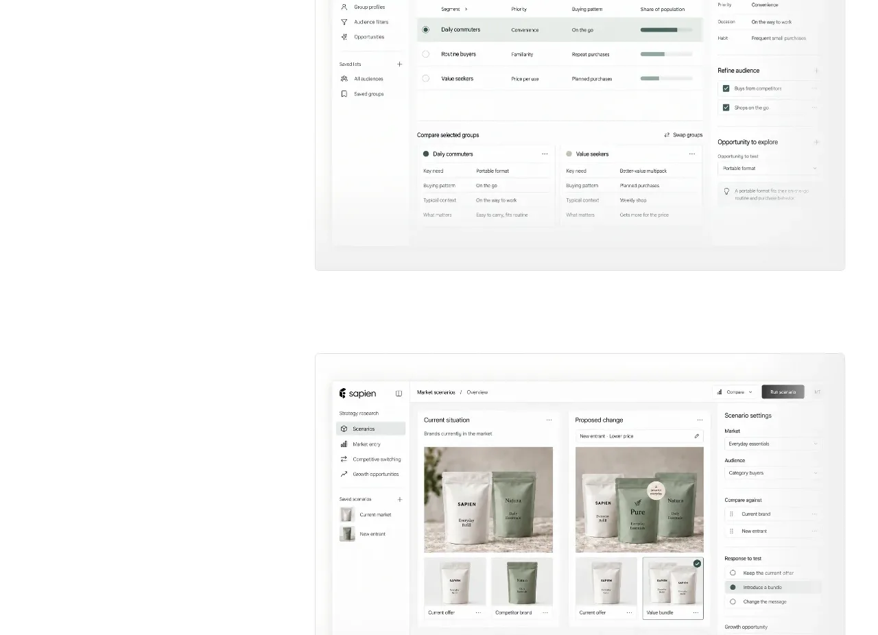
 Prediction benchmark statistic
Sapien · Stats
Prediction benchmark statistic
Sapien · Stats
P
Security and trust assurances
Polylane · Stats

 Safety and control principles
Omnia Agent · Stats
Safety and control principles
Omnia Agent · Stats