kage
kage
articos.com

Design analysis
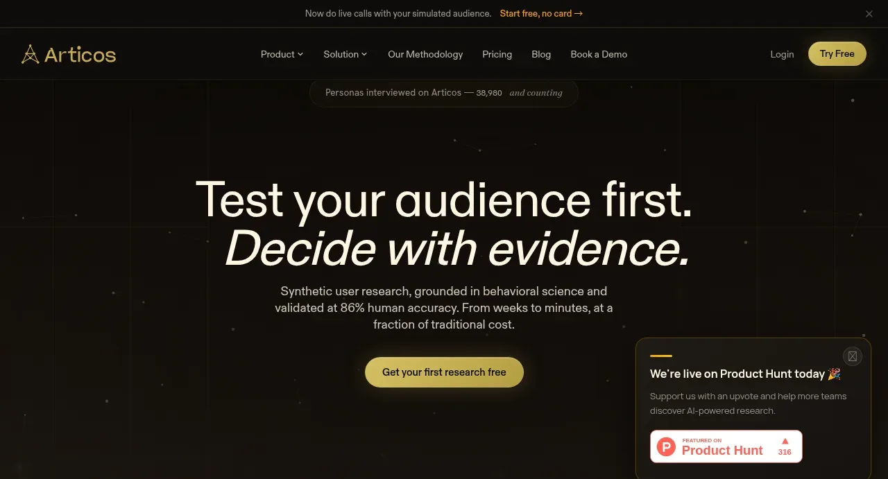
A long-scroll dark landing page built almost entirely from near-black backgrounds with a single champagne-gold accent. Hierarchy comes from type scale and a distinctive serif-italic versus grotesk pairing used for headline emphasis rather than colour. The page alternates rhythm: an airy starfield hero, a dense logo row, a split problem section with a comparison chart, a tabbed product showcase, a sparse "three steps" section that breathes with huge whitespace, then a numbered two-step feature block with diagrammatic graphics, closing with a wide multi-column footer whose most oversized element is a giant cropped wordmark. Everything is centred on restraint: no photography, only soft product mockups and thin line diagrams.
Prompt preview
## Reference images

Study these alongside the description below: hierarchy, rhythm, spacing, colour. Build for the product you are asked about, using this design language.

- Full page: https://kage-design-assets.t3.tigrisfiles.io/screenshots/articos-mcp/b74b5a52-121a-40b3-9410-436e13736de5-1791957659853-full.webp
- Above the fold: https://kage-design-assets.t3.tigrisfiles.io/screenshots/articos-mcp/b74b5a52-121a-40b3-9410-436e13736de5-1791957655243.webp
- Design on Kage: https://kage.design/designs/articos-mcp-landing-page

# Design a dark editorial landing page in the style of Articos

## Before you start
Ask the user what they are building, who it is for, and what brand assets they already have (name, colours, typefaces). Wait for the answers. Everything below is applied to *their* product, not to the reference.

## Page structure
1. **Announcement bar**: thin full-width strip at the very top with one short line of copy, a link, and a close button.
2. **Nav bar**: wordmark left, centre link group (Product, Solution, Methodology, Pricing, Blog), Log in + one pill CTA button right. Transparent over the hero.
3. **Hero**: centred, generous vertical padding. Small pill badge with a live counter above. Two-line headline: first line in a clean grotesk, second line in a serif italic for emphasis. Short two-sentence subhead, then one pill CTA. A subtle starfield/noise texture fills the background. A small floating promo card sits to the right of the hero.
4. **Stat row**: three big numbers (e.g. accuracy %, time, starting price) spaced evenly across the width, each with a tiny caption underneath.
5. **Trusted-by strip**: dim, single-row grayscale logo marquee with a small eyebrow label above.
6. **Problem section**: split layout — left column with an eyebrow label ("THE PROBLEM"), a two-line headline in the grotesk/serif-italic pairing, and body copy; right column with a simple comparison chart ("time to insight" bar comparing weeks vs minutes) and a pricing-note callout. Dark card with thin border.
7. **Tabbed product showcase**: a full-width bordered panel with three top tabs (Discover / Validate / Test & Optimize). Active tab shows a text block on the left and a large, softly elevated product mockup (light UI screenshots) on the right.
8. **How it works**: eyebrow, big headline ("Three steps…"), one subhead, then a wide vertical breathing space with a sparse diagram/graphic.
9. **Output section**: two numbered sub-features (01/02). Each has an eyebrow, headline, short body, and a diagrammatic graphic (a dot-distribution plot, a synthesis node graph). Split into alternating text/graphic halves.
10. **Footer**: very wide, multi-column link groups (Company, Product, Use cases, Solution, Compare, Research, Legal) plus a Connect column with social links. Bottom of the footer is dominated by a giant, cropped, low-contrast wordmark spanning the full width.

## Design language
- **Palette**: near-black background (#0d0b08–#141210), warm off-white text (#f2ede4), and exactly one accent — champagne gold (#d8b24a / #e6c860) for CTAs, eyebrows, active states, highlights. Never introduce a second accent.
- **Type pairing**: a geometric grotesk for headlines and UI, with a serif *italic* used on one emphasized phrase per headline — this pairing is the signature. Body text is small (14–16px), muted (70–80% opacity), generous line height. Eyebrow labels are 10–11px uppercase letterspaced.
- **Hierarchy by scale, not colour**: stat numbers huge (48–64px), headlines 40–56px, everything else quiet. Emphasis comes from size and the serif-italic switch.
- **Rhythm**: alternate dense sections (logo strip, tabs, footer) with deliberately sparse ones (hero, "three steps") that use 200–400px of whitespace. The page should breathe down its length.
- **Surfaces**: panels are dark cards with 1px low-contrast borders (#2a2620), radius 12–20px, no heavy shadows; product mockups sit on slightly lighter elevated surfaces and are the brightest things on the page.
- **Texture**: subtle starfield/noise in the hero only; diagrams are thin-line, dot-based, schematic, monochrome with one gold highlight point.
- **Motion**: static is fine; if animating, restrict to slow fades on scroll and a subtle logo marquee.

## Never
- Do not copy Articos copy, wordmark, product name, stat values, logo strip contents, or illustration style.
- Do not use the champagne-gold-on-black palette verbatim unless the user's brand calls for it — adapt to their brand colours while keeping the one-accent discipline.
- Never present the result as Articos or imply affiliation.
Components from this page
All components
 Top navigation and announcement bar
Articos MCP · Navigation
Top navigation and announcement bar
Articos MCP · Navigation
 Evidence-led research hero
Articos MCP · Hero
Evidence-led research hero
Articos MCP · Hero
 Proof points and trusted-by strip
Articos MCP · Stats
Proof points and trusted-by strip
Articos MCP · Stats
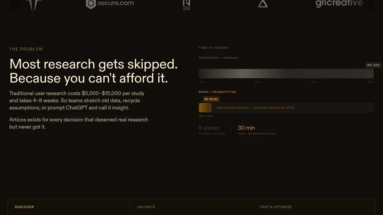 The problem and cost of skipped research
Articos MCP · Feature grid
The problem and cost of skipped research
Articos MCP · Feature grid
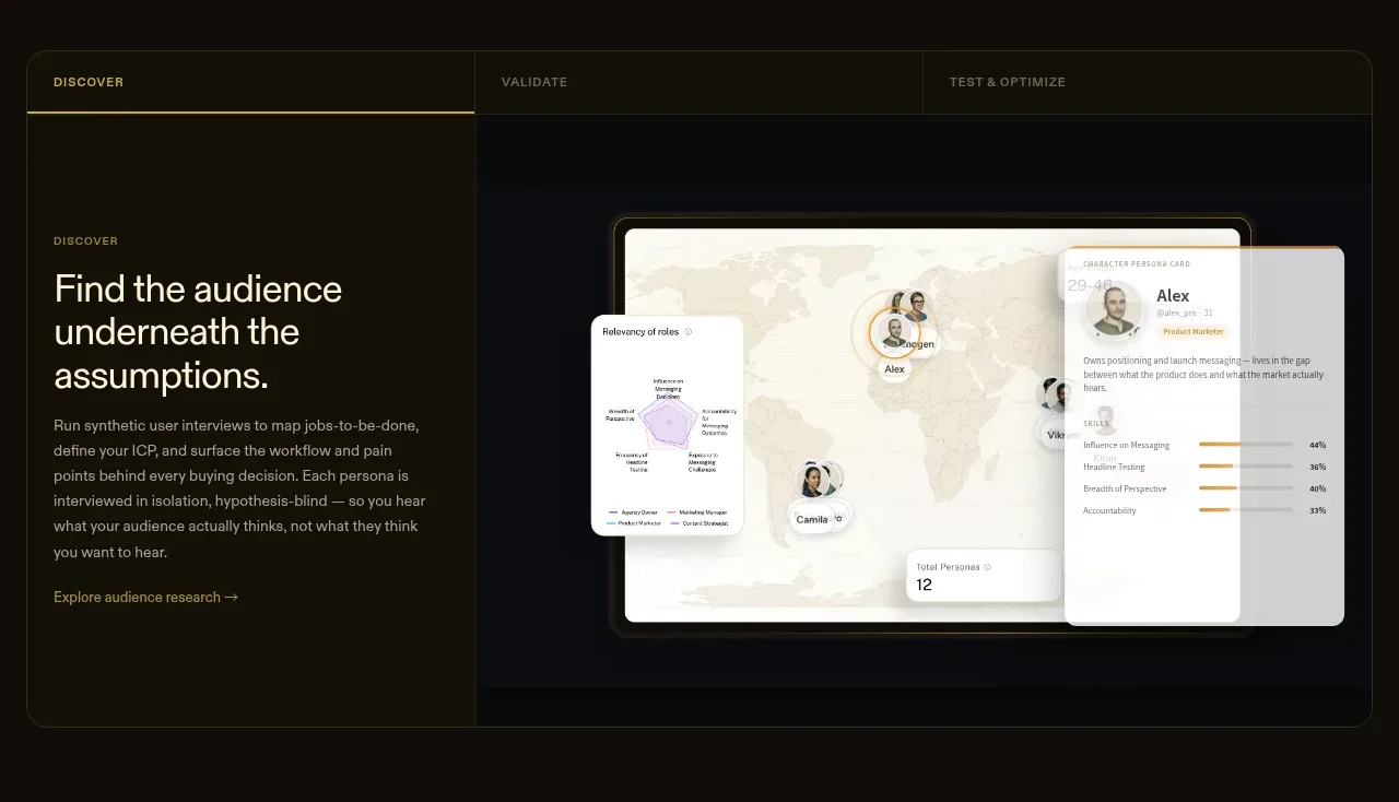 Tabbed research workflow showcase
Articos MCP · Tabs & steps
Tabbed research workflow showcase
Articos MCP · Tabs & steps
 Research output transformation
Articos MCP · Feature grid
Research output transformation
Articos MCP · Feature grid
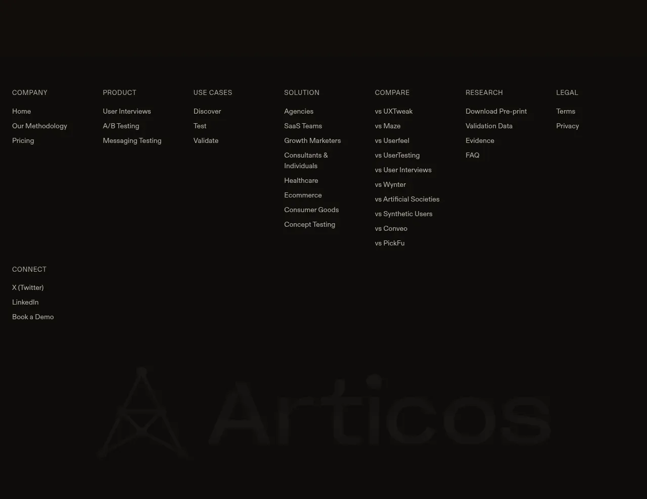 Multi-column site footer
Articos MCP · Footer
Multi-column site footer
Articos MCP · Footer