 kage
kage
temprl.org
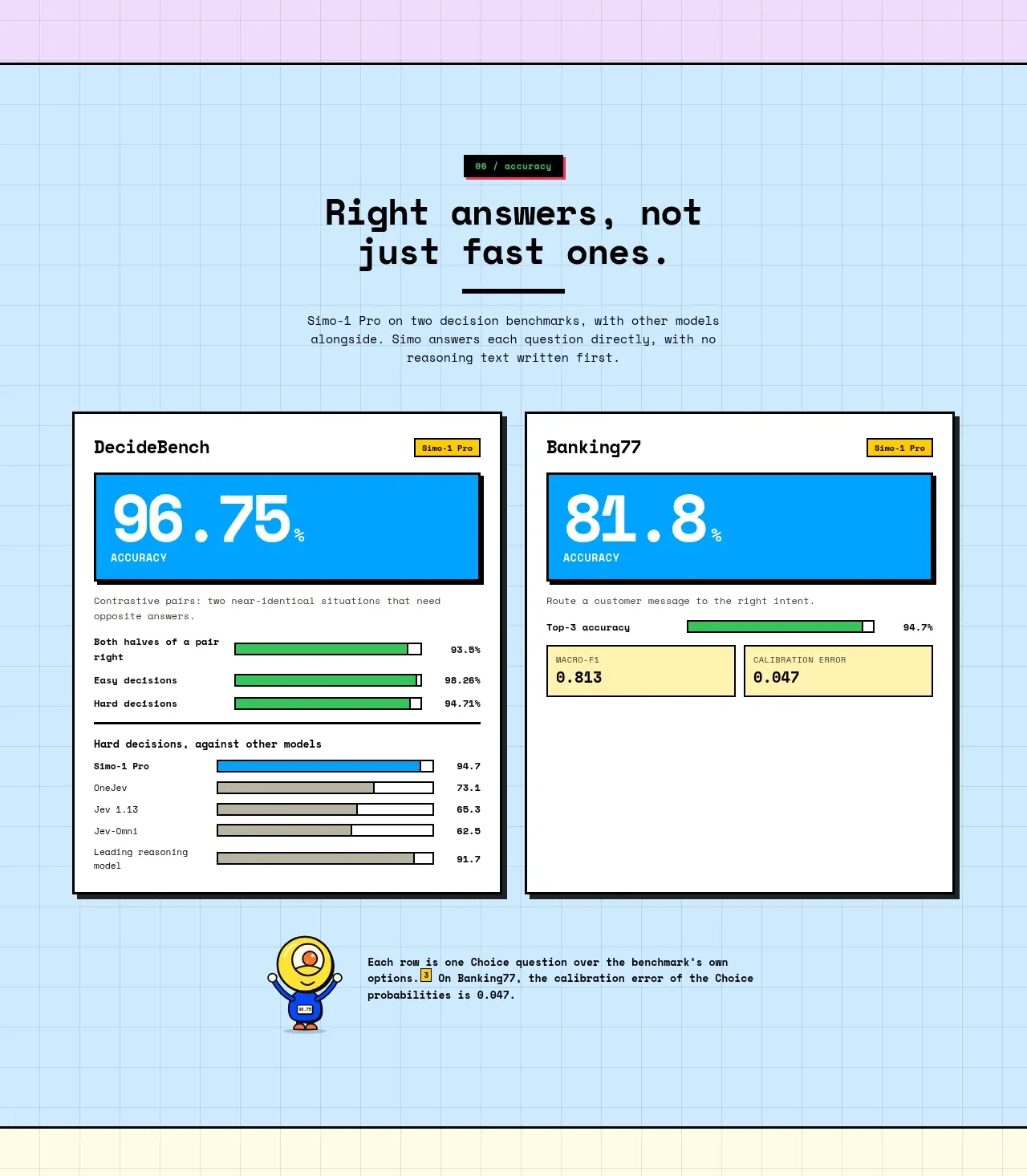
Design analysis
A blue benchmark section presents two large percentage results side by side, with supporting comparison bars and a small explanatory note. It communicates credibility through direct, quantified outcomes.
Prompt preview
## Reference images

Study these alongside the description below: hierarchy, rhythm, spacing, colour. Build for the product you are asked about, using this design language.

- Component: https://kage-design-assets.t3.tigrisfiles.io/components/simo/01913313-62ce-4f89-a048-ac4500929f0e-1791525859-7.webp
- Full page it was cut from: https://kage-design-assets.t3.tigrisfiles.io/screenshots/simo/01913313-62ce-4f89-a048-ac4500929f0e-1791525747684-full.webp
- Component on Kage: https://kage.design/component/simo-stats-2

### Before you start
Ask the user which benchmark or outcome best validates their product and how the numbers were measured. Then build an original proof section.

Create a light blue grid section with a centered headline, short methodology note, and two equal benchmark cards. Each card should have a clear benchmark name, a bright oversized percentage or score, a small category label, and a lower area with 3–5 horizontal comparison bars. Keep the focal score visually dominant, use one or two accent colors consistently, and explain the test context in a compact note beneath the cards. Use off-white cards, 2px dark borders, hard offset shadows, and square or lightly rounded corners. Avoid implying unsupported certainty: include a small source/method note and make the content readable on mobile.

Never: copy the reference's logo, product name, copy, illustrations, imagery, or exact benchmark values.
More components
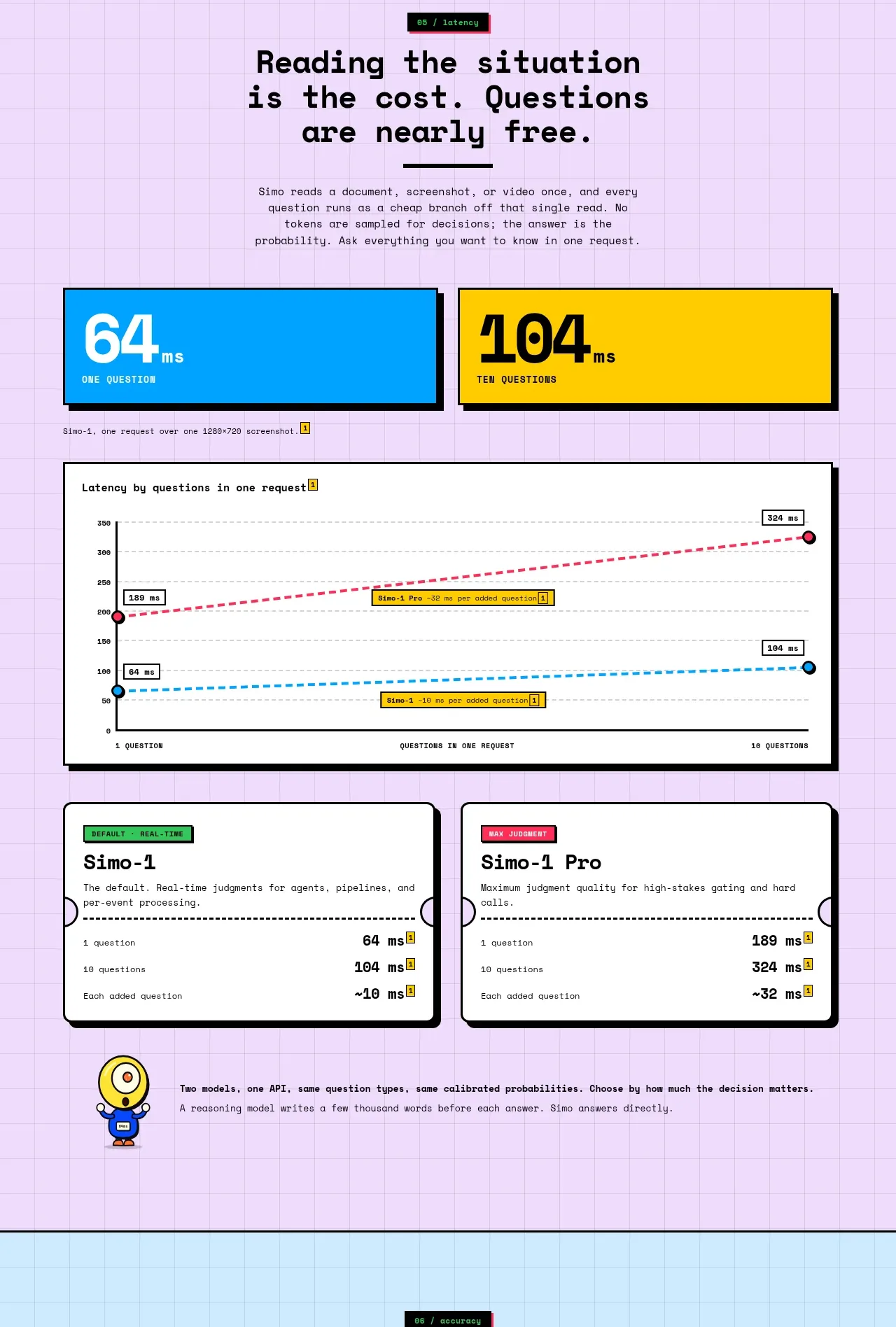
 Latency and model comparison
Simo · Stats
Latency and model comparison
Simo · Stats
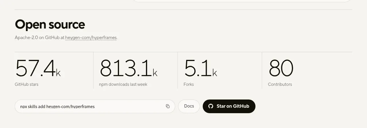
 Open-source proof and repository stats
HyperFrames Studio (Desktop) · Stats
Open-source proof and repository stats
HyperFrames Studio (Desktop) · Stats
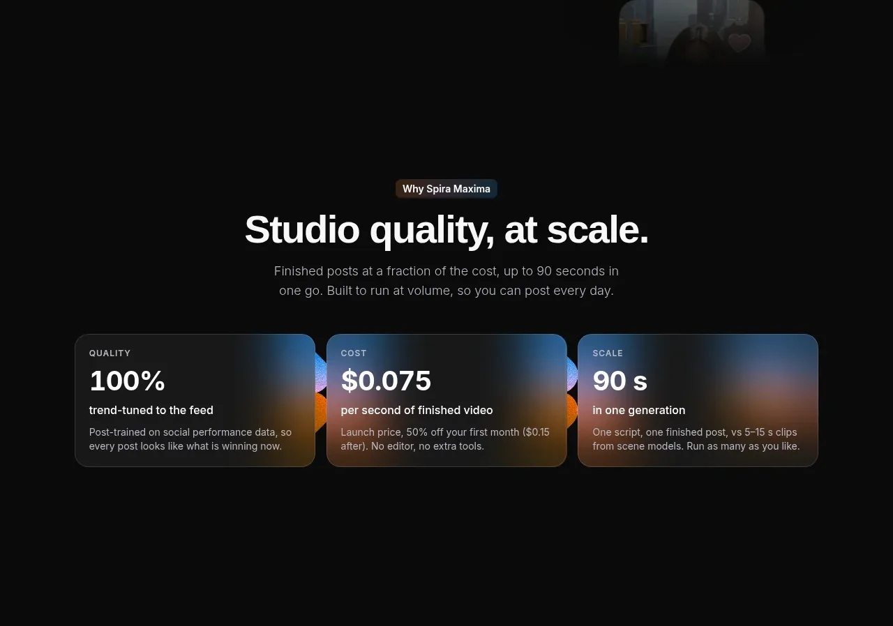
 Quality, cost, and scale metrics
Spira Maxima · Stats
Quality, cost, and scale metrics
Spira Maxima · Stats
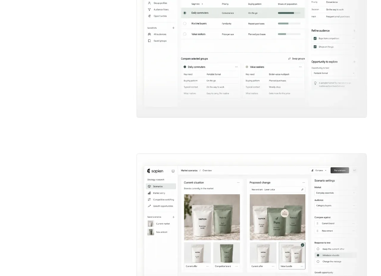
 Prediction benchmark statistic
Sapien · Stats
Prediction benchmark statistic
Sapien · Stats
P
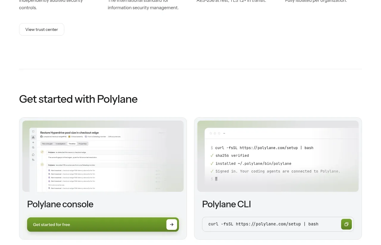
Security and trust assurances
Polylane · Stats

 Safety and control principles
Omnia Agent · Stats
Safety and control principles
Omnia Agent · Stats