kage
kage
attio.com

Design analysis
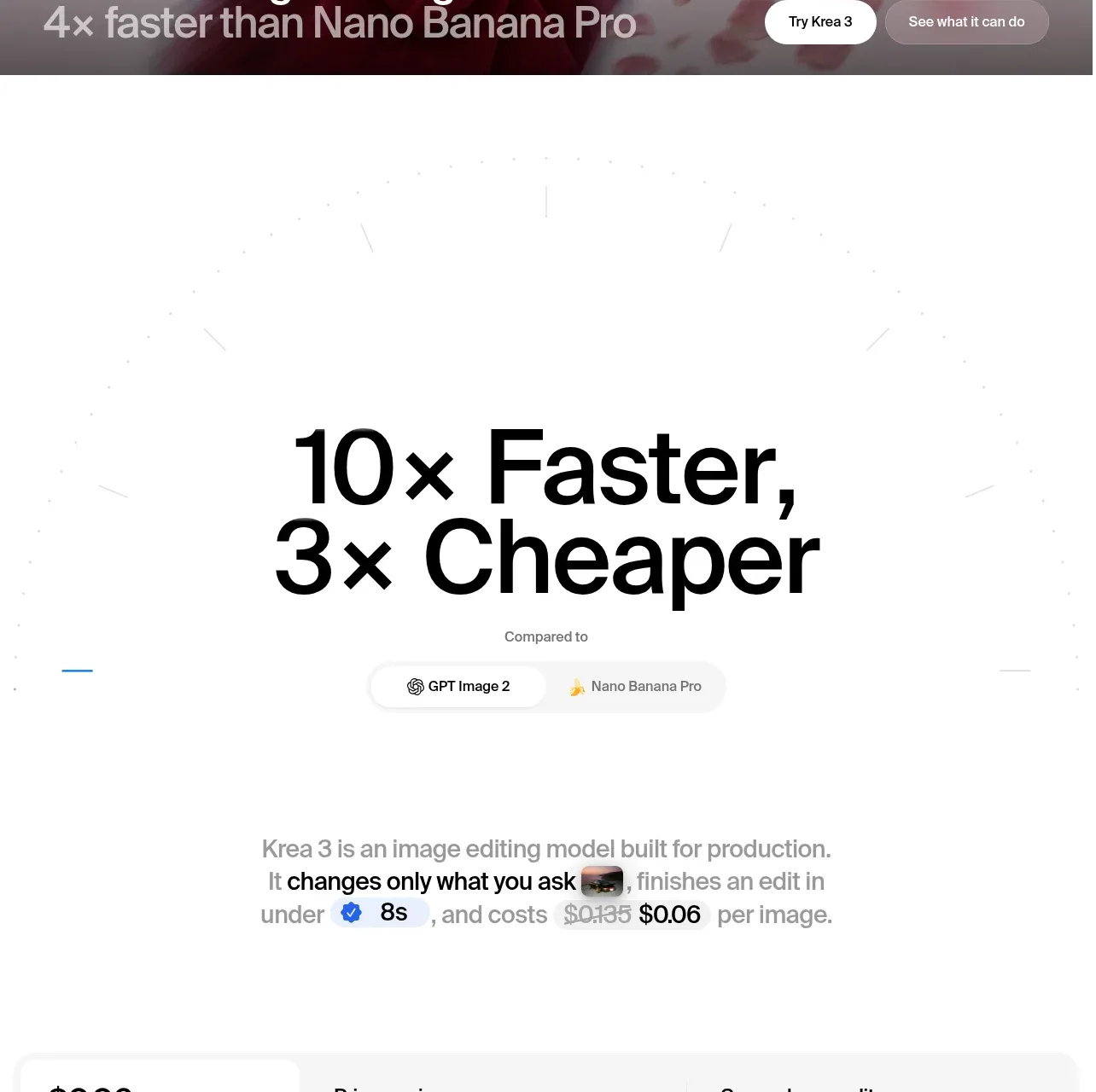
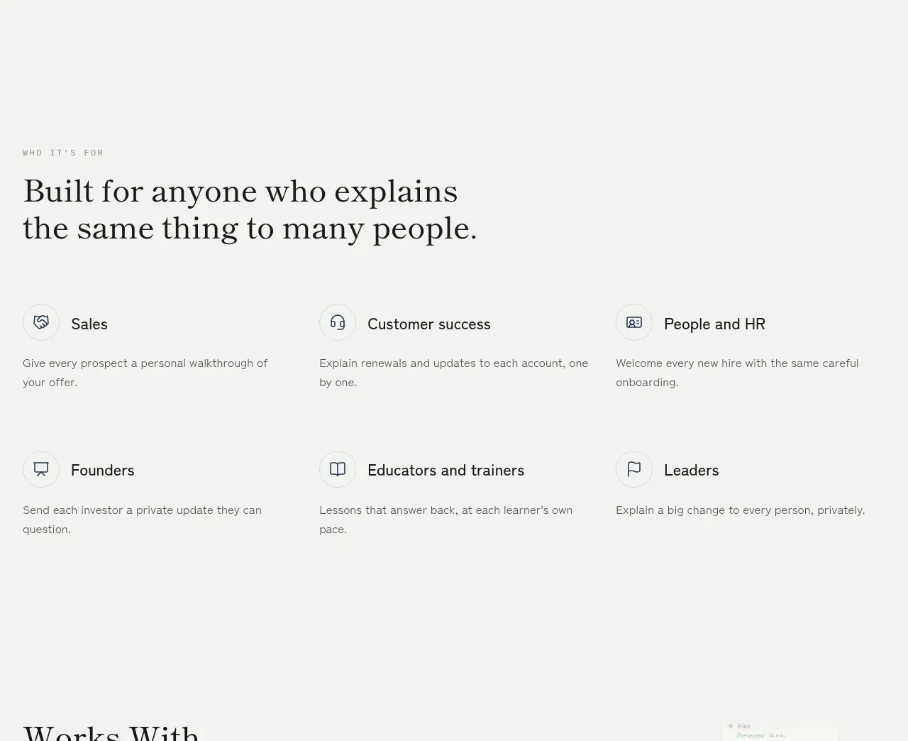
A spacious, editorial metrics block that pairs a confident scale statement with a restrained two-by-two stat grid and a subtle upward growth curve. The light technical backdrop adds infrastructure credibility without competing with the numbers.
Prompt preview
## Reference images

Study these alongside the description below: hierarchy, rhythm, spacing, colour. Build for the product you are asked about, using this design language.

- Component: https://kage-design-assets.t3.tigrisfiles.io/components/attio-com/853806da-b35e-493c-a2ae-f3b42d8e3fbb-1789060460-7.webp
- Full page it was cut from: https://kage-design-assets.t3.tigrisfiles.io/screenshots/attio-com/853806da-b35e-493c-a2ae-f3b42d8e3fbb-1789060424-full.webp
- Component on Kage: https://kage.design/component/attio-stats

## Before you start
Ask what the user's product is, who it serves, and what its visual brand feels like. Then apply the principles below to create an original version for that product—not a copy of the reference.

## Build a scale and performance stats section
Create a large, calm section that communicates operational scale through a short editorial headline, four proof-point metrics, and a subtle upward performance graphic in the background. The component should feel credible, precise, and production-ready rather than like a loud marketing dashboard.

### Layout and alignment
- Use a full-width section with a constrained inner content width of roughly 1120–1200px and generous vertical padding, approximately 120–180px on desktop.
- Keep the primary content aligned to the left edge of the inner container. Place it in the lower-left or vertically centered portion of the section so the graphic has room to breathe on the right.
- Start with a small rounded eyebrow label, followed by a two- or three-line headline. Use a short dark lead line and a softer muted continuation to create a clear editorial hierarchy.
- Place four metrics below the headline in a two-column by two-row grid. Each metric should have a thin vertical accent rule on its left, a large value, and a compact explanatory label underneath.
- Use a wide, low-contrast growth curve or rising area/grid graphic behind the content, anchored to the bottom and extending toward the right edge. It should suggest increasing throughput or scale without behaving like a data visualization users need to interpret.
- If the section is followed by another content block, preserve a clear horizontal divider and generous separation. The transition can introduce a second editorial statement or proof point, but keep it visually subordinate to the stats section.

### Typography
- Use the product's own sans-serif or a clean contemporary grotesk. Prioritize legibility and a slightly technical, editorial tone.
- Eyebrow: 12–14px, medium weight, compact line height.
- Main headline: approximately 40–56px on desktop, 1.05–1.12 line height, with restrained letter spacing. Use a heavier/darker first phrase and a regular-weight muted second phrase where appropriate.
- Metric values: approximately 28–34px, medium or semibold weight, tight line height.
- Metric labels: 14–16px, regular weight, with a slightly muted colour and comfortable line height.
- Avoid excessive all-caps, dramatic display lettering, or overly dense numerical styling.

### Spacing and responsive behaviour
- Use an 8px spacing system. Keep 20–32px between the eyebrow and headline, 44–64px between the headline and metric grid, and 28–40px between metric rows.
- On tablet, reduce the headline size and let the graphic occupy more of the lower-right area.
- On mobile, stack the content naturally: eyebrow, headline, then metrics in one column or a compact two-column grid depending on available width. Keep the accent rules and labels readable.
- Crop or simplify the background curve on small screens rather than allowing it to overwhelm the statistics.

### Colour and graphic treatment
- Start with a warm or neutral near-white background such as `#FCFCFB` or adapt to the user's brand surface.
- Use near-black for the primary text, approximately `#17191C`, and a cool grey for secondary headline text and labels, approximately `#6D737C`.
- Use one restrained brand accent for the eyebrow, metric rules, curve, and graphic lines; a useful starting point is blue `#2F70C9` or an equivalent colour from the user's brand.
- Keep the background chart extremely subtle: hairline vertical guides in approximately `#DCE5EF` at low opacity, with a pale accent-tinted fill below the curve such as `#EEF5FC`.
- Avoid gradients unless the user's brand already uses them. The overall contrast should come from typography and spacing, not decoration.

### Borders, radius, and graphic construction
- Use 1px rules in a soft neutral such as `#E4E7EA` for section boundaries and container framing if needed.
- Give the eyebrow a small pill radius, approximately 6–8px, with a very pale accent background and a compact horizontal padding of 6–8px.
- Keep the stat accent rules thin, around 2px, and approximately 44–56px tall.
- Construct the growth graphic with SVG or CSS so it remains crisp and responsive: a shallow curve that accelerates toward the right, faint repeated vertical lines beneath or behind it, and a translucent fill below the line. Do not use a detailed chart with axes, labels, or controls.
- Use modest radii, generally 6–10px. This section should feel engineered and refined, not card-heavy.

### Interaction
- The stats can be static if they are proof points. Do not add interaction merely for decoration.
- If the growth graphic is animated, use a very subtle one-time line-draw or opacity reveal on entry, respecting `prefers-reduced-motion`.
- Any adjacent text link or button should use a compact outline treatment with a clear hover state: slightly darker border, a subtle surface change, and a small directional arrow shift.
- Ensure sufficient colour contrast and preserve the semantic reading order in the DOM; decorative SVG elements should be hidden from assistive technology.

## Never
- Never copy the reference's logos, product names, statistics, wording, or exact claims.
- Never reuse the reference's copy, including its headline structure verbatim; create new messaging relevant to the user's product.
- Never include the reference's illustrations, imagery, chart labels, or branded visual assets.
- Never make the graphic more prominent than the proof points.
- Never use fake precision, unsupported customer numbers, or invented performance claims; use the user's real data or clearly marked placeholders.
- Never build a generic row of cards when the design calls for an integrated editorial section with a background growth motif.