kage
kage
audimate.ai
Design analysis
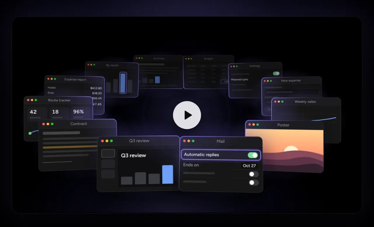
A large rounded media panel demonstrates the product through layered interface windows and a centered play control, creating an immediate visual explanation.
Prompt preview
## Reference images

Study these alongside the description below: hierarchy, rhythm, spacing, colour. Build for the product you are asked about, using this design language.

- Component: https://kage-design-assets.t3.tigrisfiles.io/components/audimate/f5eee044-0aa0-46f8-a989-58039412e614-1792130729-2.webp
- Full page it was cut from: https://kage-design-assets.t3.tigrisfiles.io/screenshots/audimate/f5eee044-0aa0-46f8-a989-58039412e614-1792130546049-full.webp
- Component on Kage: https://kage.design/component/audimate-gallery

## Before you start
Ask what the user's product and brand are, then apply the principles below to that product rather than reproducing the reference.

Build a wide product-demo media panel on a black page. Use a dark charcoal rounded rectangle with a faint border, subtle blue-violet ambient glow, and a centered circular play button. Within the panel, compose several abstract, non-branded application cards at varied depths and angles to suggest a working desktop without relying on a literal screenshot. Maintain strong contrast and keep the central play affordance obvious. Use approximately 16–20px corner radius, low-opacity borders (#202027), and layered shadows. Make the panel responsive: preserve the visual hierarchy on mobile and provide an accessible button label and poster fallback.

Never: use the reference's logo, product name, copy, illustrations, imagery, or exact visual identity.