kage
kage
backdropagent.com
Design analysis
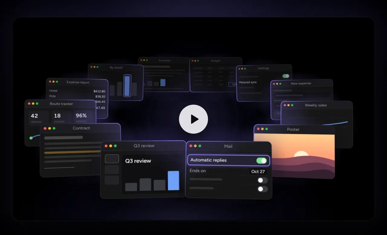
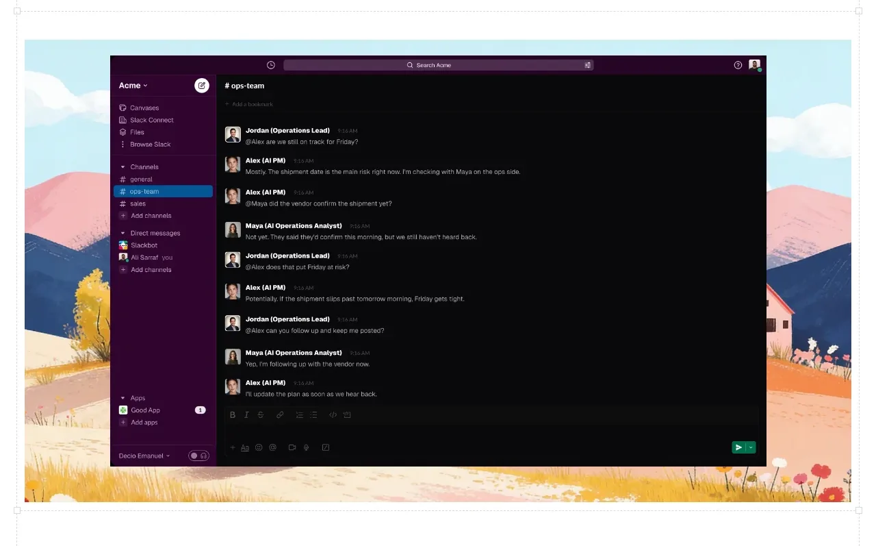
A large scenic panel frames a dark collaboration workspace screenshot, making the product interface the focal visual while preserving the brand’s editorial atmosphere.
Prompt preview
## Reference images

Study these alongside the description below: hierarchy, rhythm, spacing, colour. Build for the product you are asked about, using this design language.

- Component: https://kage-design-assets.t3.tigrisfiles.io/components/backdrop/a4be162f-a1b8-4e5c-8da7-09cb7d37c0e3-1792130679-3.webp
- Full page it was cut from: https://kage-design-assets.t3.tigrisfiles.io/screenshots/backdrop/a4be162f-a1b8-4e5c-8da7-09cb7d37c0e3-1792130585649-full.webp
- Component on Kage: https://kage.design/component/backdrop-gallery

## Before you start
Ask what core workspace or interface should be shown for the user's product and what visual environment fits its brand. Then build a distinct showcase panel.

Create a full-width contained product showcase with a soft, colorful background treatment and one large centered application window layered above it. Keep the app window dominant, with a dark or light interface chosen to contrast the background, clear sidebar/content hierarchy, readable message or activity rows, and a compact toolbar. Use a 12–16px outer radius, subtle depth shadow, and enough padding around the application so it feels staged rather than pasted in. Keep the section mostly visual with minimal copy. Ensure the gallery is responsive: crop the background gracefully and scale the UI without making text illegible.

### Never
- Never use the reference workspace screenshot, app name, people, avatars, or landscape artwork.
- Never copy exact interface labels or conversations.
- Never add decorative imagery that competes with the product UI.