kage
kage
agentshrine.com
Design analysis
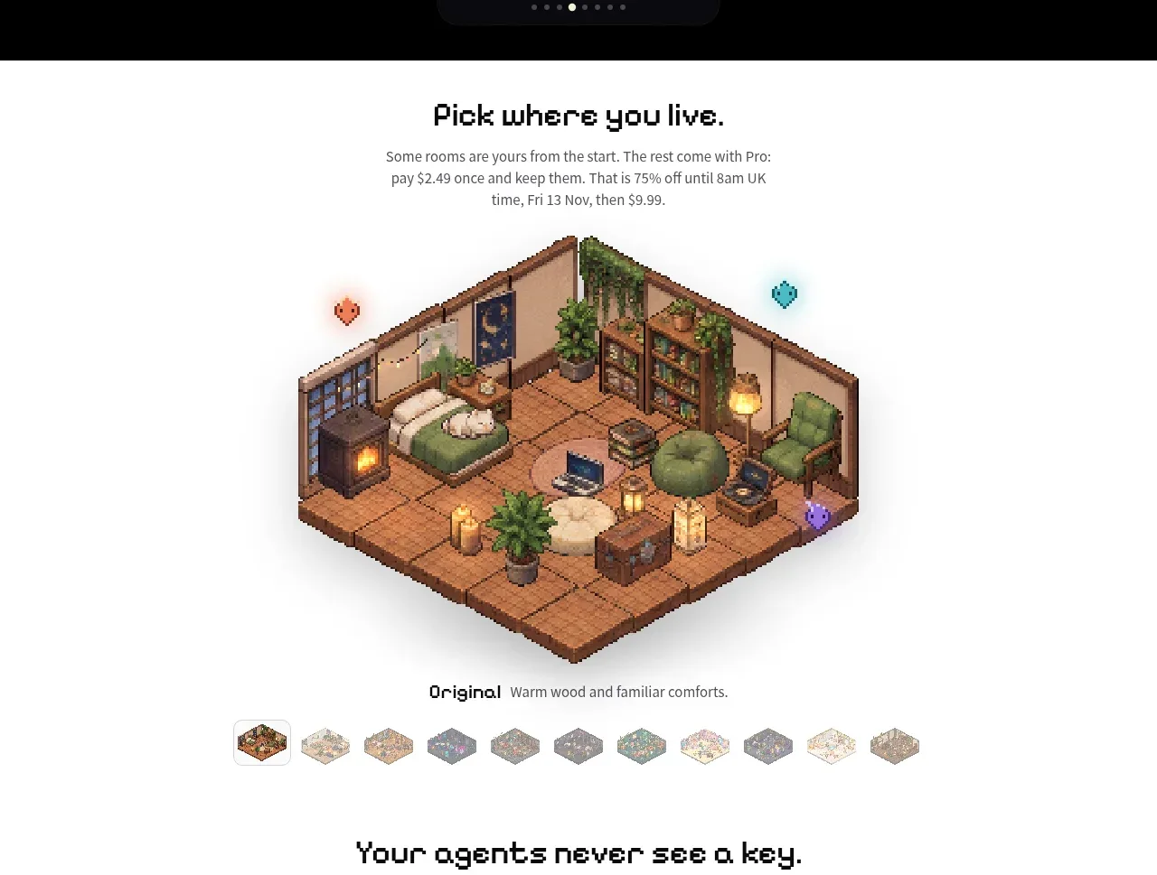
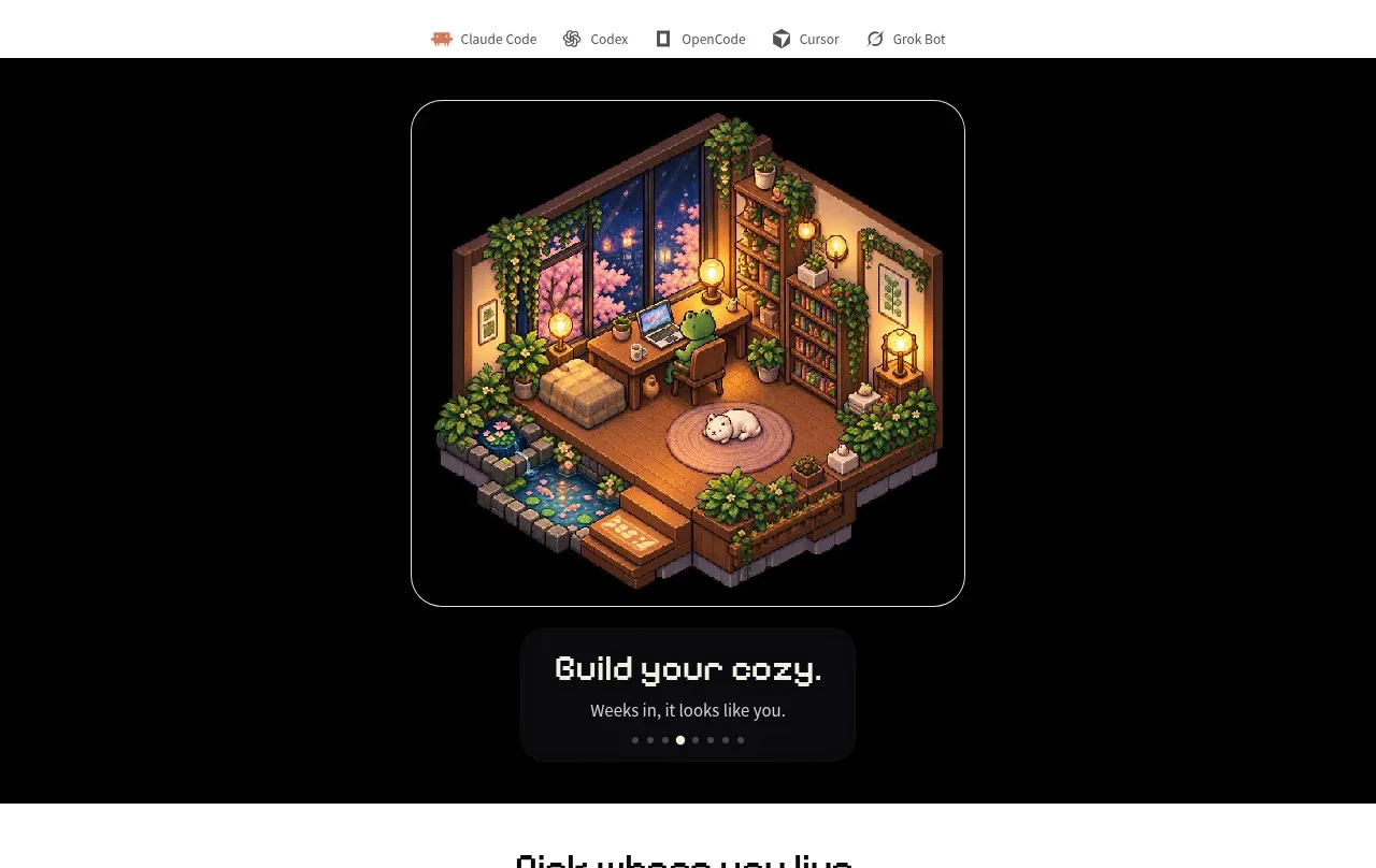
A full-width black band creates a dramatic contrast around a framed pixel-art room preview. A compact caption card and pagination dots communicate that the visual is part of a browsable showcase.
Prompt preview
## Reference images

Study these alongside the description below: hierarchy, rhythm, spacing, colour. Build for the product you are asked about, using this design language.

- Component: https://kage-design-assets.t3.tigrisfiles.io/components/shrine/ff477ea2-1694-4783-bdc4-4322fec31da4-1792130651-2.webp
- Full page it was cut from: https://kage-design-assets.t3.tigrisfiles.io/screenshots/shrine/ff477ea2-1694-4783-bdc4-4322fec31da4-1792130580085-full.webp
- Component on Kage: https://kage.design/component/shrine-gallery

## Before you start
Ask what the user's product is and what kind of product state, workflow, or environment should be showcased. Ask for brand colors and whether the content is static or interactive.

- Create a full-bleed dark showcase band with a centered visual frame, allowing the preview to feel like a premium product moment.
- Keep the visual narrower than the viewport and surround it with substantial negative space; use a thin light border and a moderate radius on the frame.
- Place a small dark caption panel below or overlapping the visual with a short title, one-line description, and compact pagination indicators.
- Use near-black for the stage, soft off-white for frame edges, and one warm accent for the active pagination state.
- If multiple previews exist, make the dots or thumbnail controls interactive, keyboard accessible, and clearly indicate the active slide.
- Let the image or rendered UI be the user's own product content, with responsive sizing that never clips on mobile.

Never: use the reference's logo, product name, copy, illustrations, imagery, or exact visual assets.