kage
kage
audimate.ai

Design analysis
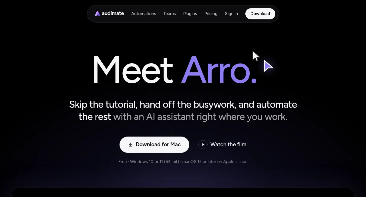
A long-form dark landing page uses near-black space, oversized white headlines, and selective violet emphasis to make the AI assistant feel calm and premium. The page moves from a centered hero and large product video into alternating two-column feature demonstrations, then tighter team and conversational sections, a status-pill explanation, comparison table, FAQ accordion, and a compact final CTA/footer; the rhythm shifts from spacious storytelling to denser proof and utility.
Prompt preview
## Reference images

Study these alongside the description below: hierarchy, rhythm, spacing, colour. Build for the product you are asked about, using this design language.

- Full page: https://kage-design-assets.t3.tigrisfiles.io/screenshots/audimate/f5eee044-0aa0-46f8-a989-58039412e614-1792130546049-full.webp
- Above the fold: https://kage-design-assets.t3.tigrisfiles.io/screenshots/audimate/f5eee044-0aa0-46f8-a989-58039412e614-1792130541875.webp
- Design on Kage: https://kage.design/designs/audimate-landing-page

## Before you start
Ask the user what they are building, who it is for, and which brand assets they already have (name, colours, type choices, logo, imagery, and product screenshots). Wait for their answers before designing. Apply the system below to their product, not to the reference product, and use their brand assets wherever they exist.

## Page structure
1. **Floating navigation** — Place a compact pill-shaped navbar near the top with a small brand mark at left, a short set of product/resource links in the middle, and a high-contrast rounded primary action at right.
2. **Hero** — Center a very large two-line headline with one short phrase in the brand accent colour. Follow it with a concise explanatory paragraph, a primary download or signup button, a secondary watch/demo action, and a small muted compatibility note.
3. **Hero product video** — Use a wide, dark rounded media frame with a subtle border, faint indigo glow, layered product-window imagery, and a centered circular play button.
4. **Positioning statement** — Add a centered paragraph block explaining the product’s difference from simpler alternatives. Use bright text for the key claim and muted gray for supporting lines.
5. **Feature pair: guided assistance** — Create a generous alternating two-column section: explanatory copy and a small prompt chip on one side, with a large dark application/demo frame on the other.
6. **Feature pair: delegated work** — Reverse the order, placing the demo frame left and the explanatory copy right. Keep the same card proportions and spacing so the alternating rhythm is clear.
7. **Repeatable workflow statement** — Center a large headline about doing a task once and repeating it, with the product concept highlighted in the accent colour and a short supporting paragraph below.
8. **Workflow example: watch** — Use a two-column row with a compact instruction block on the left and a wide dark application screenshot on the right.
9. **Workflow example: playbook** — Continue the same vertical workflow sequence with a subdued text block describing how the captured action becomes a reusable document.
10. **Workflow example: replay** — Add another widely spaced, low-contrast text block describing how the saved workflow can run again; let the large black space create a deliberate pause before the next section.
11. **Team collaboration statement** — Center a small eyebrow, a large two-line headline, and a short paragraph about sharing and refining workflows with a team.
12. **Team product frame** — Place a large rounded dark screenshot/card beneath the statement, showing a collaborative document or workflow editor with a sidebar and content area.
13. **Conversational assistance statement** — Center another large headline and short explanation about asking the product to explain or build something.
14. **Feature pair: screen understanding** — Alternate a text block with prompt chip on the left and an empty/dark demo frame on the right; emphasize the product’s ability to understand context without requiring screenshots or pasted explanations.
15. **Feature pair: generated result** — Reverse the layout with a demo frame left and explanatory copy right, showing a finished sheet, document, chart, or other result.
16. **Transparency/status section** — Center a headline about visibility and control, then place a horizontal row of compact status pills with different coloured dots and labels for states such as listening, coaching, controlling, recording, and done. Add small captions underneath.
17. **Before-and-after comparison** — Use a centered heading followed by a wide, rounded, dark table. Compare the old/manual workflow with the product-assisted outcome in several rows; keep headers and dividers subtle.
18. **FAQ** — Add a large left-aligned or centered heading and a vertical stack of full-width rounded accordion rows with concise questions and small chevrons aligned right.
19. **Final CTA** — Use a centered closing block with a small abstract brand mark, a large headline with accent-coloured emphasis, a primary rounded action, compatibility text, and a secondary demo/contact link.
20. **Footer** — Finish with a thin top divider, a multi-column footer containing the brand mark and grouped product, resource, and legal links, then a small copyright line.

## Design language
- Build hierarchy almost entirely through scale, weight, and whitespace: use oversized display headings, short paragraphs, and restrained labels instead of many decorative elements.
- Start with a very spacious hero and generous feature sections, then increase information density in the workflow examples, status row, comparison table, FAQ, and footer.
- Use a near-black background around `#000000` or `#030303`, white primary text around `#F5F5F5`, and cool muted gray text around `#77777F` to create strong but soft contrast.
- Reserve a luminous violet accent around `#8B5CF6`–`#A78BFA` for a few headline words, small brand marks, focus states, and subtle ambient glows; do not turn every control purple.
- Pair a clean modern sans-serif with a large, light-to-medium display scale: hero headings roughly 64–88px desktop, section headings 44–64px, body copy 15–18px, and metadata 11–13px. Use tight display line-height and comfortable body leading.
- Keep layouts centered and narrow for statements, then expand to wide media frames and alternating two-column grids. On mobile, stack each pair while preserving the intentional alternating order.
- Treat product visuals as dark rounded windows with thin low-contrast borders (`rgba(255,255,255,.10)`), restrained corner radii around 12–18px, and extremely soft indigo/black shadows rather than obvious elevation.
- Make buttons pill-shaped with high contrast: white or near-white fills for primary actions, black text, compact horizontal padding, and subtle hover brightness changes. Secondary actions should be text or low-contrast outlined controls.
- Use prompt chips and status pills as small dark capsules with hairline borders, tiny coloured indicators, and compact monospace-like or medium-weight labels where useful.
- Let visual rhythm carry the narrative: alternate media and copy, insert oversized pauses between workflow steps, and use dimmer text for secondary steps so the important moments remain bright.
- Keep motion understated and purposeful: reveal sections on scroll with gentle opacity/translate transitions, animate ambient violet glows slowly, and make accordions, play controls, buttons, and status pills respond with short 150–250ms transitions. Avoid busy parallax or decorative animation.

## Never
- Do not copy the reference product’s logos, wordmarks, product name, exact copy, illustrations, photography, screenshots, UI chrome, or icon set.
- Do not present the result as the reference product or imply an affiliation with it.
- Replace all example content, prompts, workflows, media, and brand treatment with assets and language appropriate to the user’s product.
Components from this page
All components
 Floating site navigation
Audimate · Navigation
Floating site navigation
Audimate · Navigation
 Product introduction hero
Audimate · Hero
Product introduction hero
Audimate · Hero
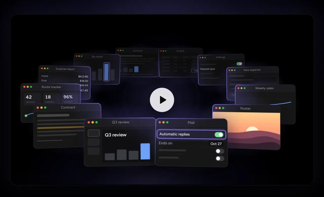 Product film preview
Audimate · Gallery
Product film preview
Audimate · Gallery
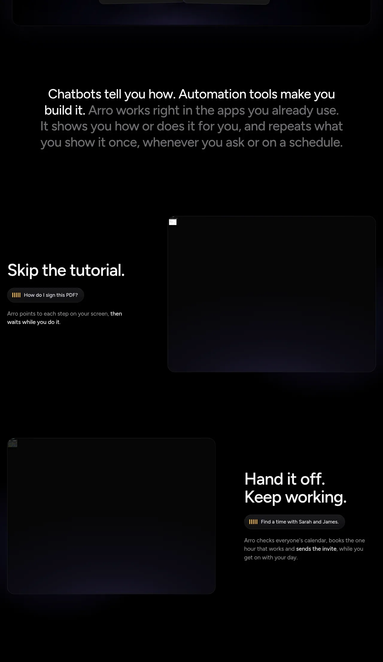 Automation workflow benefits
Audimate · Feature grid
Automation workflow benefits
Audimate · Feature grid
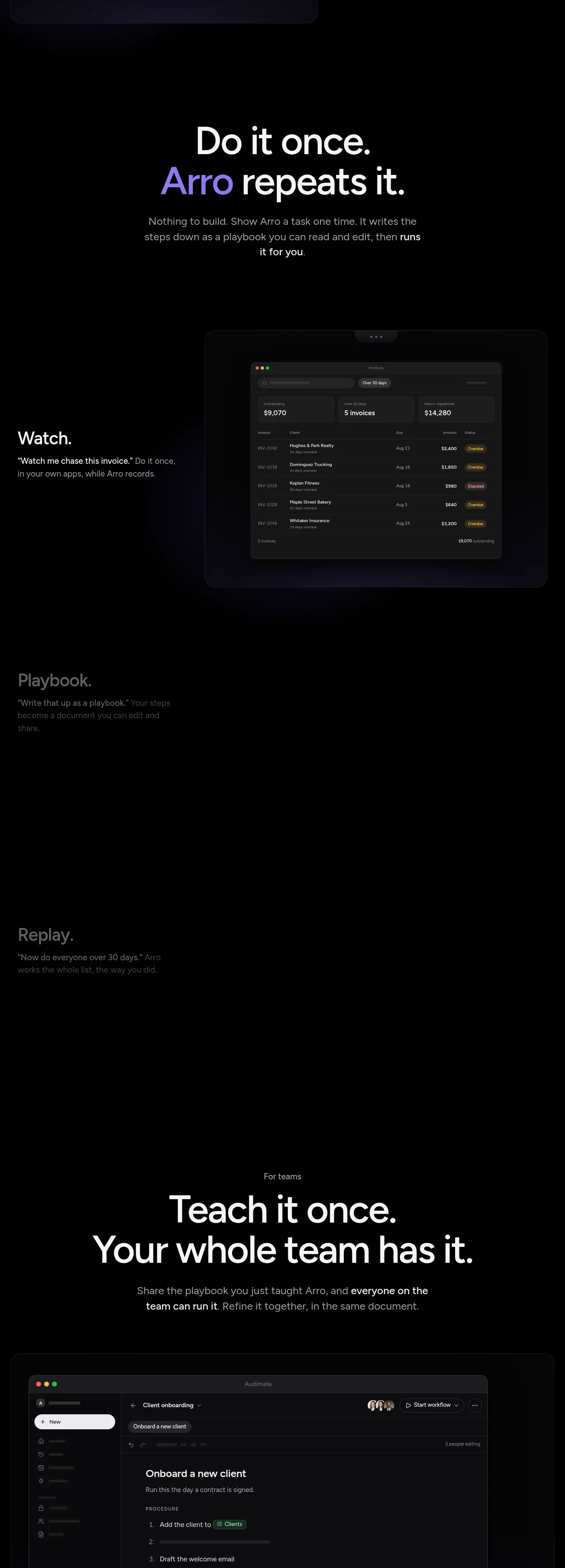 Repeatable playbook workflow
Audimate · Feature grid
Repeatable playbook workflow
Audimate · Feature grid
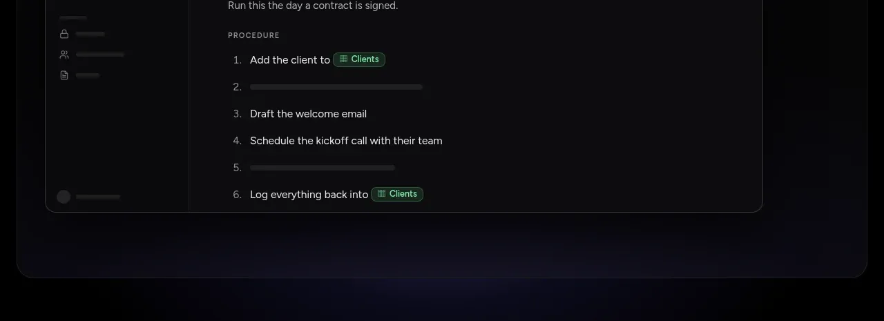 Visible activity states
Audimate · Stats
Visible activity states
Audimate · Stats
 Before-and-after comparison
Audimate · Table
Before-and-after comparison
Audimate · Table
 Questions and answers
Audimate · FAQ
Questions and answers
Audimate · FAQ
 Download conversion panel
Audimate · Call to action
Download conversion panel
Audimate · Call to action
 Multi-column site footer
Audimate · Footer
Multi-column site footer
Audimate · Footer