kage
kage
backdropagent.com

Design analysis
A spacious, mostly white AI product landing page pairs oversized black sans-serif headlines with a distinctive hand-painted countryside illustration that reappears as a visual thread in the hero, collaboration cards, and closing CTA. The page moves from a centered, high-impact hero into alternating product demonstrations, a dense business-use-case catalogue, shared-memory and team collaboration panels, pricing cards, and a dark footer; generous whitespace and thin dividers keep the long page calm while embedded UI mockups add specificity and density.
Prompt preview
## Reference images

Study these alongside the description below: hierarchy, rhythm, spacing, colour. Build for the product you are asked about, using this design language.

- Full page: https://kage-design-assets.t3.tigrisfiles.io/screenshots/backdrop/a4be162f-a1b8-4e5c-8da7-09cb7d37c0e3-1792130585649-full.webp
- Above the fold: https://kage-design-assets.t3.tigrisfiles.io/screenshots/backdrop/a4be162f-a1b8-4e5c-8da7-09cb7d37c0e3-1792130580176.webp
- Design on Kage: https://kage.design/designs/backdrop-landing-page

## Before you start
Ask the user what they are building, who it is for, and what brand assets they already have (product name, colours, typography, logo, illustrations, and imagery). Wait for their answers before designing. Apply the system below to their product, not to the reference product, and replace all reference-specific content with their own content.

## Page structure
1. **Header/navigation:** Use a slim white header with a compact brand mark at left, two or three text links centered/right, and a black rounded sign-up button at the far right. Keep it restrained and separated from the hero by whitespace rather than a heavy bar.
2. **Hero:** Create a centered headline with a two-line, large black sans-serif statement, a short muted explanation beneath it, and paired primary/secondary CTAs. Surround the upper copy with small floating contextual labels where useful, then anchor the lower half with a wide hand-crafted or brand-specific landscape/scene illustration. Place a large white rounded prompt/input card over the lower illustration, with a text area and circular arrow submit control.
3. **Core workflow introduction:** Follow with a tall white section beginning with a large muted paragraph aligned to the left. Below it, use a two-column product explanation: a pale UI report/mockup on the left and a right-side list of workflow categories with one expanded item and thin horizontal separators.
4. **Collaboration/product preview:** Add a full-width scenic panel containing a large dark communication or workspace UI mockup centered inside it. Let the colourful background illustration frame the interface without competing with its content.
5. **Integrations/tools section:** Use an alternating two-column feature block. Put a bold heading, short paragraph, divider, and numbered benefits on the left; show connected app/tool tokens in a clean orbit or network diagram on the right, using soft shadows and generous spacing.
6. **Business use cases heading:** Introduce a centered heading and short supporting line, then provide a vertical catalogue of business types. Include a narrow category navigation column on the left and repeated rows with a bold use-case heading, compact description, and a light product/data visual on the right. Keep large vertical gaps between rows so each example reads as a separate module.
7. **Shared memory feature:** Create a two-row asymmetric feature grid. In the first row, place a peach-toned conversational UI illustration on the left and the explanatory heading, body, and two short benefit labels on the right. In the second row, reverse the arrangement: explanatory copy on the left and a peach landscape panel with floating relationship cards on the right.
8. **Pricing:** Add a centered “choose a plan” style heading and short subtitle, followed by four evenly sized pricing cards in one row. Each card should contain a plan label, large price, billing note, rounded CTA, short positioning line, and compact checkmarked limits. Highlight one plan with a small “popular” treatment while retaining the mostly monochrome palette.
9. **Final CTA:** Use a strong left-aligned heading and supporting line with primary and secondary buttons. Place the recurring illustrated landscape along the full lower edge, turning the CTA into a visual conclusion rather than another plain card.
10. **Footer:** End with a full-width black footer. Put the light brand lockup and short positioning statement on the left, compact legal links on the right, social controls below, then a subtle divider and a small closing attribution line.

## Design language
- Build hierarchy with large black sans-serif headlines, short paragraphs in soft gray, and clear sectional whitespace; reserve the heaviest type for hero, section, and card titles.
- Let rhythm change down the page: start with an airy centered hero, move into alternating image/UI demonstrations, increase density in the business-use-case catalogue and pricing grid, then open back up for the final CTA and dark footer.
- Keep the base canvas near white (`#FFFFFF` or `#FAFAFA`) with text near black (`#080808`) and secondary text around `#6F6F6F`. Use thin pale dividers around `#E8E8E8` rather than boxed borders everywhere.
- Treat a warm illustrated accent system as the emotional signature: use restrained peach/orange tones (`#F4A06F`, `#F7D9CC`), meadow yellow (`#E5B52B`), muted sky blue (`#B9DDE4`), and occasional soft green. Adapt these colours to the user’s brand rather than copying them literally.
- Pair a geometric, highly legible sans-serif for all UI and headings. Use a compact type scale: very large 56–72px hero text, 32–44px section titles, 20–28px feature titles, and 13–16px supporting copy; reduce proportionally on mobile.
- Use mostly square editorial section geometry with modest 8–14px radii on cards and inputs. CTAs are black pill buttons with white text, while secondary actions are white pills with a faint border; avoid dramatic shadows.
- Give interface mockups subtle gray backgrounds, faint elevation, and crisp internal typography so they feel like evidence of the product. Tool tokens and cards can use soft diffuse shadows, but keep the overall page flat and calm.
- Reuse one illustration world or visual motif across hero, product panels, feature cards, and final CTA so the long page feels connected. Keep illustrations organic and slightly imperfect against the precise UI mockups.
- Where interaction is visible, use clear hover/focus states, a modest lift or opacity change on cards, and short 150–220ms transitions. Keep input and CTA feedback immediate; do not add decorative motion that disrupts reading.
- On responsive layouts, collapse two-column sections into a single readable order, turn the pricing row into a vertical stack, preserve generous spacing, and keep the hero prompt card legible over the illustration.

## Never
- Do not use the reference product’s logo, wordmark, name, tagline, copy, screenshots, illustrations, photography, social icons, or exact app/icon set.
- Do not present the result as Backdrop or imply affiliation with it.
- Do not reproduce reference-specific business examples, pricing values, UI labels, or branded integration marks; replace them with content and assets appropriate to the user’s product.
Components from this page
All components
 Minimal top navigation
Backdrop · Navigation
Minimal top navigation
Backdrop · Navigation
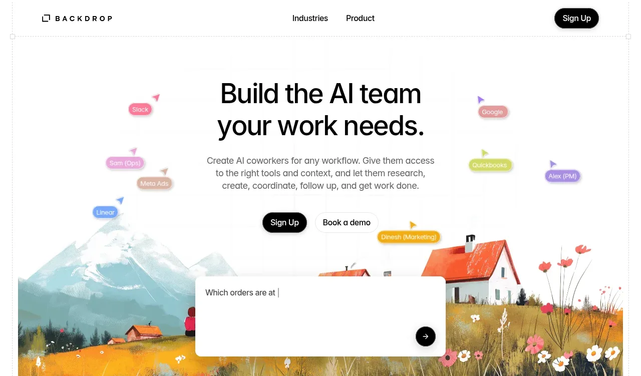 AI coworker hero
Backdrop · Hero
AI coworker hero
Backdrop · Hero
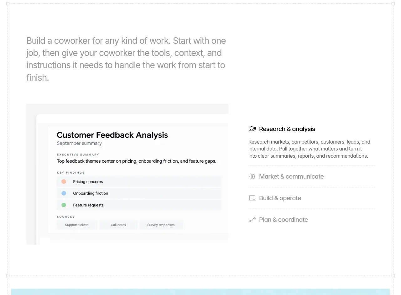 Build a coworker workflow overview
Backdrop · Feature grid
Build a coworker workflow overview
Backdrop · Feature grid
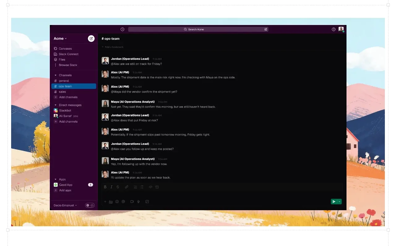 Collaborative workspace visual
Backdrop · Gallery
Collaborative workspace visual
Backdrop · Gallery
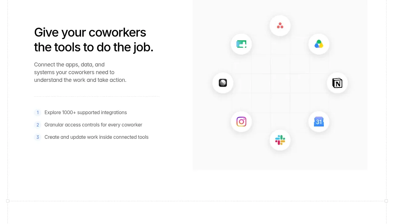 Connected tools and integrations
Backdrop · Feature grid
Connected tools and integrations
Backdrop · Feature grid
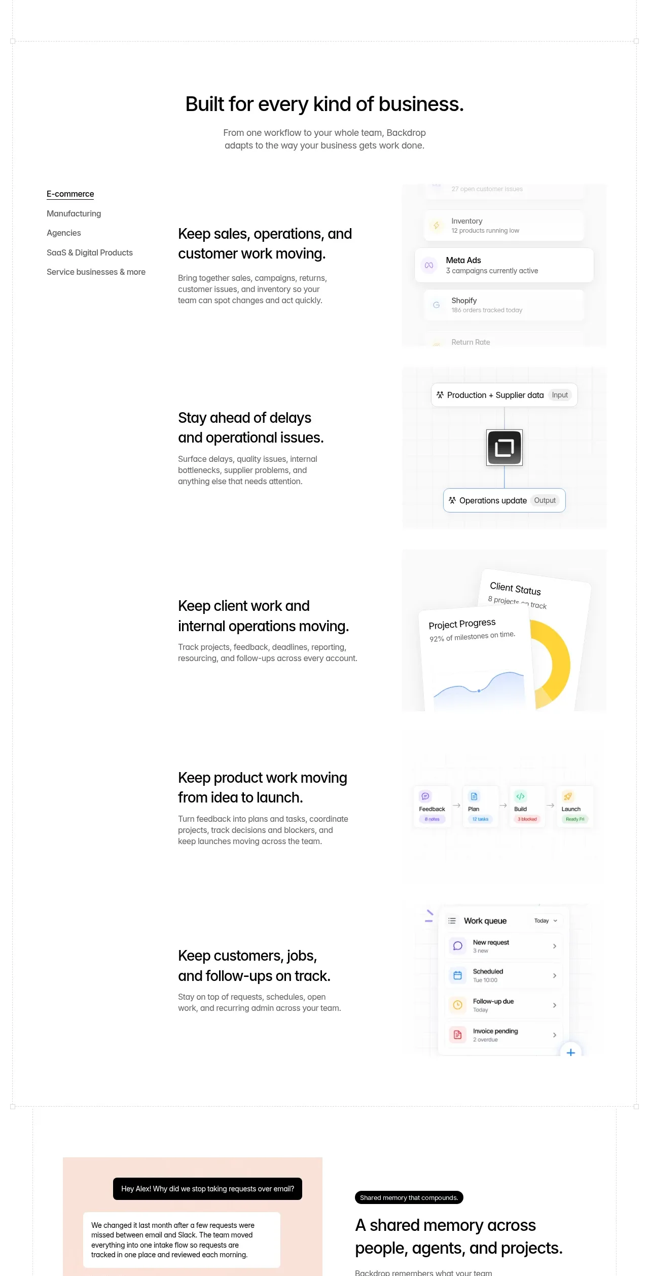 Business use cases tabs
Backdrop · Tabs & steps
Business use cases tabs
Backdrop · Tabs & steps
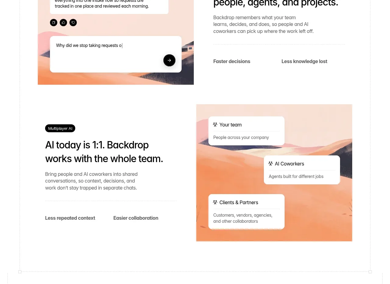 Shared memory and team context
Backdrop · Feature grid
Shared memory and team context
Backdrop · Feature grid
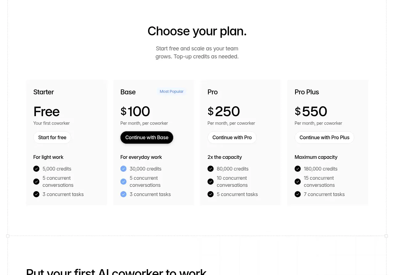 Four-tier pricing table
Backdrop · Pricing table
Four-tier pricing table
Backdrop · Pricing table
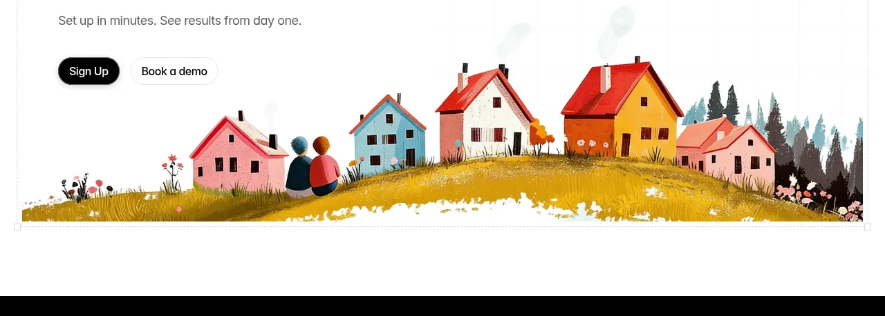 First coworker call to action
Backdrop · Call to action
First coworker call to action
Backdrop · Call to action
 Dark site footer
Backdrop · Footer
Dark site footer
Backdrop · Footer