kage
apps.marcoluthi.com

Design analysis
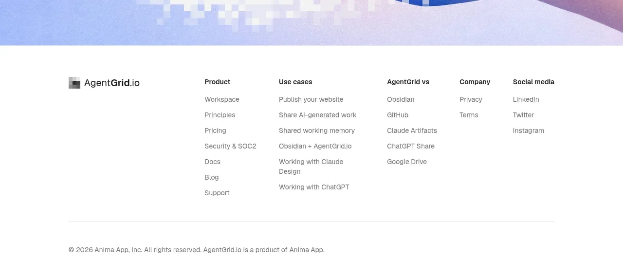
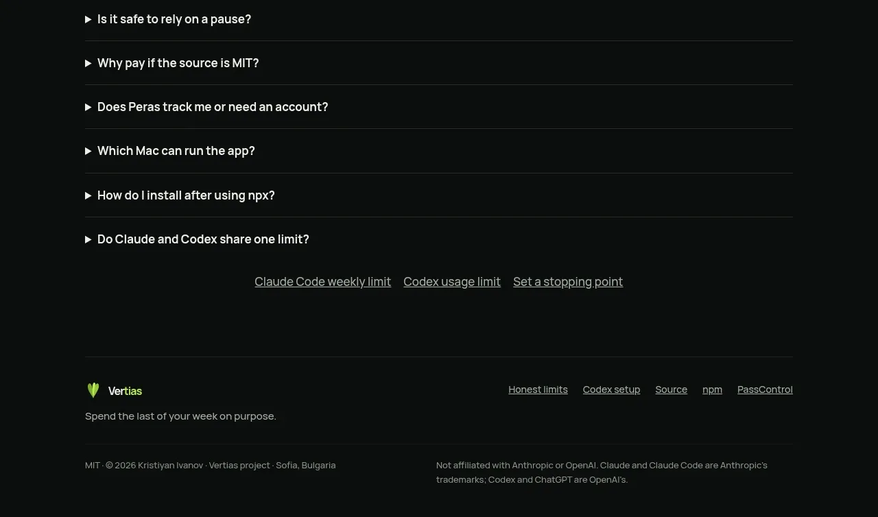
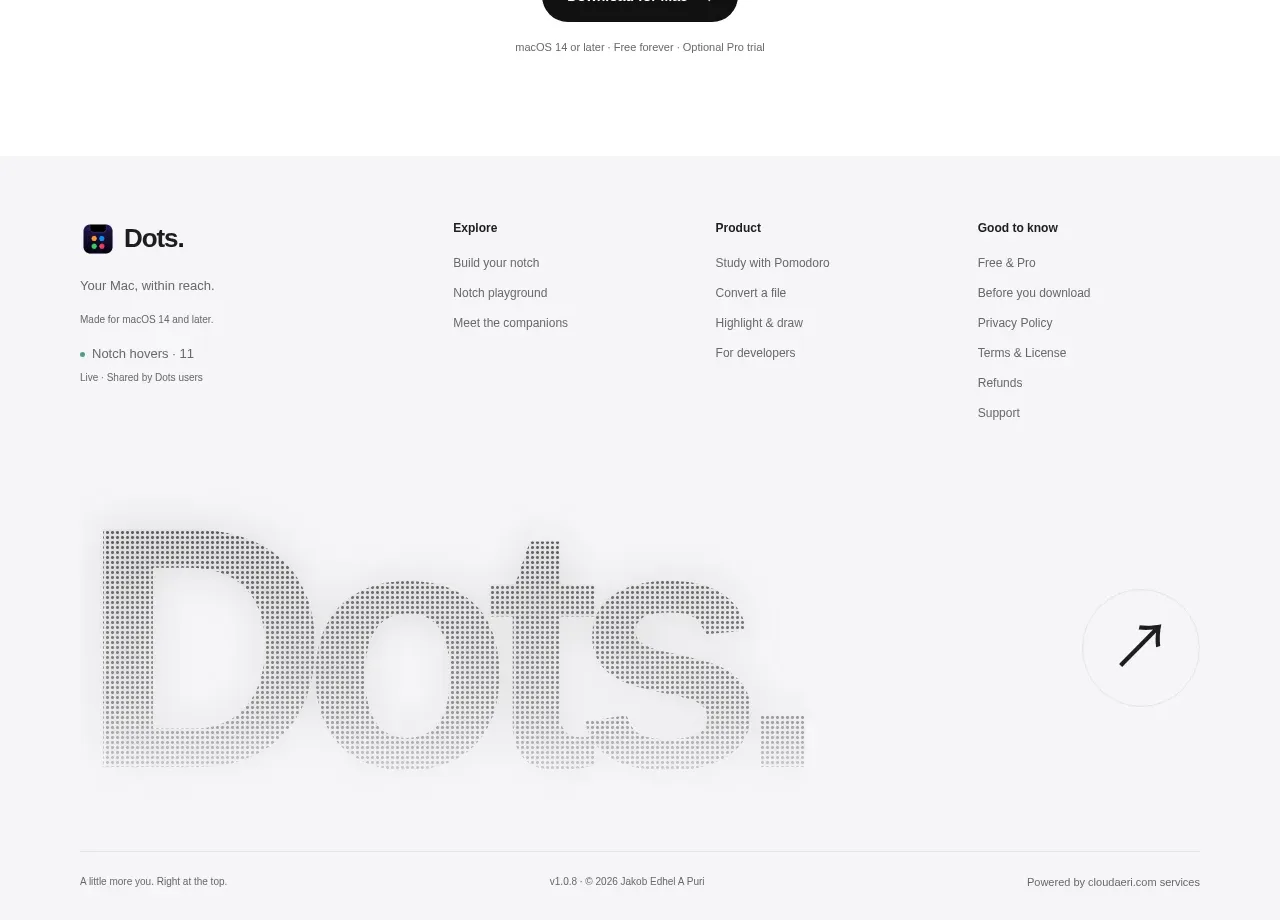
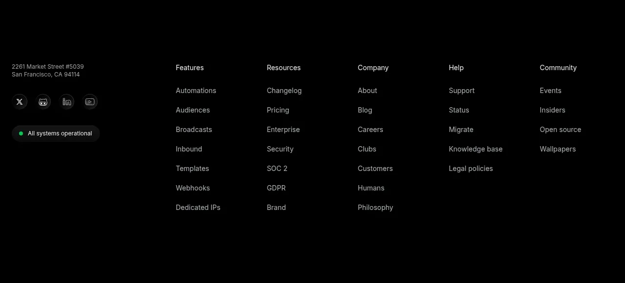
A restrained footer places the product identity and platform note on the left, utility links on the right, and a small legal line at the bottom.
Prompt preview
## Reference images

Study these alongside the description below: hierarchy, rhythm, spacing, colour. Build for the product you are asked about, using this design language.

- Component: https://kage-design-assets.t3.tigrisfiles.io/components/badgey/bd3040e3-7307-4350-8c61-c2e3eef7de7a-1792994548-7.webp
- Full page it was cut from: https://kage-design-assets.t3.tigrisfiles.io/screenshots/badgey/bd3040e3-7307-4350-8c61-c2e3eef7de7a-1792994501677-full.webp
- Component on Kage: https://kage.design/component/badgey-footer

## Before you start
Ask what product identity, support links, legal links, platform details, and copyright information the user's footer needs. Match the user's brand while keeping the footer subordinate.

Build a clean footer with a centered max-width container. Use a two-column upper row: product identity and a small platform/status note on the left, grouped utility links on the right. Add a thin divider or generous spacing before a small legal/copyright line. Use an off-white background, near-black primary text, muted gray metadata, 13–15px link text, and 12–13px legal text. Keep links clearly interactive with hover and focus states; stack the columns on narrow screens.

Use consistent alignment with the navigation and avoid excessive link density. Maintain generous horizontal padding and 24–40px vertical spacing so the footer feels calm and deliberate.

Never: use logos, product names, copy, illustrations, or imagery from the reference.