kage
monish.cc
Design analysis
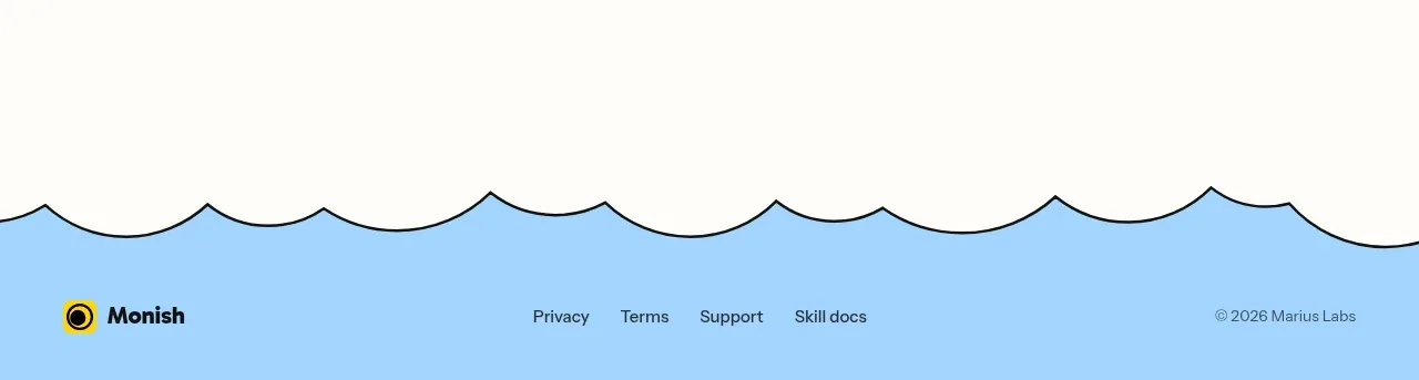
The page ends with a playful scalloped transition into a sky-blue footer containing brand treatment, utility links, and a small copyright line.
Prompt preview
## Reference images

Study these alongside the description below: hierarchy, rhythm, spacing, colour. Build for the product you are asked about, using this design language.

- Component: https://kage-design-assets.t3.tigrisfiles.io/components/monish/5f3b5863-2239-4773-833d-591642a3d58f-1792821776-8.webp
- Full page it was cut from: https://kage-design-assets.t3.tigrisfiles.io/screenshots/monish/5f3b5863-2239-4773-833d-591642a3d58f-1792821722168-full.webp
- Component on Kage: https://kage.design/component/monish-footer

## Before you start
Ask what legal, support, social, and product links the user's footer needs and what closing visual gesture fits the brand. Apply the principles to that product.

Build a full-width footer that transitions from the page using a soft scalloped or wave-shaped top edge. Use sky blue #9DD5F7 as the footer field, a small left-aligned brand lockup, centered utility links, and a right-aligned low-contrast copyright line. Keep the footer minimal with plenty of horizontal padding and a centered max-width container. Use near-black #080808 for brand and links, muted blue-gray #4D6B7C for secondary text, 14px link type, and consistent 24–32px spacing. Make the wave decorative but accessible, and stack the three footer zones vertically on mobile.

Never use logos, product names, copy, illustrations, or imagery from the reference.