kage
apps.marcoluthi.com

Design analysis
A minimal light page that lets product imagery carry the colour. The hero frames a large sans headline between floating badge cards and a QR card, and full-bleed device mockups, a carousel of badge screens, a dark promo-code device, an accordion FAQ and a saturated blue closing block alternate quiet and loud moments down the page.
Prompt preview
## Reference images

Study these alongside the description below: hierarchy, rhythm, spacing, colour. Build for the product you are asked about, using this design language.

- Full page: https://kage-design-assets.t3.tigrisfiles.io/screenshots/badgey/bd3040e3-7307-4350-8c61-c2e3eef7de7a-1792994501677-full.webp
- Above the fold: https://kage-design-assets.t3.tigrisfiles.io/screenshots/badgey/bd3040e3-7307-4350-8c61-c2e3eef7de7a-1792994497394.webp
- Design on Kage: https://kage.design/designs/badgey-landing-page

## Before you start
Ask the user what product or app they are building, who it is for, and which brand assets they already have (name, colours, type, app store listings). Wait for the answers, then apply everything below to their product — not to the reference.

## Page structure
- Sticky header: small wordmark left, a pill-shaped dark 'Download' button right, on a translucent light bar.
- Hero: small eyebrow line, two-line oversized headline, one-sentence subline, black App Store badge; floating badge-card illustrations hang at varying depths on both sides.
- Device demo section: centred iPhone mockup showing the app UI, followed by a short benefit headline and two-line caption.
- Product showcase: two-line headline, explanatory caption, then a horizontal carousel of app screens with a dot/pill pagination control and a small caption underneath.
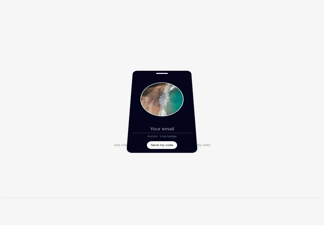
- Promo section: eyebrow, two-tone headline, one-line explanation, and a dark device mockup containing an email input and pill submit button.
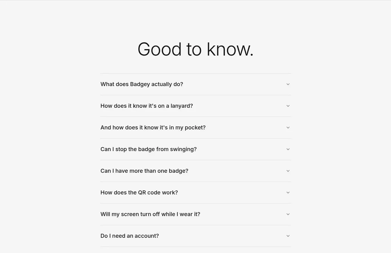
- FAQ: large 'Good to know.' headline and an accordion list of questions separated by hairline dividers, closed by default, with links to privacy policy and support beneath.
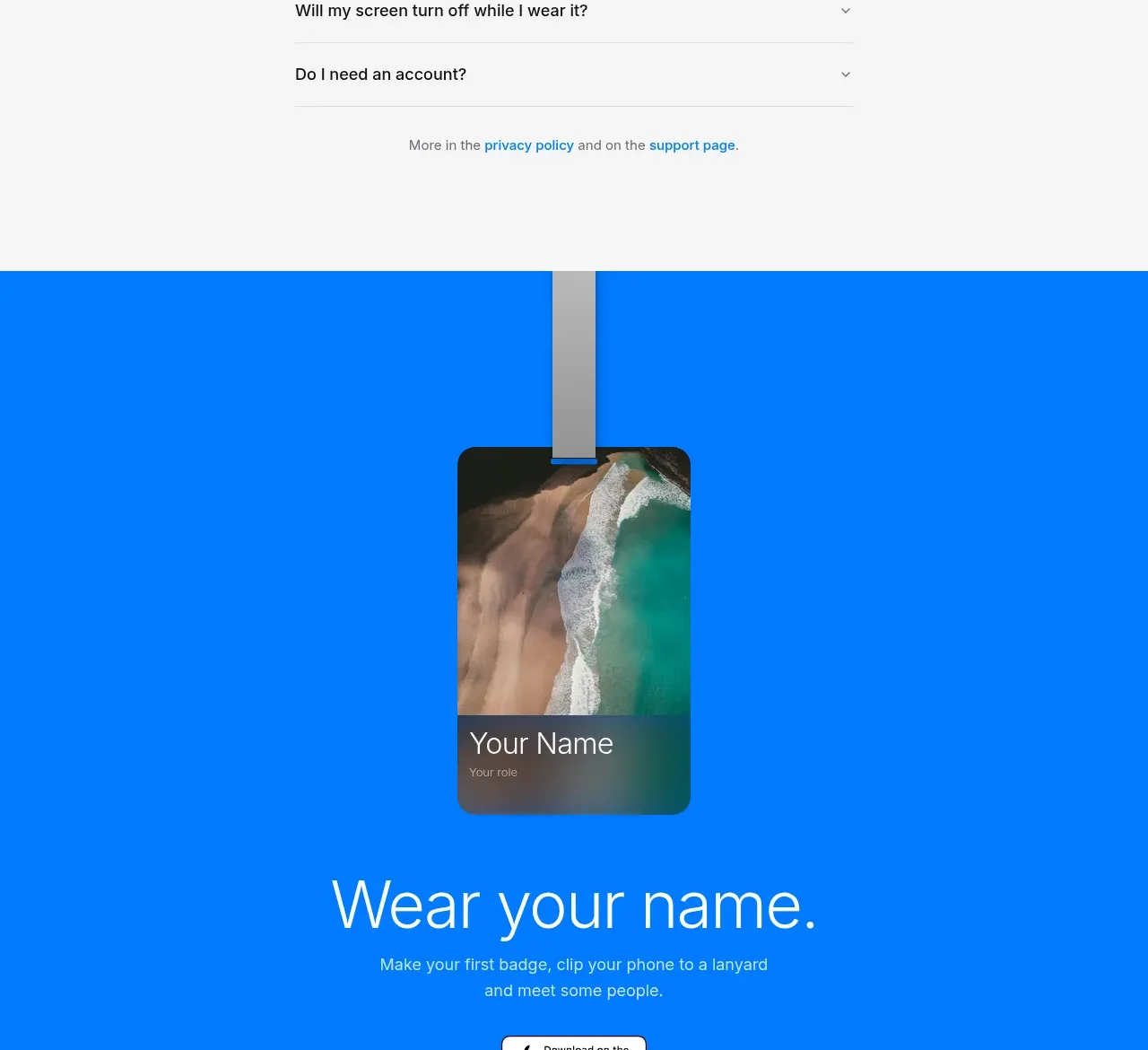
- Closing CTA: full-bleed saturated blue band with a hanging device illustration, a repeat of the headline promise in white, a short caption and the App Store badge.
- Footer: three columns of plain links plus the app name and platform requirements, with a trademark disclaimer line at the very bottom.

## Design language
- Build hierarchy from a very large headline scale (roughly 56–72px at desktop) down to 13–14px muted captions; keep the step between eyebrow, headline and caption consistent on every section.
- Set the page background to a near-white warm off-white (#f4f4f2), use near-black text (#111) and grey secondary text (#6b6b6b); keep every section on this quiet base until the final CTA.
- Introduce exactly one loud moment: a saturated brand-coloured band (e.g. #1d6ef5) for the closing CTA with white type; keep all other colour inside product imagery.
- Use one geometric sans family throughout, regular weight for headlines (relying on size, not boldness) and medium for small labels.
- Style controls as small pills with generous radius (999px for buttons, 12–16px for cards) and no shadows heavier than a soft ambient blur; separate sections with whitespace, not rules.
- Animate on scroll with gentle fades and slight parallax on floating imagery; keep the header pill sticky and floating.

## Never
Do not copy the reference's name, badge-card illustrations, specific copy, FAQ questions or the exact blue; keep every illustration and screenshot native to the user's own product.
Components from this page
All components
 Minimal product navigation
Badgey · Navigation
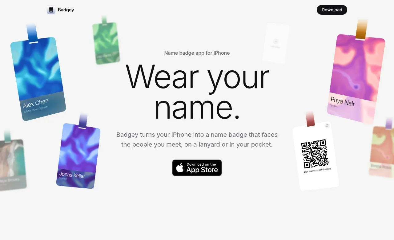 Floating badge product hero
Badgey · Hero
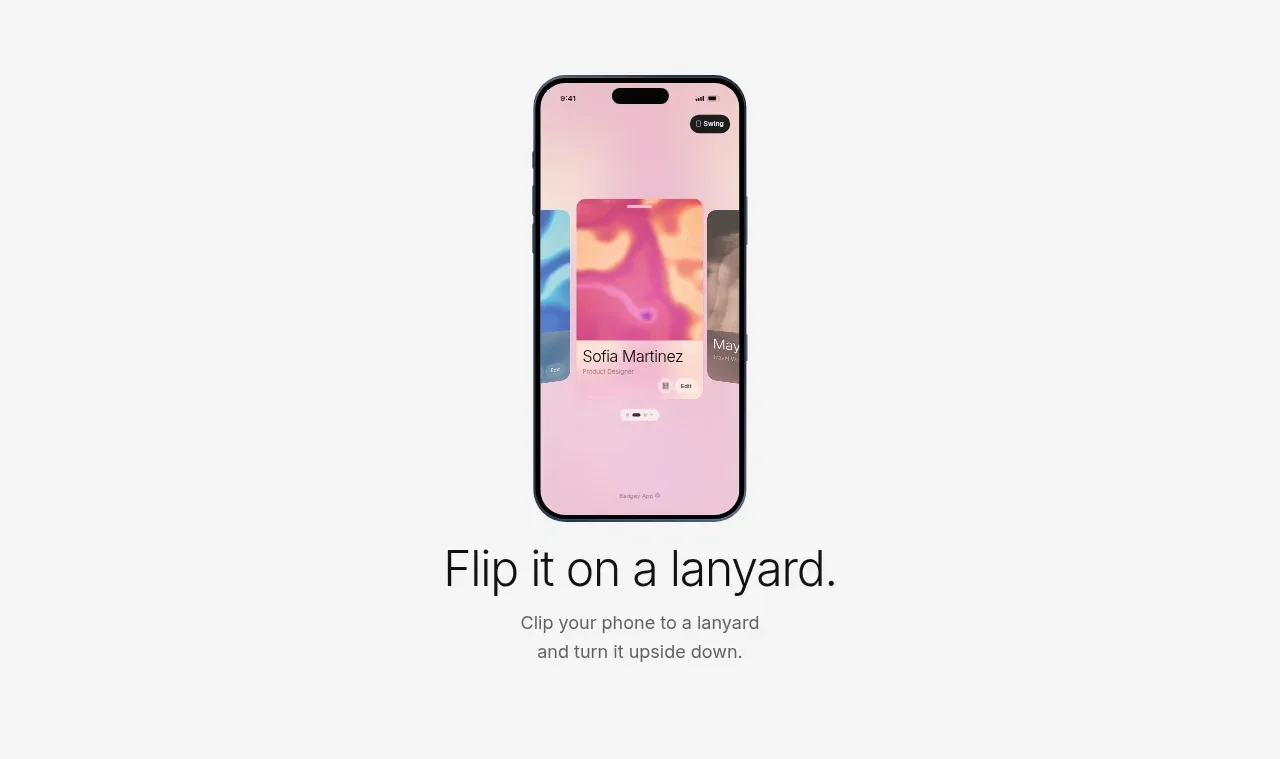 Lanyard use-case feature
Badgey · Feature grid
 Multiple badge designs gallery
Badgey · Gallery
 Promo code email capture
Badgey · Form
 Product FAQ accordion
Badgey · FAQ
 Final download call to action
Badgey · Call to action
 Product footer
Badgey · Footer