 kage
kage
beehiiv.com

Design analysis
A dark, high-contrast pricing section combines a strong editorial heading with billing and audience controls above a four-column plan comparison. Clear dividers, compact feature checklists, and differentiated primary actions make the intended upgrade path easy to scan without overwhelming the user.
Prompt preview
## Reference images

Study these alongside the description below: hierarchy, rhythm, spacing, colour. Build for the product you are asked about, using this design language.

- Component: https://kage-design-assets.t3.tigrisfiles.io/components/beehiiv-com/23eb8ac3-d7aa-449f-95ad-92bcd925810d-1789067454-5.webp
- Full page it was cut from: https://kage-design-assets.t3.tigrisfiles.io/screenshots/beehiiv-com/23eb8ac3-d7aa-449f-95ad-92bcd925810d-1789067406-full.webp
- Component on Kage: https://kage.design/component/beehiiv-pricing-table

## Before you start
Ask what the user's product is, who it serves, and what its brand personality and visual system are. Then apply the principles below to create an original pricing section for that product—not a copy of the reference.

## Build this section
Create a responsive pricing-table section for a modern software product. It should feel confident, editorial, and conversion-focused while remaining easy to compare at a glance.

### Layout and alignment
- Use a full-width section with a deep near-black navy background, approximately `#08061B`.
- Constrain the content to a centered max width of roughly 1024–1180px, with generous vertical padding.
- Start with a small uppercase eyebrow, followed by a large left-aligned headline and a short supporting paragraph.
- Place pricing controls in the same upper content band: a horizontal subscriber/usage slider or equivalent product-specific quantity control, plus a segmented billing toggle such as monthly/yearly. On narrower screens, stack these controls below the copy.
- Present four pricing tiers in one bordered comparison grid on desktop. Use equal-width columns, shared top alignment, and consistent internal padding. Let the grid scroll horizontally or stack into cards on mobile; never make text illegibly narrow.
- Include a low-emphasis text link beneath the table for viewing a fuller feature comparison.

### Typography hierarchy
- Use a bold, slightly condensed or display-style sans serif for the main heading; make it uppercase if that suits the user's brand. Target approximately 42–52px desktop and 32–40px mobile.
- Use a small, letter-spaced uppercase eyebrow in an accent colour, around 12–14px.
- Use a highly readable sans serif for body copy and feature lists, around 15–17px with 1.45–1.6 line height.
- Make plan names prominent at approximately 22–24px and use strong weight.
- Make prices visually dominant at approximately 24–30px, with billing qualifiers in a smaller regular weight.
- Keep button labels concise, clear, and semibold.

### Colour and emphasis
- Use near-white primary text around `#F7F5FF` and muted lavender-grey secondary text around `#B9B5D0`.
- Use a vivid blue-violet accent for selected states and primary CTAs, approximately `#3946D1` or adapt it to the user's palette.
- Use a restrained pink, magenta, or brand accent for the eyebrow, approximately `#D66BAA`.
- Ensure all text and controls meet accessible contrast standards. Do not rely on colour alone to communicate the selected plan or billing mode.

### Borders, surfaces, and spacing
- Keep the overall surface flat and dark; use subtly lighter transparent panels only where they improve grouping.
- Define the comparison grid with a thin low-contrast border around `rgba(220,220,255,0.18)` and matching vertical dividers.
- Use a restrained radius of about 8–10px on the outer table and controls; avoid excessive rounded cards.
- Add a horizontal divider below each plan heading and another before the feature list.
- Give each column approximately 24px internal padding on desktop, with 28–40px vertical spacing between major sections.
- Keep feature rows separated by breathing room rather than visible lines. Use small checkmarks aligned consistently in a narrow icon column, with wrapped text aligned to the same start position.
- Make primary actions filled accent buttons. Use outlined buttons for free, custom, or secondary actions, while keeping all buttons equal height and full column width.

### Interaction and responsive behaviour
- Make the quantity slider keyboard accessible, with a visible thumb, track, current value label, and meaningful accessible name. Update pricing and any subscriber-dependent copy when its value changes.
- Make the billing toggle a real segmented control with clear selected and unselected states. Update displayed prices and billing qualifiers when toggled.
- Add subtle hover and focus states to controls, links, and buttons; use a visible focus ring.
- If one tier is recommended, communicate it with a small badge or top accent without disrupting column alignment.
- Keep the comparison usable on touch devices: provide generous hit areas and either stack plans or allow horizontal scrolling with an obvious affordance.
- Respect reduced-motion preferences and avoid distracting animations.

### Content structure
- Support four tiers with: plan name, price or custom-pricing label, short descriptor, CTA, and a feature checklist.
- Keep feature copy short and scannable. Allow different feature counts, but preserve aligned headings, pricing, CTA positions, and list starts where possible.
- Make the value difference between tiers clear through plan descriptions, feature grouping, and CTA hierarchy—not just colour.

## Never
- Never use logos, product names, or brand-specific language from the reference.
- Never reuse the reference's exact copy, plan names, prices, feature names, or CTA wording.
- Never copy the reference's exact layout proportions, typography, colours, or visual details; adapt the principles to the user's product and brand.
- Never include the reference's customer photos, illustrations, decorative imagery, or other borrowed assets.
- Never omit keyboard access, responsive behaviour, visible focus states, or sufficient colour contrast.
More components
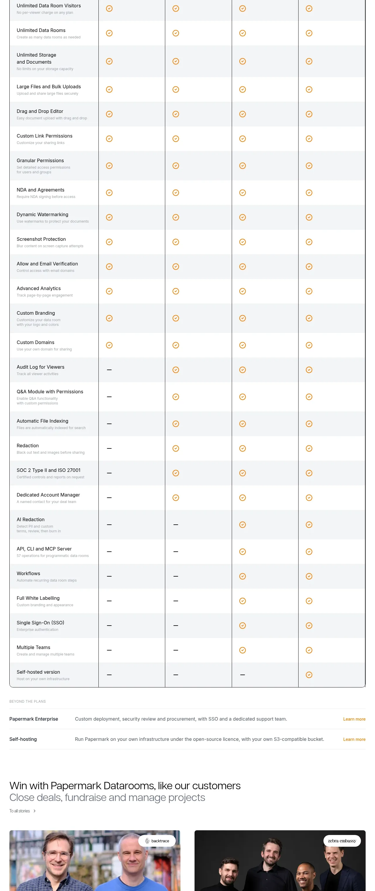
 Plan comparison table
Papermark Data Rooms · Pricing table
Plan comparison table
Papermark Data Rooms · Pricing table
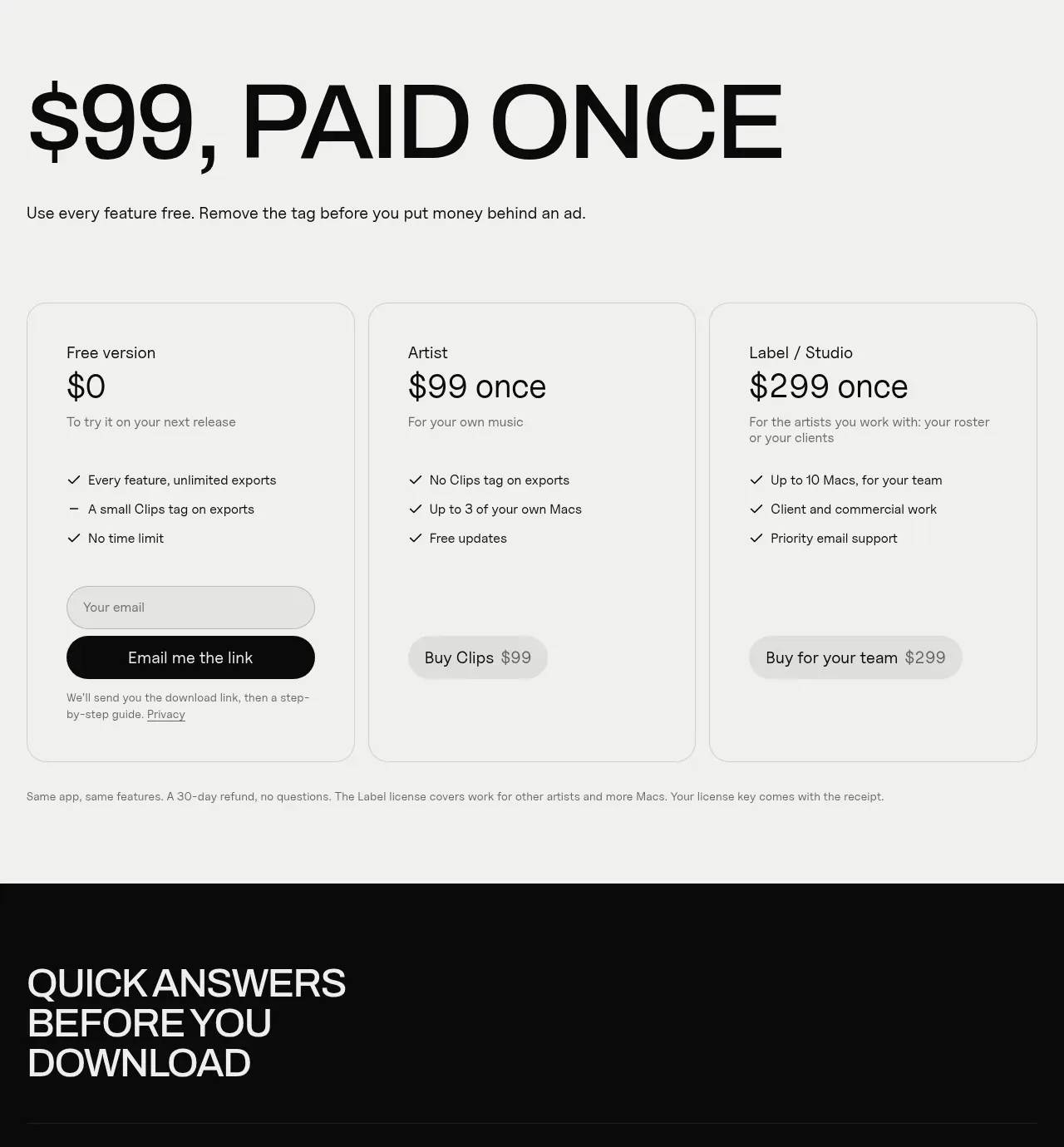
 One-time purchase pricing
Clips by Plastic · Pricing table
One-time purchase pricing
Clips by Plastic · Pricing table
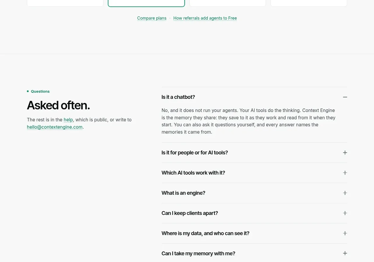
 Per-unit pricing table
Context Engine · Pricing table
Per-unit pricing table
Context Engine · Pricing table
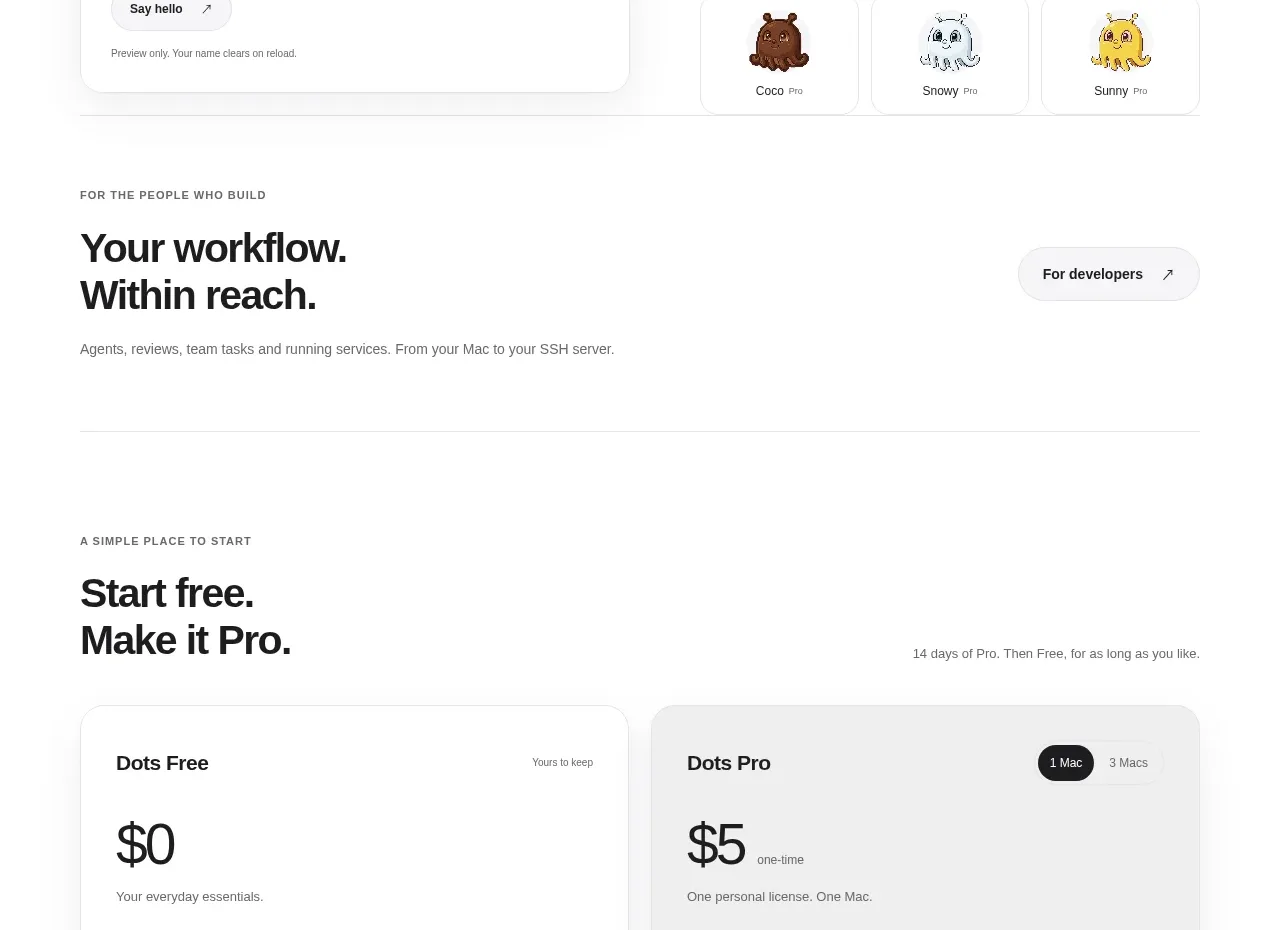
 Free and pro pricing cards
Dots · Pricing table
Free and pro pricing cards
Dots · Pricing table
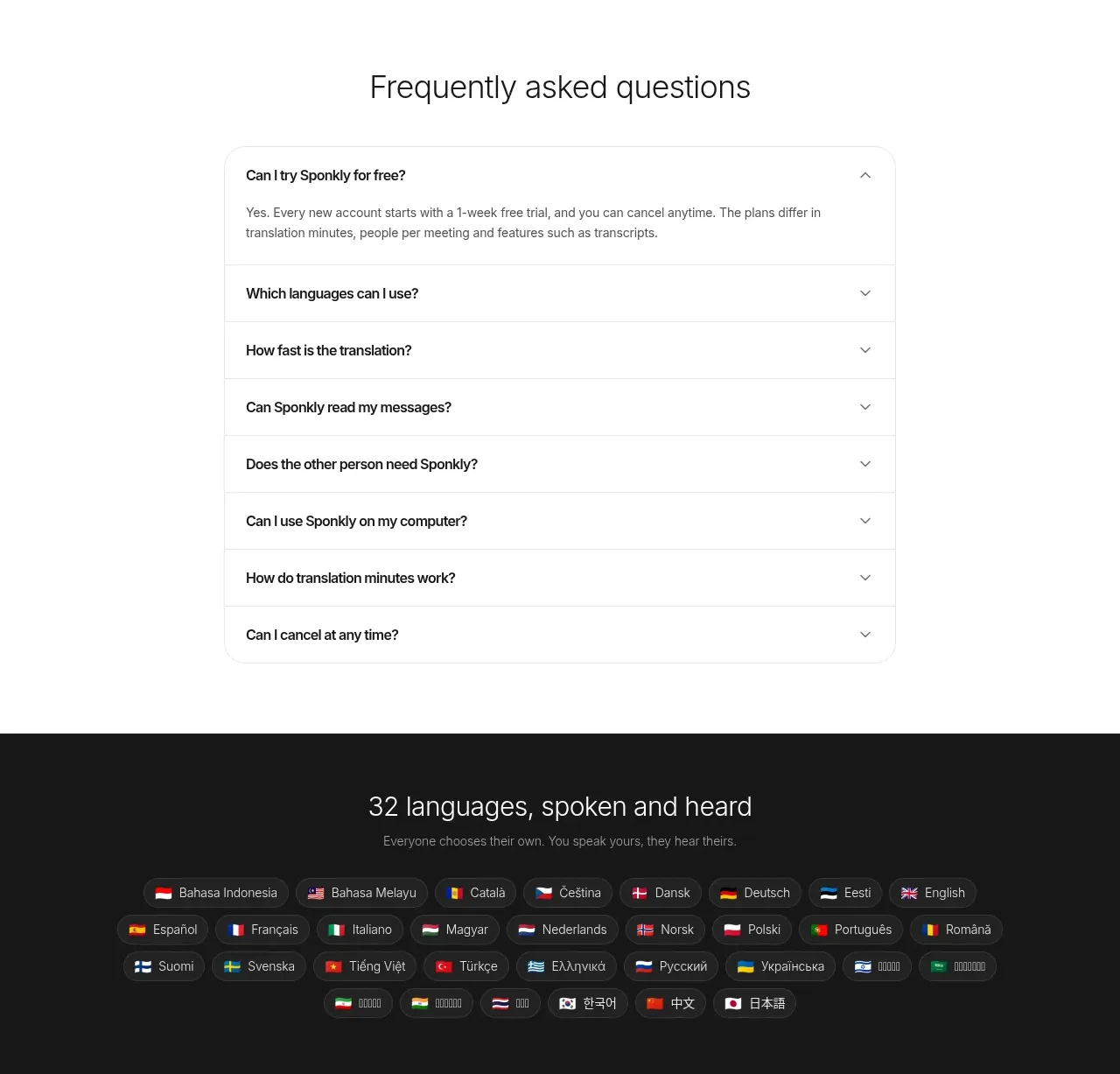
 Transparent multi-tier pricing
Sponkly · Pricing table
Transparent multi-tier pricing
Sponkly · Pricing table
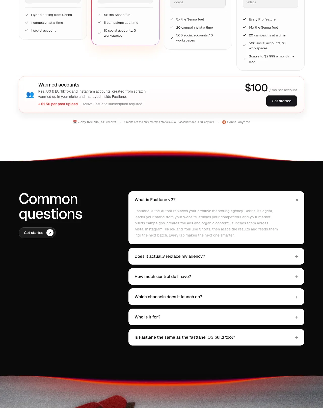
 Four-tier pricing table
Fastlane 2.0 · Pricing table
Four-tier pricing table
Fastlane 2.0 · Pricing table