 kage
contextengine.com
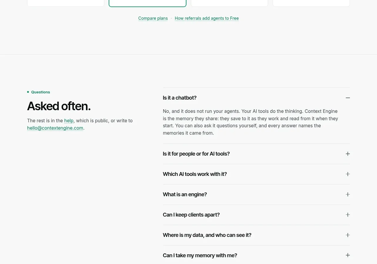
Design analysis
A centered pricing introduction leads into four compact plan cards, with the recommended plan marked by a mint border.
Prompt preview
## Reference images

Study these alongside the description below: hierarchy, rhythm, spacing, colour. Build for the product you are asked about, using this design language.

- Component: https://kage-design-assets.t3.tigrisfiles.io/components/context-engine/37fe6fcb-aa91-474a-8a89-1c1cadc0a655-1792821974-9.webp
- Full page it was cut from: https://kage-design-assets.t3.tigrisfiles.io/screenshots/context-engine/37fe6fcb-aa91-474a-8a89-1c1cadc0a655-1792821825382-full.webp
- Component on Kage: https://kage.design/component/context-engine-pricing-table

## Before you start
Ask what the user's billing unit is, which plans exist, what limits differ, and which plan should be recommended. Use those facts rather than inventing claims.

Build a pricing section with a centered eyebrow, headline, and explanatory paragraph. Under it, place four equal plan cards in a responsive grid. Each card should show plan name, large price, billing qualifier, short description, and a clear action or comparison link. Highlight the recommended plan using a 2px mint border and a very subtle tinted background; keep other cards on white with 1px neutral borders. Use black text, gray supporting copy, mint #35D3A0, pale gray #F7F8F7, 10px radius, and generous but compact card padding. Include a small row of secondary links beneath the cards. Make the grid scroll or stack cleanly on mobile and ensure price text remains readable.

Never: use logos, product names, copy, illustrations, or imagery from the reference.
More components
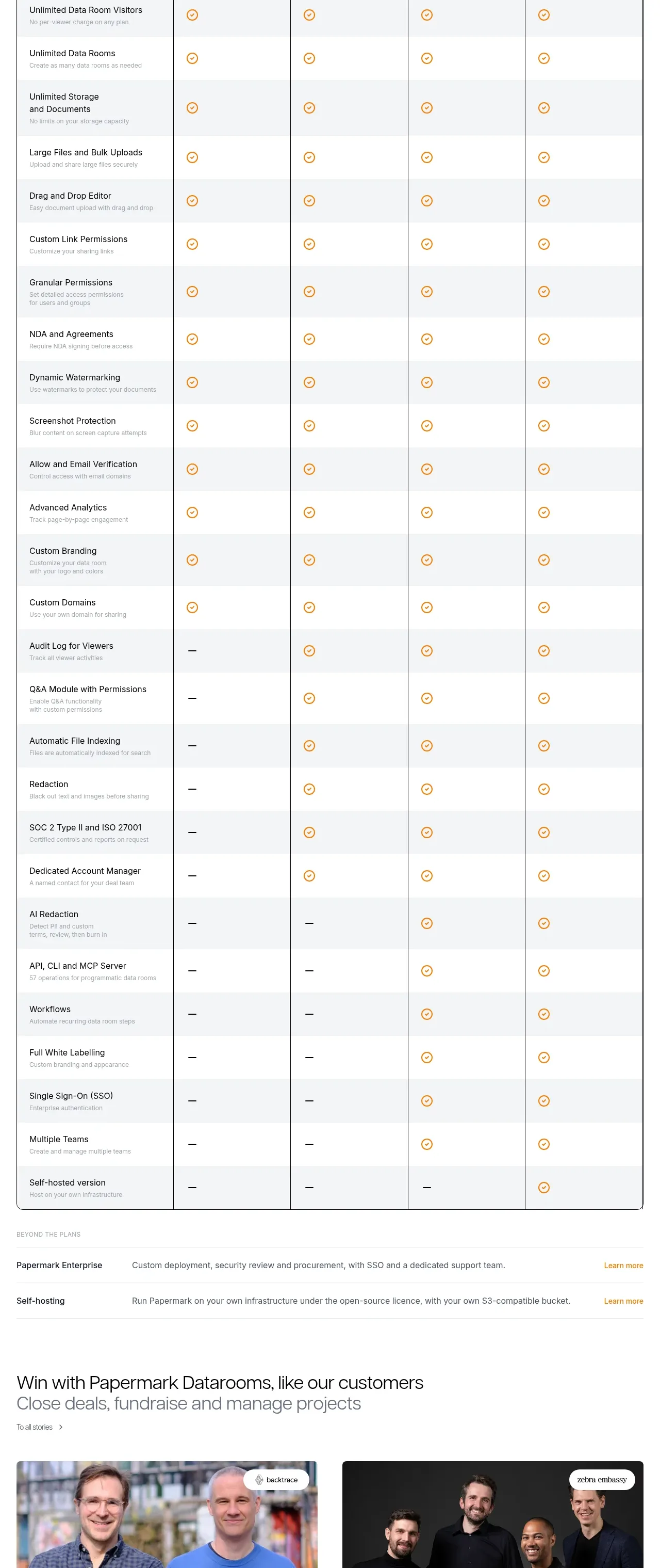
 Plan comparison table
Papermark Data Rooms · Pricing table
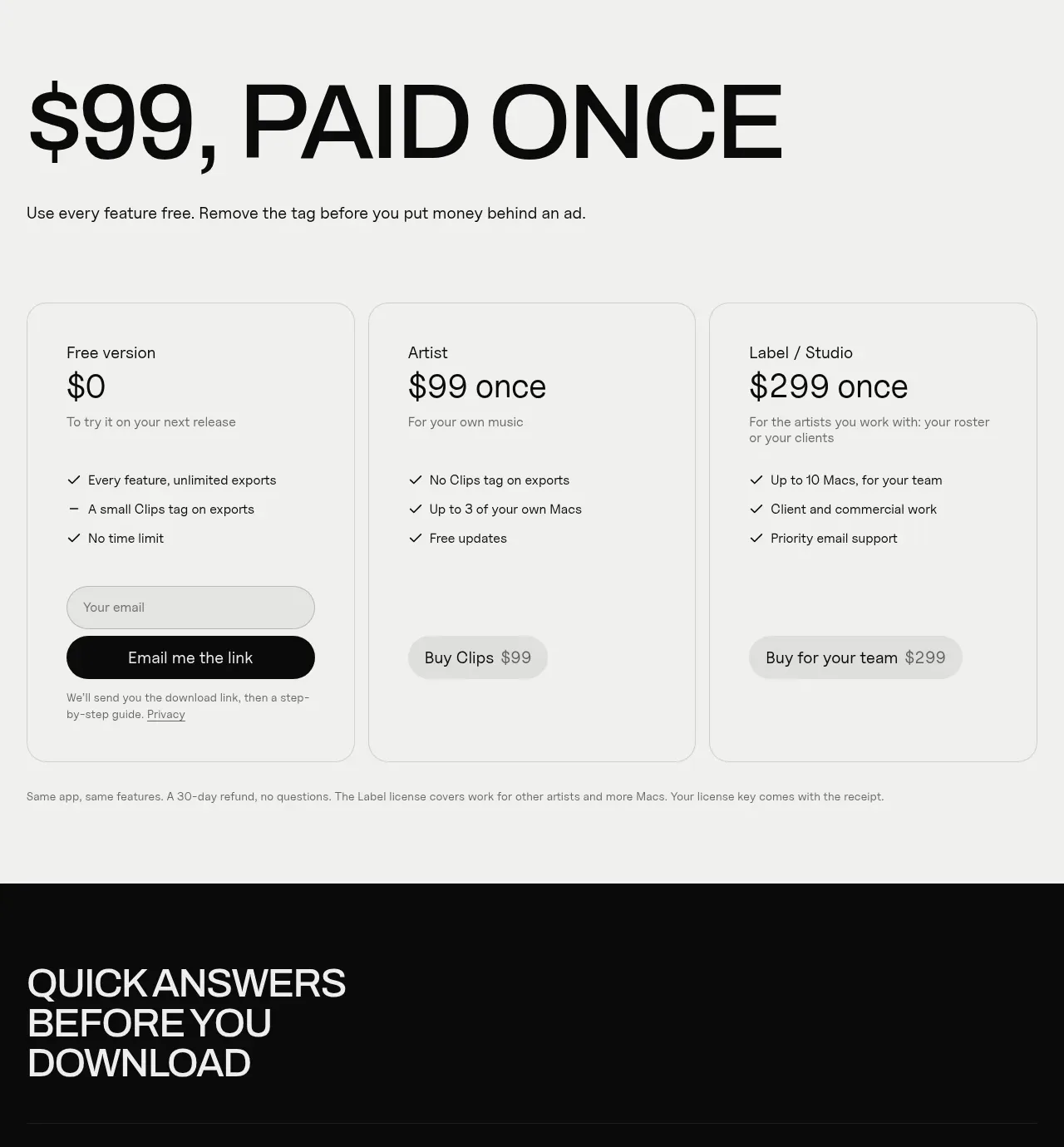
 One-time purchase pricing
Clips by Plastic · Pricing table
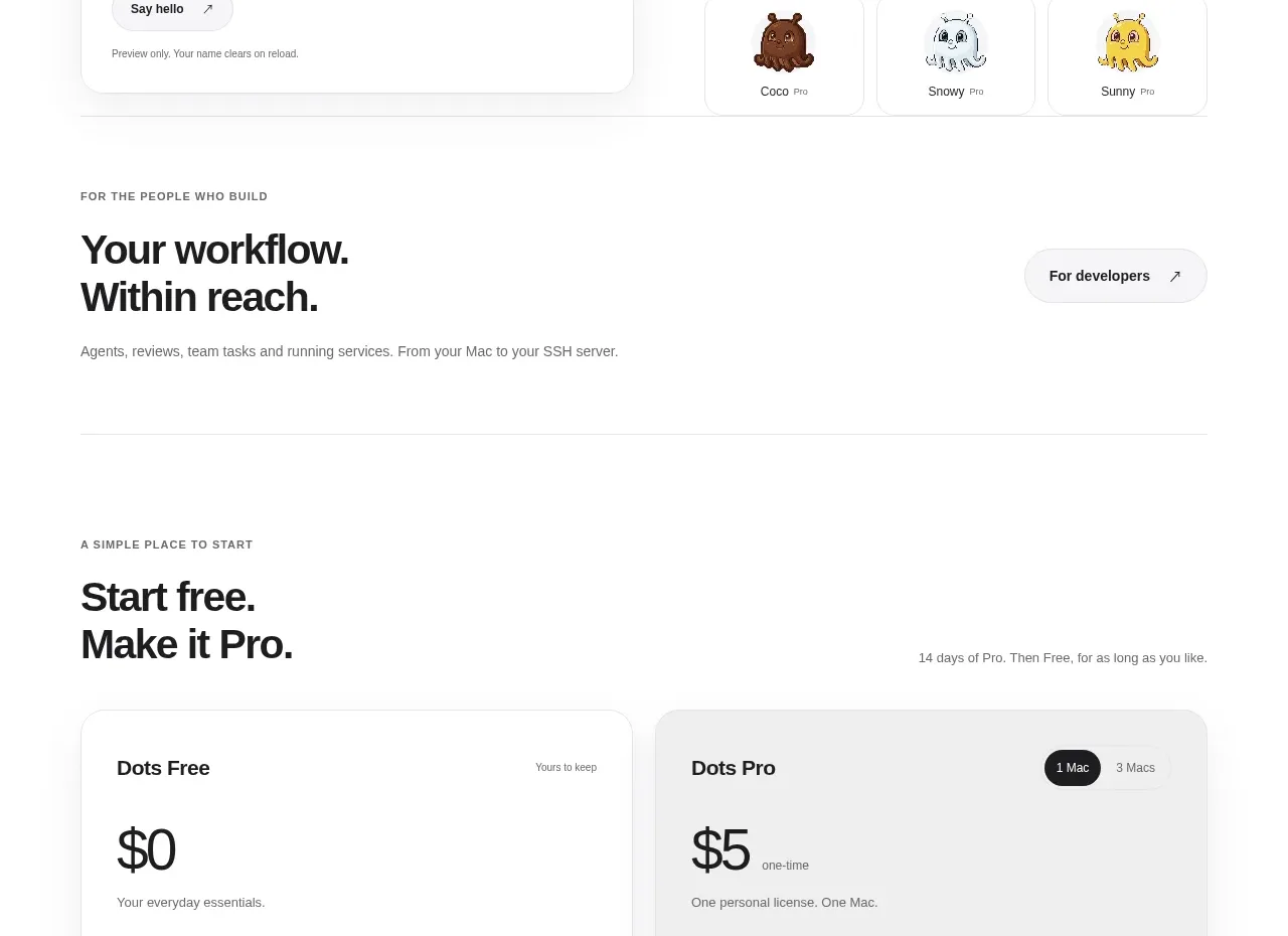
 Free and pro pricing cards
Dots · Pricing table
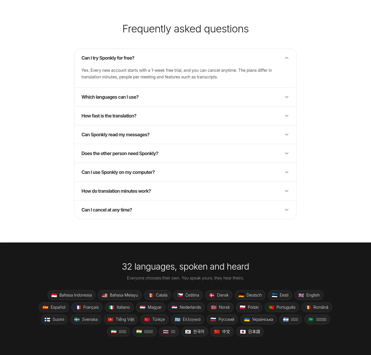
 Transparent multi-tier pricing
Sponkly · Pricing table
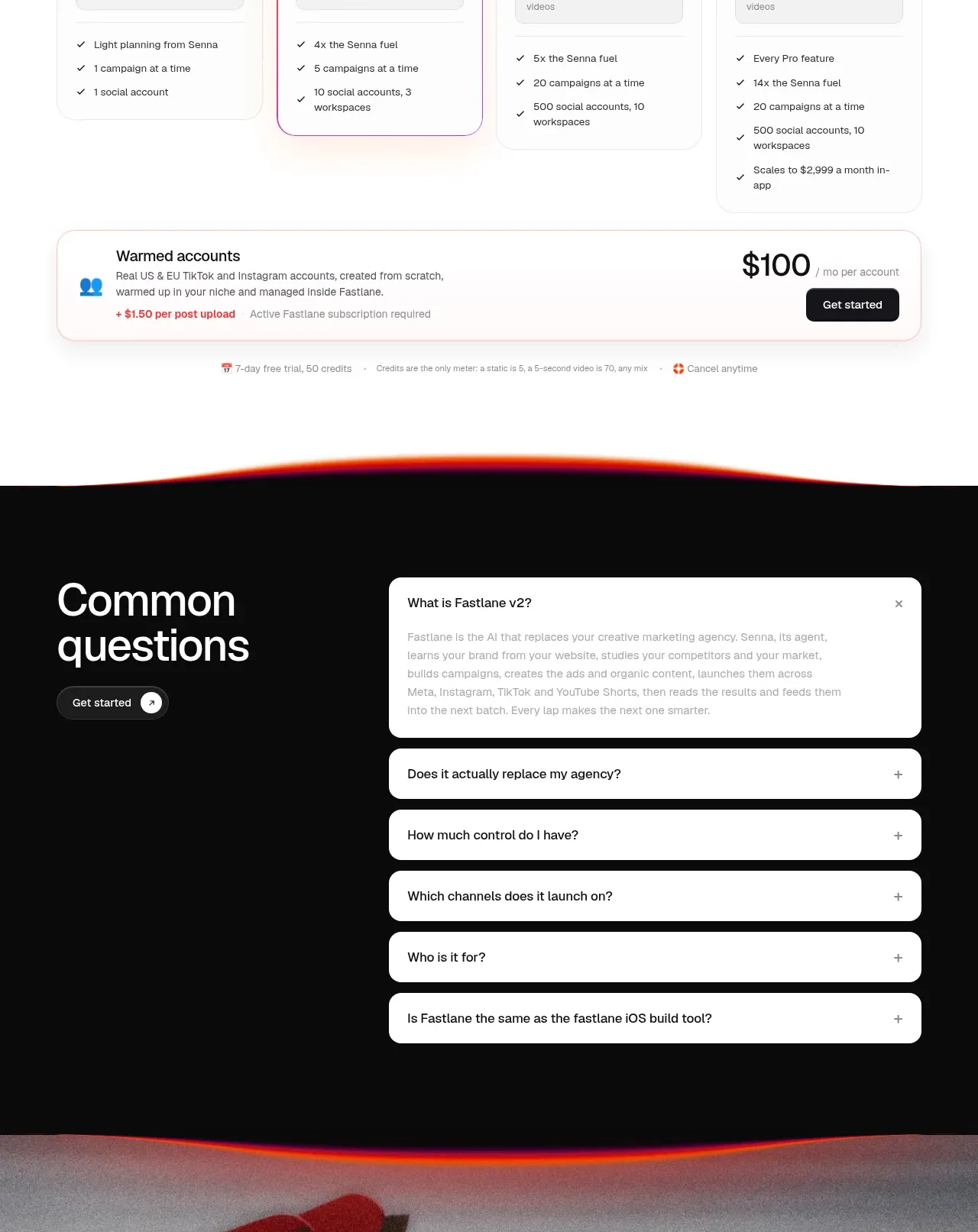
 Four-tier pricing table
Fastlane 2.0 · Pricing table

 Two-tier purchase options
Koi · Pricing table