kage
kage
capacity.so
Design analysis
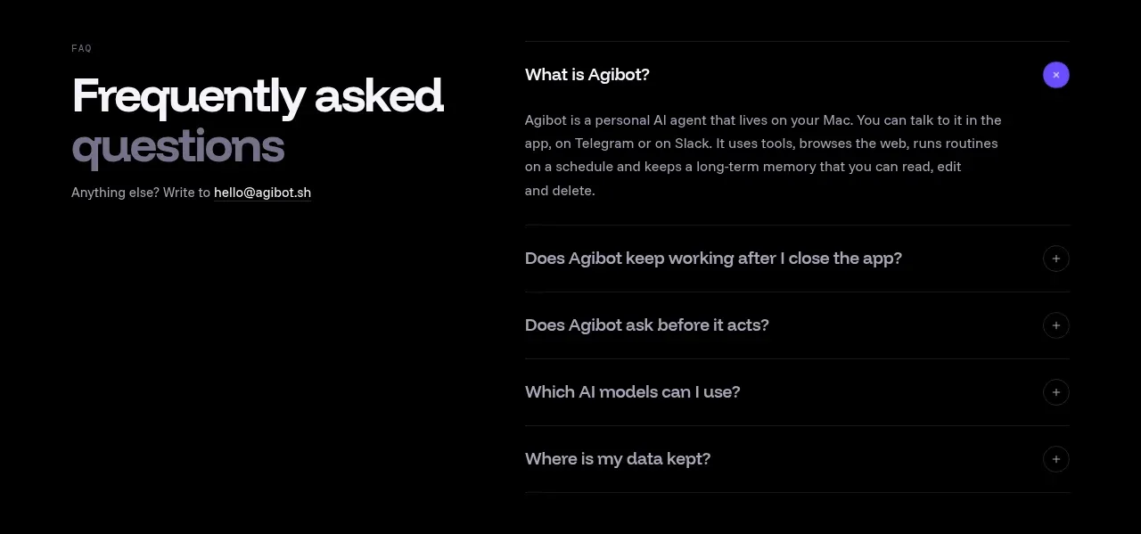
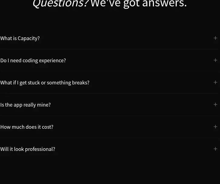
A narrow, centered FAQ uses a prominent question-led title and six clean accordion rows with plus controls and subtle separators.
Prompt preview
## Reference images

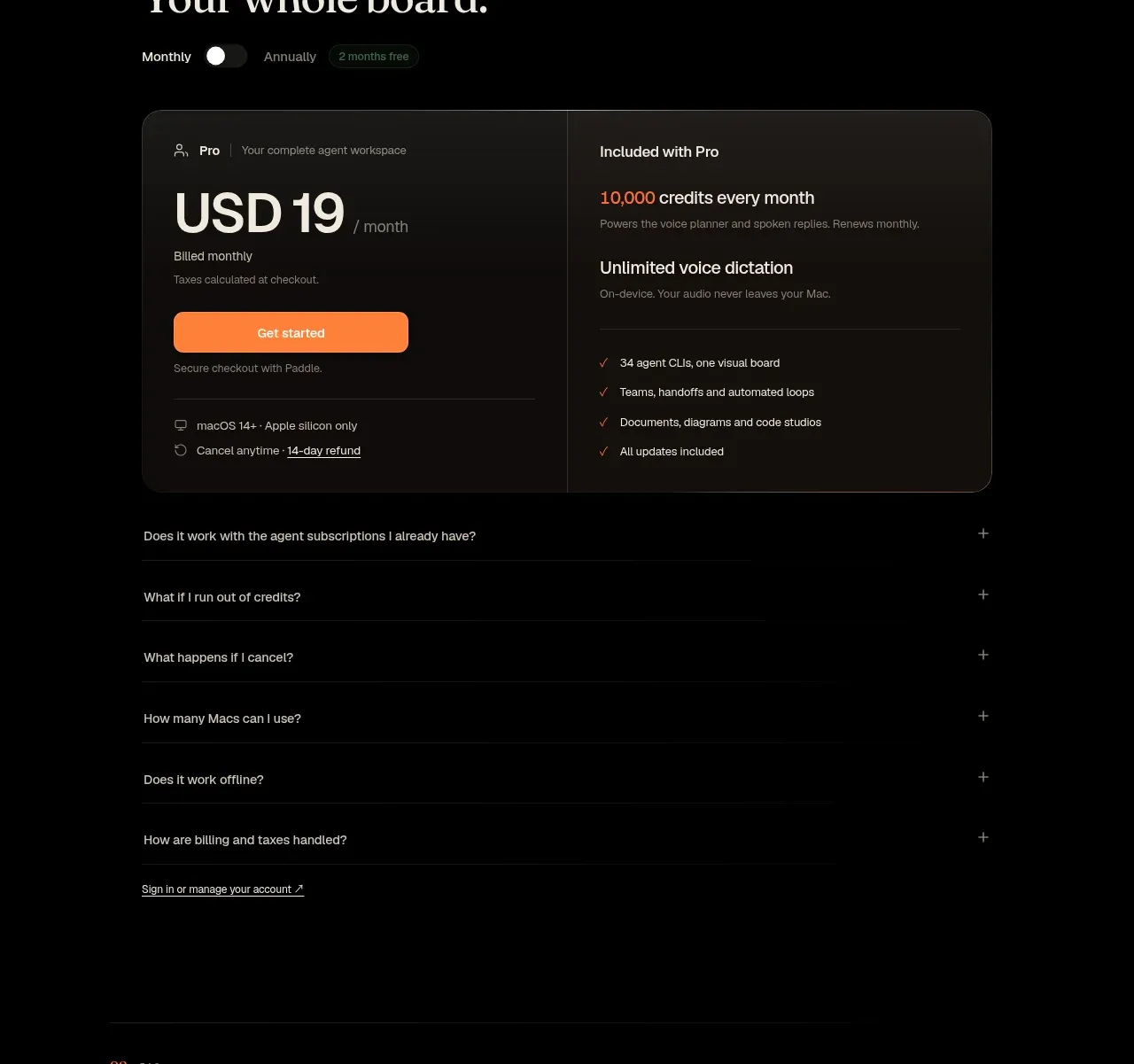
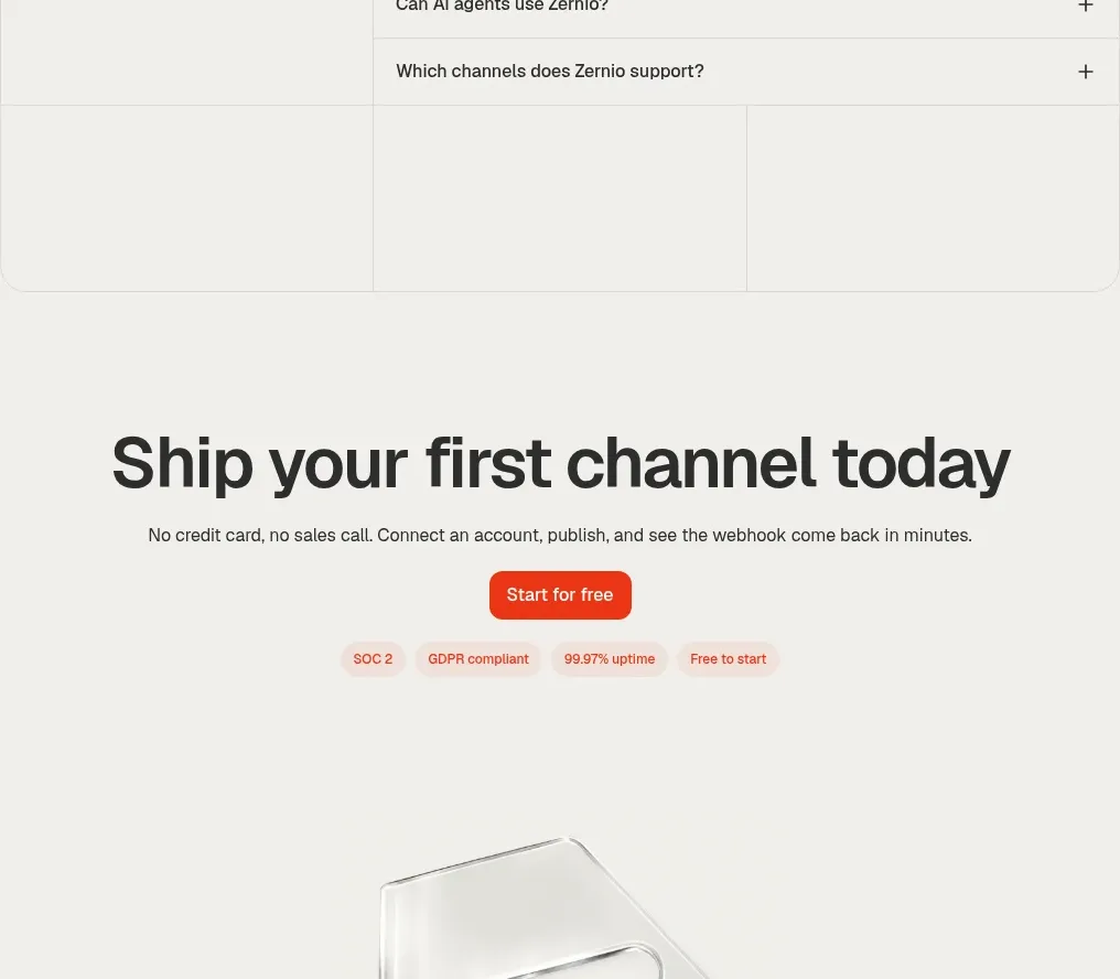
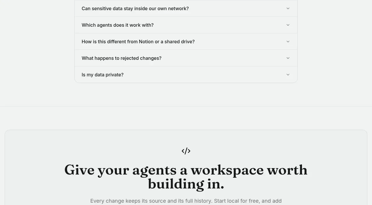
Study these alongside the description below: hierarchy, rhythm, spacing, colour. Build for the product you are asked about, using this design language.

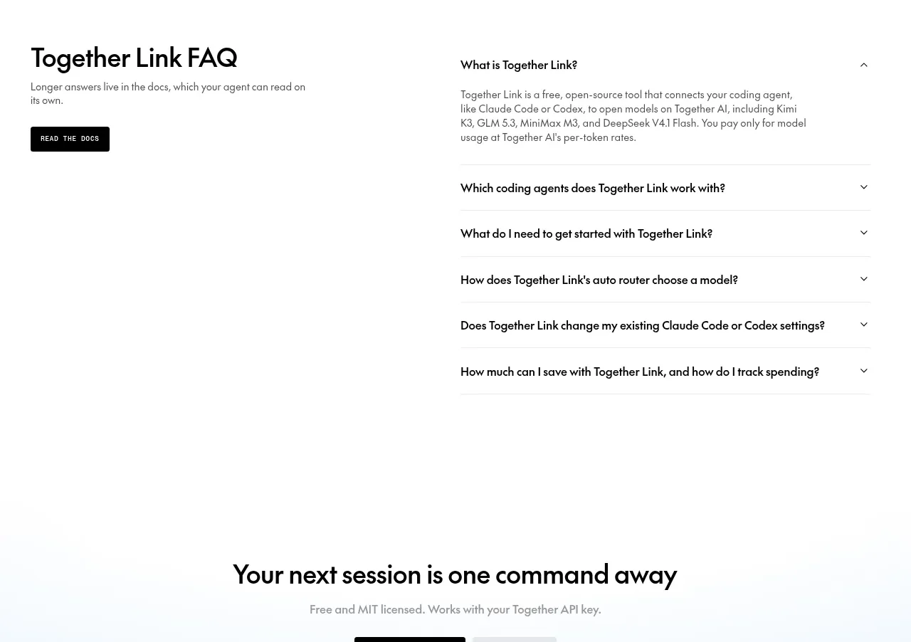
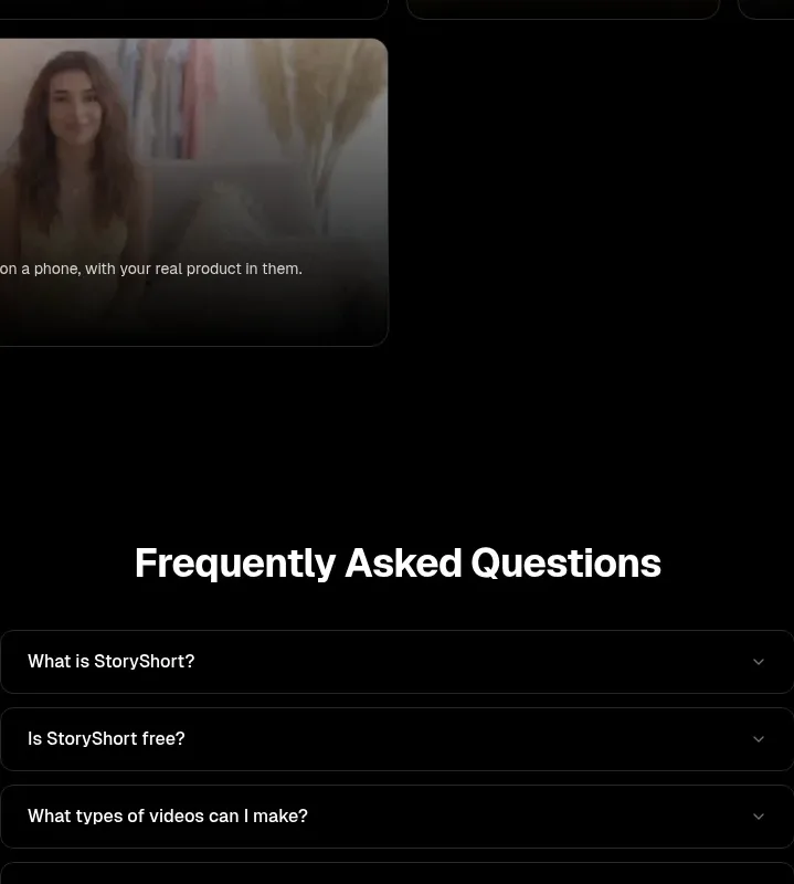
- Component: https://kage-design-assets.t3.tigrisfiles.io/components/capacity-so/08f2bf80-ea5b-4604-8f5e-193c94acfc56-1791551996-8.webp
- Full page it was cut from: https://kage-design-assets.t3.tigrisfiles.io/screenshots/capacity-so/08f2bf80-ea5b-4604-8f5e-193c94acfc56-1791551914192-full.webp
- Component on Kage: https://kage.design/component/capacity-faq

## Before you start
Ask what objections or recurring questions users have about the product and what brand tone should guide the answers. Then create this FAQ from those real questions.

Build a centered FAQ section on a near-black background. Use a large heading with a short emphasized or italic phrase, followed by a narrow list of six accordion rows. Each row has a left-aligned question, a right-aligned plus/minus control, and a subtle horizontal divider. Keep row heights generous, typography 14–16px, text warm white, controls muted gray, and borders around #ffffff10. Only one item may open at a time if that improves scanability; animate height and icon rotation, support keyboard navigation, and include accessible disclosure attributes.

**Never:** use logos, product names, copy, illustrations, or imagery from the reference.